
Adventures of
an Art Collector
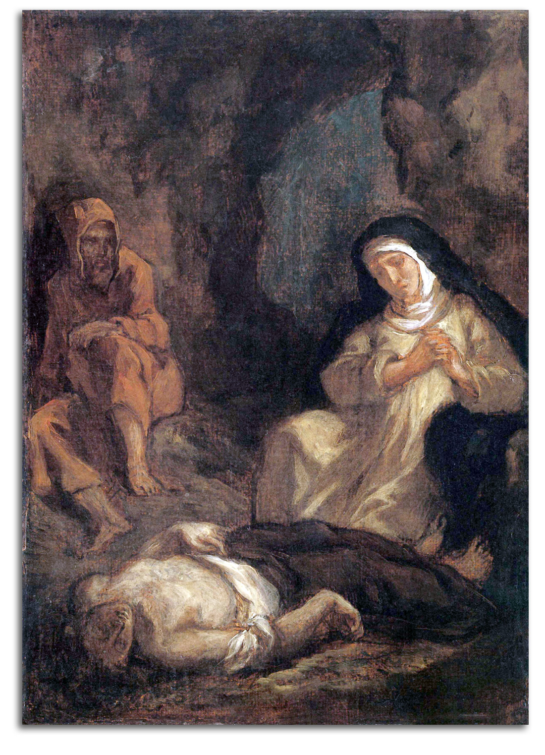
DELCROIX
Lelia Mourns over the Body of Sténio
Oil painting, 1847
Ex. Collection: FLG
Formerly on loan to Stanford University Art Museum, and
the Metropolitan Museum of Art, New York
Published in THE PAINTINGS OF EUGENE DELACROIX: A CRITICAL CATALOGUE, 1986, Number 289, Plate 108
VOL 1 PAINTINGS, European & American
VOL 2 PRINTS, European & American
Part 1. OLD MASTERS – BACKGROUND
Northern Renaissance: DURER
Southern Reniassance: BOTTICELLI & LEONARDO
Baroque – Flemish: RUBENS & VAN DYCK
Baroque – Dutch: REMBRANDT
Baroque – French: CALLOT
18th Century: TIEPOLO & PIRANESI
Part 2. EUROPEAN MASTERS – 19TH CENTURY
Neo-Classicism
Romanticism
Realism
Romantic Realism
Impressionistic Realism
Impressionism
Postimpressionism
Symbolism
Part 3. EUROPEAN MASTERS – 20th CENTURY
Fauvism
Expressionism
Cubism
Dada & Surrealism
Late Modernism
Part 4. AMERICAN MASTERS – 19TH CENTURY
Romantics
Realists
Tonalists
Impressionists
Symbolists
Part 5. AMERICAN MASTERS – 20TH CENTURY
Urban Realists
Cubists & Abstract Artists
Visionaries
Regionalists
Abstract Expressionists
Mid-Century Realists
Postmodernists
VOL 3 SCULPTURE, European & American
A. Medieval
B. Renaissance & Baroque
C. 19th Century
D. 20th Century
VOL 4 DECORATIVE ARTS, European & American
VOL 5 SCULPTURE, Tribal & Ancient
A. Tribal (Africa & Oceania & North America)
B. Pre-Columbian
C. West Asian & Egyptian
D. Minoan & Mycenaean
E. Greek
F. Roman & Etruscan
G. Celtic
VOL 6 ASIAN PAINTINGS
VOL 7 ASIAN PRINTS
VOL 8 ASIAN SCULPTURE
A. South Asia
B. Tibet & Nepal
C. Southeast Asia,
D. Japan
E. Stone Age China
F. Buddhist China
VOL 9 ASIAN DECORATIVE ARTS

VOL 2 EUROPEAN PRINTS – Introduction
Part 1. OLD MASTERS – BACKGROUND
The technique of engraving images goes back to the cave artists of the Stone Age. The concept of engraving images that could be printed on clay appeared in the West Asian cultures of the Bronze Age, starting about 3000 BCE with the Sumerians who engraved cylinder seals and readable clay tablets. The Chinese and the Japanese had paper and were making rubbings many centuries ago. The earliest known printed text with woodcut illustrations was a Chinese edition of the DIAMOND SUTRA from the Buddhist tradition in the 9th century. This scroll is about 17 feet long.
Europeans made printed textiles in the 6th century. The production of paper in the 12th century opened the door to other possibilities. The first European woodcuts on paper were German playing cards early in the 15th century. The printing press with moveable type developed in the middle of the 15th century.
By the end of the 15th century and early 16th century, illustrated books were being printed. Makers of medieval manuscripts made verbal-visual harmonies laboriously on painted sheets of sheepskin. Now unified work-image experiences were made much more easily on printed pages. Books had been very rare for thousands of years, available only to the clergy and elite classes of society. Now thousands of books were being produced throughout Europe for all the middle classes to read, generating whole new definitions of public education and the sociology of democracy.
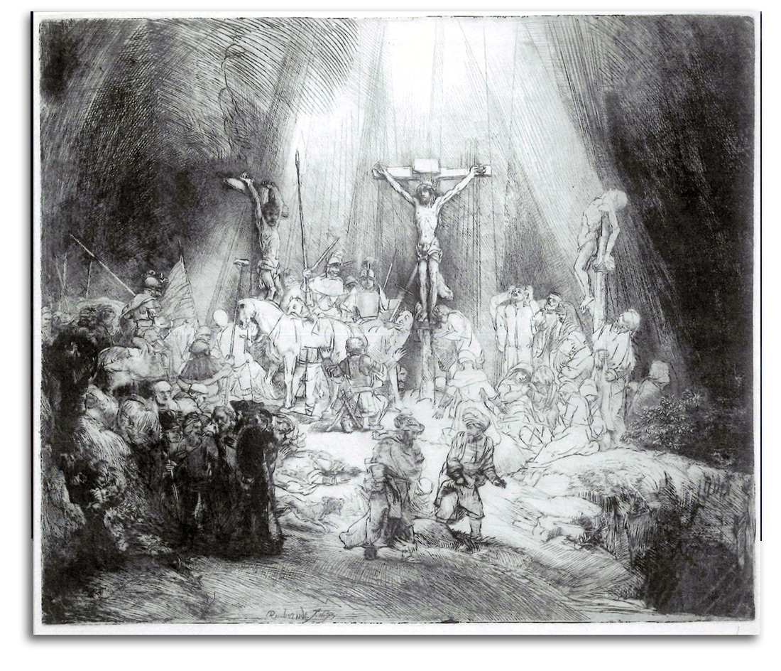
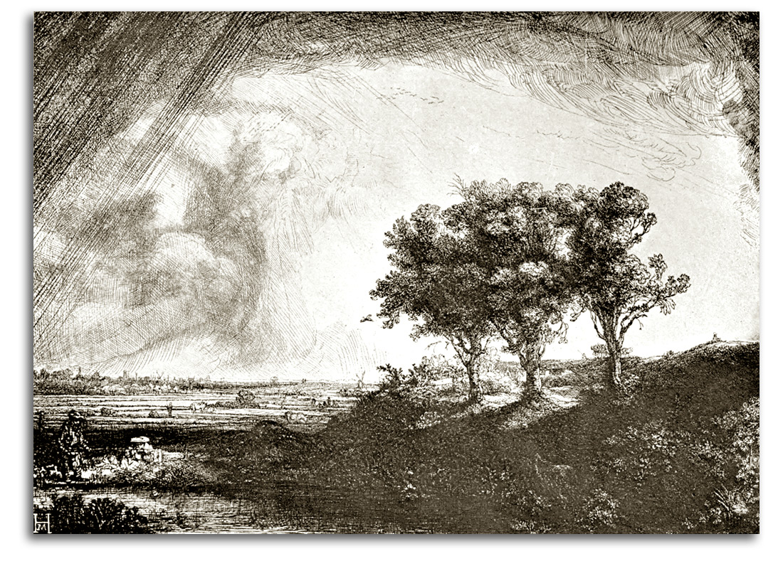
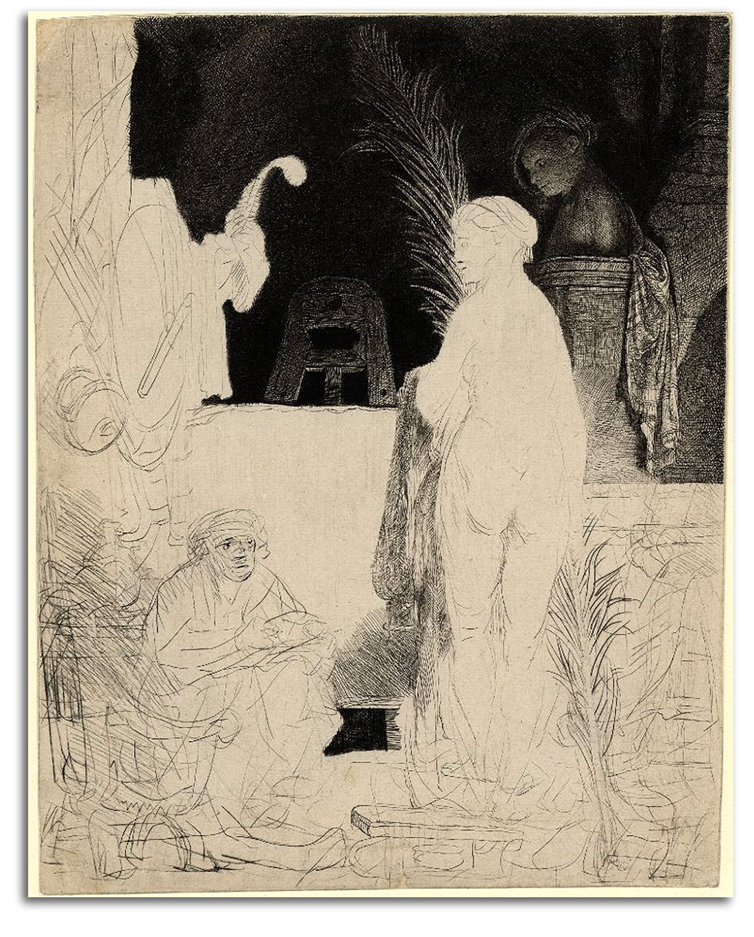
At the same time, the technique of tightly focused engraved prints was mastered by painters such as Mantegna in Italy and by Durer in Germany. Many think the engravings of Durer have never been matched. Etching developed in the 17th century. Rembrandt made the greatest etchings of the age. In many ways, his 300 etching plates tell the whole of the human story.
The brilliant visualizations by painter-printmakers during the Renaissance and Baroque periods (1400s through 1600s) gave printmaking a new respect. However, many regarded these pretty sheets of paper as little more than “ads” for paintings. It was not until the 1700s that a large population started to regard prints as original works of art. The concept of limited editions and signing prints did not become widespread until the 1800s. Art historians and connoisseurs determine if a fine print is an original, a replica, a reproduction, or a fake. All four types of prints will be illustrated in this course. The difference affects visual quality and financial value.
Modern printmakers regularly have drawn inspiration from the Old Master printmakers we will visit in this course. Also inspired by Old Masters have been those who permeate our environment today with billions of multiplied images in periodicals, on TV shows, and computer screens. Only five centuries ago all printed images were unique, handmade, and precious. Now duplicated images form the informational architecture of our lives.
OLD MASTERS – Northern Renaissance: DURER
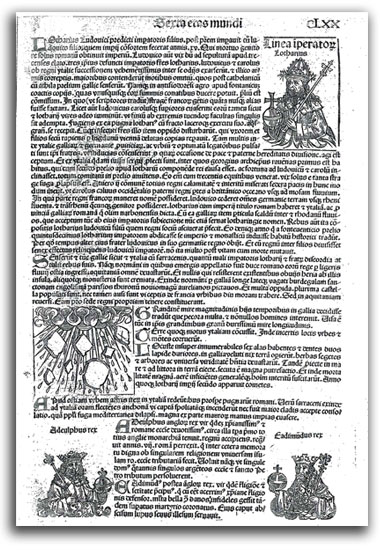
Epiphany by Albrecht Durer (attributed). Cut c.1486-89.
Published 1493
Woodcut
Collection: FLG on loan to IAD
Published in THE SPIRIT OF THE RENAISSANCE, 2007
NOTE: This explosive image of an epiphany – the Spirit of the Divine bursting into the material world – probably was cut by Durer. It must be among his earliest works, and is much more sophisticated than many of the rather crude woodcuts in this book. The page is from the Nuremberg Chronicle of 1493 which was a monumental history of the world and the most important illustrated book of the early Northern Renaissance. Durer (born 1471) worked on this book as a teenager between 1486 & 1489. His remarkable capacity to render dynamic images of the Transcendent seems to have started with this image and continued for the rest of his life. This very early image is obviously somewhat elementary, but it already speaks of his rapidly maturing specialization in luminosity. The intensity of his luminous bursts of radiance in the form of halos, auras, and epiphanies is unmatched during the Renaissance. My attribution of this woodcut to Durer was confirmed by Gunther Troche, Director of the Achenbach Foundation for Graphic Art at the Fine Arts Museums of San Francisco in 1970 when he was curating an exhibition of Durer prints.
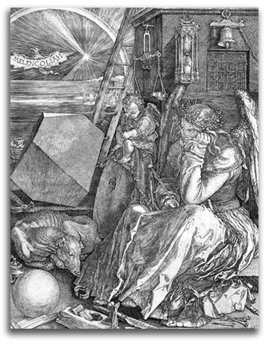
Melancholia by Albrecht Durer: (1514). A later printing from the original plate
Engraving.
Collection: FLG on loan to IAD
Ex. Collection: Metropolitan Museum of Art, New York
Published in THE SPIRIT OF THE RENAISSANCE, 2007
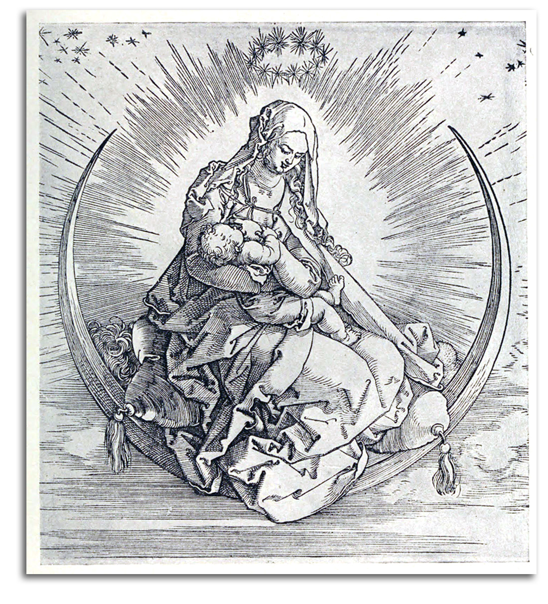
DURER (after)
Virgin & Child on the Crescent Moon (printed c1505)
Wood engraving. Later edition
Collection: FLG
OLD MASTERS – Southern Renaissance: MANTEGA, BOTTICELLI & LEONARDO
MANTEGA
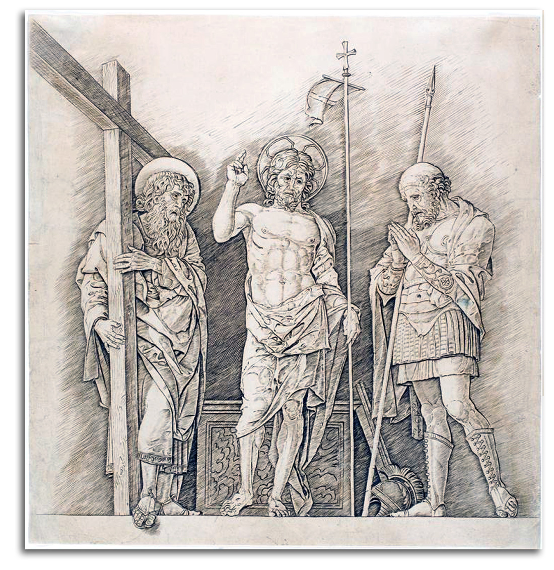
THE RISEN CHRIST, engraved c1472
engraving
Facsimile engraving, c19th century
Collection: FLG
Ex. Collection: James Stowe
NOTE: The art of etching became an art form in the 15th century. One early center of etching was the elegant Italian city of Mantua. The primary court painter in Mantua after about 1460 was Andrea Mantegna. He spent most of the rest of his life there.
In 1453 Mantegna married Nicolosia Bellini from Venice. Her two brothers, Gentile and Giovanni Bellini, were strongly influenced by Mantegna. Giovanna eventually would develop an early High Renaissance style in Venice. Giovanni’s students were Giorgione and Titian who brought the Venetian High Renaissance to full maturity. Mantegna also influenced Durer who developed a High Renaissance style in Germany.
Mantegna was the first fully developed Renaissance painter & printmaker in northern Italy. He also was one of the first great Italian printmakers. “The Risen Christ” is one of his best-known prints. The tightly carved style expresses Mantegna’s intense vision of Christ with strength far beyond that of an ordinary human.
Notice how one of the feet has been extended into the viewer’s space. Why? To reduce the psychological distance to Christ, in other words, to help the viewer feel closer to Christ.
I purchased this impression of Mantegna’s famous print with the understanding that it is not from the 15th century, but rather a later edition – one that is quite close to the original. How close? I’ve known experts who were not sure if this later impression is 15th century or 20th century. That’s how good a replica can be.
BOTTICELLI
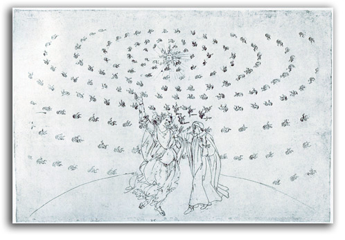
Dante and Beatrice ascending to the Fixed Stars
(Illustration for PARADISIO, Canto 26)
Drawn c1480-90
Lithograph from a drawing in
LA DIVINA COMMEDIA by Dante Aligieri
Nonsuch Press edition, 1928
Copy #1: Collection: CSUEB, Gift of IAD
Copy #2: Collection: FLG
NOTE: This was the first book to bring together all of Sandro Botticelli’s images with Dante’s words that were written about 1300. In effect, it is the “first edition” of Botticelli’s grand project. Botticelli spent many years illustrating Dante’s famous poem. He was commissioned to do these drawings by Lorenzo di Pierfranceco de’ Medici with the specification of one image for each of the 100 cantos. That fortunate Medici owned Botticelli’s world-famous painting “The Birth of Venus.” Botticelli’s Dante work on sheepskin was never completed. Many are mere sketches. Some are finished drawings. A few have been colored. 94 sheets survive, all 32 x 47 cm. Most are in Berlin. The Vatican Library holds several. Botticelli’s work on this project probably began in the late 1470s or early 1480s and continued until 1495. It would have been a sumptuous book with a magnificent binding. But it was not to be. The Medici family was driven out of Florence. What would have been Botticelli’s final illustration of the Highest Heaven is a blank page.
Through Hell and Purgatory, Virgil (Reason) guides Dante to see many sinners and how they are being punished. Up through the Heavens of Paradise it is Beatrice (Intuition) who guides Dante on his path toward the Highest Heaven. At first she is much larger than he. As he grows in wisdom, he grows to be as tall as she. In this picture, near the end of the book (and the end of Dante’s journey to God), they are in the Eighth Heaven of the Fixed Stars, nearing the Highest Heaven. Beatrice tells Dante to close his eyes so that he can see Ultimate Reality with his Inner Eye, a reality that ordinary eyes cannot see.
LEONARDO
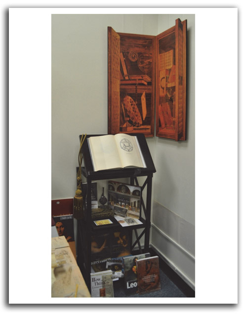
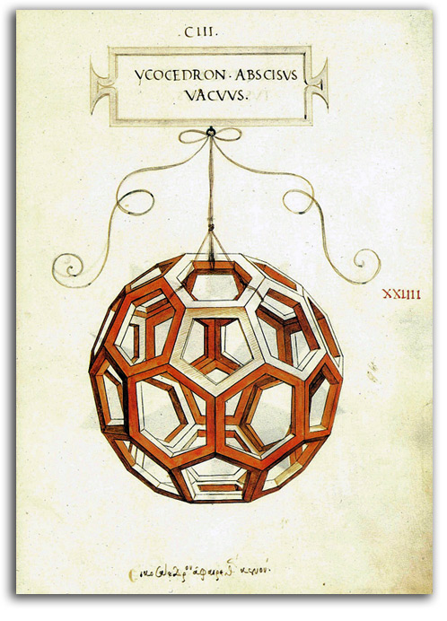
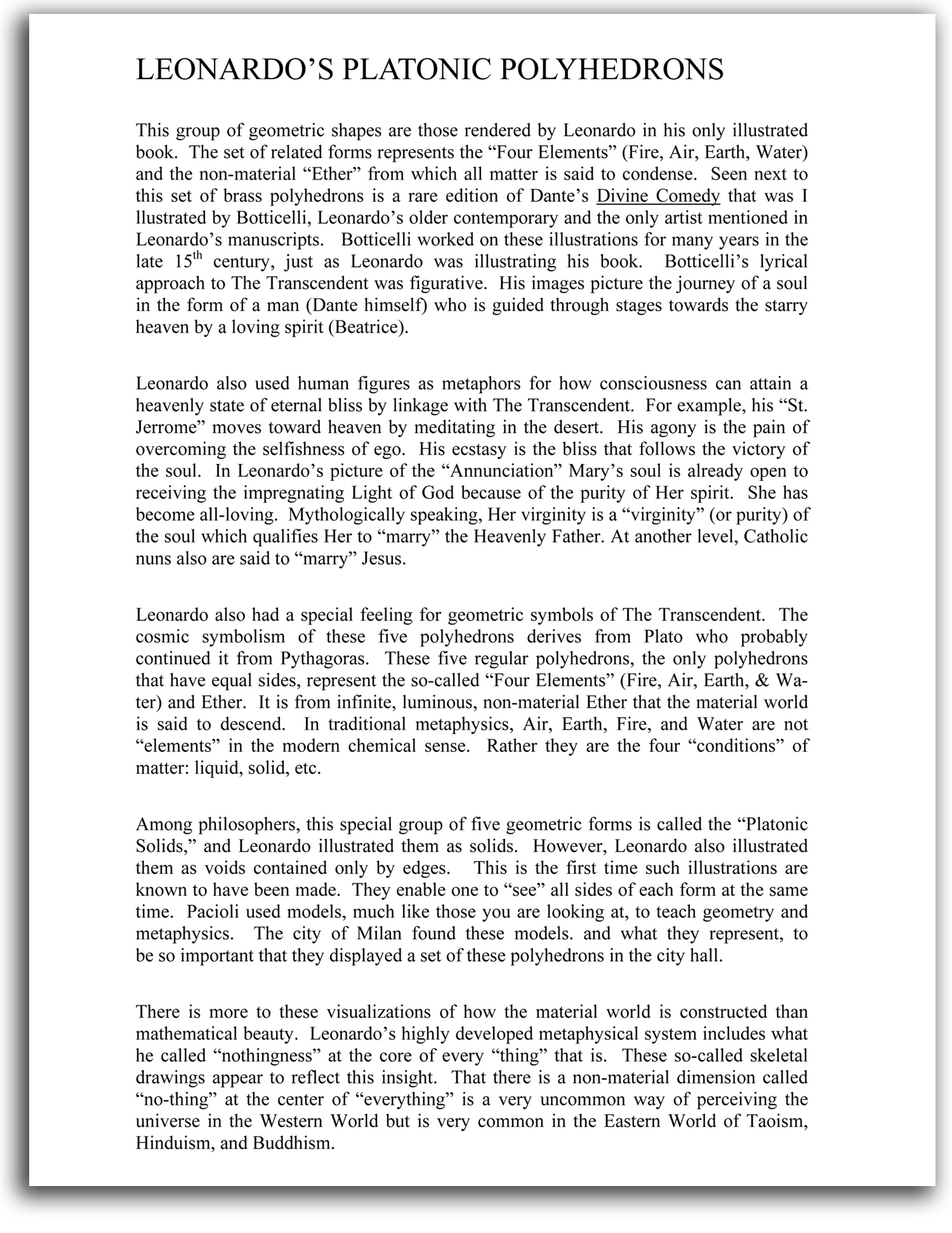
Illustration of a Dodecahendron (symbol of Ether)
Page in DIVINA PROPORTIONE by Pacioli, 1509
Facsimile edition, 1990?
Collection: FLG
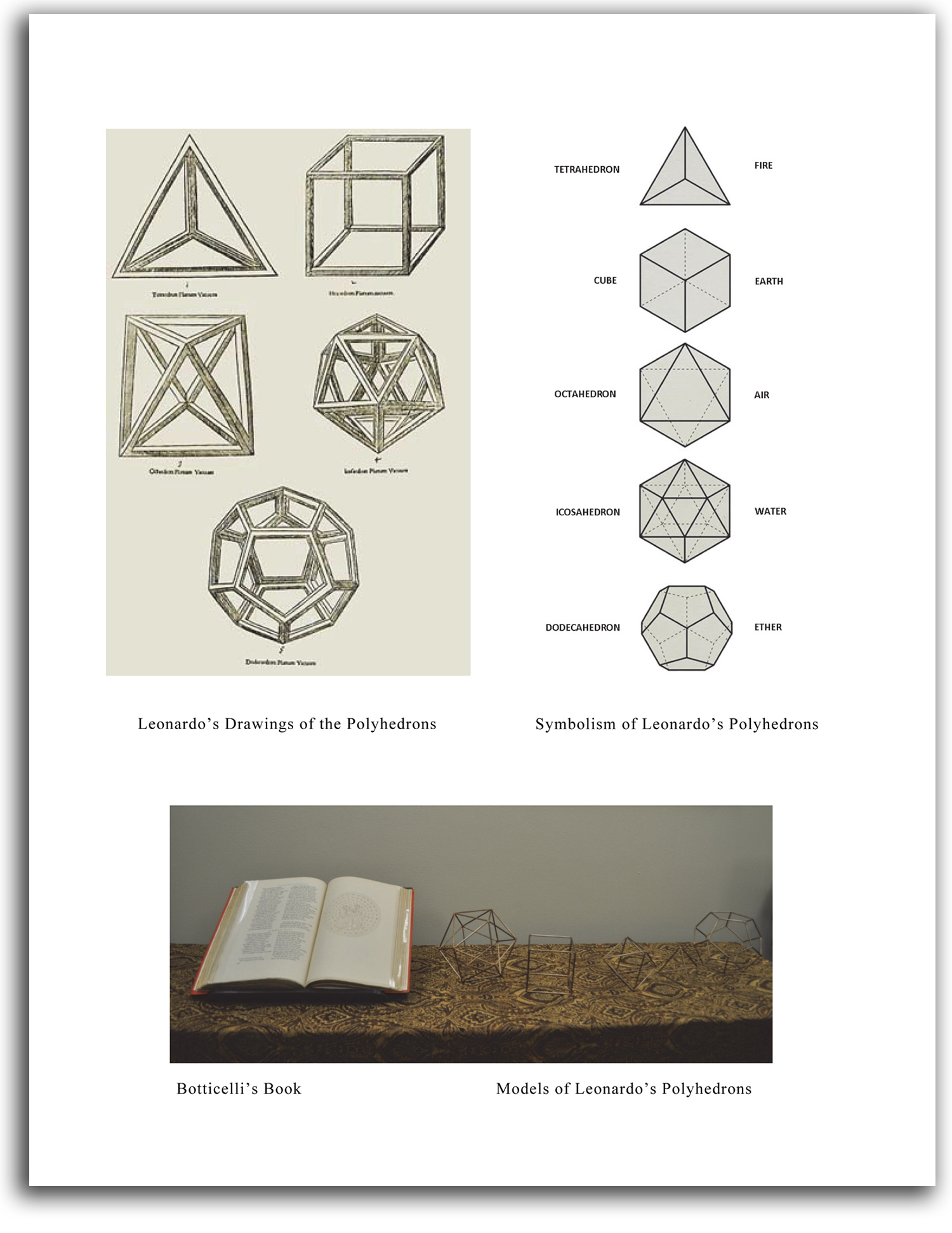 Click here for a closer view of above page in PDF format
OLD MASTERS – Baroque / Flemish: RUBENS & VAN DYCK
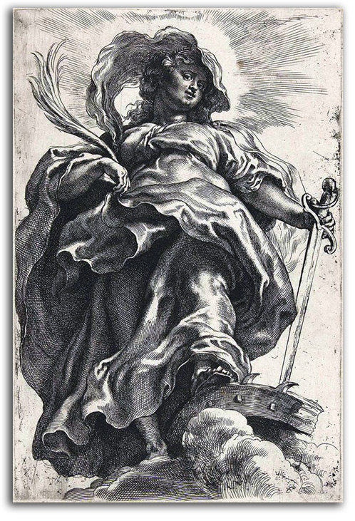
RUBENS
ST. CATHERINE OF ALEXANDRIA
c.1620. Etching & engraving
Collection: FLG
NOTE: Rubens had a large workshop of engravers making prints after his designs. He can be credited with the general composition of many of the plates but not for any of the execution. This “St. Catherine” is the only etching Rubens is known to have made himself. Following Christian tradition, she is standing over the spiked wheel on which a pagan Roman emperor attempted to torture her to death in the 4th century. Following her prayer, the wheel broke, and the emperor had to settle for having her beheaded. Rubens has given us not only a story but a story wrapped in a vivid expression of the meaning of the story. This is an explosive figure of a Transcendent spirit who has triumphed over torture, a spirit who has moved beyond ordinary humanity to an illuminated state of Grace. This Transcendent condition of the soul is what the halo symbolizes in the sacred art of the West and the sacred art of the East. It is typical of Baroque art to be activated by swirling masses, as if being blown by the wind. This convention is dramatic and thus emotionally engaging which is what the Catholic Church during the Counter Reformation wanted its art to be. The dramatic “wind” blowing form into place also was thought of as the Divine Spirit moving earthly matter into purposeful positions.

VAN DYCK
Self-Portrait (etched c1630)
Etching, probably a 17th century edition
Collection: FLG
NOTE: Anthony van Dyck began in the studio of Rubens, and then became arguably the most graceful portrait painter of the age. Apparently at the recommendation of Nicholas Lanier (whose portrait he painted), van Dyck became court painter to King Charles I of England. His English portraits established the standard against which British art would be judged for centuries. His etched portraits are as graceful as his paintings. This self-portrait is the most famous example. The combination of specificity and spontaneity is remarkable. This famous self-portrait is from a series of portraits he did with collaborators, a series called ICONOGRAPHY, a series which was the first printed “book of famous people.” ICONOGRAPHY was not published as a bound book, but rather as loose sheets that collectors could keep as a portfolio or bind into a book. The Louvre bought the original copper plates and still sells good impressions from its electrotypes.
An ELECTROTYPE is a reproductive print of considerable fidelity. The technique was invented in the early 19th century. The process involves making a mould of the original engraving, etching, or block of type, by depositing a thin copper or nickel shell over the original surface by means of electrolytic action. The facsimile impressions are printed from this new block.
OLD MASTERS – Baroque – Dutch: REMBRANDT
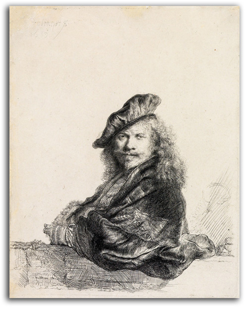
REMBRANDT
SELF-PORTRAIT LEANING ON A SILL (etched 1639)
etching. Later edition from the original plate. (signed)
Collection: FLG
NOTE: Today, the best-known artist of the 17th century is the Dutch master Rembrandt van Rijn (1606-1669). He is arguably the greatest portrait painter of all time. His name, and only a handful of other artist names, have become household words. As a painter of portraits, and as an “illustrator” of Bible stories, his use of light to articulate aspects of psychology and the depth of his humanity have never been exceeded. He also was a printmaker. No prints have been more avidly collected by a greater number of enthusiasts. If van Dyck was an etcher of consistent compositional structures and remarkable simplicity, Rembrandt was an etcher of enormous variety and often haunting complexity. This particular print is often considered the greatest of his early self portraits. He continued to explore this thing called “self” in a very long series of paintings and prints for the rest of his life. That series is arguably the most complete “self portrait” ever made by an artist. The fact that the Met had a collection of Rembrandt etchings made from his original plates in modern times was first told to me by A. Hyatt Mayor, curator of that print collection, when he was my professor at the Institute of Fine Art, New York University in 1966. They were later put up for sale. I purchased this impression at the Met in 1980.
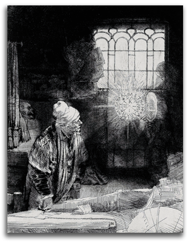
REMBRANDT
THE ALCHEMIST (aka FAUST) (etched 1652)
Etching & engraving. A late impression from the original plate
Collection: CSUEB. Gift of IAD
Ex. Collection: Metropolitan Museum of Art, New York
NOTE: Rembrandt eventually had an international reputation as an etcher. The meaning of most of his portraits and narratives is clear. But this famous print is mysterious. Scholars have debated its meaning for centuries. An old man in a dark room looks up from his writing desk, pen in hand, and sees a luminous disc inside of which are words. The meaning of those words is a mystery. Most of the room is imprecise – the table, the books, the globe; but the words are quite precise. The whole scene is a mystery, and that may well have been just what Rembrandt wanted it to be. The title published in the 17th century was “The Practicing Alchemist.” Only in the 18th century did it start being known as “Faust.” To the uninitiated, Alchemy was little more than efforts by greedy people to turn lead into gold. There were such people during the Middle Ages and the Renaissance. However, true Alchemy was a meditative tradition within Christianty that had parallels with Asian yoga. During the 16th & 17th centuries, true Alchemy was a special interest of leading figures of the time including Sir Isaac Newton. By means of spiritual practices, one attempts to transcend lead-like selfishness and attain the Transcendent state of Golden Consciousness. {For further details, click here for “The Mystic Ladder: Parallel Stages of Consciousness in Alchemy & Tantra.”]
The legend of Faust probably was based on the life of J. G. Faust (c1480-1540) who was an alchemist and magician in Wurttemberg. In Goethe’s play/poem Faust (which occupied much of his life), the central character makes a “deal with the Devil.” For a number of years, Faust gets what he wants and then must surrender his soul to the Devil. If the subject actually is Faust, the scene probably is when a good angel warns Faust not to sign up with the Devil. What is the Devil actually? In a number of spiritual traditions, the Devil is understood to be one’s ego – selfishness personified.
OLD MASTERS – Baroque – French: CALLOT
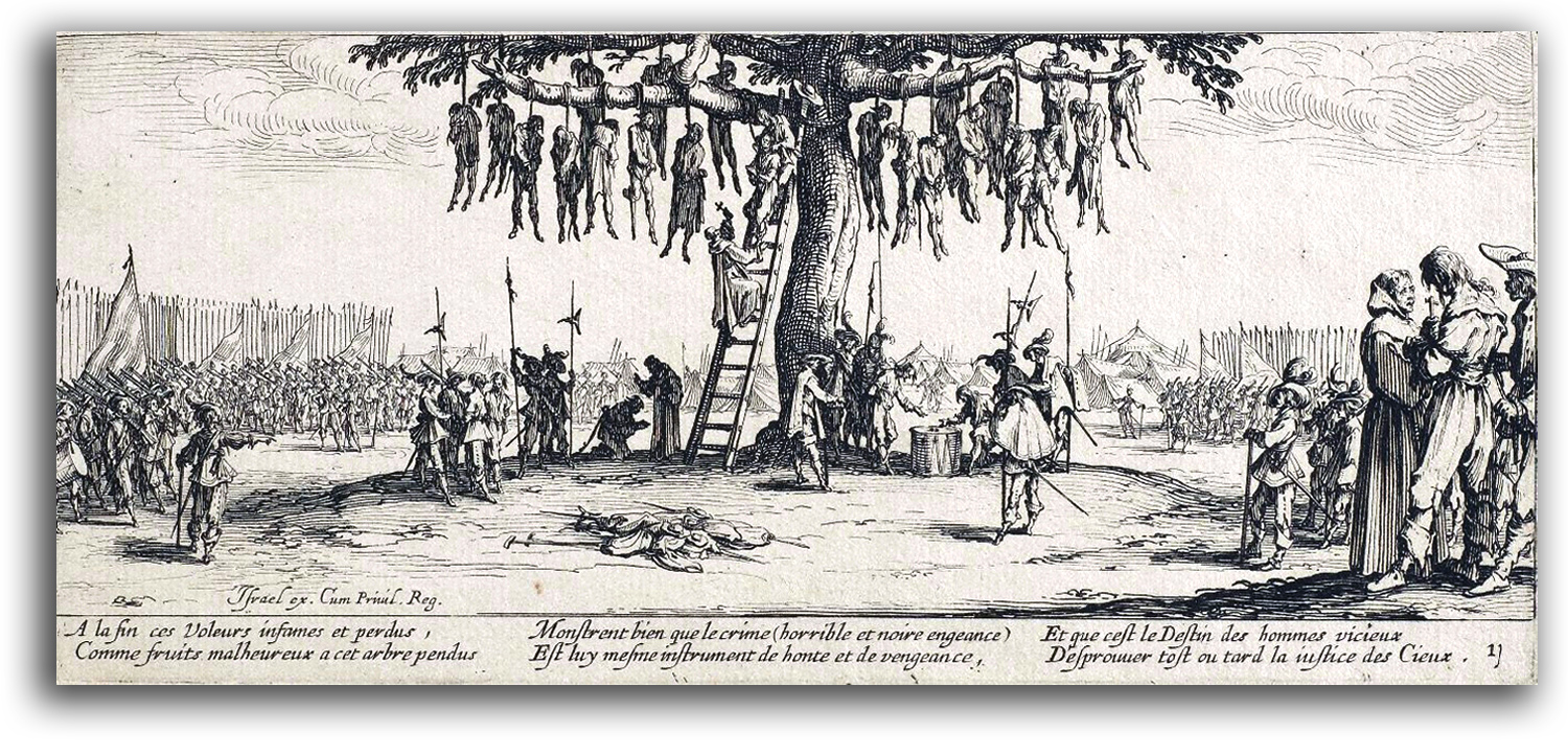
CALLOT
The Hanging, c1633
Original Etching from
LES MISERES ET LES MALHEURS DE LA GUERRE, 1633
Collection: FLG
NOTE: THE MISERIES OF WAR is Jacques Callot’s most famous work. The bloody Wars of Religion had been going on for years in the countryside of his native Lorraine near Nancy. For him, the horrible realities of war had a kind of normalcy. Callot made some 1400 etchings and a number of important technical innovations to the technique of etching. Most importantly, he recorded the daily life of soldiers, and clowns, and beggars with such psychological depth that his work was studied by many who came after him including Rembrandt and Goya.
OLD MASTERS – 18th Century: TIEPOLO & PIRANESI
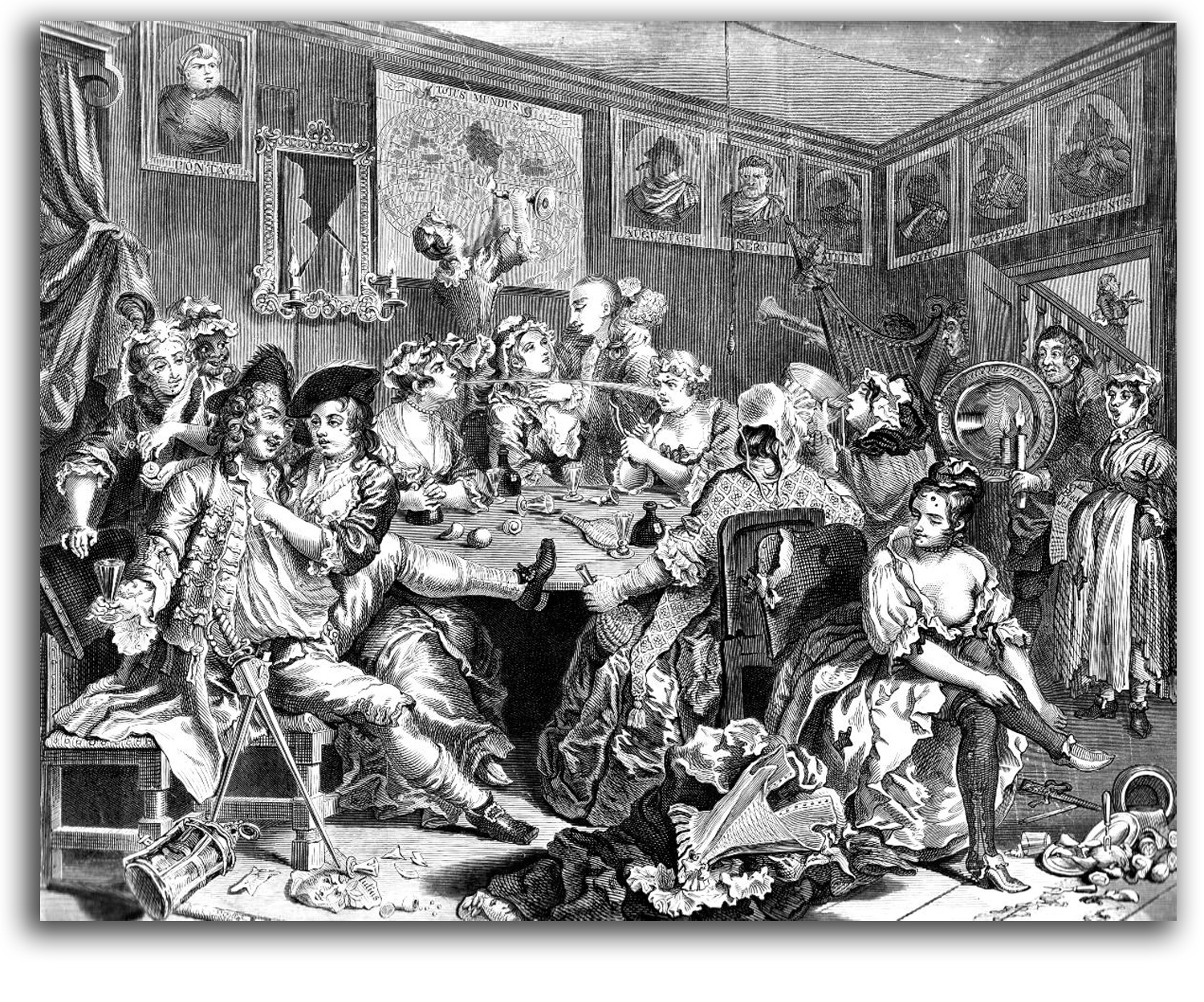
HOGARTH
The Tavern Scene (painted 1732-33)
Engraving, Plate 3 of 8 from A RAKE’S PROGRESS, 1735
Collection: Unknown
NOTE: William Hogarth was an English printermaker, story teller, and social critic in the early 18th century. Since printmaking began, it has served more often than not as a way of telling stories. The earliest handmade prints told religious stories silently. Since the advent of the printing press in the middle of the 15th century, the Western World has been enriched by billions of illustrated books, periodicals, and newspapers. Hogarth published his story-books as portfolios of engravings such as A HARLOT’S PROGRESS (1731), A RAKE’S PROGRESS (1735), and INDUSTRY AND IDLENESS (1747). These were lively satirical critiques of immoral living rendered as if they were dramatic scenes on a stage. He quickly came to be regarded as a genius. He also was a painter of considerable skill. Many of his prints were first paintings. However, his fame rests on his prints. Among other things, Hogarth is credited with inventing sequential art in the Western World. In Modern times, this way of telling stories in a visual manner became comic strips, graphic novels, photo-essays, and the filmmaker’s storyboard.
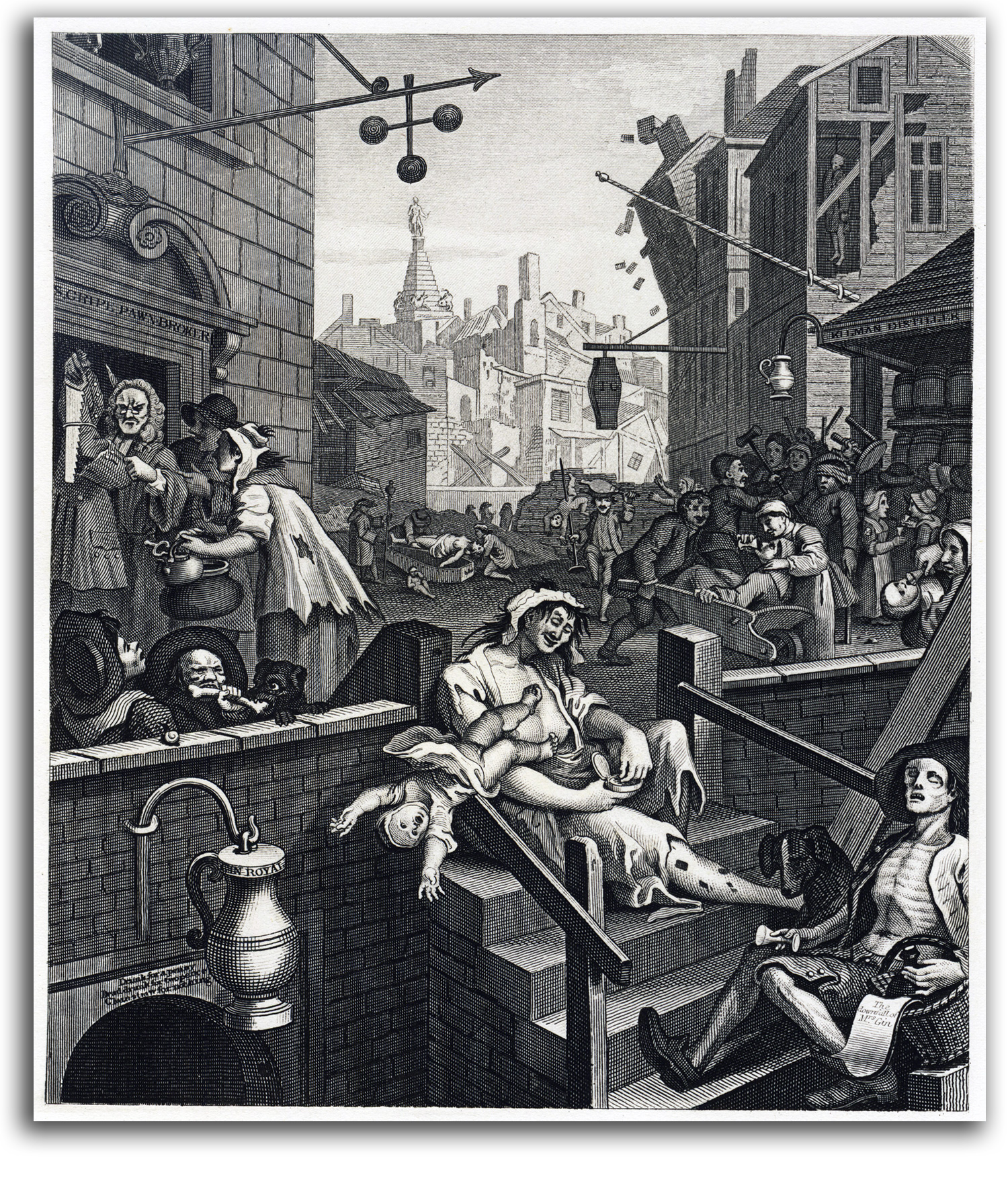
HOGARTH
Gin Lane, 1751
Engraving
Collection: Unknown
NOTE: Hogarth was not merely a humorist. He was out to improve society. His engraving “Gin Lane” (in which a drunk mother’s child falls to its death) helped to get passed a law restricting the use of gin.
WATTEAU (after)
Gersaint’s Art Gallery (painted 1720 or 21)
Etching, 1732
Collection: Unknown
NOTE: During much of the 18th century, France was the dominant power in Europe, both militarily and culturally. Many other nations copied its architecture, paintings, and clothes. French became the international language of Europe. The style that dominated the 17th century was the Baroque. Visually, to simplify, that means a few large forms moving slowly. The style that dominated the 18th century in France was the Rococo. Visually, to simplify, that means many small forms moving rapidly.
The leading painters in France included Watteau, Boucher, and Fragonard. All three also engraved their paintings themselves, from time to time. Antoine Watteau was the first great French artist of the era. His work was so popular that after his death, over 600 of his works were made into prints. He established the early Rococo style that was followed during most of the rest of the century. This picture, his last major composition, shows King Louis XIV packing his art collection.
The Rococo style was designed for the pleasure of the upper classes whose lives were focused on self-indulgence and conspicuous consumption. Fragonard’s graceful compositions are as fluid as the silks that his men and women wear. Many in the upper classes of this period contributed nothing to society. Some, such as the philosophes, contributed a great deal by creating plays, novels, poetry, encyclopedias as well as the scientific and increasingly democratic ideals of the Enlightenment. The economic strength of the middle classes (the Third Estate) grew dramatically over the century and eventually overthrew the king and the decadent nobility in the Revolution of 1789.

BOUCHER (after)
Pastoral Love
Etching by Duflos, 18th century
Collection: IAD (2012)
NOTE: Francois Boucher was the leading master of the mature Rococo during the middle of the 18th century. He worked in many media: painting, drawing, prints, tapertries, porcelain, stage design, and costumes. He had much to do with the spread of the Rococo to most of Europe. Highly favored by King Louis XV and Madame de Pompadour, he became Director of the Royal Academy. This contemporary 18th century etching by Duflos one of the best of Boucher’s etchings. The subject of rustic lovers is a fantasy genre that Boucher invented.
FRAGONARD (after)
The Swing (painted 1765-70)
Etching, ND
————————————
Facsimile etching by Molnar, c.1955
Collection: IAD (2012)
NOTE: Jean-Honoré Fragonard was a gifted painter-printmaker of the late Rococo. Exuberant, hedonistic, and energetic, he produced over 500 paintings. He studied under Boucher who let him make replicas of his paintings. He later became very successful in the pleasure-loving court of King Louis XV. His favorite theme was love. The painting of “The Swing” is now in the Wallace Collection in London. It probably is his best known painting. His highly theatrical subjects may seem silly to modern eyes, but his attitude was a mirror of his times, and he used his versatile brush better than any other painter of the age. He was able to change with the times, and made Neo Classical paintings after about 1780, and even shared a studio with David, leader of the Neo Classical Movement of the late 18th century. During this period, his earlier shallow libertine eroticism changed dramatically. His late allegories of love express a new Romanic vison of love as a mystical experience. Fragonard had a second career as the first curator of the Louvre after it became a public museum following the Revolution of 1789.
Part 2. EUROPEAN MASTERS – 19TH CENTURY
INTRODUCTION
During the first half of the 19th century, four different styles of painting and printmaking ran side by side. The highly rational Neo-Classicism of the 18th century continued with the cool, smooth figures and faces of Ingres.
Romanticism became popular as a reaction to the tightly drawn boundaries and thin colors of Ingres and his school. The Romantics, from Delacroix to Turner, preferred fluid edges, intense color, and dramatic plots. Realism offered a third alternative. Courbet and Millet in Europe, and Homer in the United States pictured the life of ordinary people, giving sincere respect to the working class for the first time. By the middle of the century, a style that can be described a Romantic Realism was the most popular style among the art-buying public. The most beloved practicioners of the time included Bougereau and Makovsky. It was against this type of art that Manet and the Impressionists reacted.
EUROPEAN MASTERS – 19TH CENTURY – NEOCLASSICISM
Neoclassicism was a style of art & architecture that developed in Europe during the second half of the 18th century inspired by a continuing reverence for Raphael, and by the discovery of many Greek and Roman antiquities – products of the new discipline of archeology. Architecture grew ancient columns at every opportunity. The writings of Winckelmann, drawing on Platonic ideals, stressed the beauty of Greek art and “brain-born images” over mere nature. The paintings and prints of this style have an emotional restraint, solid sculptural forms, rigid postures, firm outlines, and usually very little color. The goal was “noble simplicity.” Neoclassicism is primarily a rationally oriented, left-brain aesthetic. The first great practitioner of this style in the late 18th century was David, who became Napoleon’s court painter. The next great practitioner was David’s student, Ingres, who with masterful linearity was a dominating figure in early 19th century France. The two great rivals of the era were Ingres and Delacroix.
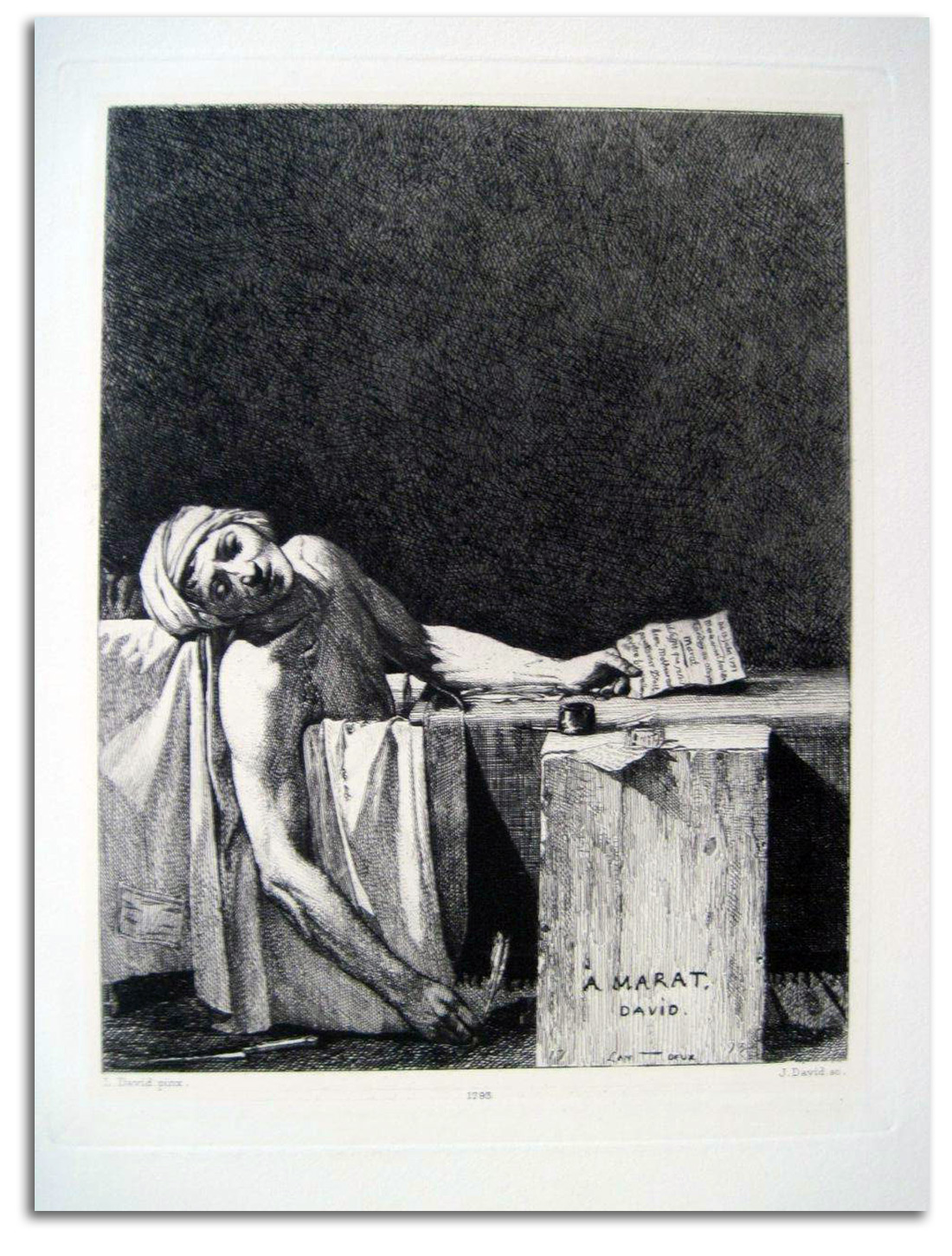
DAVID (after)
The Death of Marat (painted 1793)
Original etching & drypoint by J. David, ND
Collection: IAD (2012)
NOTE: Jacque-Louis David was the most gifted Neoclassical painter of his era. During the late 18th century, the mood of many French people was turning away from the shallow frivolity of the Rococo style of art and architecture to a more moral mood. David shared this mood, a mood that was being stimulated by the democratic ideals of Enlightenment philosophers. That included many of the same philosophers who had inspired the American Revolution of 1776.
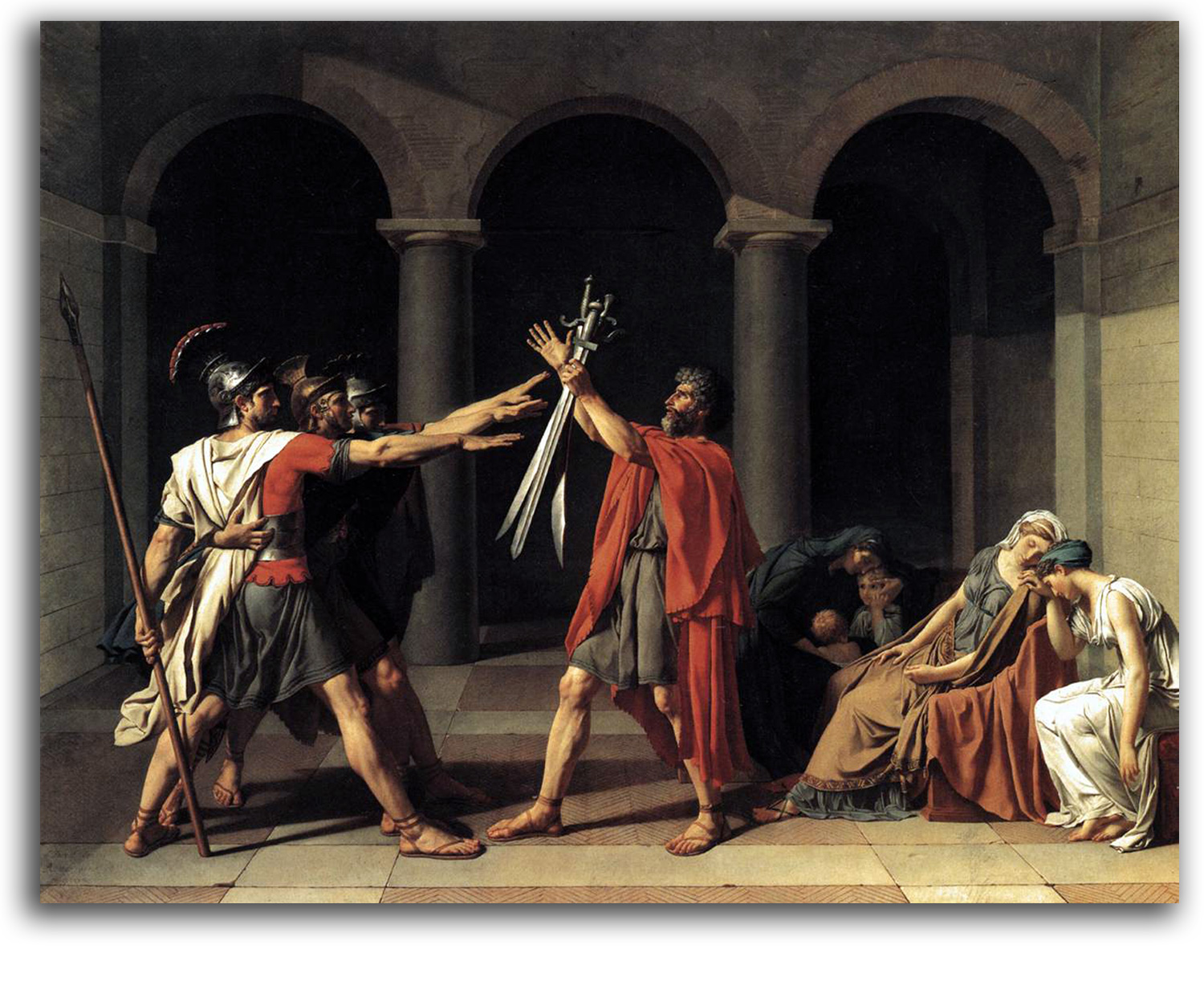
DAVID
Oath of the Horatti
oil on canvas, 1784
His first great painting “Oath of the Horatti” (1784) celebrated the Republican ideals of ancient Rome. We see the sons of the general taking an oath to fight to the death for the collective values of their community. David’s “Death of Socrates” (1787) shows us a philosopher who questioned traditional mythology and it cost him his life. Socrates could have accepted exile rather than death. However, he chose to drink that deadly cup of hemlock in order to show that the values to which he had dedicated his life were those of his community, and that this cup was the collective judgment of his beloved society.
Deep social changes in French society led to the French Revolution in 1789. The Divine Right of Kings would be eliminated by bloody means and replaced by a democratic republic. The United States was the first modern republic. France became the second modern republic. David was proud to be part of the French Revolution, and voted for the death of the King Louis XVI and Queen Marie Antoinette. The subject of “The Death of Marat” is the murdered body of Jean-Paul Marat, a famous early leader of the Revolution and a friend of David’s. It is one of David’s most famous paintings. He was asked to make a number of replicas at the time by fellow revolutionaries.
In some ways “Marat” is traditional. As part of his effort to sacralize the Revolution (even though he was an atheist), David seems to have deliberately composed the dead body (with his extended arm) in the Christian tradition of the way the body of Christ looked when brought down from the Cross. The aesthetic effect as a whole composition is one of “noble simplicity” – a continuation of the ideals of Neoclassicism.
In some ways “Marat” is modern. It is one of the first major political paintings in European history. It was admired by Napoleon who, when he became Emperor, made David his court painter. Moreover, the dramatic contrast of darkness and brilliant lightness, with the “story” squeezed in between, inspired a range of modern painters from Munch to Picasso. David’s pupil, Ingres, would carry Neoclassicism far into the 19th century. This rare etching is by J. David, David’s grandson, and a leading etcher of the era.
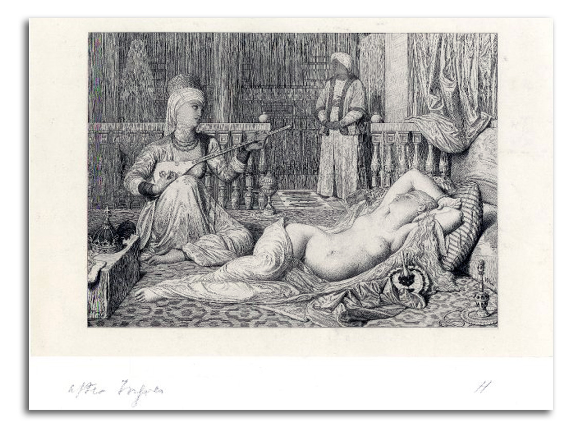
INGRES (after)
Odalisque with a Slave (painted 1839)
Engraving by Haussoullier, c1880s
Collection: FLG
EUROPEAN MASTERS – 19TH CENTURY – ROMANTICISM
Romanticism started to be discussed as a style about 1800. Based on imagination and emotion, Romanticism grew in reaction to the Neoclassical, highly rational values of the Enlightenment that were discredited by the bloody horrors of the French Revolution. Romanticism flourished until the middle of the century, celebrated by many poets (such as Wordsworth, Keats, Shelley, and Poe) and philosophers such as Burke who said: “…all that stuns the soul…leads to the sublime.” The poet and art critic Baudelaire said it in a word: “Romanticism… is feeling.”
The visual characteristics of Romantic paintings and prints include emotional situations, dramatic perspectives, fluid outlines, and rich colors. Leading practitioners included popular painters such as Delacroix and Turner in Europe, Cole and Church in the United States, and visionary printmakers such as Blake and Doré. The aesthetic of Romanticism is primarily that of the right-brain.
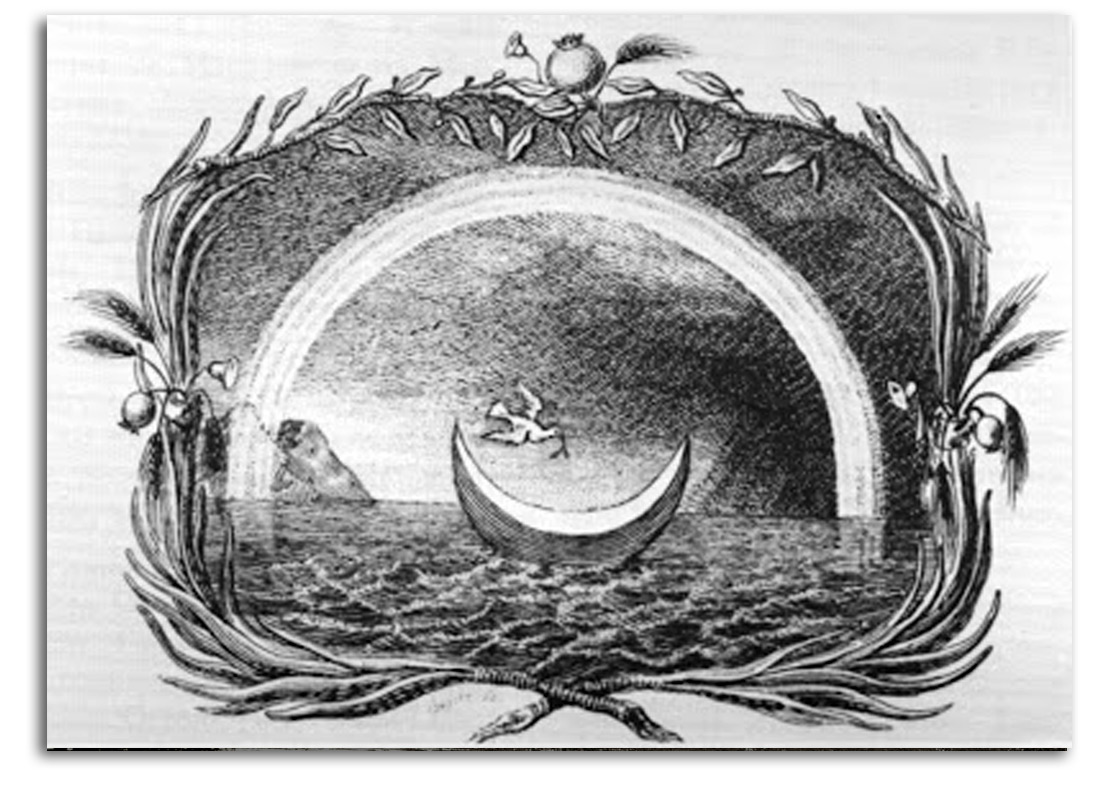
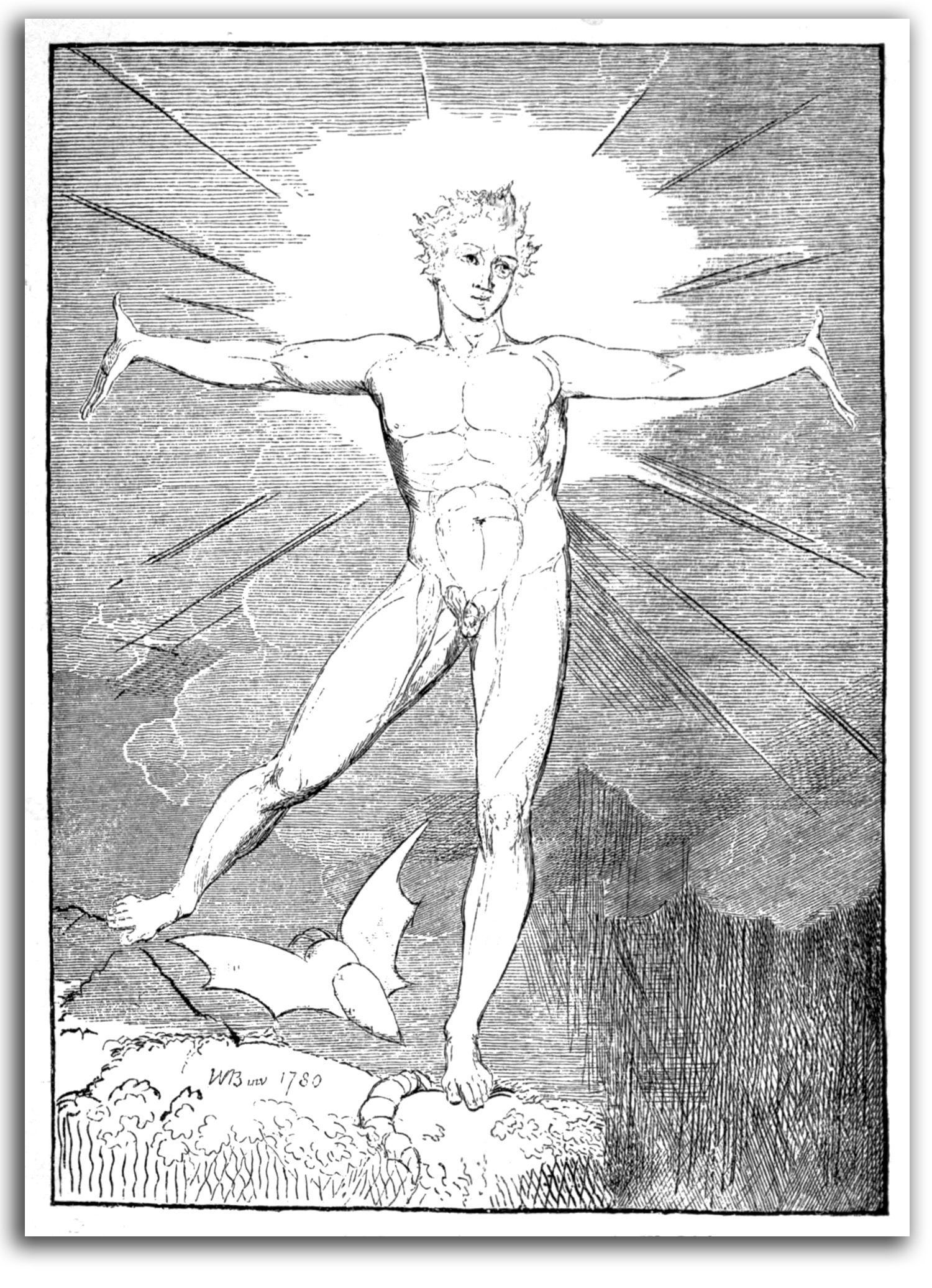
Glad Day by William Blake, c1805
Engraving, later edition
Collection: FLG
Exhibited in FLAMING PAGES: THE ILLUMINATED BOOKS OF WILLIAM BLAKE, University Art Gallery, 2006
NOTE: This is the second version of this famous print, and was never colored. Thanks to donations from IAD, the Special Collections of the CSUEB Library now has outstanding facsimile editions of all of Blake’s “illuminated books.” In 2004, drawing on that collection, FLG organized an exhibition called FLAMING PAGES: THE ILLUMINATED BOOKS OF WILLIAM BLAKE. It was the first such exhibition. Professor Martin Paley, an advisor to the exhibition, spoke at the opening. This impression, a later printing from the original plate, was featured in the exhibition.
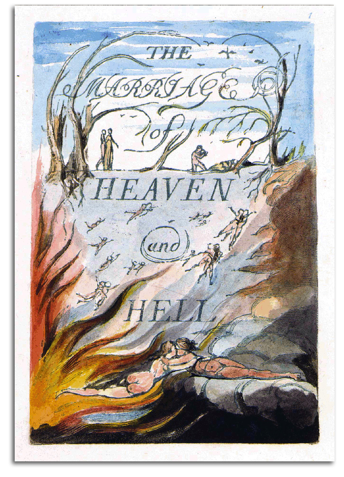
BLAKE (after)
Cover of THE MARRIAGE OF HEAVEN AND HELL (printed c1790-93)
lithographic replica of an engraving,
Trianon Press & Oxford University Press, 1975
Collection: FLG
Exhibited in FLAMING PAGES: THE ILLUMINATED BOOKS OF WILLIAM BLAKE, University Art Gallery, 2006
NOTE: It is rare to find a good artist who also is a good writer, and it is rare to find a good writer who also is a good artist. On one shelf in my library are books written by artists. It is a short shelf. This is not a criticism; it is just a fact. There are exceptions, of course. Delacroix and van Gogh were remarkable writers. Blake is in a category all his own. He is the only great artist who also is a great poet. It is particularly remarkable that he was often able to be both on the same page. Exactly how he was able to print his engraved words and his engraved images on the same sheet of paper was an astonishing technical accomplishment and remains a mystery.
Blake’s poems have been famous for a long time. However, his work as a visual artist was not widely known until a series of facsimile editions of his rare “Illuminated Books” began to appear after World War II. Those published by Trianon Press were of exceptional quality. Thanks to donations from IAD, the Library of California State University, East Bay, now has a complete set of facsimile editions. I and my students presented the first comprehensive exhibition of facsimile editions of Blake’s “Illuminated Books” in the University Art Gallery of CSUEB in 2006. Speaking at the opening was Professor Morton D. Paley of UC/Berkeley, the noted Blake authority who had been an advisor to the project. P.S. For my Blake exhibition brochure CLICK HERE. For the study guide for this exhibition, consisting primarily of my wall labels, CLICK HERE.
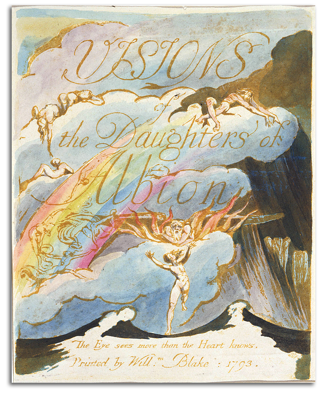
BLAKE (after)
Title page in
VISIONS OF THE DAUGHTERS OF ALBION, 1793
Lithographic replica of an engraving
Facsimile edition by Dent, 1932
Collection: FLG
Gift of Arthur B. B. MacLeMore, 1955
Exhibited in FLAMING PAGES: THE ILLUMINATED BOOKS OF WILLIAM BLAKE, University Art Gallery, CSUEB, 2006
NOTE: The Dent editions are the finest facsimile editions of Blake’s illuminated books produced before World War II. This title is a fine example. It was exhibited in my Blake exhibition of 2006. For that exhibition brochure CLICK HERE. Arthur MacLeMore was my Godfather. Under his guidance, I studied World Art and World Religions from 1953 to 1958. That is why I was able to teach a class in Comparitive Religion when I was a student at Kenyon College. Uncle Arthur (as I called him) had an enormous library that contained facsimile editions of all of Blake’s Illuminated Books.
At the end of each year of study, he gave me a facsimile edition of one of Blake’s Illuminated Books. Holding those books in my hands was like holding rainbows. It was that experience of seeing words and images dance together in a swirl of colored light that made me want to become a poet and an artist at the same time. So, in 1954 (at the age of 14) I started my first private press (Sun Moon Press) and “published” my first illustrated book of poetry, STAR SONGS, I’ve been illustrating and publishing collections of my poems ever since as private press editions. For a checklist of my poetry publications CLICK HERE. It was from this background in the ’50s that in the ’60s I began writing art history books and catalogues, publications in which the words and images also dance together. I have never written a book without pictures. My daughter once asked me why I did not write books with just words. I told her I did not know how. In fact, I don’t even read books that are unillustrated. I read about a hundred books a year, but they are all illustrated. My mind just stopped working in the non-visual mode after all those novels in college, and after I graduated as a speed-reader from Evelyn Woods Reading Dynamics Institute at 10,000 words a minute. That psychological transformation contributed to the restructuring of my brain because that form of speed-reading turns word-reading into a semi-photographic visual process. I know it is unusual, and I often apologize to friends and relatives who love novels; however, both my left-brain & right-brain always want to work together at the same time. My two hemispheres have become geared that way. Except for short passages, if a book does not engage both sides on my mind, neither side wants to gear up. I ended that conversation by reminding my daughter what Alice (of Alice in Wonderland) once said: “What’s the use of a book without any pictures…?”
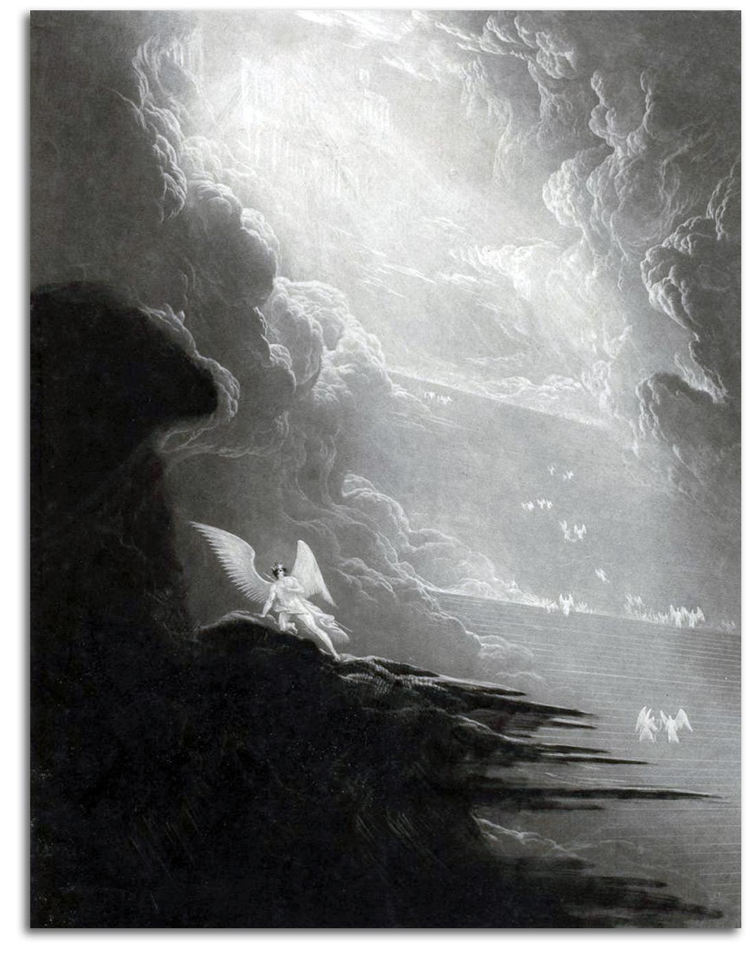
Satan Viewing the Ascent to Heaven (made c. 1824-27)
Mezzotint, 1853, from PARADISE LOST by Milton, 1853 edition
Collection: FLG
NOTE: When Blake was illustrating Milton, he felt Milton was on Satan’s side. John Martin had a different vision. For him, the Divine Light was superior to all else and could never be extinguished. In an era when most book illustrations were merely reproductions of existing paintings, Martin’s mezzotints were original creations – creations so much admired that they were produced in a number of editions. He did his own mezzotinting with a painterly fluidity. He generated two editions simultaneously, one large folio-size and a smaller edition in Imperial Octavo, both first published in 1827. It was his mysteriously beautiful light that captured the popular imagination, along with his skillful sense of human scale being dwarfed within dramatic vistas of infinite space. Those who admired his work included artists such as Rossetti and Thomas Cole (who founded American landscape painting), writers such as Ralph Waldo Emerson, Jules Verne, and H.G. Wells, as well as such filmmakers as Cecil B. DeMille and George Lucas.
MEZZOTINT is an Italian term meaning half-tone. It is a form of printmaking that developed in the 17th century in an effort to approximate the tonalities of a painting. The technique is a member of the intaglio family, along with etching and engraving. However, it produces an image made with subtle tonal gradations of light and shade rather than with lines.
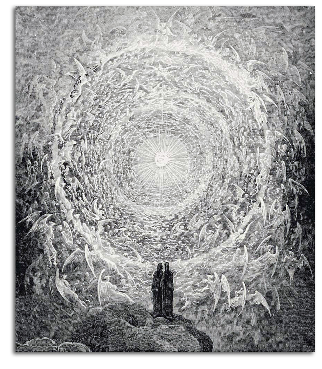
DORE
The Angelic Throng in the form of a Rose
(Il PARADISIO, Canto 31)
Wood engraving from
IL PURATORIO ED IL PARADISIO by Dante, 1867
Facsimile edition by Pantheon, 1948
Collection: FLG
Exhibited in THE ART OF THE BOOK: THE MODERN LIVRE D’ARTISTE, University Art Gallery, CSUEB, 1999
NOTE: No 19th-century printmaker was more productive than Gustave Doré. He was widely respected as a painter and a sculptor, but is now remembered primarily for the prints he made to illustrate books. Starting in the 1850s, he visualized almost 100 books. This child prodigy became a very skillful literary illustrator making memorable images for books by Dante, Rabelais, Milton, Coleridge, Byron, Poe, and Balzac. The breadth of his vision was enormous. His illustrations are highly imaginative. Some are intensely mystical. His style is a Romantic extension of what Delacroix had begun as a literary illustrator, but with more realism than most illustrators of the time. Doré had a very large following. His drawings were engraved on wood, under his watchful eye, and then inked for printing. He sometimes needed a staff of 40 engravers to keep up with the huge demand. THE DIVINE COMEDY of Dante is one of his most celebrated books, and this image has been reproduced more than any other from the set. It takes the inner eye and inner ear above all the lower heavens, as far as the soul can travel, up past astral and causal planes to the very edge of what the mind perceives as space and time – the ultimate outer membrane of the perceptual bubble of the mind. After that, there is only luminous silence.
For a feeling of how a large number of Christians have pictured the Heavens since the Middle Ages, compare this image with that of Botticelli’s Dante image under SOUTHERN RENAISSANCE (click here). The Doré image is virtually the Botticelli image seen from below. For thumbnails of all the Dante illustrations CLICK HERE.
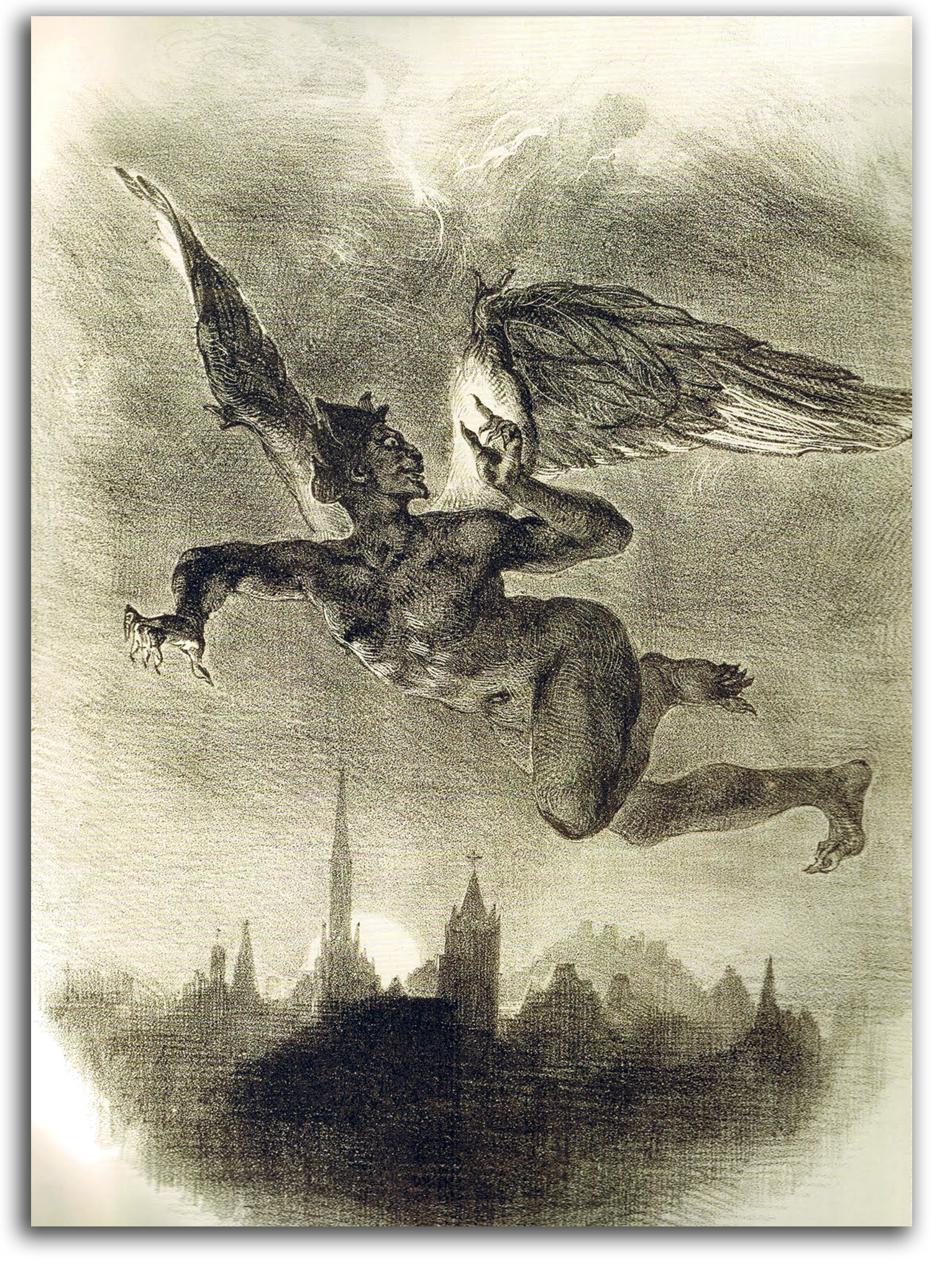
DELACROIX (after)
Mephistopheles over Wittenberg (drawn 1825-27)
Lithograph from FAUST by Goethe, 1828
Collection: Unknown
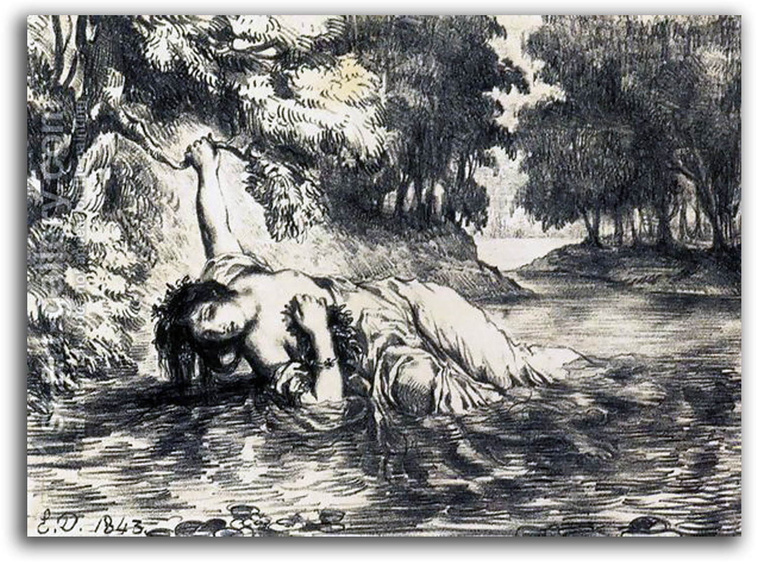
DELACROIX (after)
The Death of Ophelia (printed 1843)
Lithograph from HAMLET by Shakespeare {ACT IV, scene vii}
Collection: Unknown
NOTE: Eugene Delacroix was the greatest French painter of the Romantic era. He consciously continued the richly colorful and highly energetic tradition of Rubens, while his rival Ingres and the other Neoclassicists of the time favored the restrained tradition of Poussin. Delacroix also was a brilliant writer. His free use of intensely emotional color and passionate shapes inspired the Impressionists, Cézanne, van Gogh, Matisse, and Picasso. Delacroix shared with Lord Byron (one of his favorite poets) a love for the “forces of the sublime.” Baudelaire said: “Delacroix is passionately in love with passion… .”
Lithography was not widely respected as an art form until Delacroix decided to explore the medium. He was the first major artist to do so. By 1825 he had started to illustrate such works as Goethe’s FAUST, as well as Shakespeare’s HAMLET and KING LEAR (1843). Goethe seems to have been quite pleased, and is reported to have said: “Delacroix has surpassed my own vision.”
Thereafter, respect for the medium of lithography grew. Nevertheless, etching remained a more respected medium for painters until the 1890s when the brilliant color lithographs in Paris started to be enthusiastically collected works of art.
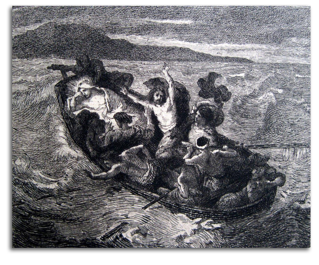
DELACROIX (after)
Christ Asleep during the Tempest (The Barque). painted c1853
Original Etching by A. Greux, c1853
NOTE: It is traditional to say Delacroix was not a religious man. However, he painted quite a few Biblical scenes with deep emotions. Delacroix painted this particular composition several times. Van Gogh was very moved by Delacroix’s sketch for this painting. According to Robaut (1855), this etching was made by A. Greux for Durand-Ruel. The names of both artists appear underneath the image on some impressions but these are not signatures.
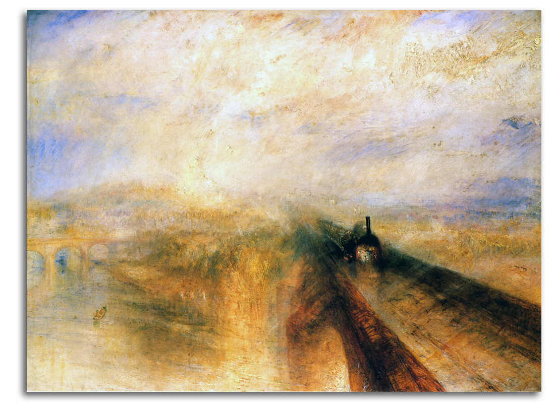
TURNER
Rain, Steam, Speed: The Great Western Railway (painted c1844)
Oil
Collection: National Gallery, London
NOTE: J. M. W. Turner was the greatest British painter of the 19th century. His visions of the natural world and our relationships with it were rendered with explosions of light and breathtaking angles of perception. Whatever was dramatic caught his eye. He melted matter into cauldrons of color – colors that stretched forms to the outside edges of abstraction. Animating his imagery was his conviction that light is the body of God. He was a strong influence on generations of later painters, from the Impressionists of the 1870s to the Abstract Expressionists of the 1940s.
The early history of the Industrial Revolution got underway with the English invention of the steam engine in the 18th century. The development of the railroad in the early 19th century wove together the commercial centers of England and eventually every modern nation. The railroad that Turner is picturing here ran from London to Bristol at the wondrous speed of 35 miles an hour.
This was England’s first major railroad. It was built during the 1830s by a brilliant engineer and entrepreneur named I. K. Brunel. Brunel was the genius who also (starting in 1843) built the propeller-driven metal ships that tied together the world-wide British Empire in ways that old-fashioned sailing ships could not. One of his iron ships could make the transatlantic voyage from four weeks to two weeks. A Brunel ship also laid the undersea cable that united Europe and the United States by means of the electric telegraph (1866). Brunel represents the kind of self-confident visionary who created the Industrial Revolution. Many of his bridges are still in use, and the British still regard him as a National Hero.

Keswick Lake by J. W. M. Turner, 1834 for Rogers, POEMS, p. 36
Chromolithograph from a Watercolor
Printed by E. Goodall Collection: FLG on loan to IAD
Published in GLOBAL VISION: A SURVEY OF WORLD ART, Part 1, 2006
Documented in J. M. W. TURNER: HIS ART AND LIFE, 1979 number 1182, p. 440
NOTE: J. W. M. Turner England’s most famous landscape painter composed the most abstract paintings and watercolors of the early 19th century. Many of his spontaneous sketches- such as this one- probably from the 1820s were later used to make detailed engravings for a wide public and for smaller public chromo-lithographs such as this. His highly abstract color fields and profound luminosity strongly influenced the French Impressionists. Monet and Pissarro discovered Turner’s work in London in 1870 just as their Impressionist styles were maturing and they acknowledged his influence. This Chromo-Lithograph is an 1840-1850 edition.
EUROPEAN MASTERS – 19TH CENTURY – REALISM
Realism in the visual arts was a major movement in France and elsewhere between about the 1830s and the 1870s. It was especially popular during the 1850s & ‘60s. It developed in reaction to the idealism of both Neoclassicism and Romanticism, and took on several different forms. All those forms involved doing away with traditional subjects such as the mythological, the biblical, and the historical, and placing the focus on contemporary, everyday reality.
{WRAP: GOYA} Before Realism as a movement began, the realistic work of Goya as an isolated phenomena exploded in Spain at the beginning of the 19th century. The first form of Realism as a continuing movement was landscape painting. It was concentrated in the forest of Fontainebleau, some 35 miles southeast of Paris, in and around the village of Barbizon. So it came to be known as the Barbizon School.
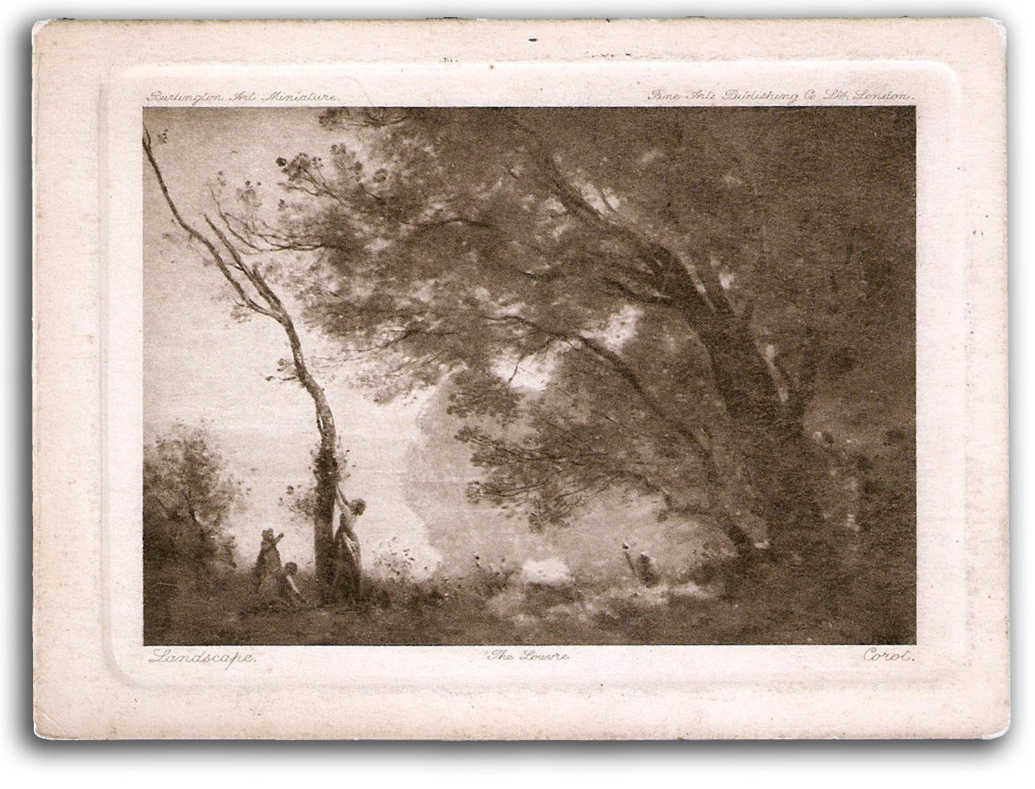
COROT
The Louve
At first, during the late 1820s, there were only a few painters working there, led by Corot. By the 1860s, there were hundreds of painters working and living there. The French political revolutions of 1848 increased the taste for democratic Realism. Among the leading Barbizon figures were Corot, Rousseau, Millet, Daubigny, Dupré, and Troyon. They were strongly influenced by the Dutch landscape painters of the 17th century, such as Ruisdael and Hobbema. But the
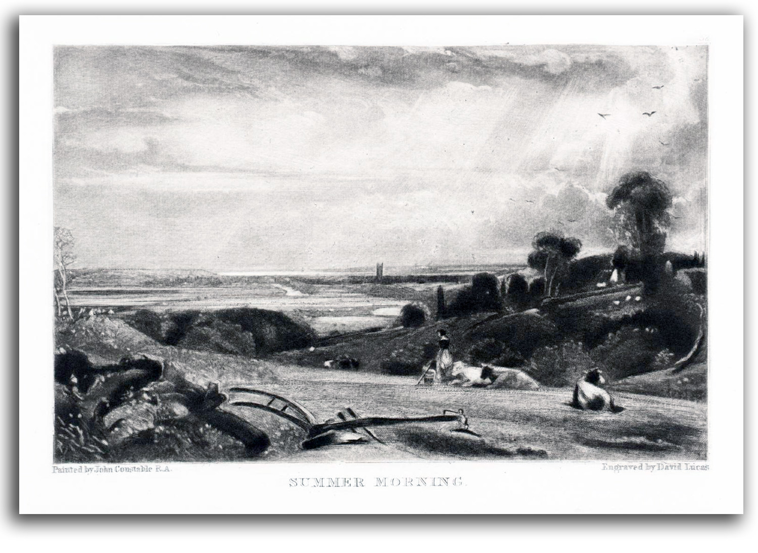
CONSTABLE
Summer Morning
spark that animated the start of the Barbizon School was an exhibition of the landscapes of Constable in the Paris Salon of 1824. Constable made them want to picture their own landscapes.
Their usual technique was to paint nature directly in the open air (plein air). They were the first to do this. Before this time, artists did their painting indoors. Their aesthetic was primarily tonal, with darkened light, heavy shadows, mid-range colors, loose brushwork, and soft forms. As Corot expressed it: “I love more than anything else…the harmony of the tones.” Corot’s direct pupils included Morisot, Pissarro, and Boudin (the teacher of Monet), but Corot also inspired generations of painters (and a very large number of forgers).
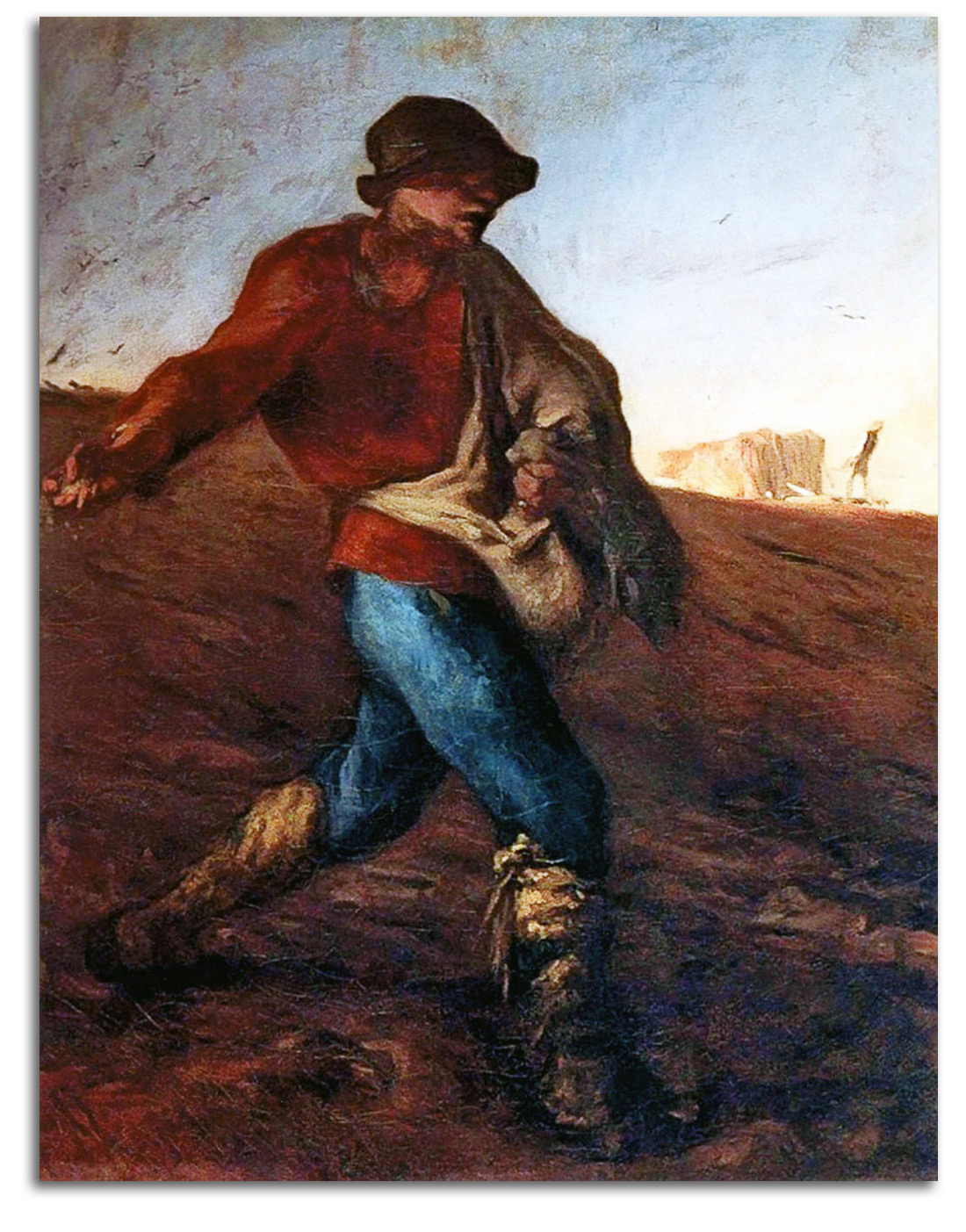
MILLET
The Sower
oil on canvas, 1850/51
Sometimes there were figures in the landscapes of some of these artists (such as Corot), but figures usually were secondary to the landscape, except in the case of Millet for whom figures were primary. He was focused on the noble values of his fellow farmers, and was among the first to paint farm people with reverence. The religiosity of the paintings and prints of this deeply religious man eventually won him a large audience.
The early landscapes of the English and the French were the first manifestations of what would be the most important single development during most of the history of 19th-century European painting – landscape painting. Turner and Constable, and especially the Barbizon painters, were a major inspiration for the Impressionists who followed their lead into outdoor painting during the 1870s. Landscape painting had developed slowly in Europe. Realistic settings for figures developed in the 15th century. Giovanni Bellini and Leonardo were among the first to paint really convincing landscapes for their figures. But it was not until the 17th century that landscape became its own subject, especially in the hands of the Dutch masters and Claude Lorrain. These artists were the departure points for both the English landscapists and the French landscapists in the early 19th century.
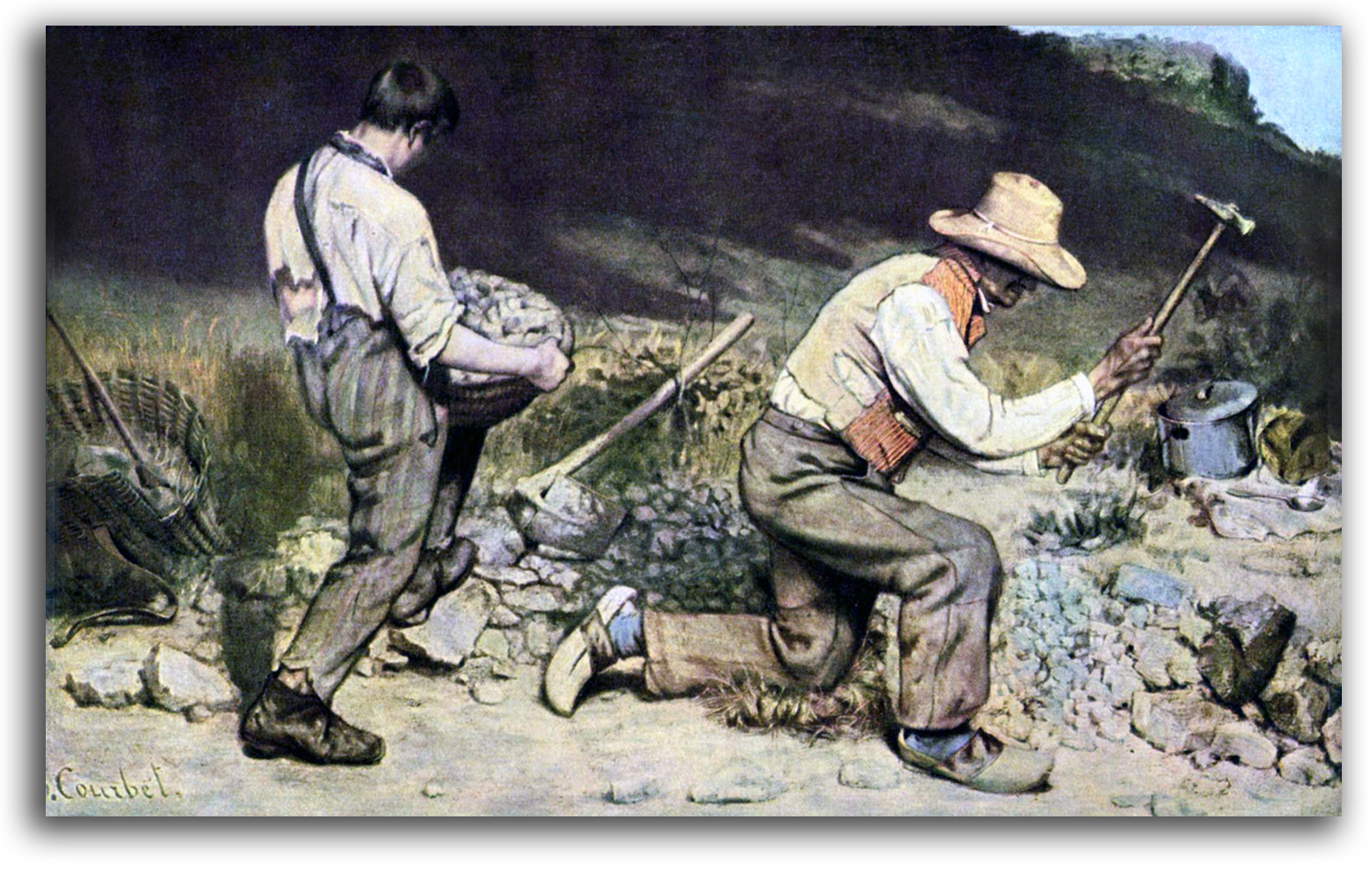
COURBET
The Stone Breakers
oil on canvas, 1849
A second group of Realists were urban Realists. The most famous painter to call himself a Realist was Courbet. He grew up in the country and loved rural values, but he wanted to make it in the city. So he moved to Paris in 1839. The work of Rembrandt, Halls, and other Dutch masters, along with Chardin and le Nain, convinced him he should focus on daily reality and nothing else. He once said: “Show me an angel and I will paint one.” In 1849 he won a gold medal from the state. “The Stone-Breakers” of 1849 is considered by many to be Courbet’s first great work. For the rest of his life he would celebrate the working poor and work for greater democracy as both an artist and as an active citizen of the Republic, with socialist and anarchistic ideals, even when it cost him jail time. When some of his paintings were rejected by the Exposition Universelle of 1855, he set up his own exhibition Pavilion of Realism next door. {WRAP IMAGE: Pavillion}
The urban Realists and the rural Realists laid the foundations for Modernism by rejecting the traditional subject-matter of the mythological, the biblical, and the historical, and by insisting that the only proper subject matter for contemporary art is contemporary life. This is what Baudelaire as an art critic had in mind at mid-century when he invented the term “modernity” and called out for art that is of its own time in his famous essay “The Painter of Modern Life.” (1860). He wrote: “By ‘modernity’ I mean the…fugitive…the half of art whose other half is the eternal and immutable… .”
The next stage in the development of Modern art in the 1870s was Impressionism – a style that my professor of Modern Art, Meyer Schapiro, called the “the final, Rococo phase of Realism.”
Manet and Whistler started off under the Realism of Courbet, then found their own way to mature styles.
Both of their styles anticipated Impressionism in some ways. Manet’s style in the 1860s I have called Impressionistic Realism, a modified Realism that was moving toward Impressionism by reducing Courbet’s Realism to an “impression” of what can be seen at a glance. Whistler’s style in the 1860s I have called Tonalistic Realism. He turned Courbet’s corporeal Realism into Tonalism. In the process, Whistler compressed foreground and background into a very flat picture-plane, a convention that would be developed by the Impressionists, Postimpressionists, and many later Modernists. Some call Whistler’s style Aestheticism. That term is suggestive but not diagnostic from the point of view of arthistorical analysis. Whistler certainly believed in Aestheticism, but Aestheticism was an attitude not a style, an attitude that favored “art for art’s sake” – a love of beauty for its own sake, with no interest in morality or storytelling.
Among the popular printmakers at midcentury, Daumier and Doré with great compassion filled periodicals and books with thousands of illustrations of the disadvantaged urban populations on whose backs the Industrial Revolution was built.
In the U.S., Homer was inspired by Courbet’s Realism. Later, what may be described as a branch of the Barbizon School developed in the U.S. during the 1880s and ‘90s. Among the leading figures were George Inness and William Keith.
Realism would take on many forms during the 19th century. For example, Rosa Bonheur painted some landscapes in the forest of Fontainbleau but her primary Realism was in her striking portraits of animals. She was the first woman to receive the Legion of Honor.
During the second half of the century, the most popular of all styles of figure painting and genre paintings was what has come to be known as Romantic Realism.
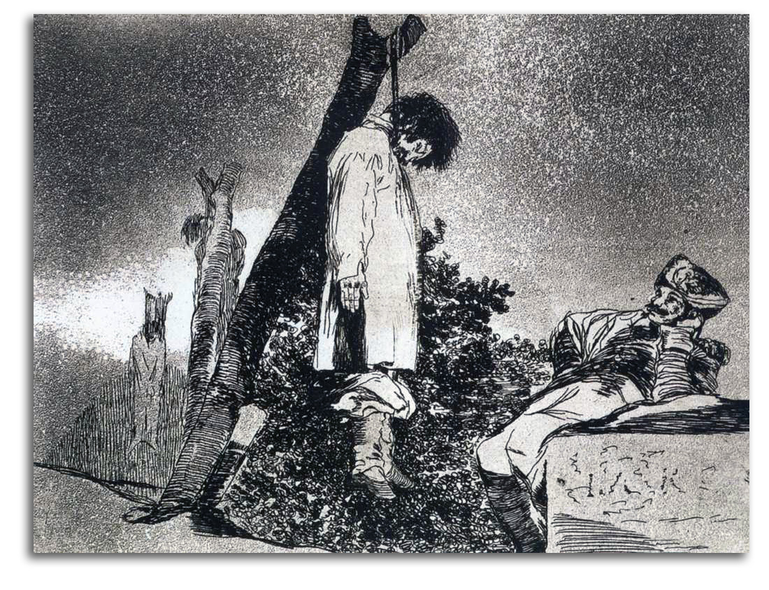
GOYA (after)
Here Neither [Hanged Man; soldier Watching] (etched c1812)
From THE DISASTERS OF WAR, 1812-14
Lithograph from an etching (Modern edition)
Collection: IAD
NOTE: Francisco Goya was the first Realist in European art, long before Realism became a named style. From a modest background, this dynamic Spaniard learned art from the etchings of Rembrandt, Valasquez, and Tiepolo. He worked his way into the Spanish Court and made courtly Rococo paintings. But he was repulsed by the empty, decadent lives at court, and later by the horrors of the war that arrived with the invading French army of Napoleon in 1808. From his guts came a new way to picture the world. From his haunted visions came his first series of etchings: the CAPRICHOS of 1799. During the French invasion, while 20, 000 fellow Spaniards were starving to death around him, Goya created his next set of powerful prints: THE DISASTERS OF WAR (partly inspired by Callot’s THE MISERIES OF WAR). This war was one of the many horrific wars with which the Modern history of Europe began. Goya’s prints were magnets for every later artist who wanted to visualize intense realities. Delacroix, Courbet, Manet, Daumier, and van Gogh would study Goya very carefully. In the 20th century, Picasso would owe Goya a great deal, especially when Picasso was responding to the Spanish Civil War of his time during the 1930s. By coincidence, Goya and van Gogh (who can be described as the last great Realist of the 19th century) shared the same birthday – March 30.
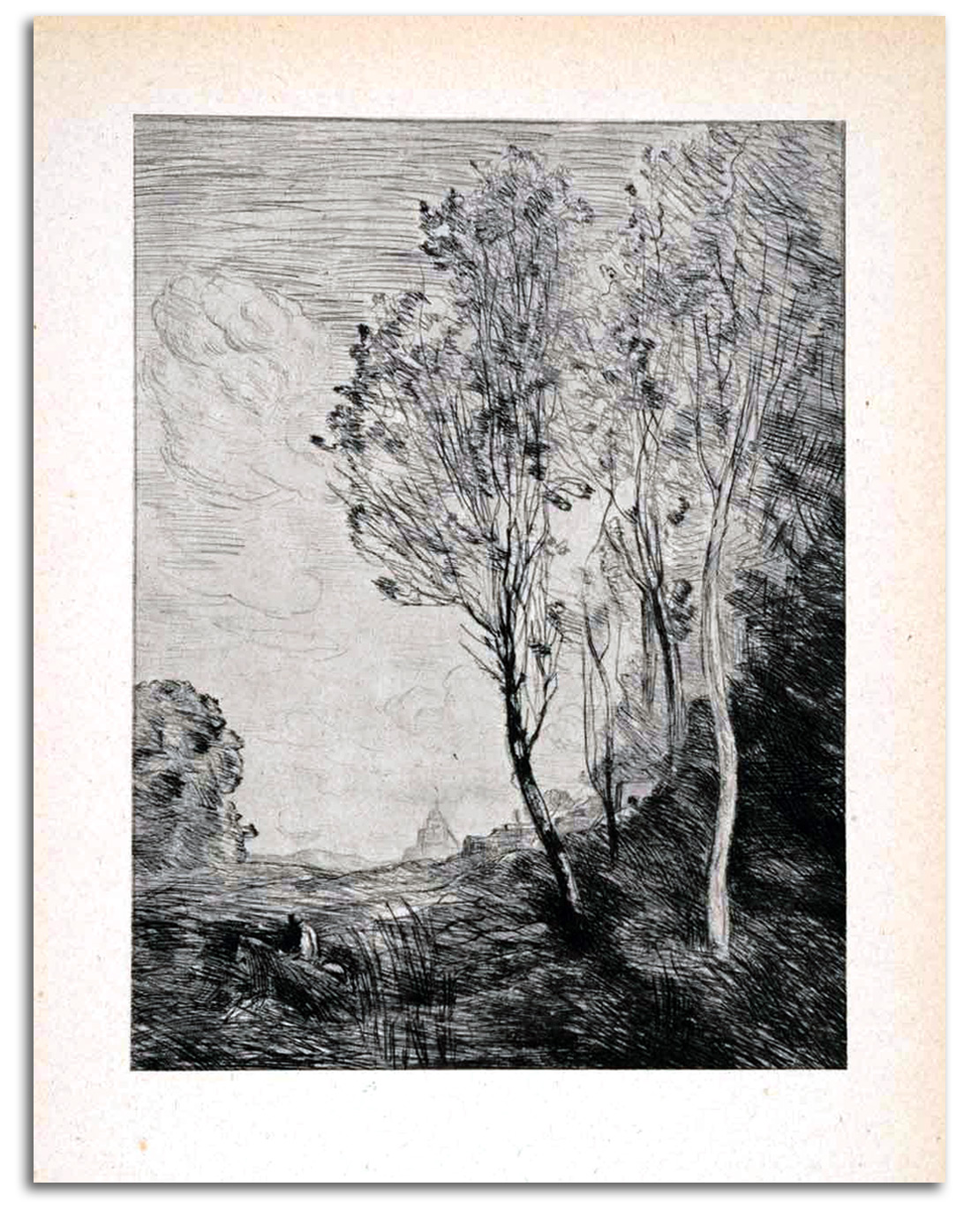
COROT (after)
Souvenir of Italy [Landscape], ND
etching
Replica etching, Bibliotheque Nationale edition, 20th century
Collection: IAD
NOTE: J-B-C Corot had more than one way of painting. His earlier work has a solidity that came from both Poussin and his visit to Italy. He also did more work with the classical figure than any other Barbizon artist. However, from the 1850s on, he was best known for the quiet silvery radiance of his landscapes that were extremely popular. There never is a hint of the Industrial Revolution in sight. The viewers could dream of an earlier time. For Corot, the dream was to attain the condition of music. Many would say that he did.
Corot also did more than any other artist of the time to elevate the aesthetic value of the quickly painted sketch. Until then, a sketch was merely a working tool to get to a finished canvas. In the hands of Corot, the painted sketch came to be appreciated as a work of art in itself, as did his feathery etchings. The sketch as a complete artistic reality would be a very meaningful new idea to the young Impressionists to whom Corot was a warm and generous mentor.
The usual Barbizon technique was to paint nature directly in the open air (plein air). They were the first to do this. Before this time, artists did all their painting indoors. The Barbizon painters, however, finished their paintings indoors. Their aesthetic was primarily tonal, with darkened light, heavy shadows, mid-range colors, loose brushwork, and soft forms. As Corot expressed it: “I love more than anything else…the harmony of the tones.” Corot’s direct pupils included Morisot, Pissarro, and Boudin (the primary teacher of Monet), but Corot also inspired generations of painters (and a very large number of forgers).
In an effort to reach a large audience, Corot mastered etching, lithography, and the cliché-verre (glass picture) – a semi-photographic mode of printing from glass plates, a technique that preceded actual photography. One etches an image on a piece of glass that has been smoked with a candle. The glass is then placed on light-sensitive paper and left in the sun where the image transfers to the paper.
————————————————————————–
THE ETCHING REVIVAL
The birth of etching in the 17th century, as a quick way to make an engraving, resulted in many masterpieces from artists such as Rembrandt. However, during the 18th century, the etching technique produced few original works. It became primarily a reproductive technique, except on the hands of a few masters such as Tiepolo and Piranesi. The Etching Revival began during the 1850s, with Barbizon painter-printmakers such as Corot, Millet, and Daubigny leading the way in the restoring of etching as an expressive medium with the unique touch of the artist.
{wrap: DESJOBERT: BAS-BREAU, NEAR BARBIZON. Etching}
Earlier Barbizon etchings, like earlier Barbizon paintings, stress the thick materiality of the trees in the forest. These early densely packed trees seems to enclose the light. This etching by Desjobert is an example. In time, there was less materiality, more tonality, and a brighter luminosity. These painter-printmakers moved from a thick, heavy, almost material light toward a thin non-material light that is the strongest element in the composition, a light
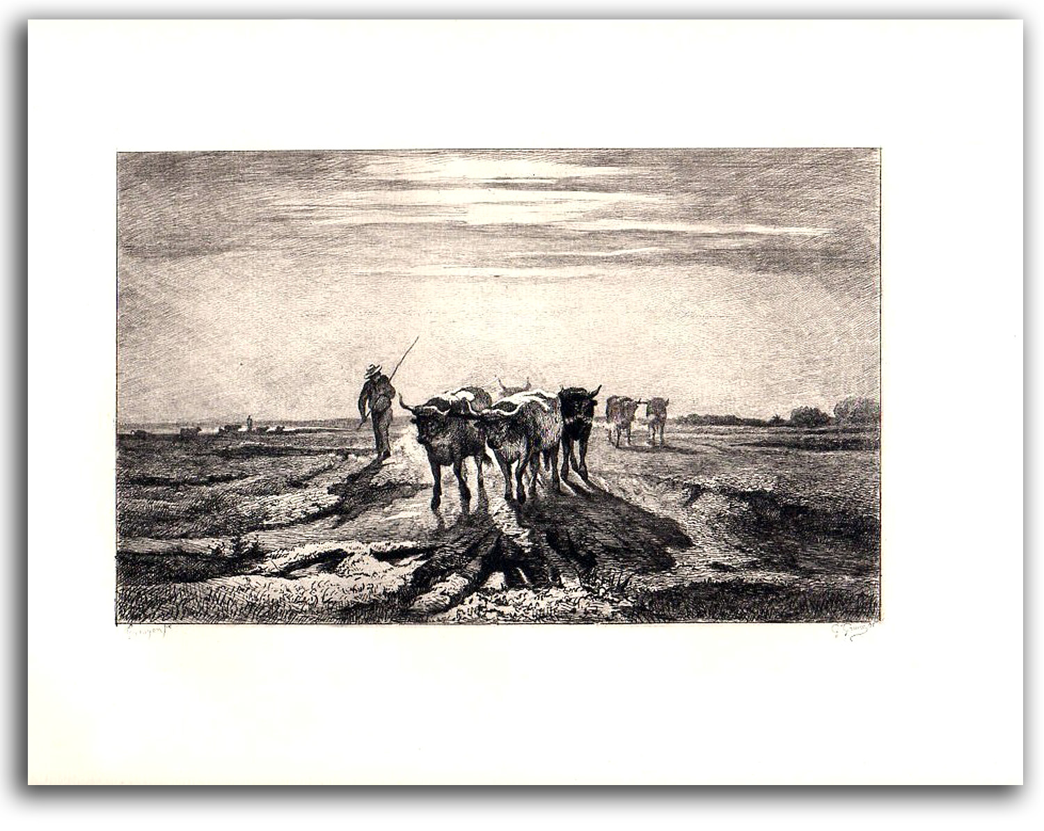
TROYON & GREUX
that envelops the trees and the animals. These two etchings by Troyon and Daubigny are examples of the transition from thick light to thin light. The openness and energetic spontaneity of Daubigny’s late etchings of the 1860s seem to have been a particular inspiration to the young Monet and Renoir as they followed the footsteps of Barbizon artists into the magical Forest of Fontainebleau. In short, such etchings appear to have a springboard for the birth of Impressionist painting. {wrap: Daubigny River Crossing: very abstract landscape with a couple & a cow}
You can get the DESJOBERT from BIGSTOCKPHOTO.COM & the DAUBIGNY from OLDMASTERPRINTS.COM
The Revival spread quickly in Europe and the U.S. From the 1860s to the 1880s, etching manuals appeared and etching clubs were formed. As the Revival was getting underway in the 1860s, masterpieces came from the hands of Manet and Whistler, both of whom also admired the etchings of Rembrandt and Goya. A new Realist tradition began in the world of printmaking, a tradition that parallels the growing acceptance of the very different, more Modern, painted sketch by the Impressionists. By the 1920s, etching collectors were spending a great deal of money. Such collections had become major status symbols, but the quantity of original work was shrinking. The Great Depression of the 1930s put an end to the Etching Revival around the world. Only in the Postmodern era have a handful of artists such as Jasper Johns wanted to explore etching again.
ENGRAVING, perfected in the 16th centuty, involves cutting thick lines with a wide tool called a graver or burin. The ink is held in the grooves. The printed lines are smooth and have a hard edge.
ETCHING, perfected in the 17th century, involves cutting lines into a wax-covered plate with a needle. The hand motions are much like drawing. The hard or soft ground resists acid. The plate is bathed in acid which bites the lines which have been exposed as bare metal. It is those lines that have been sunk into the plate which hold the ink. The printed lines have a smooth, hard-edged line. The technique of MEZZOTINT was added in the 18th century. It provides a tonal element, while AQUATINT provides the effect of a watercolor wash.
DRYPOINT, also perfected in the 17th century, involves cutting lines with a needle directly into an unwaxed plate. In addition to the line cut into the plate, some of the metal from the groove collects on the edge of the cut. When inked, the burr leaves a very soft feathery line.
PHOTO-ETCHING (gravure, or photogravure) developed during the same period as the Etching Revival for commercial production in the middle of the 19th century. A number of photographers at the turn of the century, such as Stieglitz and Coburn, used it as an excellent translation of the wide tonal range of the platinum print.
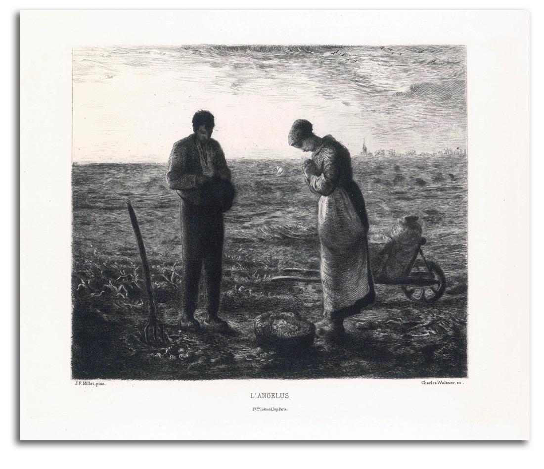
MILLET (after)
The Angelus (painted 1857-59)
Original Etching by Charles Waltner, 1873
Collection: FLG
NOTE: There were figures in the Barbizon landscapes of some of these artists (such as Corot), but figures usually were secondary to the landscape, except in the case of Jean-Francois Millet for whom figures were primary. He was focused on the noble values of his fellow farmers, and was among the first to paint farm people with reverence. Daumier’s figure-forms were helpful models. The religiosity of the paintings and prints of this deeply religious man eventually won him a large audience. Many called him the “poet of the poor.”
Millet did a great deal to develop the etching revival in France. This print is of one of Millet’s most famous images. A couple has heard the Angelus bell, and have stopped working long enough to recite the Angelus, a prayer that commemorates the Annunciation made to Mary by the angel Gabriel. Their potato-digging tools lay beside them. This picture has touched many people of many ages, from Walt Whitman and Vincent van Gogh to generations of school children who stared at it on the classroom wall. The depth of the sincerity in this picture has moved the hearts of millions.
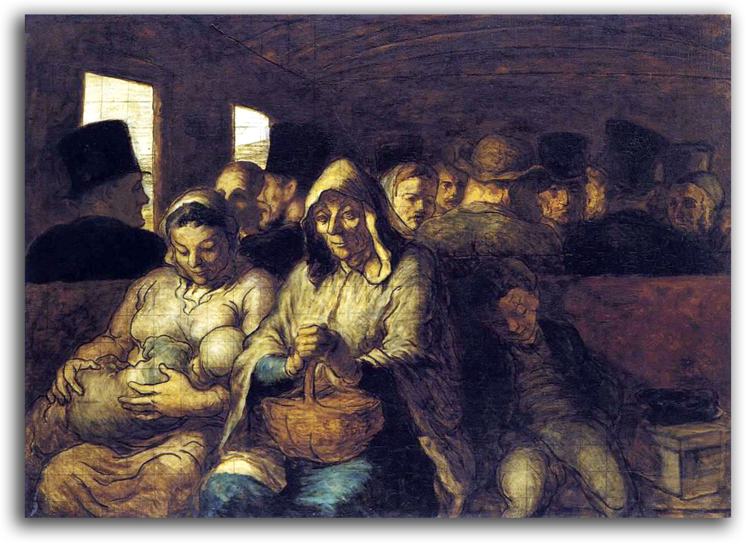 DAUMIER
Third Class Carriage (painted 1864)
Oil
Collection: Metropolitan Museum of Art, New York
Lithographic reproduction of the oil, ND
Collection: IAD
NOTE: In the popular mind, no artist is more closely associated with 19th-century Realism than Honoré Daumier. He was a true “man of the people” in a way that has never been matched. He was a painter and a sculptor, but most of his work was illustrations printed in periodicals.
These periodicals were read by people in Paris who could not afford the paintings of Courbet or Corot. But they could afford newspapers and the kind of comical journals to which Daumier contributed his best-known images – primarily LA CARICATURE (which ran from 1830 to 1835) and LE CHARIVARI (which ran from 1832 to 1937 and inspired the British magazine PUNCH). Daumier’s energy was enormous. He left us 4,000 lithographs, 1,000 wood engravings, 1,000 drawings, and 500 paintings, as well as a number of sculptures.
He is most remembered for caricatures – satirical drawings of incompetent government officials, unjust lawyers, and human beings full of shortcomings, drawings that he started to publish during the 1830s & ‘40s. In other words, he was partly a cartoonist, partly a social critic, and largely an artist of extraordinary skill and deep humanity. After his start in periodicals, he turned to the new art of lithography, and finally to painting. Largely overlooked until the 20th century was the power of such paintings as “Third Class Carriage.”
His range of subjects was the whole of The Human Comedy, a subject he liked to discuss with his friend Balzac whose novels explored some of the same territory. Daumier rendered the life of working-class people with a respect bordering on reverence. For the newly prosperous middle classes that he satirized regularly he also had a sympathetic understanding of their very human weaknesses.
Daumier has been called the “Michelangelo of Caricature.” But he was a great deal more than a satirist. His faces and figures speak volumes. I suspect his snapshots of the moment inspired the Impressionists to respect the fleeting glance. His robust vitality was admired by Delacroix, Millet, and Degas who collected his prints extensively. In the 20th century, he was a hero among the Expressionists. In the words of Baudelaire: “One of the most important men, I will say not only of caricature, but also of modern art.”
For a listing of the complete works of Daumier, click here for DAUMIER-REGISTER.ORG.
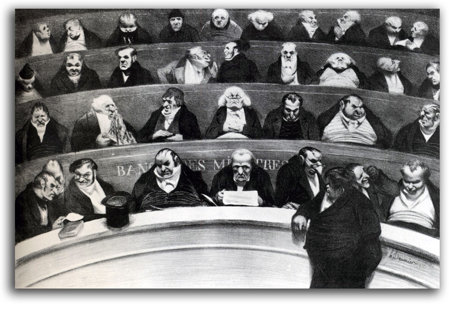
DAUMIER
The Legislative Belly (drawn 1834)
Replica Lithograph, ND
Collection: IAD
NOTE: Pictured here are the conservative members of the French Chamber of Deputies. Each one would have been recognizable at the time. This satirical “portrait” pictures them as arrogant, lazy, and corrupt. Most Americans today have a similar view of the U.S. Congress.
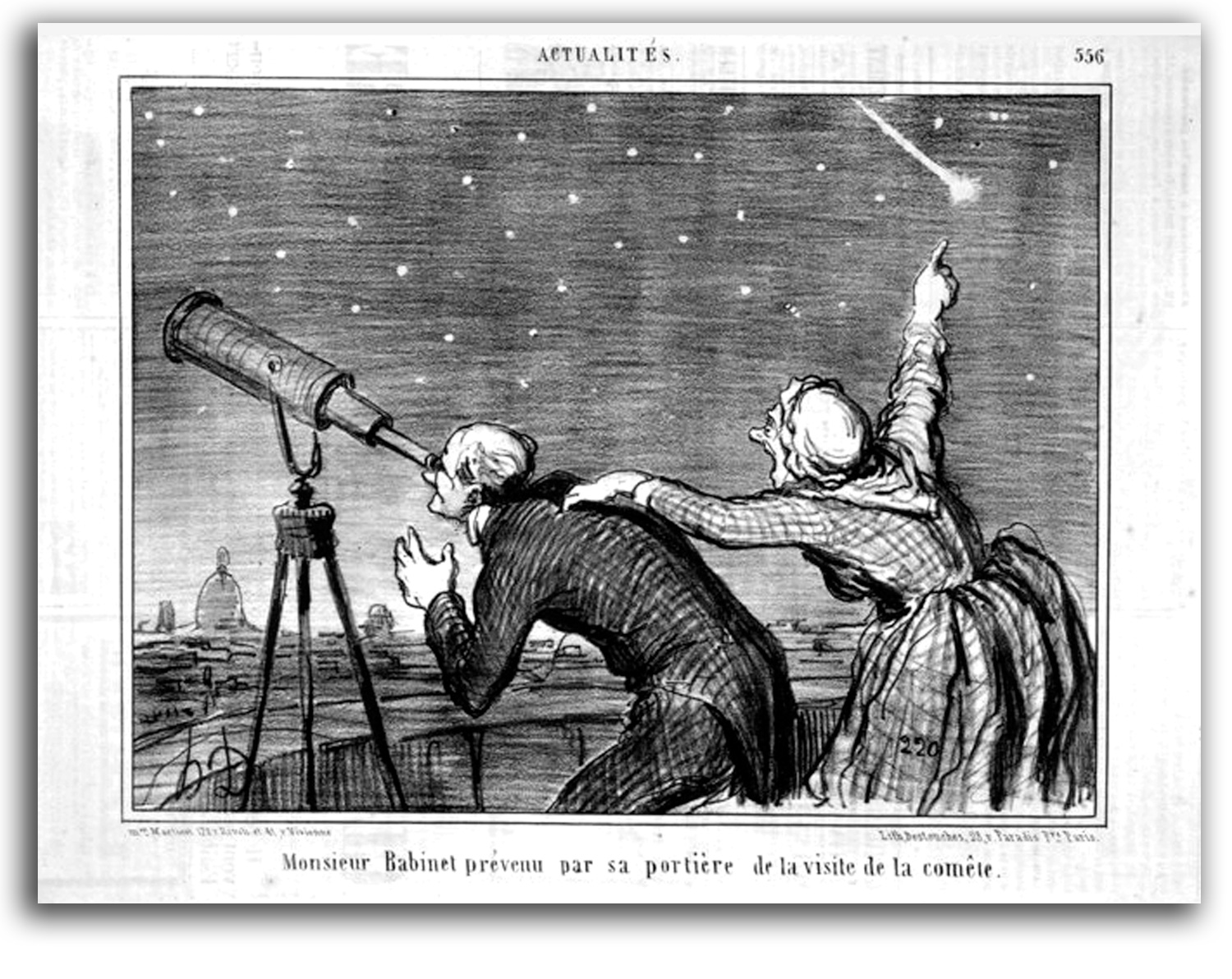
DAUMIER
Mr. Babinet alerted by his Housekeeper to the Arrival of the Comet (drawn 1858)
Lithograph on the original Newsprint, 1858
Collection: Smart Museum of Art, Chicago
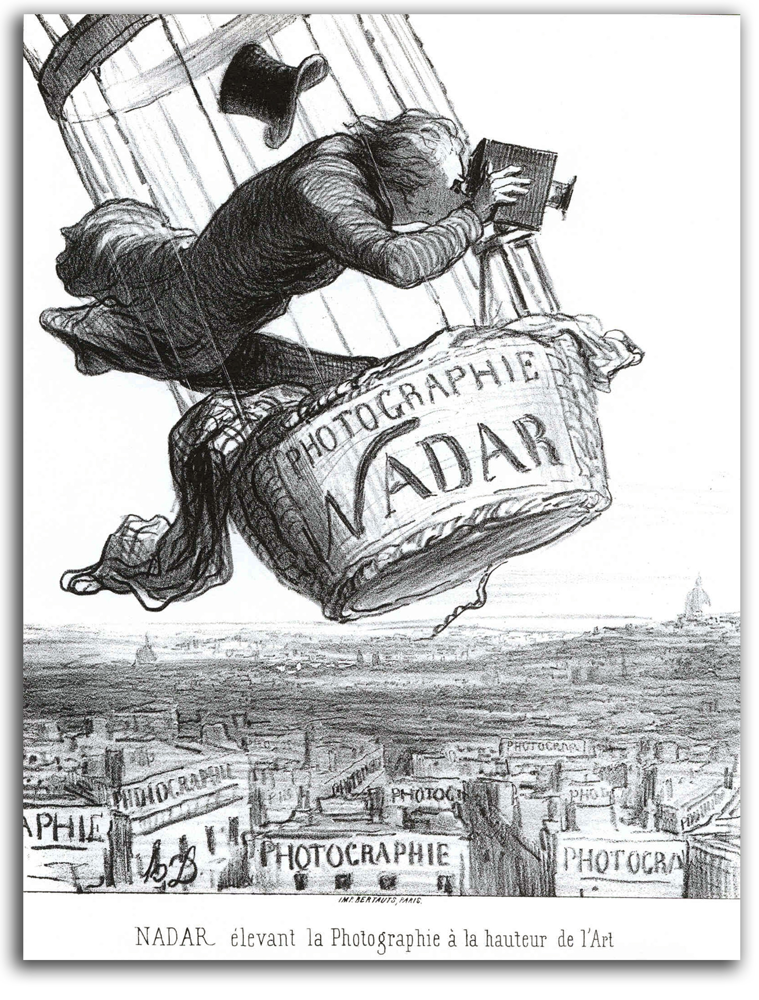
DAUMIER
Nadar elevating Photography to the Height of Art (drawn 1862)
Lithograph, c1862
Collection: Museum of Fine Arts, Boston
NOTE: Nadar was an important photographer in 19th century France. He actually did photograph Paris from a balloon. Photography developed during the 1840s and started to be popular in the 1850s & ‘60s, particularly for portraits. The process was quick, cheap, and remarkably “real.” It soon became the most universal form of picture printing.
Some thought photography would replace painting. That did not happen. In fact, most people did not consider photography to be a “fine art” until the middle of the 20th century. But photography in the mid 19th century did influence how painters looked at what they were doing. I think many painters probably said to themselves something like: “If photographers can do Realism so well, perhaps we should do something else.” This kind of questioning contributed to the development of less realistic, more “modern” painting.
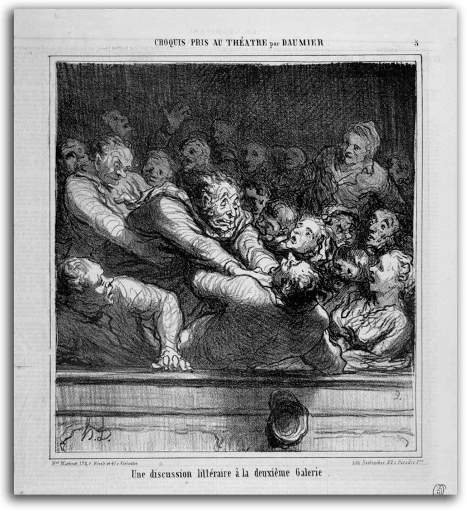
DAUMIER
A Literary Discussion (drawn 1864)
Replica lithograph from the original Newsprint, 20th century
Collection: IAD
NOTE: For a comprehensive register of Daumier prints CLICK HERE.
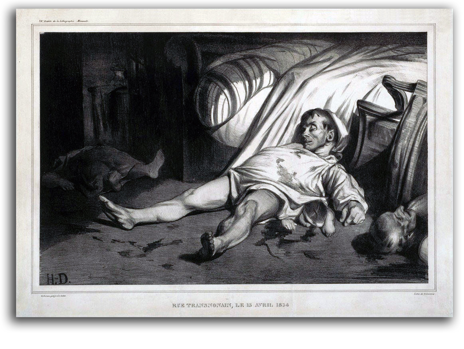
DAUMIER
Rue Transnonain (drawn 1834)
Lithograph, c1834
Collection: British Museum, London
NOTE: Not all of Daumier’s images were humorous. As with David’s “Marat,” this is a picture of a recent killing in Paris. The title of this print is the address of where a working class family who opposed the government was killed by government troops. Several bodies lie on the floor. The history of France’s efforts after Napoleon to create a democratic republic is a bloody story of riot and revolt after riot and revolt as the nation went back and forth between being a constitutional monarchy and being a republic. A stable Third Republic was not established until after the Franco-Prussian War of 1870.
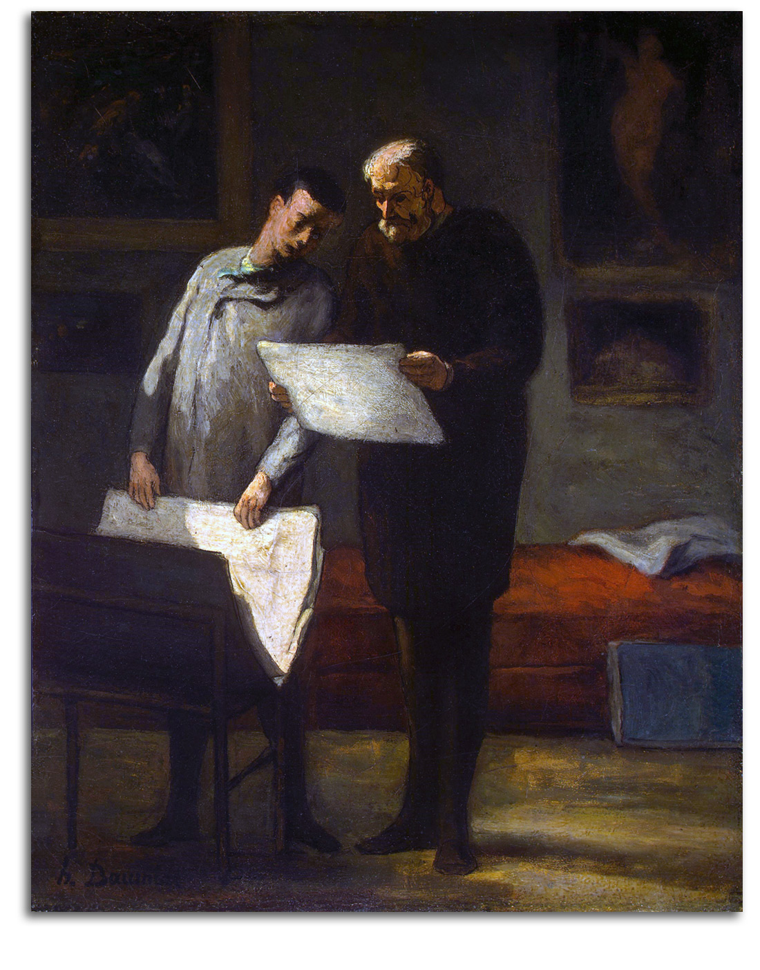
DAUMIER
Advice to a Young Artist (painted 1860)
Poster, ND
Collection: IAD
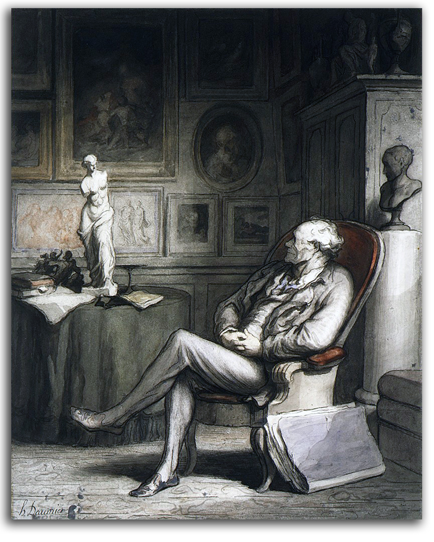
DAUMIER
The Connoisseur (painted ca.1860-65)
Pen and ink, watercolor
Collection: Metropolitain Museum of Art, New York
NOTE: Daumier had begun his career making cartoons (as did Monet and many others). In this later years, Daumier had become so respected as an artist that he made watercolors and paintings especially for collectors. Many 19th century figures in the art world were moved by his work, such as Baudelaire (who lived next door), and Degas who collected 1,800 of his prints and studied closely his vibrant linearity and his razor-sharp contrasts of light & dark. They admired Daumier’s work partly because of his extraordinary skill in the simultaneous rendering of form and feeling with singularly expressive lines, and partly because of the depth of his humanity. No one since Rembrandt had said so much about the full range of the Human Condition.
For a short visual survey of French 19th century prints (DAUMIER to DEGAS), Click Here
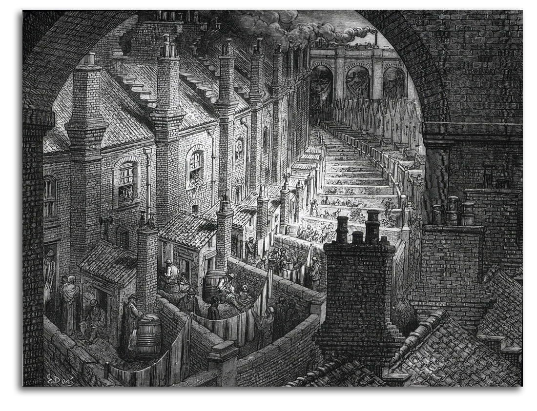
DORE
Over London, by Rail, 1872
engraving
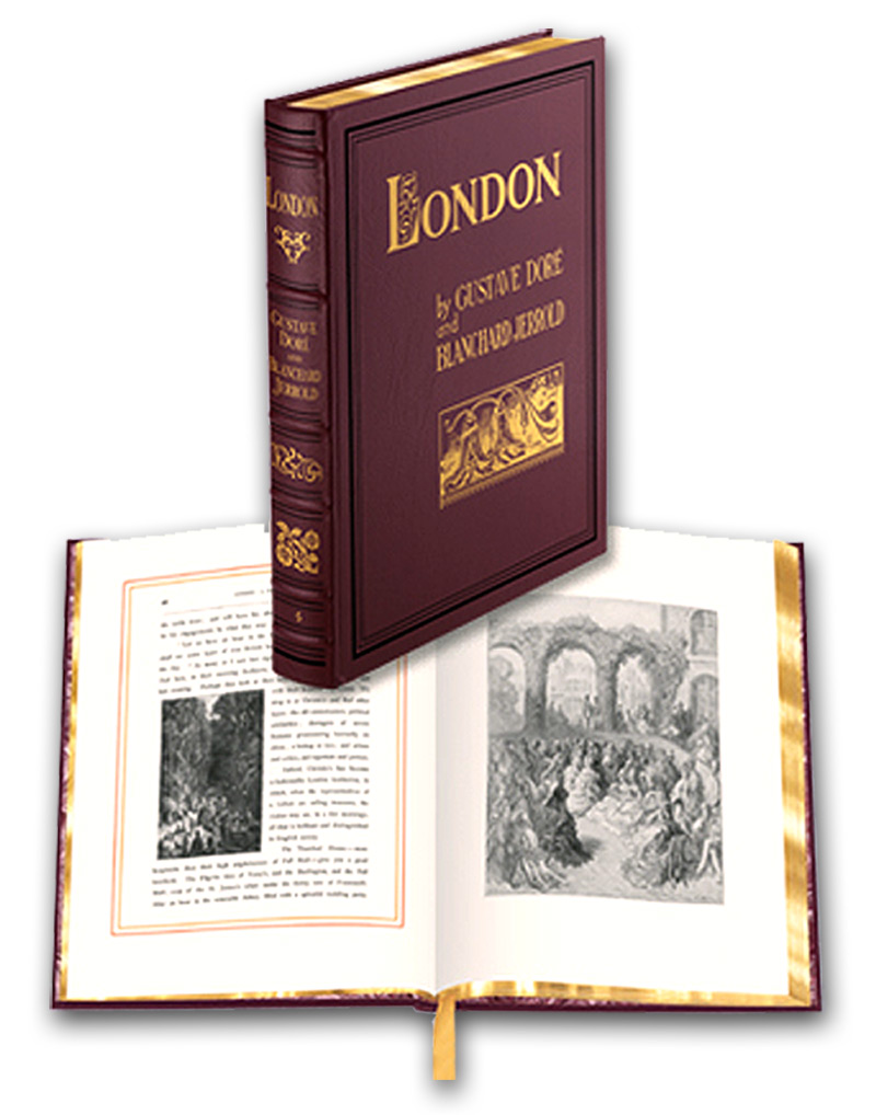
DORE (after)
Illustrations in LONDON: A PILGRIMAGE, 1872
Facsimile edition by Dover, 2004
Collection: FLG
NOTE: No 19th-century printmaker was more productive than Doré. He was widely respected as a painter and a sculptor, but is now remembered primarily for the prints he made to illustrate books. Starting in the 1850s, he illustrated almost 100 books. This child prodigy became a very skillful literary illustrator making memorable images for books by Dante, Rabelais, Milton, Coleridge, Byron, Poe, and Balzac. The breadth of his vision was enormous. His illustrations are highly imaginative. Some are intensely mystical. His style is a Romantic extension of what Delacroix had begun as a literary illustrator, but with more realism than most illustrators of the time. Doré had a very large following. His drawings were engraved on wood, under his watchful eye, then inked for printing. He sometimes needed a staff of 40 engravers to keep up with the huge demand. Each commercial success, and there were many, brought him larger contracts.
His most complex projects were not standard literary volumes, but rather the ENGLISH BIBLE (1866), and LONDON: A PILGRIMAGE (1872). The contract for LONDON had him living in London three months of the year for five years, and receiving the enormous sum of 10,000 pounds each year. In this monumental volume of 180 wood engravings, Doré changed his focus from literature and mysticism to social realism.
The Industrial Revolution was bringing great wealth to London and England along with grinding poverty and widespread disease among the lower classes. The novels of Charles Dickens, from the 1830s to the 1860s, took long looks at all this and told the story of this early modern world with deep feeling and unmatched skill. As Dickens reported: “It was the best of times, it was the worst of times… .” He became the most popular writer of the age. With his books, and in many other ways, Dickens fought for children’s rights, public education, and many other social reforms. Doré also wanted to tell the story of modern urban decay, but visually.
Doré’s book sold many copies, but not all the critics liked LONDON. They said Doré concentrated too much on the poor side of the city. That, of course, is exactly what he wanted to do. Everyone knew the happier side of the city. He wanted to show the side most people did not want to see. Why? Because he wanted to help change the situation. The books of Dickens and Doré actually did make life somewhat better for those who had almost nothing. They did not do this single-handedly, but their role was important. The selfish materialists of the upper middle class, who were allowing millions to starve because of their mindless greed, were finally moved to begin social reforms. For thumbnails of all the LONDON illustrations CLICK HERE.
EUROPEAN MASTERS – 19TH CENTURY – ROMANTIC REALISM
Romantic Realism, at first glance, seems like a contradiction in terms. After all, Romanticism is a style against which the Realists revolted. The new Realism became strong in much of European art during the 1850s & ‘60s. By then, many elements of Neoclassical line and Romantic color has merged in the paintings approved by the academic Establishment, an Establishment controlled in France by the Académie des Beaux-Arts. The tight rules of its school continued the traditions of Raphael and Poussin and Ingres, in other words the Renaissance tradition. The focus of Academic training was rendering the human body by using plaster casts of Greek sculpture and later drawings from nude models. The goal was to paint figures that look a good deal like low-relief sculpture. And they did it very well.
Before the Revolution of 1789 French artists lived by selling their work to the nobility and the clergy. That had been the way since the Middle Ages. After the Revolution of 1789, noble patronage largely disappeared. Until commercial galleries developed at the end of the 19th century, the only way an artist could become established was to be accepted into the annual or bi-annual Paris Salon, a large juried exhibition organized by the government. The situation was similar in England where the Royal Academy was the arbiter of taste.
Before the Revolution of 1789, the art patronage by the middle class in France was rather small. Those who could afford art tended to purchase little domestic scenes and still-life paintings, while the nobility purchased large canvases of “noble” History and Mythology aiming for universal and timeless values. Many aristocrats agreed with the 18th century art historian J. J. Winckelmann that looking at Greek art would make people wiser. Others went further, agreeing with the poet-philosopher Friedrich Schiller that only art can elevate people to their full moral potential.
After the Revolution of 1789, the economics of the Industrial Revolution generated a very large middle class that grew and grew until it eventually gained political control of all Modern nations. The upper middle-class continues to hold that power, both economically and politically. There are still a few constitutional monarchies, but their power is ceremonial not political.
During the first half of the 19th century, sociologically speaking, the aesthetic debate between line-loving Neo-classicists and color-loving Romantics (between those who favored Poussin and those who favored Rubens) was largely a class debate between the old upper class and the new middle class. Eventually, the old and the new found out that they could get along.
Romantic Realism was a compromise between the romanticised Neoclassical tradition that had dominated the European art created for the upper class since the middle of the 18th century and the Realism favored by the new democratic middle class. This aesthetic compromise was accepted by the Academic artists of the official Beaux-Arts tradition of the Establishment for the rest of the 19th century.
The Academic artists mixed elements of the real with a good deal of romantic feeling for color and sentiment. Suiting the middle-class values of newly democratic Europe and North America, subjects often pictured were highly detailed family scenes (usually indoors), friendly neighborhood views, and portraits. Solid individualism and contemporary family values is what this part of the new tradition was all about. Typical were Makovsky in Europe and Eastman Johnson in the U.S.
Mythological images of gods and goddesses were permitted by the rules of Academic Realism (as moral lessons), so long as the pictures were not too sensuous. To picture actual erotic feelings was not permitted in the world of Victorian morality. Masters of this “noble” genre within the tradition included Gérome, Cabanel, and Bouguereau.
The French government eventually withdrew from sponsorship of the Salon. At the start of the 20th century a new organization called the Salon d”Automne was established in Paris by Rodin and Renoir, and quickly attracted Cézanne, Gauguin, Matisse, and Picasso. It remains an important exhibition.
The term “Romantic Realism” has a long history in literary criticism and history, but has now also become part of art history and criticism as a way of describing a wide range of visual art over the last century and a half. The term is used for art from the Hudson River School of the mid 19th century to the extreme photorealism of today, along with the very contemporary folksy landscapes of Thomas Kinkade. (By the way, I understand Kinkade is the richest artist alive today.)
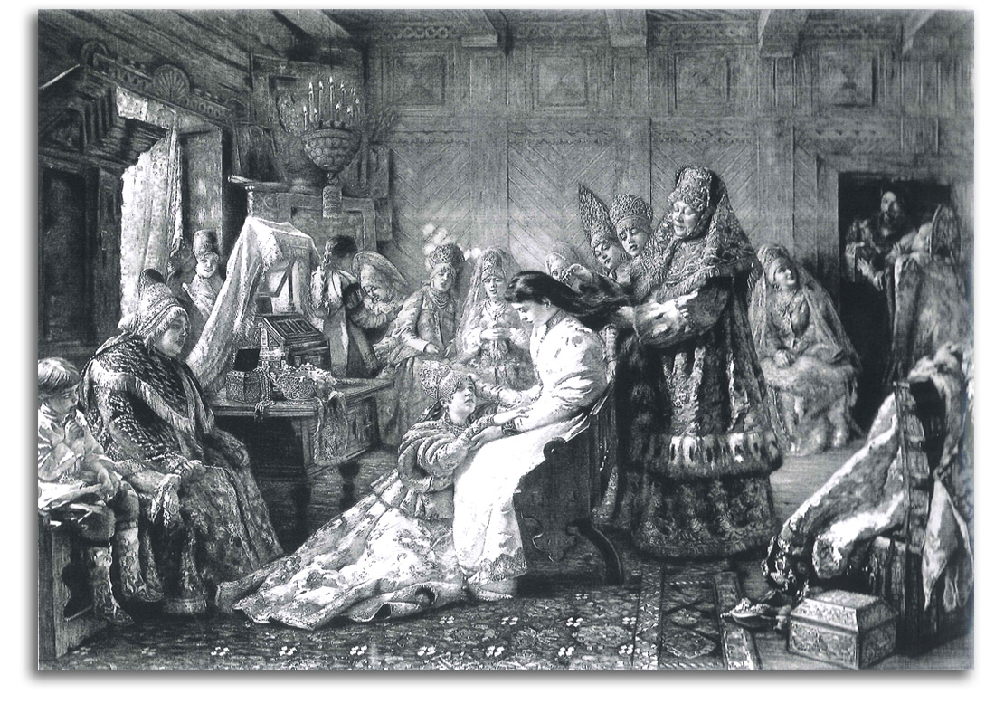
MAKOVSKY (after)
Avant Le Marriage
d’apres Le Tableau de M. Makowski [sic] (painted 1880s)
[aka The Russian Bride’s Attire]
wood engraving from
L’EUROPEENNE ILLUSTRE, 1890, pp.168-168
Collection: FLG
NOTE: This print was based on Konstantin Makovsky’s very popular painting that was exhibited at the Chicago World’s Fair of 1893 and is now in the collection of the Fine Arts Museums of San Francisco.
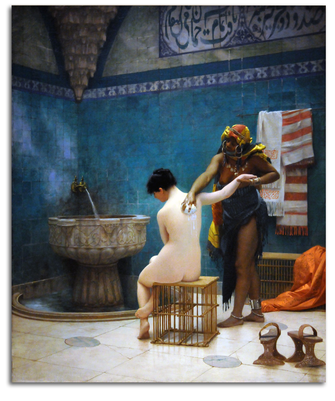
GEROME
The Bath (painted c1880-85)
Poster. Edition of the Fine Arts Museums of San Francisco, 1974 {Editor/Publisher: FLG}
Collection: FLG
NOTE: J.-L. Gérome was a highly respected Academic artist in France starting in the middle of the century. One may or may not like his subjects, but his skill as an image-maker cannot be denied. His primary interest was the female nude. He also was a gifted teacher with a considerable range of subjects for an Academician. His students included some of the best European and American artists of the later 19th century, such as Eakins, Redon, and Cassatt. Even the young Vincent van Gogh signed up for Gérome’s distance-learning course. (Theo van Gogh, Vincent’s brother, headed the Paris office of Goupil.) After a long period of neglect, Gérome’s popularity has returned. Ever since I first published this poster almost 30 years ago, some version of this image has been continuously editioned by FAMSF on cards, calenders, etc. The French have put him on a stamp, and Getty Museum in Los Angeles recently presented a Gérome exhibition.
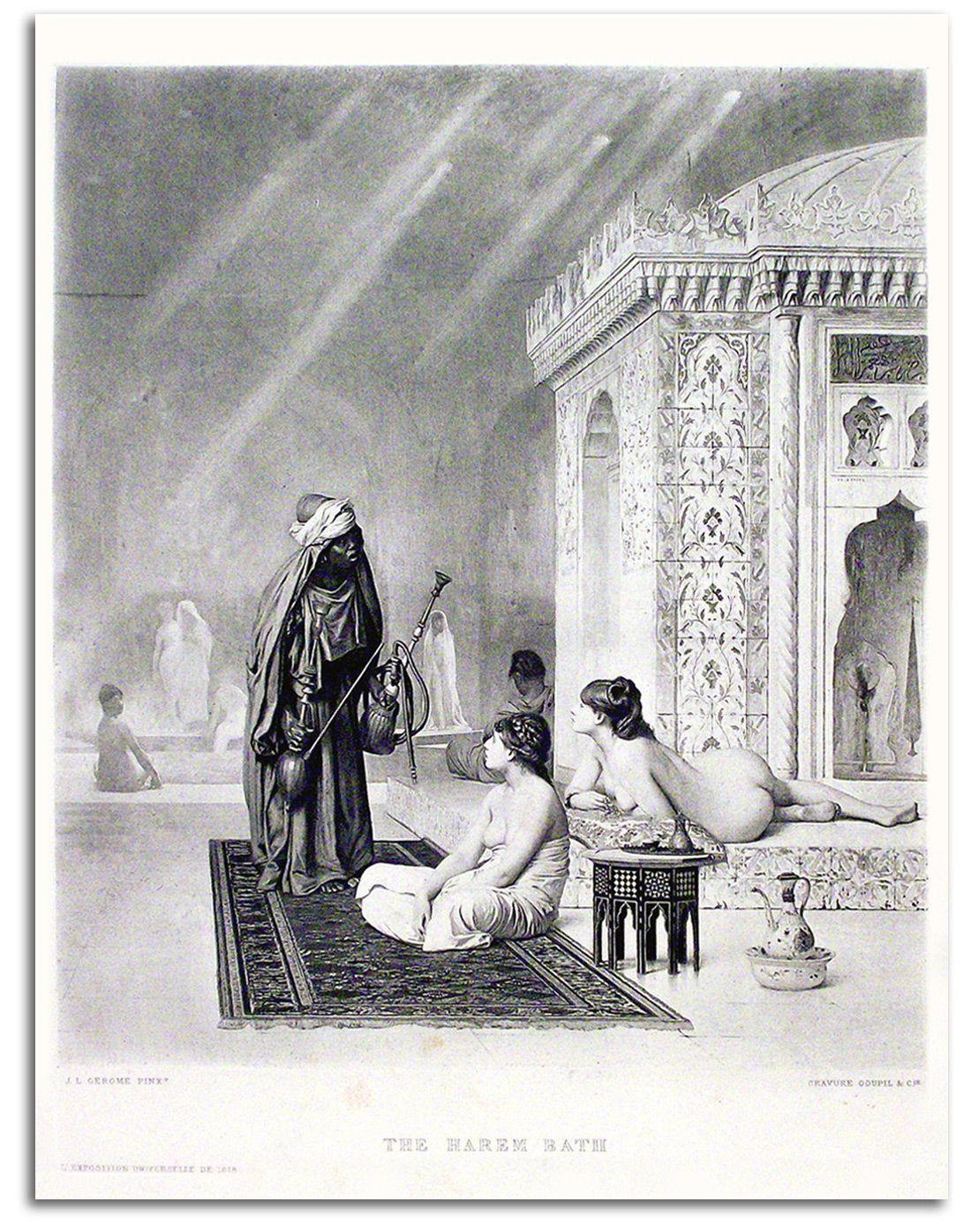
GEROME
The Harem Bath, 1878
Engraving
Edition by Goupil
Collection: IAD
NOTE: Gérome’s dealer was Adolphe Goupil, whose daughter, Marie, Gérome married. Goupil, from his base in Paris, had a world-wide business in painting, sculpture, and reproductive prints. When such dealers entered the art market during the second half of the 19th century and began to make high quality reproductions of the paintings they had for sale, during the 1870s and ‘80s, the taste for collecting photogravure prints became widespread, and remained for decades the primary form of international art-collecting in the middle class. A whole new market for picture-postcards also opened up. The quality of reproductive prints became excellent in books and art magazines such as GAZETTE DES BEAUX-ARTS and THE STUDIO. It was not until after World War II that this type of black & white print was replaced by color prints in art magazines and mass-market magazines, along with cards and posters. It was by means of color reproductions in LIFE, LOOK, etc. that millions of people “saw” fine art for the first time.
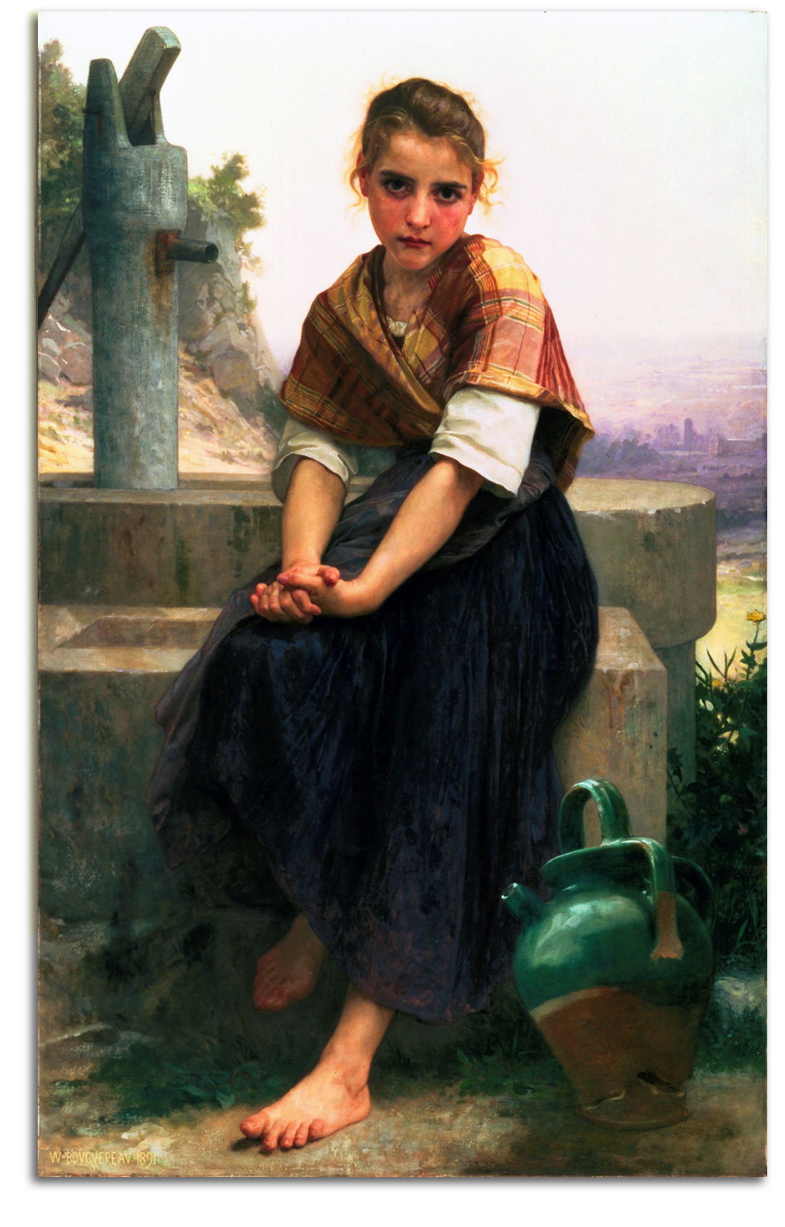
BOUGUEREAU
The Broken Pitcher (painted 1891)
Poster. Edition of the Fine Arts Museums of San Francisco, 1975
{Editor/Publisher FLG}
Collection: Tom & Charlotte Gleim
NOTE: William-Adolphe Bouguereau was one of the most respected painters in all of the 19th century in both France and in the U.S. His technical skill was remarkable. His output was enormous, over 800 paintings. His pearly tones were hypnotic. His shy peasant girls and smooth nude goddesses contained just enough eroticism to be permitted to hang in Victorian homes. His work has often been considered by Modernists as the worst kind of painting, the very thing that the Impressionists rebelled against. It is indeed what the Impressionists rejected. But does that mean it’s bad? Postmodernism has allowed a revision of terms like “good” and “bad,” a revision that looks favorably on styles very different from Modernism.
As Chief Curator of San Francisco’s city museums during the early 1970s, I felt it was appropriate for our exhibition program to be a balance of shows that would appeal to large audiences, and shows of special interest for scholars and collectors. So, in addition to shows such as “Prints of the Italian Renaissance,” and “Vuillard,” we presented blockbusters such as King Tut and van Gogh – shows that appeal to every kind of visitor. We also presented exhibitions of artists appreciated by millions of people who happen to like Realism (but were not appreciated by the Modernist Establishment) – shows such as Andrew Wyeth and Norman Rockwell. Those two shows were very well attended. Our Wyeth book was picked up by the Book-of-the-Month Club and sold over 700,000 copies in its first decade.
I also felt it might be good to reconsider Academic painters of the pre-Modern era. Their paintings had been languishing in basements for decades, unseen by anyone. They were once loved by millions of people. Should Bouguereau be hated forever just because he did not want the Impressionists to be allowed into the Salon? Perhaps these paintings were worth a second look. So, in 1975 we presented the first 20th century exhibition of Bouguereau’s paintings, an exhibition organized by Mario Amaya at the New York Cultural Center. It was an eye-opener for many who had never seen his work. The poster I published at the time sold well, and there have been many FAMSF editions since then. The painting itself was donated by M. H. de Young, founder of the de Young Museum, who represented the best in late 19th century American taste.
I was surprised when I was congratulated for presenting the show by the Director of the Louvre, Michel Laclotte, who called it a radical act. He liked to visit San Francisco in part because the California Palace of the Legion of Honor museum at the time was the only French museum in America. [For the history of how the CPLH became a French museum CLICK HERE.]
I thought this show would be interesting to do, but did not think of it as radical. Laclotte said it was the first show he’d seen in America that respected a French Academic artist. Then he told me that he and his team were planning the new Musée d’Orsay as a very different kind of museum, a museum of the whole of the second half of the 19th century – a museum of not only Impressionists and Postimpressionists, but also of Academic artists such as Bouguereau who defined so much of the art of the age.
After all, he said, the 19th century was a century of both ways of looking at the world, and a national museum should present the whole of a nation’s cultural history. Then over lunch he added: “And these Academicians were continuing the Renaissance style, which was a pretty good style to be continuing. It defined the core values of Western civilization for centuries.”
When Laclotte gave me a private tour of the d’Orsay under construction in 1985, it was my turn to congratulate him for developing a museum masterplan that was a truly radical act. The world was expecting France to create nothing other than a temple of Impressionism and Postimpressionism, but the world got much more. “Postmodern” was the attitude behind Laclotte’s planning. A Postmodern attitude is an attitude that allows people to look at both Modern and non-modern art and then decide for themselves what they like.
The d’Orsay, which opened in 1986, has become one of the most visited museums in the world, and has expanded popular appreciation for the art of the Academics. In a recent exhibition at the Getty Museum in Los Angeles, the Bouguereaus were the hit of the show, and there are over 2,000 Bouguereau reproductions for sale on eBay.
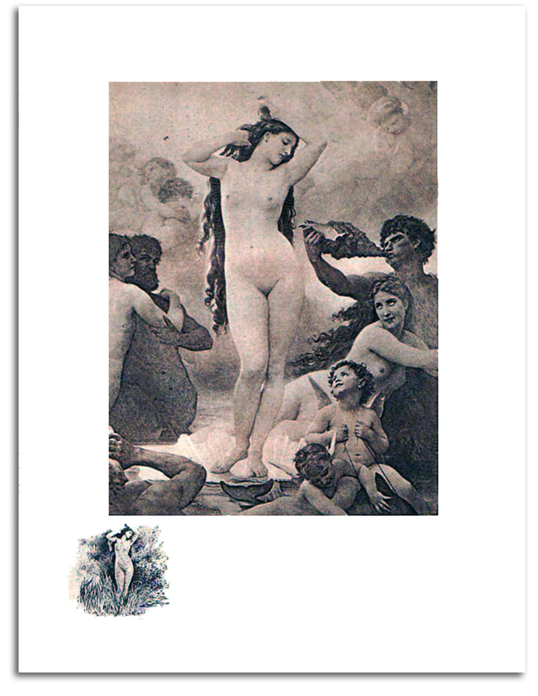
BOUGUEREAU
The Birth of Venus (painted 1878)
Gravure, 1908
Edition of the Musée du Luxembourg
Collection: IAD
NOTE: This is his most famous painting. It is almost 10 feet high. It was purchased from the Salon of 1878 for the Musée du Luxembourg but is now in the Musée d’Orsay. Most people in Europe and the U.S. “saw” this picture for the first time in photo-gravures such as this one, a “fine print” often protected by a sheet of tissue paper.
EUROPEAN MASTERS – 19TH CENTURY – Impressionistic Realism
Impressionistic Realism was a modification of Realism. It was developed by Manet during the 1860s and served as a bridge to Impressionism. He flattened corporeality and provided only the barest of detail such as one could see at a glance. This left the viewer with a visual “impression.” This was a key step on the road to Impressionism. He also illustrated the “first modern book” – Mallarmé’s translation of Poe’s RAVEN – in 1875, a book that included Manet’s haunting “impression” of a shadow.
Some call his transitional style “Pre-Impressionism.” But that is a non-diagnostic term. It points to nothing but chronology, and says little about characteric features. Therefore I use the term Impressionistic Realism because this term helps to explain the visual character of Manet’s transitional style.
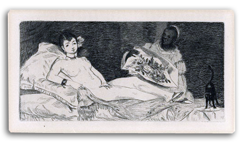
MANET
Olympia (small plate), 1865-67
(Based on the painting of 1863)
Original etching & aquatint
Printed by Félix Bracquemond
in EDOUARD MANET by Zola, 1867
Edition by Dentu
Ex. Collection: FLG
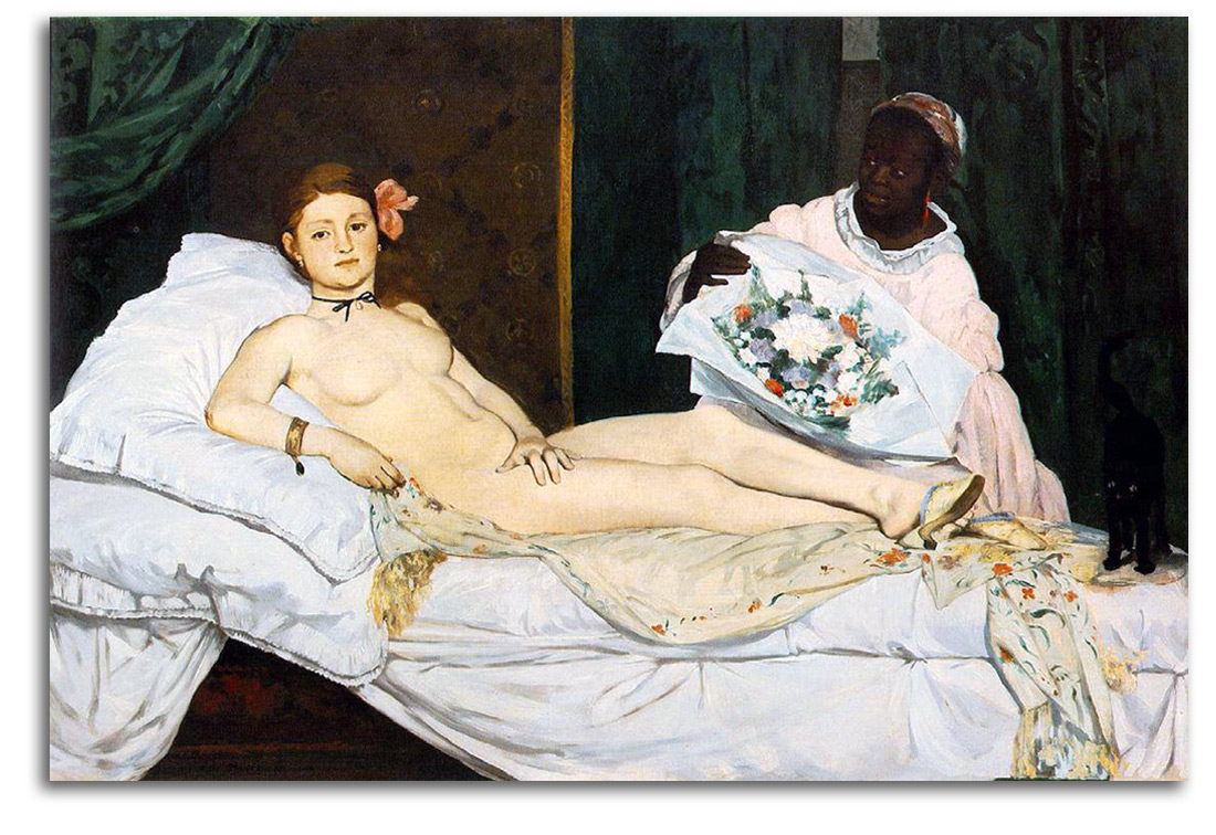
MANET
Olympia, 1863
Oil
Collection: Musée d’Orsay, Paris
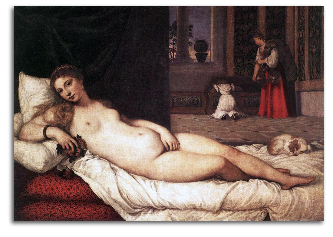
TITIAN
Venus of Urbino, 1538
Oil
Collection: Uffizi, Florence
NOTE: “Olympia” of 1863 is one of the first paintings by which Edouard Manet became famous (or infamous). In his mind, he was linking to a noble tradition of nudes in this posture, a tradition going back to Titian and Giorgione. But the Art World was shocked by how he did it. In the first place, the woman seems to have no modesty at all. The confrontational gaze suggests a very “modern” woman – very self-assured. That is an attitude that makes non-modern men (then and now) quite uncomfortable. Moreover, she may actually be a prostitute! Among the artists, the shock was in the flatness of her form. Most art lovers thought that a “good Realist” should make
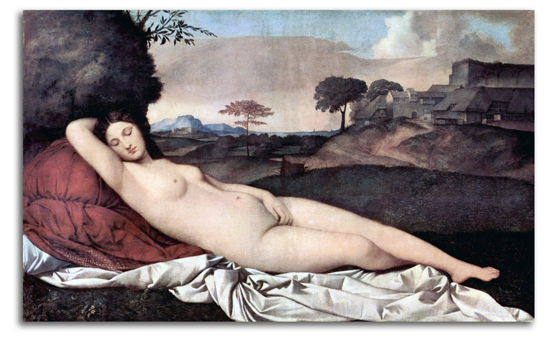
GIORGIONE
Sleeping Venus, c1510
Oil
Collection: Staatliche Kunstsammlungen, Dresden
his ladies round, sculptural, tactile. Every artist had done that since the Renaissance; but Manet did something else. He made her body very flat, hardly modeled at all. The print is even flatter. Courbet remarked that Olympia has the “flatness of a playing card.” This radical simplification of traditional, descriptive, Renaissance ideals toward Symbolism’s new aesthetic idea of an “impression rather than a description” was a major step in the early development of Modern art.
Manet was not an Impressionist, but he anticipated Impressionism in many ways. What Manet did has often been called “Pre-Impressionism.” That is a clumsy term, a non-diagnostic term, that speaks of nothing but chronology and does not express any stylistic features. Therefore I have replaced “Pre-Impressionism” with a more diagnostic term that indicates visual features of Manet’s style: “Impressionistic Realism.”
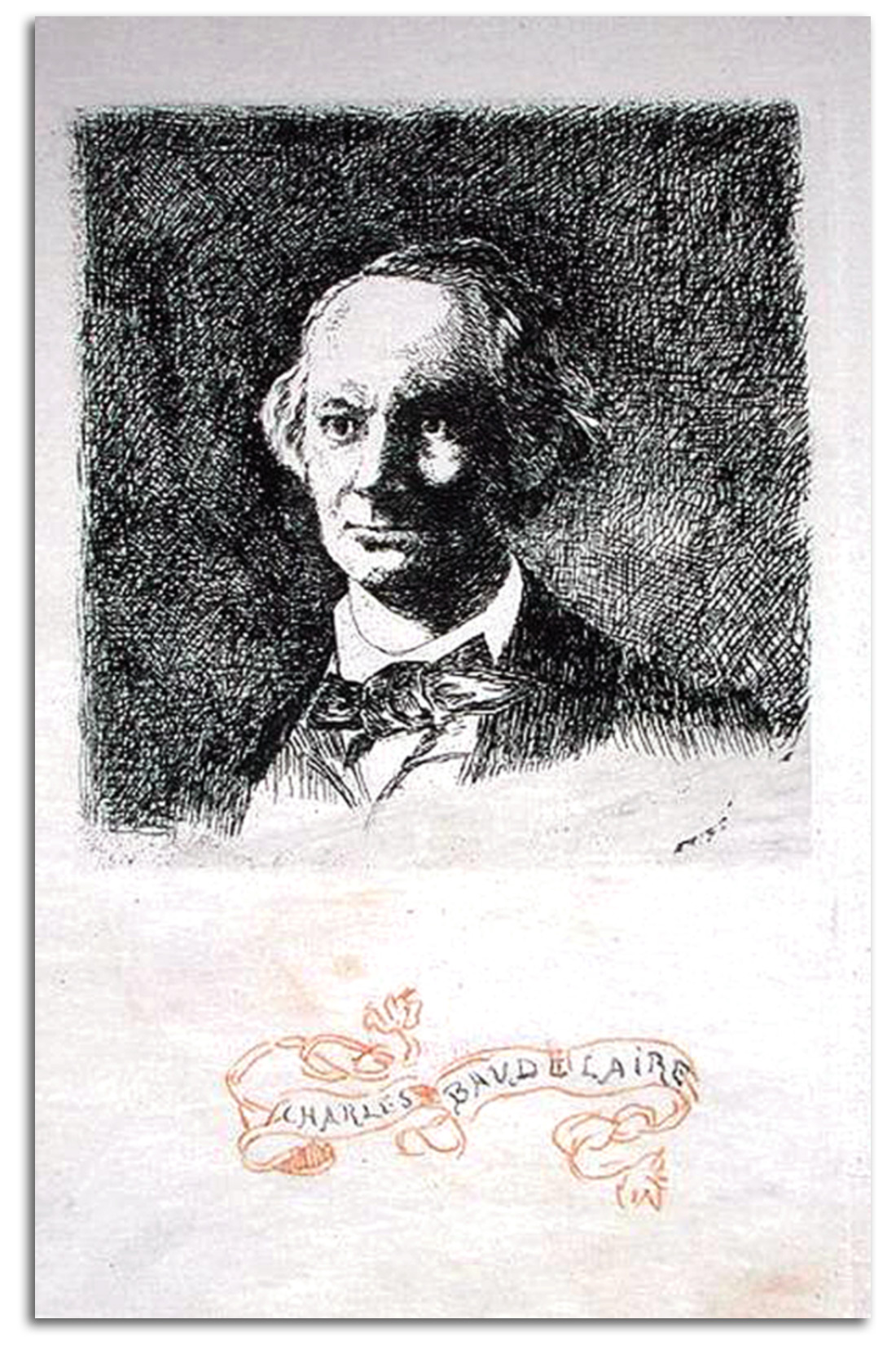
MANET
Portrait of Baudelaire, Full Face
(based on a photograph by Nadar), 1865-69
Etching
Printed with the date 1865
Edition by Salmon
Collection: FLG on loan to IAD
Published in GLOBAL VISION, Part 1, 2006
NOTE: Manet and the famous Symbolist poet & art critic Baudelaire were good friends during the 1860s, and perhaps as early as the late 1850s. Indeed, they were frequent companions. In the mind of many, Manet is the first “modern” painter, and Baudelaire is the first “modern” poet. In fact, Baudelaire seems to have invented the very term “modernity.” It is what he wanted every poet and painter to be expressing. Between 1862 and 1869 Manet etched five portraits of Baudelaire.
This particular rendering of Baudelaire (based on a photographic portrait by Nadar), was done in the Realist style that was typical of French painting and printmaking during the 1850s & ‘60s, a style within which Manet matured in the years leading up to his first masterpieces of the early ‘60s. He used this Realist style as he began to etch in 1859 or 1860. During the early ‘60s his fascination as an etcher was with Spanish Old Masters especially Velásquez and Goya. Their influence would never leave him completely as he walked with both courage and hesitation over the bridge between the pre-modern and the modern.
The next image following this one is of another “Portrait of Baudelaire” that Manet began in 1862 using a very different style, an outline style with very little detail. Manet had been inspired by both the flatness of Japanese prints and by the Symbolist concept of “suggestion rather than description” to make this second portrait one of radical simplicity. Manet would continue to use variations of both styles for some time. However, it was while using his “impressionistic” style that he created his most innovative prints such as the portrait of his dear friend Berthe Morisot (c1872-74), and his revolutionary “portrait” of a shadow in the edition he illustrated of Poe’s RAVEN in 1875 which featured a French translation by his new poet friend Mallarmé whom he met in 1873.
In many works of the ‘60s & ‘70s, Manet takes away the concept of a centralized composition inside traditional perspective, and sometimes takes away all traditional background. This leaves us with nothing but an “impression.” This radical innovation was not lost on the critics. These critics may not have liked what Manet was doing, but some of them did understand it. For example, Silvestre wrote: “It is this instantaneous impression that Manet has intended to render.” The term “Impressionism” was coined by another critic by the name of Leroy in a satirical review of 1874 for LE CHARVARI. Leroy was making fun of the title Monet had given to one of his paintings: “Impression: Sunrise.” But the term “Impressionsim” stuck.
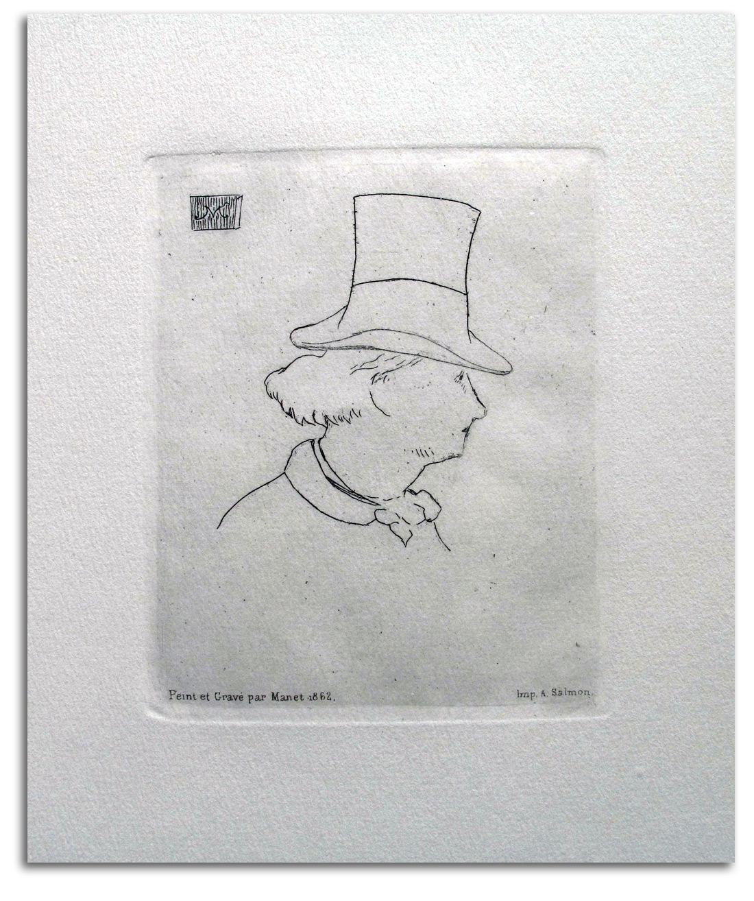
MANET
Portrait of Baudelaire, in profile with a Hat, 1862-69
Etching. [Plate Signed with a monogram]
Later edition
Printed with the date 1862
Edition by Salmon
Collection: FLG on loan to IAD
Gift of Mark Burstein, 1976
Published in GLOBAL VISION, Part 1, 2006
NOTE: Both this portrait and “Portrait of Baudelaire, Full Face” were published in CHARLES BAUDELAIRE: SA VIE ET SON OEUVRE by Asselineau in 1869, two years after the poet’s death. Manet took both portraits through a number of states before he was satisfied that they were ready for publication in this book.
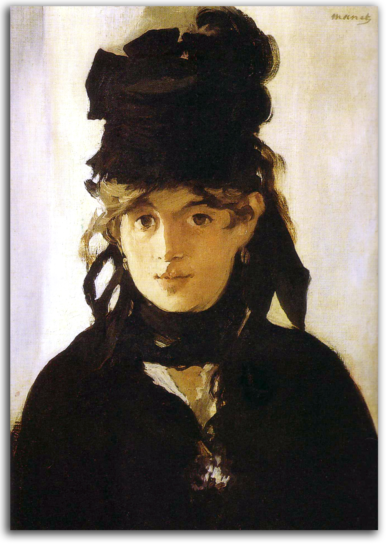
MANET
Berthe Morisot with a Bouquet of Violets, 1872
oil
Collection: Musée d’Orsay, Paris
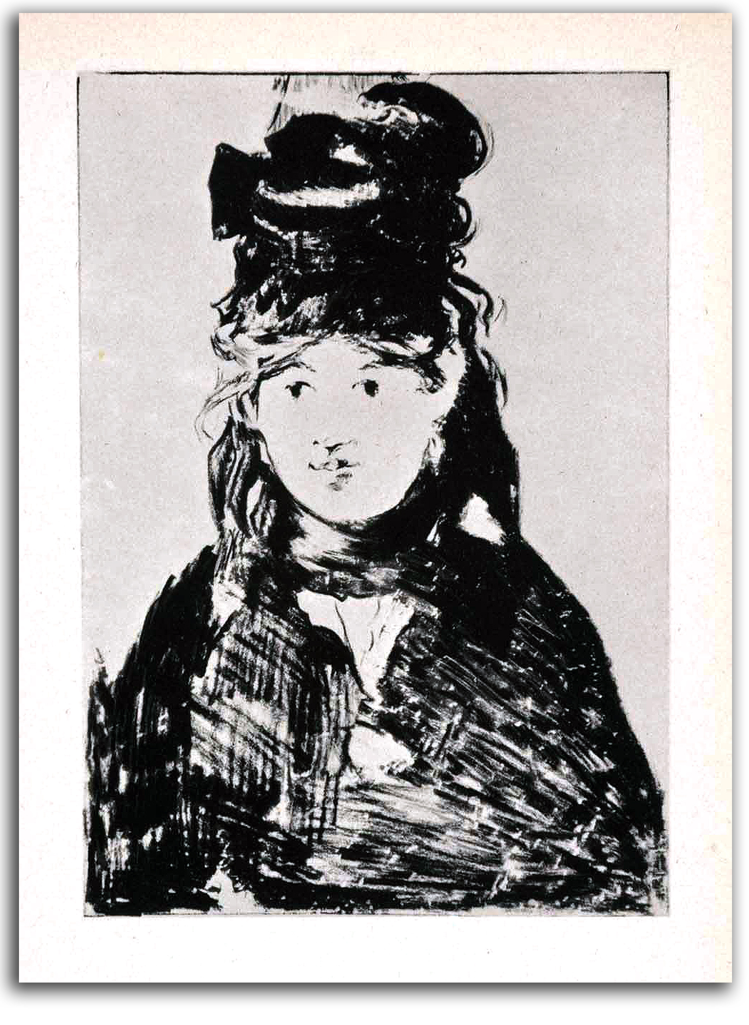
MANET
Berthe Morisot in Black (drawn 1872-74)
Original Lithograph, first printed by Clot, 1884
This edition 1946
Collection: IAD (2012)
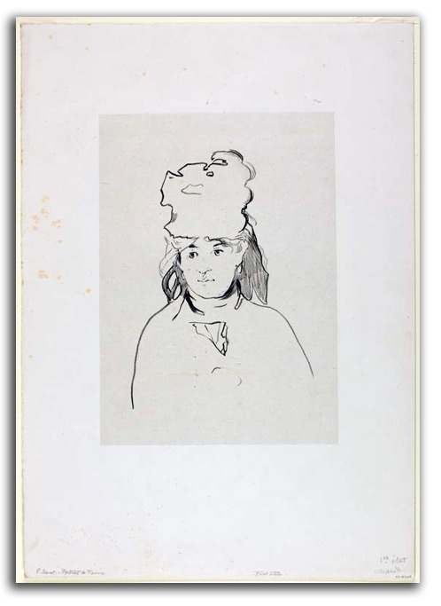
MANET
Berthe Morisot in Silhouette (drawn 1872-74)
Original lithograph, as first printed 1884
Collection: Art Institute of Chicago
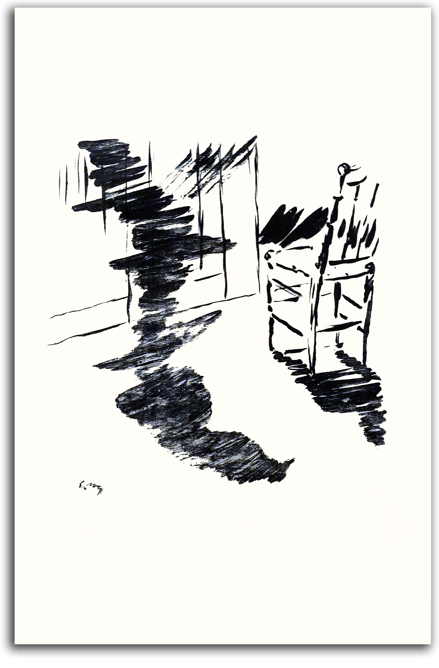
MANET (after)
Nevermore! (aka “That shadow that lies floating on the floor”)
from LE CORBEAU (The Raven) by Poe
translated by Mallarmé, 1875
Edition by Lesclide
———-
Facsimile edition, Walker & Co., 1968
{published at the recommendation of FLG}
Collection: FLG. Gift of the Publisher
Exhibited in THE ART OF THE BOOK: THE MODERN LIVRE D’ARTISTE, University Art Gallery, CSUEB 1999
NOTE: This book is widely considered the first “Modern” book. Mallarmé learned English primarily so he could understand the poetry of Poe. Baudelaire was equally enthralled by Poe. Why was Poe’s poem so compelling? It was a new kind of poem – one never seen before. The story is more a mystery than a narrative. The key symbols are haunting and unexplained. The teller of the tale has lost his love, Lenore. A strange bird pecks at the window, flies in, and says a strange word: “Nevermore.” And that’s the end of the poem. Baudelaire and Mallarmé were attracted by a story left untold, a story that is merely suggested. They were equally attracted by Poe’s new way of using words. Poe’s words are only partly rational signs. They also are musical sounds, the aesthetic power of which often transcends their ordinary meaning. The reader is left with the feeling of having just heard a strange, haunting melody. The meaning is unclear, but the effect is gripping. It is this form of mysterious, musical suggestion that inspired the entire Symbolist Movement of the later 19th century.
Poe wrote “The Raven,” his best known poem, in 1845. It has been famous ever since. In 1885 an American critic would claim it was “the most popular lyric poem in the world.” It is one of the few poems that a large number of people can recite from memory. Most literary historians interpret the poem to mean the lover who has lost his love will “nevermore” be free from pain and sorrow.
EUROPEAN MASTERS – 19TH CENTURY – Impressionism
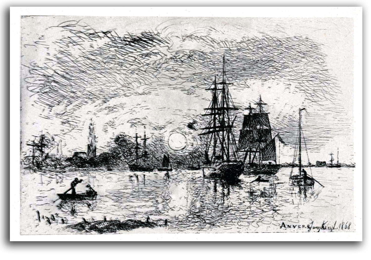
JONGKIND
Sunset, Harbor of Anvers (etched 1868)
etching
Modern edition, 1946
Collection: IAD (2012)
Impressionism was the final phase of Realism. The classic form of the Impressionist style was created in 1869 by Monet and Renoir. They had painted in the Forest of Fontainbleau intrigued by the pioneering Realism of the Barbizon School. They also had been interested in the solid corporeal Realism of Courbet whom they visited from time to time as young men. Then they were inspired by the radically flattened Realism of Manet, and his idea of rendering only an “impression” of reality. They would take this concept to the next level.
The Impressionist style that they created flourished in various ways in the hands of many other painters during the 1870s: Pissarro, Sisley, and others. Other semi-Impressionists (such as Degas) exhibited with the Impressionists but did not share all their ideas. Manet refused to exhibit with them, and Degas did not like the outdoors at all.
What was Impressionism? Where did it come from? Here is part of a general answer I published in CLAUDE MONET: PAINTINGS IN CALIFORNIA COLLECTIONS (1974):
Like every new movement in the history of art, the Impressionists were able to draw on all the painting that had preceded them, as well as all the innovations that were taking place in their contemporary world. Among the numerous resources they chose to be influenced by in their formative years were: the sensuality in the courtly art of Rococco; the light-reflecting impasto of Constable; the luminous mist in the landscapes of Venice and Turner; the vertical view-points and “floating” space of Japanese prints; the numerous insights into the nature of light and vision offered by the new technique of photography, and the color theories of scientists like Chevreul and Helmholz; as well as the energetic brush work of Delacroix, who realized that no object has only one color in it, and that pure, unmixed hues placed side by side, will “fuse naturally at a certain distance.”
In the bright sunlight and open air, Monet and his friends began to paint landscapes unlike any that had ever been seen before. The Barbizon School painted landscapes of darkness. They tended to work with the deep shadows of dusk and dawn. An Impressionist might say that the Barbizon painters did not stay outside long enough. Most of them finished their canvases in the studio. They were after a broad view of nature’s image. They took a long, meditative look at the general character that the solid reality of nature offers the eye.
They were not interested in movement. Almost nothing moves inside their compositions; nor is there any abstract sense of motion in their carefully controlled technique. They were not interested in air. They were not interested in the changes of times. Their panoramas are abstract allegories of what nature looks like standing still.
Monet and his friends looked through a shorter slice of time in a smaller piece of space. They were interested in the more vibrant reality that dwells inside each moment before it changes into the next. Wanting to capture all the aspects of nature’s transitory existence, the young Impressionists not only began but finished their canvases out-of-doors. Before them only Daubigny and Boudin were doing that regularly.
To experience nature in its ripest complexity, they chose to paint in the bright sun. Under the impact of light at its strongest, they saw that nothing is black or grey outside. Even shadows contain colors. So they eliminated from their palettes that dark color range which was so important for Manet, and began to use lighter and lighter hues, concentrating on the primary colors (red, yellow, blue) and their complementaries (orange, green, violet).
To capture the momentary “effect” or “impression” of a figure in a dark setting was one problem – one that Manet had solved. But how can one capture all the shimmering quality of colored light outside?
Monet’s genius came up with a radically new approach. He would represent the object not in terms of the form he knew the object to have, but in terms of the image that the light from the object reflects into the retina of his eye. In this way, the image that he was capturing on the canvas was not the intellectualized, hard outline around a tactile object, but the purely visual, vibrating halo of colored light surrounding it.
Intuitively reaching out for a way to capture the sensations of this image, he evolved a vocabulary of short, rapidly executed strokes which enabled him to represent those energy vibrations that he could feel moving through the air and earth and water all around him.
We might think of “energy” and “vibrations” as terms that did not become popular until the 1960s. However, both terms were often used by artists in the late 19th century. Materialists seldom understand such terms. But that did not (and does not) bother artists. The classic Impressionist brushstrokes are short, rapid, and energetic, and they undulate – not entirely unlike the physical shape of light waves themselves. Sometimes I wonder if these artists, who did study the science of light and color, were (consciously or unconsciously) imitating the undulating nature of electro-magnetic waves. [For my book of poems on ELECTRO-MAGNETISM click here.]
Monet and Renoir loved aspects of the city, especially the vitality they felt on a parade day (Monet) or in a dance hall (Renoir); but they also had a special love of nature. Their vision of the natural world was a dream-world, a dream that appealed to many urban dwellers who were no longer surrounded by nature.
Nature was rapidly leaving the lives of the new urbanites in Paris (and in every major city), taken away by industry and the urbanization of what has been the natural, pre-urban environment of villages in the country. These urbanites had a desire to hold on to nature, a desire than manifested in a wish to look at images of nature in poetic ways. And they wanted these paintings and prints to be unpolluted visions. No factories appear in Impressionist paintings or prints, as a rule. Industry was not part of the dream.
The Impressionists stayed focused on the material world of everyday people and objects, as seen inside the Renaissance traditions of linear perspective and gravity. There are no angels or goddesses. This obviously is a form of Realism, but a new form of Realism that favors the passing glance, a glance that requires little detail in the picturing of the moment. More often than not, there is no story being told, only a glance at a passing moment captured as an energized vision of colored light.
Traditional Realism requires no effort on the part of the viewer to grasp the reality of the picture. There usually is an obvious narrative, an actual story being told, a story supported by a great deal of naturalistic detail. The visual stage is set. The story being performed by the figures in the pictured play is as clear as if one is hearing the spoken lines of a drama.
The Impressionists did something entirely different. Sketch-like pictures were painted rapidly outdoors with short vibrant strokes in fluid motions and high-keyed colors. There was very little darkness, even at the edges. Even shadows were colored. These “incomplete” compositions force the viewer to “complete” the picture.
Impressionists do not tell stories; they capture glances. The viewer of an Impressionist work (consciously or not) has to bring the picture into focus, to make the picture “real” by a leap of imagination. This engagement of the imagination was a step toward the post-naturalistic symbolism of Postimpressionism, when the symbolic worlds of the new artists become more important than real worlds of the old artists.
Most of the Impressionists were poor for a long time. Only towards the end of their careers did they begin to sell well. There were only a few favorable reviews of their early exhibitions in the 1870s. Eventuallly, the critics and collectors, liked what they saw. Monet, for example, became wealthy and created his dream garden in Giverny where he painted the famous water lilies in his water garden during the last decades of his life.
Monet also enjoyed a considerable amount of respect from contemporary painters and poets. Cézanne said: “Monet is only an eye, but my God what an eye!” Mallarmé said to their mutual friend Berthe Morisot: “I am happy just to have lived in the same epoch as Monet.”
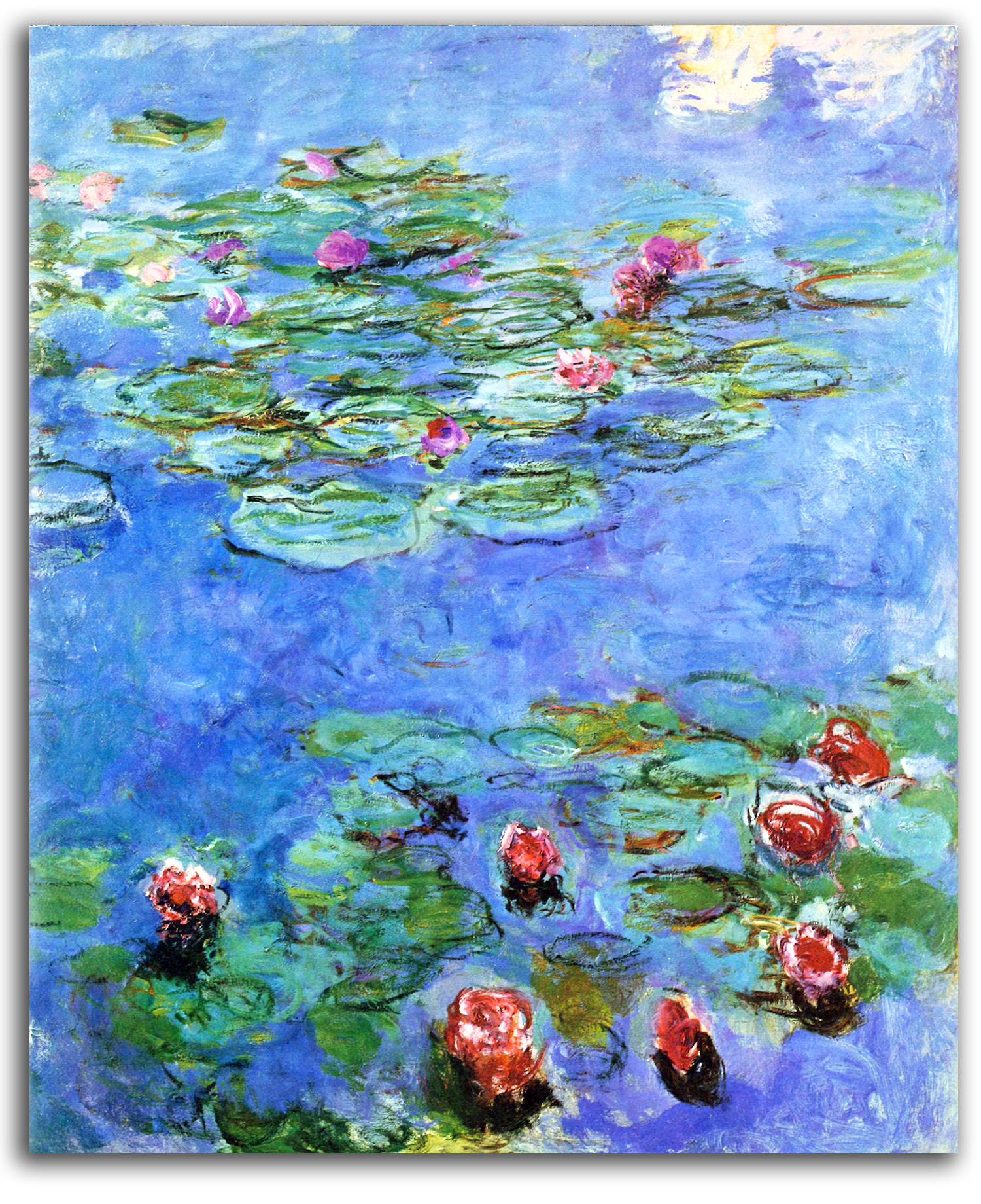
MONET
Water Lillies
Some Impressionists became Postimpressionists, as we shall see in the next section. But not Monet. There is a saying among art historians: “Monet was the first Impressionist and the last Impressionist.” That may not be entirely true; however, Monet did continue classic Impressionism into the 20th century, when he created many of his greatest water lily paintings.
What is Monet’s magic? I can’t think of another artist who has left so many critics tongue-tied when they try to articulate his unique qualities. Color – yes, deeply important. Many consider him the greatest colorist of the century. Light, however is at least as important, indeed I think it is even more important. Why? Because it is light that gives life to color. When asked what his subject-matter is, Monet replied: “The subject-matter…is…light.”
What he most wanted to capture is what he called the “enveloppe” – the luminous air that envelops everything we see. This transparent aura of luminosity embraces all material objects. It is the animating component of visual reality. For Monet, this is the “nothing” that is everything. Visually, it determines every object it surrounds.
Monet was always after this luminous atmosphere, an envelopment he spoke of in many ways:
We live in a luminous cloud of changing light. That is what I have to catch.
…the object enveloped in sunlight and atmosphere.
I want to paint the air which surrounds the bridge, the house, the boat, the beauty of the air in which these objects are located…
…the surrounding atmosphere brings it to life – the light and the air which vary continually. For me, it is only the surrounding atmosphere which gives subjects their true value.
…that which I seek: “instantaneity,” especially the enveloppe, the same light spreading everywhere… .
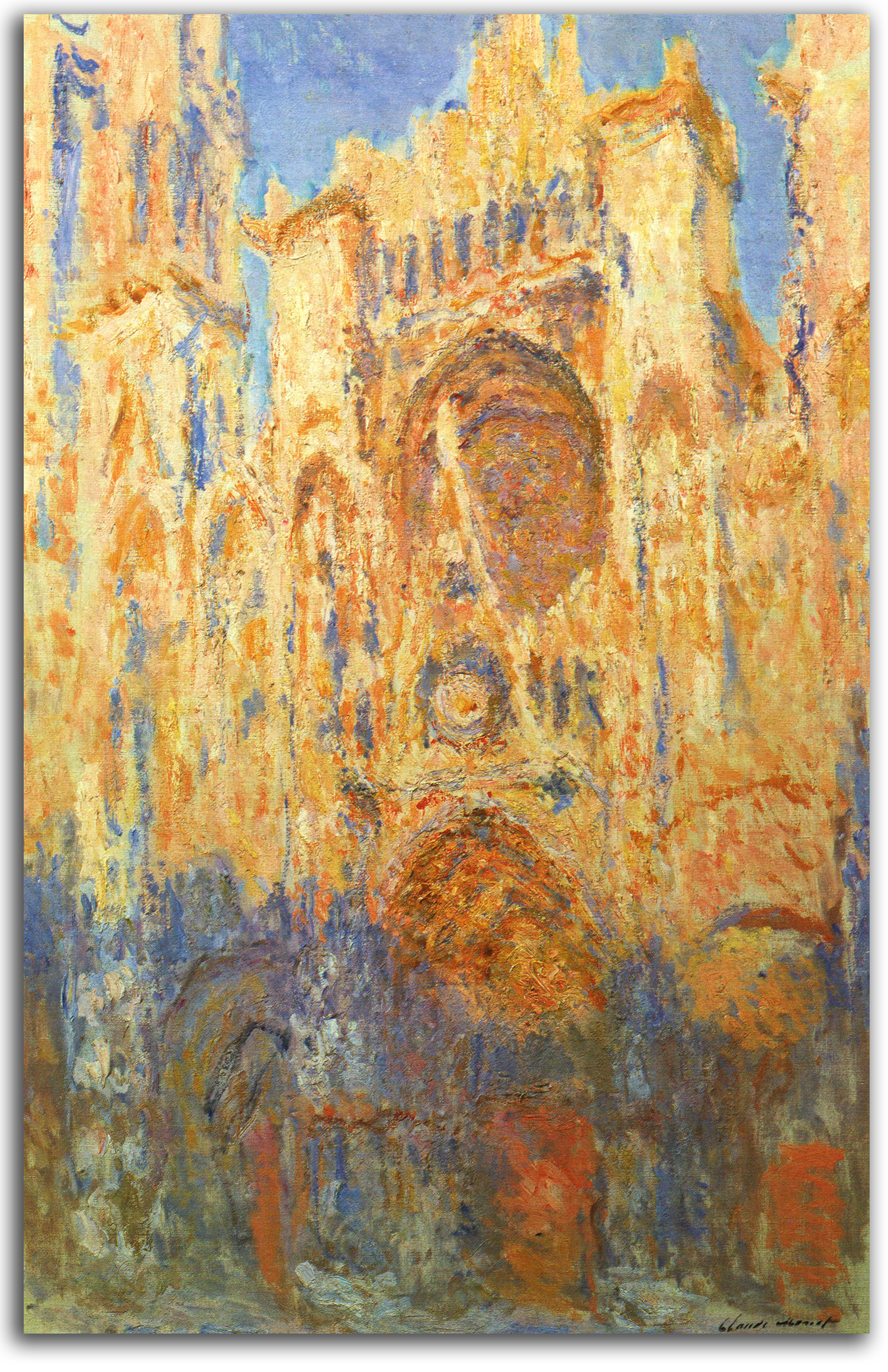
MONET
Rouen Cathedral
In his earlier work, there often is a certain solidity of form that is enveloped by the luminosity he loved so much. Starting in the 1880s, he took this way of picturing to another level. He began to have the materiality of objects de-materialize, virtually melt into the “enveloppe.” The cathedral in Rouen and the Houses of Parliament in London appear to have no physicality at all! They are merely masses of mist.
During the Renaissance, the arts and the sciences were not as separated as they are today. A craftsman like Leonardo was equally interested in both, and used both. But the two worlds grew apart. During the 19th century, some artists became interested in science again. The Impressionists were particularly interested in the science of color and perception. However, for most people, the dividing line between the sciences and the humanities remained strong. The traditional dividing line between the sciences and the humanities has grown more elastic in the 20th century. I am reminded of Einstein’s famous fomula: E = MC2. This formula is more than a theory. It is a bedrock of modern physics. Among other things, this formula enabled the creation of the Atomic Bomb. What are the implications of this formula: ENERGY = MASS times the SPEED OF LIGHT squared?
Light and matter seem entirely different at first thought, but actually they are aspects of each other. Light is what matter becomes when it is moving very fast – literally at 186,000 miles per second. Matter is what light becomes when it is moving very slowly, slow enough to be perceived by our human senses. In short, matter is solidified light – light that has materialized.
One of the most interesting things that has happened in 20th century philosophy is not only that the humanities and the sciences have grown closer, but also that physics and metaphysics have grown closer. Physics is the study of material reality. Metaphysics is the study of the relationships between material reality and Transcendent reality. What Einstein described in his famous formula is very similar to what the great spiritual traditions have been describing for centuries.
Monet was not a religious man, but according to Gustave Geffroy, Monet’s first biographer, a number of Monet’s close friends testified that he was pantheistic at heart. Many (from his time to ours) have felt a strong spirituality embedded in his work.
Monet and his close friend Mallarmé shared a perception of the material world as only a suggestion of the larger universe. A photograph of Mallarmé hung in Monet’s home. Monet’s friend, the sculptor Auguste Rodin, was deeply moved by Monet’s Rouen series, a series that echoed Rodin’s own spiritual love of medieval cathedrals. Those two artists exhibited together. They both felt Transcendent energy pulsating though the universe. Rodin pictured how it moves through a body. Monet pictured how it moves through the air.
Georges Clemenceau (later Prime Minister of France during World War I) wrote of the Rouen series in 1895:
The perfect eye would distinguish…all…vibrations perceptible… . Monet’s eye…is ahead of ours, and guides us in the visual evolution [of] our perception of the universe.
Another critic of the time, C. Janin, was certain that what Monet was revealing in the series was “eternity.” This feeling has persisted though the whole of the 20th century, with Modern critics such as William Seitz at MoMA writing about Monet’s “transcendentalism” and his “cosmic pantheism.”
Monet’s vision was somewhere between matter and light. When we look at his late great paintings of water lilies, we see how far he traveled into an imaginary world that is partly here and partly not. His matter is so luminous that it seems to be on its way to becoming light.
He took away the usual borders of our vision; the watery world seems to go on in all directions, toward infinity. He took away the distinction between earth and sky. All we feel is unbroken continuity. The lilies are rendered as such abstract forms, with such broad fluid strokes, that they seem to be half a fact and half a dream.
Are we looking at water lilies themselves or their reflections? Hard to tell, and after all, are such distinctions important? We have been taken to another world, a world beyond logic, a spiritual space, where air, earth, light, and water have been fused into an Alchemical Unity.
It was not until quite late in their careers that the Impressionists produced prints. The quality of those prints varies a great deal. In the selection for this historical period, as in all the historical periods in this course, the selection is quite concise. I have tried to show you typical examples of the very best work of these artists when they worked as printmakers.
Many amateur artists and some professionals still practice versions of this ever-popular style, popular not only because it is pretty but because the energy of its spirit is extremely positive, and that positive spirit is very rare today.
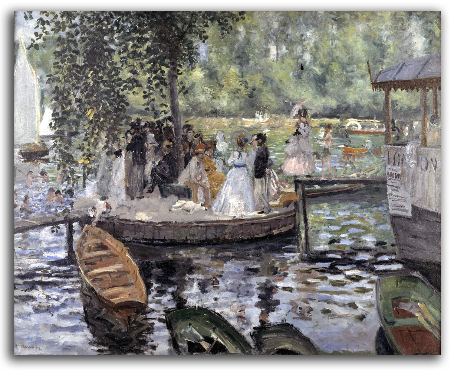
RENOIR
La Grenouillere {The Frog Pond}. (painted 1869)
Oil
Collection: National Museum of Sweden, Stockholm
[Replica oil, c1890-1900
Collection: FLG on loan to IAD
Published in GLOBAL VISION, Part 1, 2006]
NOTE: It was in this painting, and in other paintings of the same period, that Pierre Auguste Renoir and Claude Monet created the Impressionist style with scenes of the natural world permeated with glittering sunlight and rendered with short, spontaneous brushstrokes of vibrant color. The end results looked to most people of the time like mere sketches, but to the artists these works were complete expressions of the real world perceived with feeling – “impressions” of passing moments deeply felt. The Art World gradually adjusted its vision and began to love Impressionist art. Renoir and Monet and the others, who had lived in poverty most of their lives, became rich. In the 20th century, Impressionist paintings, prints, books, posters, and cards became (and remain) the best-selling art style of all time.
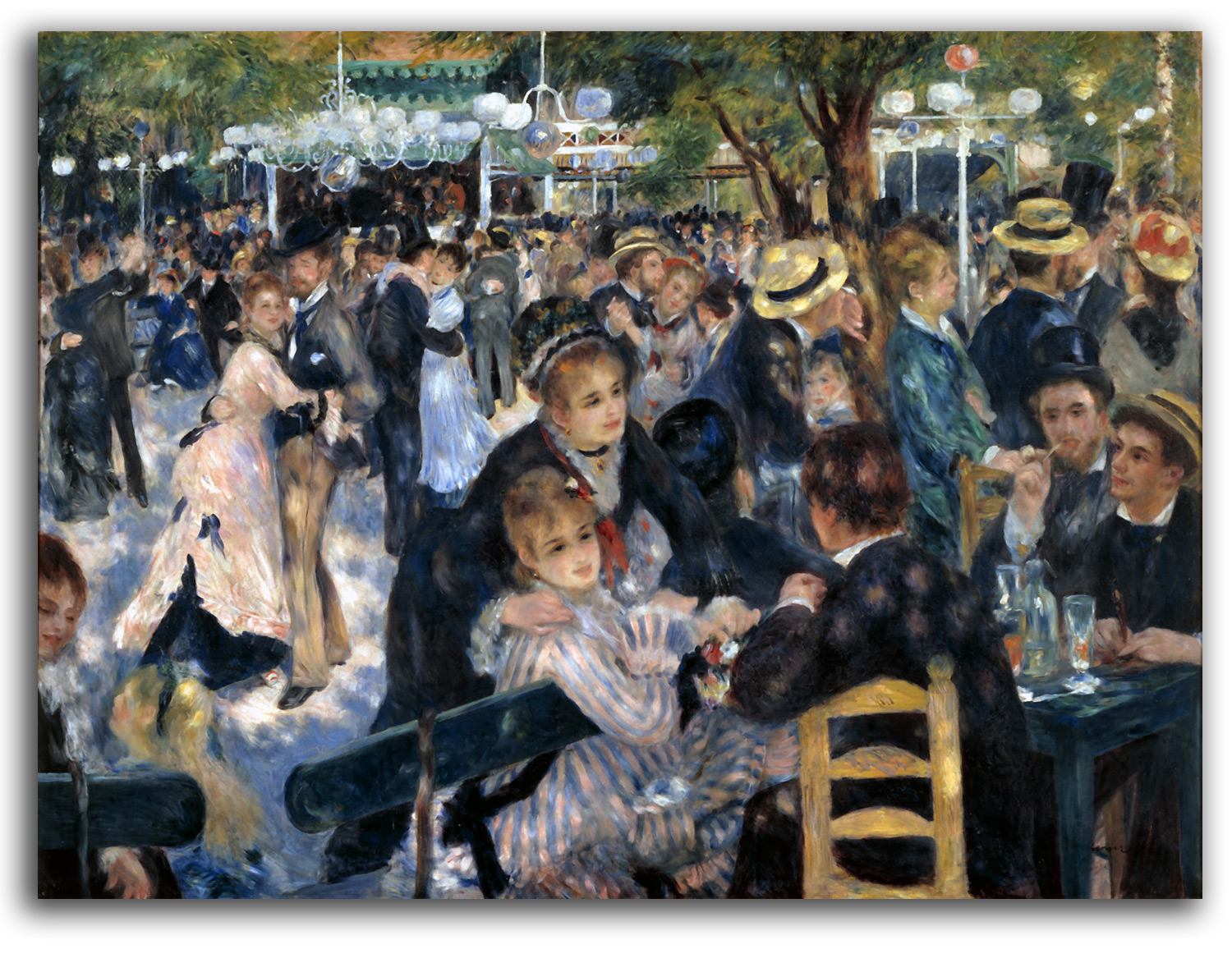
RENOIR
La Moulin de la Galette
Conceptualization and first painting: 1876
(Renoir painted two versions)
First edition: 1919. Published by Vollard
This edition: c.2000. Published by the Vollard Estate
Color etching
Collection: FLG
NOTE: Pierre-Auguste Renoir (1841-1919), together with his friend Claude Monet, is remembered as one of the creators of Impressionism in 1869. This style flourished during the 1870s when Renoir painted two versions of “La Moulin de la Galette.” Renoir is often called “the painter of joy.” This image is a good example of why. Indeed, I think the reason why Impressionist prints and books sell more than those of any other era is because the essential spirit of Impressionism is joyful.
I have been in love with Renoir’s art since I was a boy. All during college, a print of “The Boating Party” hung on my wall. When I was hired to work for Duncan Phillips in Washington, D.C. during the summer of 1963 it was my privilege to look at “The Boating Party” in his collection every day. On one memorable day, I saved this priceless painting from a fire. Some think that is the most important thing I have every done. Renoir’s period of greatness was limited. His later paintings are often rather ugly (and so are many of this prints), especially after his arthritis became so bad that paintbrushes had to be tied to his hands. However, at his best, Renoir’s form of figurative Impressionism is matchless.
Norton Simon also had a deep love of Renoir. He was the first person to pay a million dollars for a Renoir way back in the 1960s. In 1990, when I was working for Norton Simon in Pasadena, he was considering bidding on the second version of “La Moulin de la Galette.” The auction house sent it to Los Angeles for him to look at. He asked me for a recommendation. I said: “Buy it!” He paused, and said: “I’d like to, but the estimate is $70 million and I only have $50 million.” It did sell for over $78 million and thus set a world record for an auction sale.
Just before Renoir died, Volland published a color etching of this legendary image in 1919. This particular print is from an excellent second edition of this hand-colored etching that authorized by the Vollard Estate in 2000.
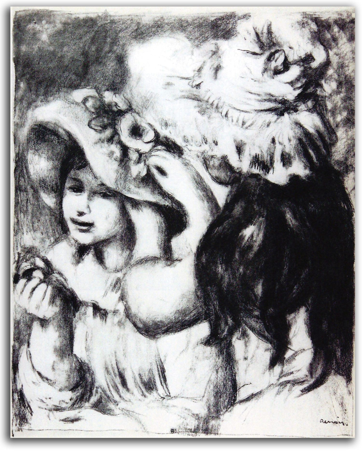
RENOIR
The Hatpin (drawn 1894)
lithograph [Plate Signed]
Authorized edition of 1952
Printed by Mourlot
Collection: CSUEB. Gift of IAD
Published in GLOBAL VISION, Part 1, 2006
NOTE: Renoir did not make prints until late in life, after his fingers became crippled by arthritis. Not all of his prints are of high quality, however ‘The Hatpin’ is considered a masterpiece and his best work as a printmaker. This impression is not from the first edition, printed by Vollard a century ago, but from the last estate-authorized edition in 1952 by Mourlot, the famous lithographic printer in postwar France. This impression is from the first stone for a multi-colored lithograph. This lithograph is a 1952 edition that was authorized.
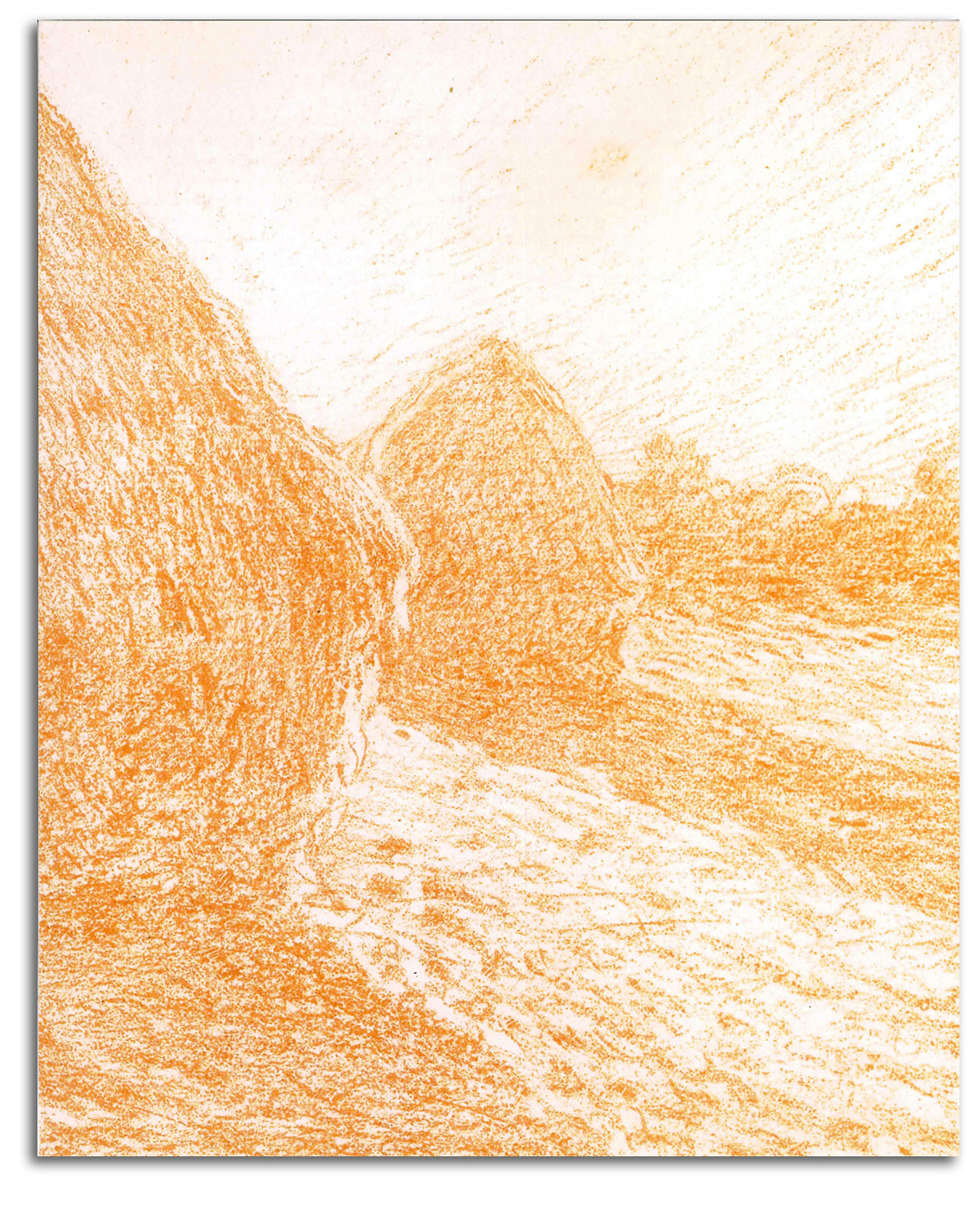
MONET (after)
Grainstacks, Last Sunrays (painted c1894)
lithograph from 20 LITHOGRAPHIES D’APRES CLAUDE MONET
Printed by Thornley, 1894
——————————
Facsimile lithograph in THE UNKNOWN MONET by Ganz & Kendall, 2007
Collection: FLG
NOTE: There is a belief that Monet did not make prints, but that is not entirely true. It is correct to say that he never became involved in direct printmaking because Monet’s attitude toward printmaking was ambivalent. However, in his early days of mid 1860s, when he was anxious for publicity, he made line drawings for reproduction. That was a kind of printmaking. More importantly, in the 1890s he decided to collaborate with a very skillful British lithographer named William Thornley on a number of print projects. Best known is a portfolio based on a set of 20 paintings selected as a kind of mini-retrospective of the last decade. With help from photography, Thornley produced 20 transfer color lithographs (each printed from a number of stones) in a portfolio called 20 LITHOGRAPHIES D’APRES CLAUDE MONET (1894). Monet was responding to the new vogue for color lithography. With a new level of visual quality being available, Monet was happy to be able to offer something to middle class collectors who could not afford his paintings. The prints are lovely. Monet was so pleased with this portfolio that he put his signature on all 25 sets, along with the signature of Thornley.
However, the portfolio did not sell well. Many years would go by before collectors could leave the idea that a reproductive print (a print made from an existing painting or drawing) could be considered an original work of art – depending on the intension of the artist. That psychological breakthrough did not happen until the Postmodern prints of Rauschenberg and Warhol. These Monet prints now sell for many thousands of dollars apiece.
MONET (after)
Water Lillies (painted c1914-17)
{acquired at the recommendation of FLG}
Poster editioned by FAMSF, 1974. (editor/publisher: FLG)
Collection: FLG
NOTE: Of all the subjects that Monet painted, none has been loved by more people than his water lilies. This particular painting is widely considered one of his greatest water lily paintings. This painting has been chosen to appear on the cover of any number of Monet books, including the most important of all scholarly books on Monet – the four-volume, boxed, catalogue raisonné of George Wildenstein. Outside the scholarly world, a poster of this painting has been seen on the walls of the “Golden Girls” TV show for decades. The remarkable aesthetic character of this painting is such that it is the most visited work at the Legion of Honor museum in San Francisco.
When I was Chief Curator of San Francisco’s California Palace of the Legion of Honor museum in the 1970s, it was was an entirely French museum – the only such museum in the United States at the time. [For a short history of the CPLH museum CLICK HERE]. Part of the reason I was hired for that position was because of my special knowledge of and love for French art.
Our acquisitions policy at the time was to represent French art from the Middle Ages to the end of the 19th century. We had an agreement with SFMOMA that they would take it from there, starting with Matisse.
I knew I wanted to end the museum’s suite of galleries with a great Monet, but which kind of Monet? My preference was for water lilies, because I consider them to be his greatest works. How to go about looking? I devised the following strategy. Every time I went to New York, London, or Paris (once or twice a year) I would look at every Monet that was for sale. If I encountered a painting of interest, I would go as quickly as possible to the Musée de l’Orangerie in Paris – the so-called “Cathedral of Impressionism” in a special building not far from the Louvre. This unique museum of water lily murals in a pair of oval galleries that Monet had created in his final years, this unique envelopment of his finest work, was my bench mark. Only if a possible purchase could hold its own in comparison with the spirit of the murals of the Orangerie would I give that painting further consideration.
I looked for years. Little on the market came close, except for a handful of fine works offered to me by Danial Wildenstein and Katia Granoff. Wildenstein (at my request) also introduced me to Florance Gould who was said to be the richest woman in the world. She kindly agreed to lend us some of her 19th century French masterpieces for the 50th Anniversary of the CPLH. They came to the opening together, along with both of his sons. Katia and I briefly considered co-creating a Monet exhibition for the 50th Anniversary, an exhibition to which I gave the working title of “The Music of Silence.”
Even a surprising percentage of the water lilies hanging in major museums did not hold up too well to the bench mark – except of course at the Musée Marmottan (which houses the world’s largest collection of Monet’s paintings – a gift from Monet’s second son Michel.)
Finally, after five years of searching, I found this incredible painting at the New York gallery of Spencer Sammuals. It was a dream come true. The price was higher than anything the trustees had ever spent, but the painting sold itself. Its presentation in San Francisco was timed to coincide with the 50th Anniversary celebrations of the museum in 1974.
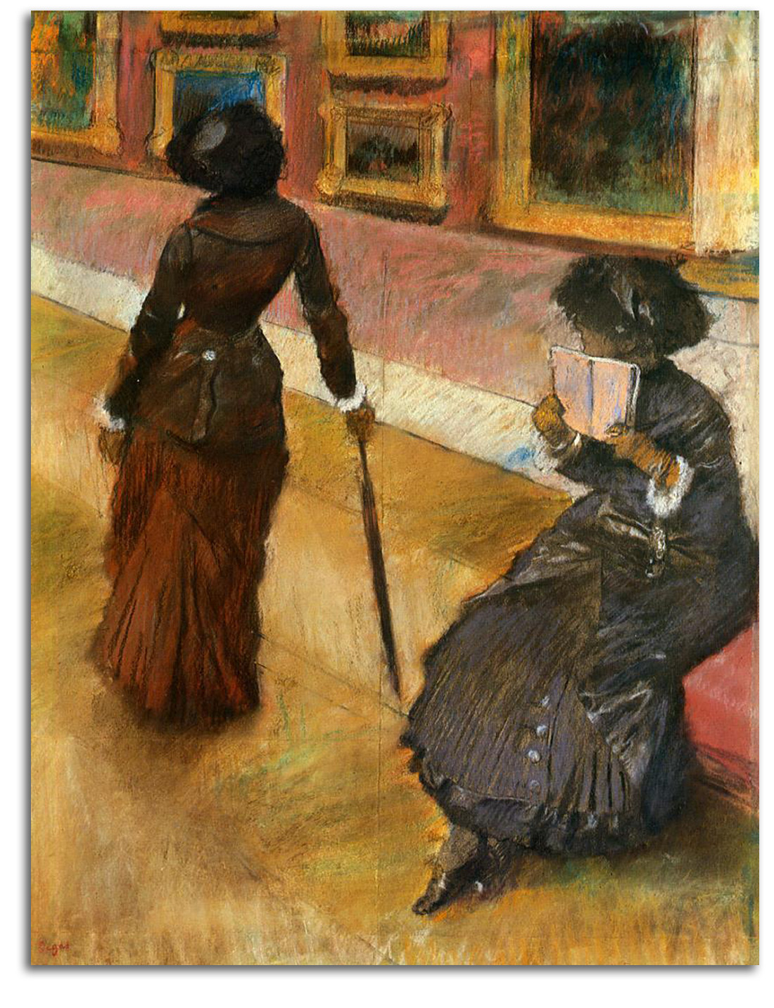
DEGAS (after)
Mary Cassatt in the Louvre, Paintings (etched 1897)
Etching, aquatint, & drypoint
(20th century replica lithograph)
Collection: FLG
NOTE: Edgar Degas was not a happy man, but he was an extremely versatile artist. In the words of one of my favorite professors, Hyatt Mayor (Curator of Prints at New York’s Metropolitan Museum of Art): “Degas explored more media than any artist between Durer and Picasso.” The media he mastered included painting, drawing, pastel, sculpture, etching, lithography, monotype, and photography. [For the first exhibition catalogue of Degas’ work as a photographer, which I helped to develop, CLICK HERE]. This image is of his friend Mary Cassatt at the Louvre. Both Degas and Cassatt exhibited with the core Impressionists, but neither of them ever abandoned all of the corporeal Realism in which they were trained. In short, Degas worked on the edges of Impressionism.
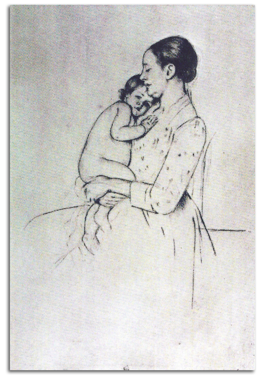
CASSATT
Mother & Child (printed c1894)
Replica lithograph from an etching, 1920s
Collection: FLG
Published in GLOBAL VISION, Part 1, 2006
NOTE: She exhibited with the Impressionists in Paris (and was the only American woman to do so), but much of her style was grounded in the Impressionist Realism that was practiced by her good friend Degas. This etching is typical of her semi-Realist style.
EUROPEAN MASTERS – 19TH CENTURY – Postimpressionism
POSTIMPRESSIONISM – The First Generation
Postimpressionism is a term that refers to a cluster of Early Modern styles that developed over three “generations,” each “generation” dated by the decades in which the key artists reached maturity. The term was coined by a critic named Roger Fry in 1910. He focused on Cézanne, Gauguin, and van Gogh, and extended the concept to Matisse. It was a very perceptive term because it separated these artists from the Impressionists at a time when they were all being considered together as one radical style. It is not a very good term from a technical point of view because it merely indicates chronology and provides no information that is descriptive of the style or styles (which is what good arthistorical terms do). But the term has been around for so long that we are stuck with it. The overall timetable is clear:
1) 1st Generation 1880s: Cézanne, Gauguin, van Gogh
2) 2nd Generation 1890s: Lautrec, Bonnard, Munch
3) 3rd Generation 1900s: Fauves & Expressionists
There is a wide variety of individual styles within Postimpressionism, and many books have attempted to find common features, usually without much success. Indeed, there probably has been more debate among art historians about the definiton of this term than there has been about any other term in recent history, except Postmodernism.
After studying the subject for 50 years, I have located a set of characteristics that collectively characterize the general features of all three generations of Postimpressionsts: 1) figures are more symbolic than naturalistic; 2) colors are more symbolic than naturalistic; 3) there is a flattening of the picture-plane – a bringing together of the background and the foreground; 4) the primary focus is on the expression of internal emotional states rather than external visible realities; and 5) the character of these emotions often were related to a questing for the Transcendent.
Most Postimpressionists had lost interest in traditional religion, but were conscious that they were engaged in a secular search for the sacred. As van Gogh remarked: “We are all traveling toward infinity.”
Postimpressionism was a fundemental transformation in the very purpose of art. The entire Renaissance tradition of art was being overturned, and the foundations of Modern art were being established. The whole of the Realist-Impressionist tradition was not overturned all at once. Cézanne, Gauguin, and van Gogh all worked in an Impressionist style before they moved on. In the process of moving on, they maintained some of the main features of the Realist-Impressionist tradition. Most of the focus remained on everyday life – actual people, objects, landscapes – not angels or goddesses as a rule. (Gauguin liked to break this rule, and indeed he liked to break many rules.)
Most of the figures still respond to gravity. Most of the compositional structures are still delineated by the general elements of linear perspective, but it is often modified for a formal purpose.
Most of the figures still look like human beings, but their shapes are changed (often dramatically) to suggest an emotional reality (rather than a material reality). And natural shapes also are modified for a formal purpose, often so there will be an “echoing” of forms, as when the back of a horse echos the curve of the mountain behind it.
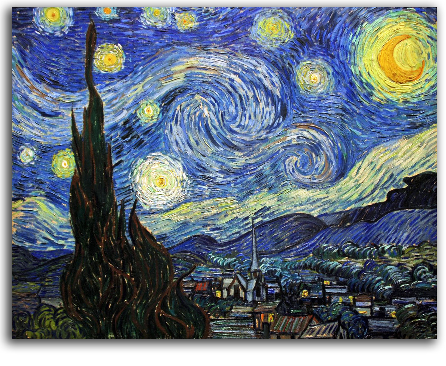
VAN GOGH
Starry Night, 1889
Colors are often particularly radical. They very often have little to do with the natural world, but are selected to express an emotional truth (rather than a physical fact). This was a very difficult change for many artists to undergo. For example, van Gogh refused the whole idea for some time. Finally Gauguin convinced him of the expressive value of this “new truth” about imaginative color, and the rest is history. What van Gogh then did with the emotional power of color has never been surpassed – equaled perhaps but never surpassed.
In short, the radically new conviction among the Postimpressionists is that internal realities are just as important as external realities, in other words, that feeling is at least as important as thought. This was a revolutionary break from the materialistic assumptions that had dominated (and still dominate) most of the industrialized, urbanized world, and its traditional, comfortable, story-telling, naturalistic art.
Consider this statement by Cézanne: “Right now a moment of time is passing. We must become that moment.” If those words were coming from an Impressionist, the reference would be to what is seen in a moment. However, as those words are coming from a Postimpressionist, the reference is to what is felt in a moment.
The traditional concept of a painting or a print being a “window” through which to see the so-called “real world” was abandoned by the Postimpressionists. Elements of the “real world” are simply used as points of departure for composing a semi-abstract image that reflects a psychological feeling, or what Mallarmé (following Leonardo) called “a state of the soul.”
The Postimpressionists were not widely known during their lifetimes. Van Gogh sold one painting. Cézanne and Gauguin spent much of lives in self-imposed exile, far from the marketplace of art. The Establishment was just beginning to accept (reluctantly) the innovations of the Impressionists at the end of the century. What the Establishment knew about the Postimpressionists was “too much.”
Nevertheless, in the mind-set of this new kind of form-making, and the spiritual purpose behind it, is the beginning of Modernism. There were many Postimpressionists, of course. In this concise survey, I am concentrating on just a few of those I consider the most important members of each of the three generations, just as I have done with Impressionism and all the other isms.
Like the Impressionists, the Postimpressionists did not usually start to edition prints until the 1890s. And like the Impressionists, the quality of their prints varies considerably.
1) 1st Generation 1880s: Cézanne, Gauguin, van Gogh
CEZANNE (after)
Pine Trees & Rocks (painted c1902-06)
Limited edition collotype from a watercolor
CEZANNE AQUARELLES by Georges, 1926
Collection: CSUEB, Gift of IAD
Ex. Collection: Earle Loran, Berkeley, who reproduced it in his famous book on Cézanne [CEZANNE’S COMPOSITION, 1970] in place of the lost original watercolor. In other words, this print is as close to the original watercolor painting as anything can ever be.
Published in GLOBAL VISION, Part 1, 2006
NOTE: Without a title, it would be difficult to know this image is part of a natural landscape. It is, and its precise location has been found and photographed. However, what we see is a feeling, a feeling as abstract and as softly rich as chamber music. Cézanne tells us: “A work that did not begin in emotion is not art.”
It is because he transformed the very purpose of making paintings and prints, and did it with such brilliance, that he has been so widely respected. Many (including Matisse and Picasso) have called Cézanne the “Father of Modern Art.”
Paul Cézanne’s primary achievement was moving beyond the traditional Renaissance idea of a painting or a print as a “reproduction” of visible reality (a window through which to view the world around us), and replacing that idea with the revolutionary idea of a picture as primarily an abstract composition. He used realistic elements merely as points of departure for arrangements of form and color and light that are primarily as abstract as a musical composition.
He began as a passionate Romantic, moved into Impressionism, and then into Postimpressionism. He was inspired by the firm formality of Poussin, and by the strict outlines of Plato’s solid geometry. However, what he built out of those influences transcends his sources.
Noting there are no lines in nature, he reduced the role of drawing. Instead of using drawing to construct the illusion of three-dimensional space in an architectural manner, he virtually eliminated the Renaissance tradition of rationalizing space by means of linear perspective. Instead, he constructed a new kind of pictorial space with blocks of flat colors knitted together by dark fluid lines that vibrate between the edges of the color-forms and the pulsating whiteness of unpainted infinity.
For generations, Formalist critics and historians have spoken about Cézanne from nothing other than a formal point of view. They have chosen to overlook what he said about why he made these forms. Many younger critics and historians have not been hypnotized by Formalist propaganda. I am happy to be part of this generation. We think art history involves both form and content.
Many feel Cézanne’s paintings are not only formal unifications of great visual power but also as symbols of the Transcendent, especially since the unpainted parts of the canvas seem to symbolize the infinite luminosity of the divine. This is not a baseless projection. He was raised Catholic and in 1890 became a committed Catholic – making him one of the very few Modernists who actually was “religious.” He attended church regularly. He made statements in conversations and in his letters that are entirely congruent with metaphysical interpretations of his work.
A number of Cézanne “conversations” survive. Some of the quotations may be inflated with the enthusiastic rhetoric of poet-friends who published these conversations. After all, by the end of his life, Cézanne had become almost a god to a number of young painters and poets.
At Columbia, I argued these points with one of my professors who is an authority on the matter, Theodore Reff. There certainly is a good deal of room for debate, and Reff and I did not always agree on which words are really those of Cézanne or close to Cézanne. I encourage you to read as much as you can and decide for yourself.
As I look back over the historical evidence as a whole (what he actually wrote and what he is said to have said), I find a core of consistency to the wording of Cézanne’s thoughts about art and spirituality. For example:
When I judge art, I take my painting and put it next to a God-made object like a tree or a flower. If it clashes, it is not art.
What I am trying to explain is more mysterious. It is entwined in the very roots of being.
I feel colored by the nuances of infinity.
Nature…as it is felt…is divine.
Art must provide the flavour of…eternity.
Try to understand. If my canvas is saturated with that vague cosmic religiosity that stirs me, that makes me better, and it will touch others in an area of their sensitivity even they are not aware of.
Art is a religion. Its purpose is the elevation of thought.
Cézanne’s watercolor paintings are often as beautiful as his oil paintings, and sometimes even more luminous. In part, this is because it is in his watercolors that he almost always gives equal space to the light of color and to the light of emptiness. Here, inside this combination, is the dance of eternity and time. [WRAP: a Watercolor]
Neither my words nor anyone’s words can take you to the experience of this dance. Words can only point the way. You have to go there yourself.

GAUGUIN
Portrait of Mallarmé (etched 1891)
Etching, engraving, & aquatint [Plate Signed]
Printed 1919
Collection: FLG
NOTE: In this haunting portrait of his friend Mallarmé, one sees the elfin ear of one whose deepest love was for the Orphic World of ancient Greece, before the meaning of primal mythology was lost, crushed by urban rationality, when Orpheus and other poet-musicians of the shamanic tradition still sang the Truth. We also see the raven from Mallarmé’s translation of Poe’s most famous poem that features the mysterious raven. We can almost hear the great dark bird whispering “NEVERMORE.”
GAUGUIN
Image of Buddha
woodcut print, 1898
Paul Gauguin started as a part-time Impressionist then quit his day job as a stockbroker to become a full-time Postimpressionist. In his search for the Transcendent in a Godless world, he (like his friend van Gogh) was strongly attracted to Buddhism. They were among the first artists in Europe to be so attracted. Gauguin pictured Buddha from time to time, and painted a portrait of a friend with the title of “Nirvana.”
Indicative of how far Gauguin was into the study of Buddhist doctrine is a letter he wrote to Bernard shortly after the death of van Gogh:
To die at this moment was a great happiness for him; it respresents the righteous end of his suffering and if he returns in another life he will carry the fruits of his good conduct in this world (according to the laws of Buddha).
Gauguin also was strongly attracted to the ideas of his friend Mallarmé who proposed to painters and poets that they suggest rather than describe, and that each vision rendered should be a poetic vision whether visual or verbal. In the late 1880s, Gauguin worked on a concept he called Synthetism. What he was trying to synthesize was the old tradition of visualizing natural forms with the modern Mallarméan concept of symbolic figures and symbolic colors in an abstract harmony that is suggestive of emotional states rather than descriptive of external realities. This heroic attempt to unify the old and the new was at the core of the work of all three generations of Postimpressionists, and thus of Modernism as a whole.
Gauguin decided he wanted to leave urban life, saying: “Civilization makes you sick.” In 1891, after a sendoff dinner hosted by Mallarmé, he sailed to Tahiti in the hopes of finding a life that was less corrupt, more pure, in Polynesia. He did not find all that he was looking for – after all Tahiti had become a French colony. But he found a good deal of the tribal world was still alive. It was there that he painted most of his greatest paintings. The best-known is “Where do we come from? What are we? Where are we going?” (1897-98). What does all this mean?
GAUGUIN
Where Do We Come From?, 1897/98
Much has been written in an effort to explain this huge mysterious painting. In a letter of 1899 from Tahiti, Gauguin suggested people were wasting their time trying to understand this painting and its title with the rational side of the mind. He wrote:
… my dream is intangible, it comprises no allegory; as Mallarmé said, “It is a musical poem, it needs no libretto.” Consequently the essence of a work, unsubstantial and out of reach, consists precisely of that which is not expressed; it flows by implication from the lines…without words; it is not a material structure.
Standing before one of my pictures of Tahiti, Mallarmé also remarked: “It is amazing that one can put so much mystery into so much brilliance.”
Like most Postimpressionists, Gauguin was not a religious person, but part of him wanted to be. He painted quite a few Christian themes, and wrote a good deal about religion, particularly in his book L’ESPRIT MODERNE ET LE CATHOLICISME (1897-98). But he was looking at faith from the outside not the inside. Nevertheless, Gauguin was ultimately after the Light of the Transcendent that radiates through matter, though thought, from the other side of form. His ego was so large it got in the way of being able to see the realm where all is light, but at least he had a glimpse, a taste that made him very thirsty for more. Here is one of the ways he expressed it:
Oh mysterious world of all light, thou hast made a light shine within me, and I have grown in admiration of thy primordial beauty, which is the immemorial youth of nature.
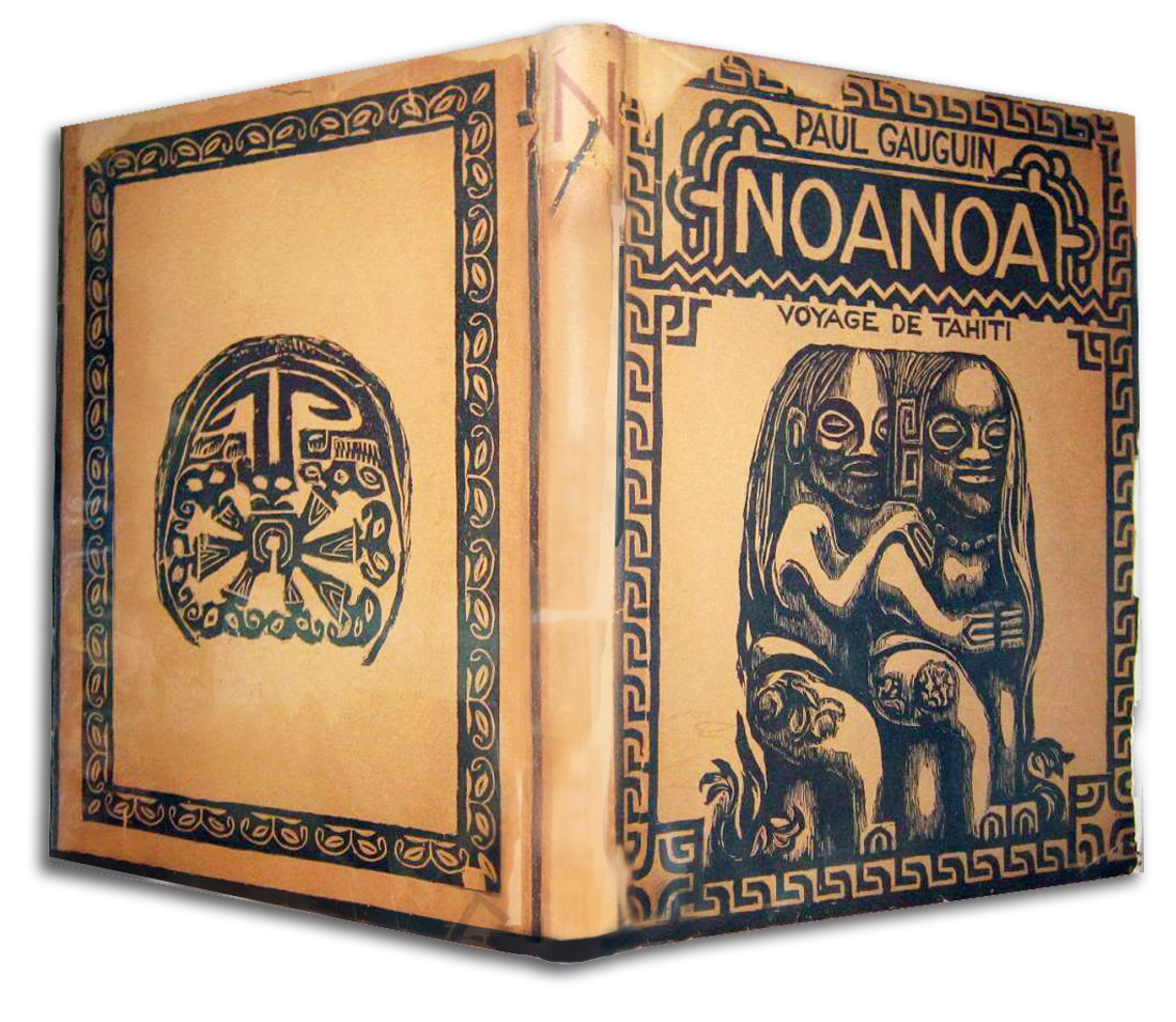
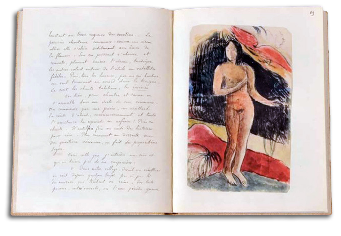
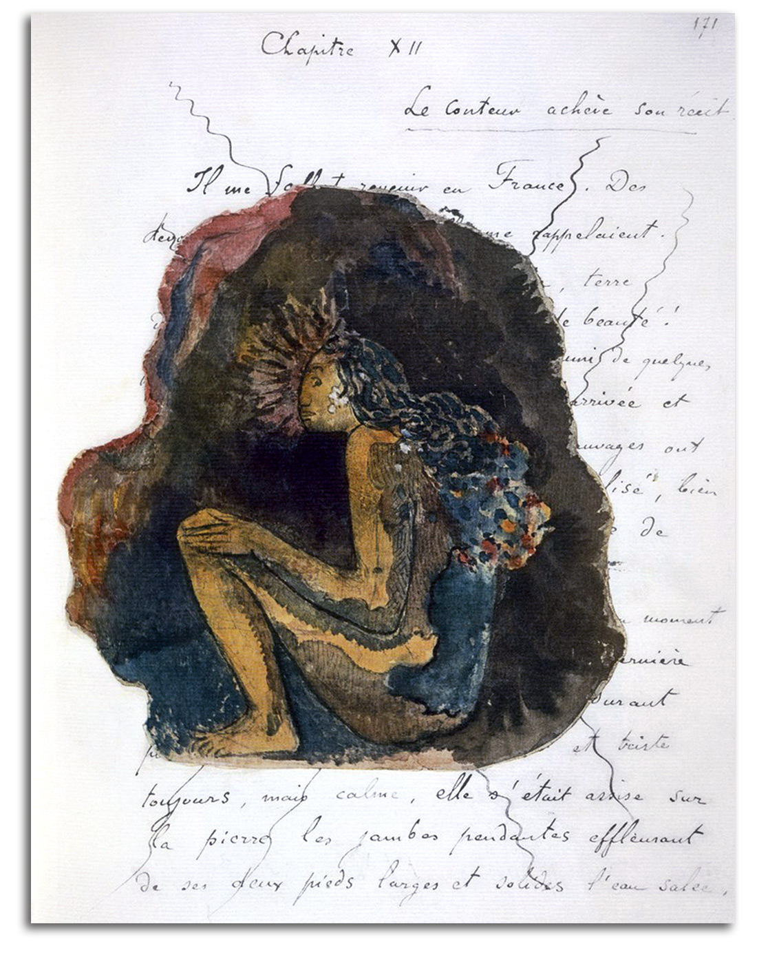
GAUGUIN (after)
NOA NOA: VOYAGE DE TAHITI
First edition by Piper, Munich, 1926
Collection: National Gallery of Australia, Canberra
Gift of FLG, 1987
NOTE: For those who collect books illustrated by great artists, it is a sad fact that (unless we count the letters of van Gogh in a posthumous edition illustrated with his drawings) only one illustrated book was generated by a member of the First Generation of Postimpressionists. That was Gauguin’s NOA NOA {FRAGRANCE}. Gauguin probably was inspired to make an illustrated book (and in a large format) by the edition of Poe’s RAVEN that was created by Manet and Mallarmé in 1875 [CLICK HERE].
Gauguin imagined being the author, with a text written in his own hand, and a rich collage of actual woodcuts, along with reproductions of drawings and paintings from his Tahitian voyage. He enthusiastically gathered visual and verbal material for this album in Tahiti, much of it during 1891. The book opens with a quote from Baudelaire: “Tell me what you have seen?” In the text, Gauguin speaks of the slow, sweet rhythms of Polynesian life. Then he reports on Polynesian mythology for which he had considerable respect.
The 10 woodcuts he made to illustrate NOA NOA visualize many of these myths and legends. The suite is permeated by rich abstract rhythms, strange symbolic colors, and a mysterious spiritual luminosity. These prints mark the first time a Western artist worked at length under the influence of tribal art. His example would inspire many early Modernists to explore tribal art, art that became a profound influence on the development of Modernism. The book ends with Gauguin returning to France.
When he actually did return to Paris in 1893 he looked for ways to get his work exhibited and published, without much success. He returned to Polynesia where he died in 1903. The text alone (edited by a friend) was first published in LA REVUE BLANCHE in 1897. Of course, the text is only half of the experience. It was not until 1926 that the world saw in the Munich volume the whole of Gauguin’s remarkable viseoliterary dream.
The original manuscript is in the Louvre. This volume published by Piper was the first printed edition of the manuscript. The size of the limited edition was 300. As my friend Riva Castleman (Curator of Prints & Books at MoMA) observed in her book A CENTURY OF ARTISTS BOOKS (1994), this lavish Munich edition, prepared with great care, was “a remarkable event in book publishing.”
Shortly after his death, Gauguin was given a major retrospective at the Salon d’Automne in Paris in 1903, and a larger one in 1906. These exhibitions were powerful experiences for many young artists in Paris who had known only some of his work. Picasso was particularly interested in what he saw. He admired Gauguin greatly. Picasso sometimes even signed himself “Paul” in Gauguin’s honor. There is reason to believe Gauguin’s combination of sensuality and primitivism led directly to Picasso painting “Demoiselles d’Avignon” in 1907.
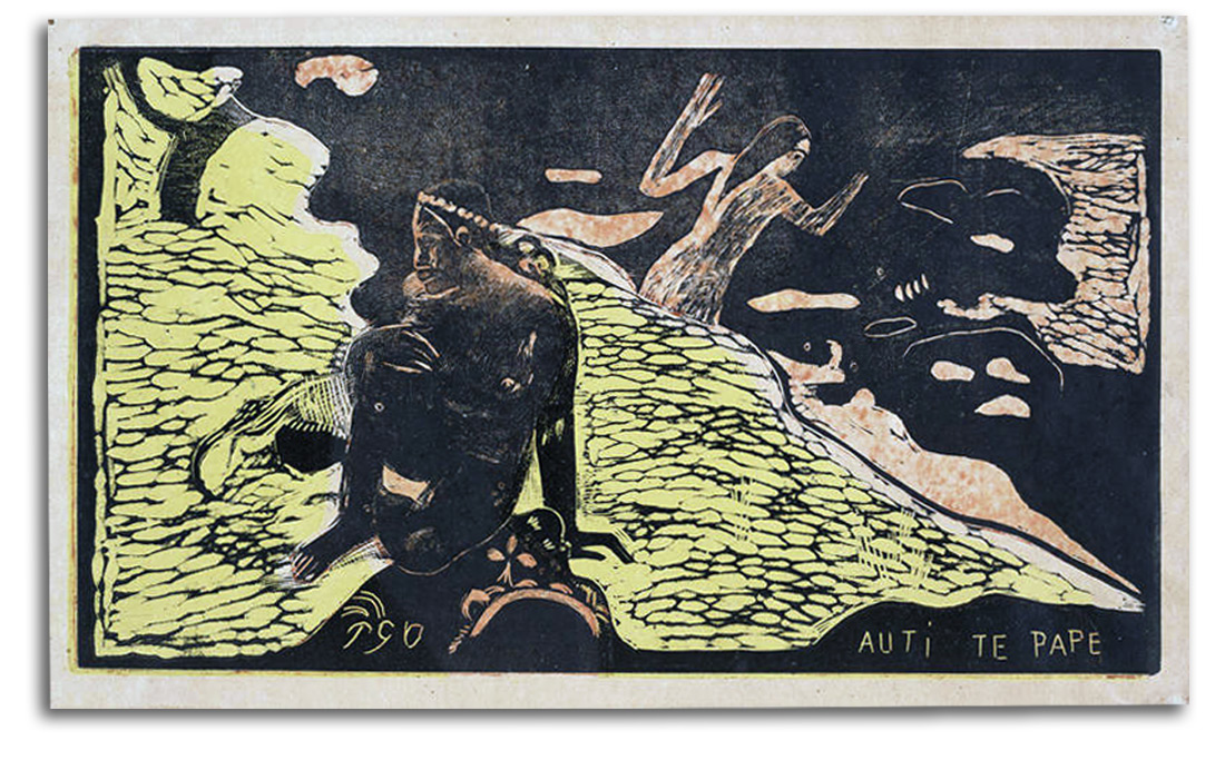
GAUGUIN (after)
Auti te Pape (Women by the River) Engraved c1893
Hand-colored Woodcut
2nd edition by Librarie de France, 1925
Collection: FLG on loan to IAD
Published in GLOBAL VISION, Part 1, 2006
NOTE: This is one of the woodcuts he made to illustrate NOA NOA. He cut the blocks and pulled a few proofs, but did not print editions. The first edition was hand-printed by his son Polo. This impression is from the 2nd edition of 1925. The figures show how much he was incorporating tribal art. The symbolic (non-naturalistic) color is typical of Postimpressionism as a whole.
The entire suite of NOA NOA woodcuts is permeated by rich abstract rhythms and a mysterious spiritual light. Gauguin’s prints are by far the most important group of prints made by a member of the First Generation of Postimpressionists. The importance of his “discovery” of tribal art, as a way of freeing himself from the urban art of the past, would be difficult to exaggerate. Tribal art had been looked down on as “mere artifacts” without true beauty. Gauguin looked with new eyes and saw true beauty. It was his work and his attitude that turned the eyes of many young Modernists toward tribal art, including the eyes of Matisse and Picasso and the Expressionists. Tribal art eventually became the most important single “outside” influence on the development of Modern art during the first half of the 20th century.
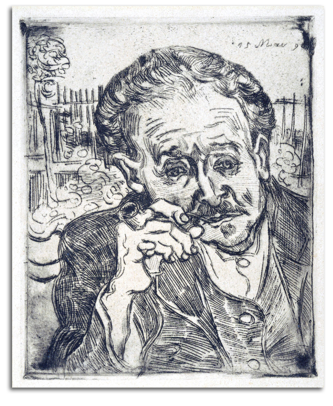
VAN GOGH
Portrait of Dr. Gachet, 1890
Original Etching
Collection: Norton Simon Museum, Pasadena
Published in Lanier Graham, VINCENT VAN GOGH:
PAINTER, PRINTMAKER, COLLECTOR, 1990
NOTE: Vincent van Gogh loved prints. He collected many prints (European and Japanese), and he made several lithographs during his early period. This is the only etching van Gogh ever made. Van Gogh told his brother that he was grateful for the medical help Dr. Gachet was trying to provide, but that he seemed to Vincent to be as troubled as he was. Many have looked at this portrait and seen not only a doctor but also the anxious, deeply troubled face of all of modern humanity (a face that I also see crying out from Munch’s famous man on the bridge, a face which was painted about the same time as this one).
What is behind the look on Dr. Gachet’s troubled face? Constant doubt and endless anxiety are modern plagues caused by disconnection from a tribe, and disaffiliation with traditional spirituality. Van Gogh, like most Modern artists, had little interest in the kind of traditional religion that had held Western society together for centuries. Van Gogh’s early interest in his father’s Christianity evaporated after he abandoned his early dream of being a preacher.
However, van Gogh maintained a deep devotion to spiritual values as he moved from his dark early paintings and prints in Holland, to the bright Impressionist colors he discovered in Paris, and finally during the profound Postimpressionism of his final years. Symbolizing ideas became increasingly important to him. He put a bright luminosity around the head of his mother in his portrait of her because he wanted it to feel like a traditional Christian halo. He was fascinated by what he regarded as the spiritual values of Japan. Projecting his psychology into that idealized world, he painted himself as a Buddhist monk. {WRAP: G as a Monk}
When I started my graduate work at Columbia, it was my great good fortune to have as my advisor, Meyer Schapiro, the most widely respected historian of Modern art in the United States. Attending his lectures on Modern art was very stimulating. Talking with him privately in his office was even more stimulating. We could go deeply into a subject for as long as we wished. One of our special topics was van Gogh.
In his book VAN GOGH (1950), one of his many legendary publications (a book that is still in print), Schapiro said this: “His career as an artist is a high religious-moral drama… .” Schapiro also described the art of van Gogh as: “…the first example of a truly personal art, art as a deeply lived means of spiritual deliverance or transformation of the self… .”
In our first conversation in the Fall of 1963, I told Schapiro what Motherwell had said to me the year before: “Abstract art is a form of mysticism.” Schapiro smiled and said: “Of course!” I knew I had come to the right graduate school!
I then added that Motherwell’s sentence is why I decided to become an art historian and a curator. For as long as I could remember my central interests had been both art and spirituality. I was fascinated by abstract art, especially Abstract Expressionism, but never knew why. Motherwell’s statement blew my mind and then glued it back together. All of a sudden, it became clear that Modern art, from van Gogh and Gauguin to Pollock and Motherwell, had always been a quest for self-transformation, a quest for the Transcendent, in a world where (to them) God was gone.
I had grown up in a family devoted to public service. Like van Gogh, I had considered becoming a minister, but was looking for another form of public service. I knew it would be in the area of cultural affairs, but what exactly? I was in my junior year at the School of International Service at American University in Washington, D.C., considering UNESCO, the Foreign Service, etc. But nothing felt quite right.
Motherwell had come to A.U. to give a talk. At the end of my conversation with Motherwell that day, I felt it would be very useful for more of contemporary society to realize that Modern art is not merely interesting. Modern art can be a way toward spiritual wholeness, and (in that moment) I knew this is what I wanted to do. The road of my life stretched out before me. I saw myself as a professor and a curator of Modern Art. The next day, I signed up for a second major in Art History and began looking at graduate schools. I ended up selecting Columbia University in New York City, largely because Meyer Schapiro was teaching there, and his books stirred by soul.
Professor Schapiro guided my course of study so that I could trace the history of art not as mere forms but as a very important way humanity in the Western World has quested for the Transcendent from the Medieval era (his first speciality) to the Modern era (his second specialty). The first topic we considered for my master’s thesis was some aspect of “Metaphysical Symbolism from Alchemy to Abstract Expressionism,” but that, he said, was much too broad. “Focus on a single aspect you can deal with in a useful way. For example, the Androgyne, or the sun-moon unity that you have decided to name the Soluna.”
The second topic we discussed was “How Modernism replaced religion in the Postimpressionism of van Gogh and Gauguin.” Again too broad, he said, “…but worthwhile. This really is what Modernism is about, after all, as you have discovered.” So, explore the topic, he continued, but focus on a specific area of the general topic to which you can contribute something new. He ended that particular conversation with these words: “Along the way, consider what happened to van Gogh when he lost interest in what most people call God. He decided to speak of Love’s presence as God, or what he said was ‘as good as God’.”
With that idea spinning in my mind, I plunged into more research on Postimpressionism and the birth of Modern Art as a new kind of spirituality. At the end of that first year at Columbia (1963-64), my mentor was taken from me. Schapiro told me he was being promoted to the position of University Professor, and would no longer be teaching Art History in the usual way. He told me I would need a new advisor. I was sad. Because I had already done so much work on Nicholas Lanier and the collecting of Italian Art in Renaissance England, he recommended I complete that biography under Professor Wittkower for my M.A. thesis and then work on Postimpressionism for my Ph.D. I followed Schapiro’s advice, and moved under the wonderful wing of Wittkower, but not until Schapiro and I had some memorable conversations on the nature of Alchemical symbolism, and the Kabbalah, and how van Gogh continued to use religious symbolism in his non-religious art.
Once I became a museum curator, it was my privilege to install two van Gogh exhibitions. The first was in San Francisco at the de Young Museum (December 1970 – January 1971). This exhibition was part of the last world tour of the private collection of van Gogh’s nephew, who was named Vincent after his uncle. He was usually simply called “the engineer.” His collection was by far the largest van Gogh collection in the world. He could have sold it for billions of dollars, but he sold nothing and was planning to donate all of it to the Dutch nation at the end of the world tour. His collection is now the heart of the van Gogh Museum in Amsterdam.
Three things stand out in my memory from that experience: seeing so much of van Gogh’s art all at once was overwhelming; holding several of the canvases in my hands was an experience beyond words; and spending a good deal of quality time with Mr. van Gogh was very special.
We had lunch a number of times. He agreed with Professor Schapiro that “Uncle Vincent” had remained a very spiritual man all his life, not religious in the ordinary sense but deeply spiritual.
LG: How did your uncle think of God?
VvG: As love. God is love. When we love, God is moving through us. When we love well, when we do something well, God is flowing through us smoothly. We do not get in the way of the flowing.
How van Gogh died is vivid testimony to the depth of his spirituality, the depth of his capacity to love. Mr. van Gogh (the nephew) told me his side of the story, which of course his mother had told him. I was too overwhelmed by what he was telling me to make notes at the table, as I usually do during particularly rich conversations. So I do not have many exact quotes to share with you. I could not even write a general recollection that night. My hand would not stop trembling. But the next day, I did write a summary in my journal with a couple of direct quotes. Here is the heart of it:
There was not a great deal of money to go around. Mr. van Gogh’s father (Theo) had been the primary financial support of his brother (Uncle Vincent) for years. But with the arrival of a baby (him) the finances had become very thin indeed. Uncle Vincent had always felt guilty at being a burden on his brother, and felt he could no longer do that under the new circumstances. A choice had to be made, and Uncle Vincent did not want Theo to have to make the choice. It was clearly more important to Uncle Vincent that the available funds support the life of the child. “So Uncle Vincent took away the problem. He killed himself.”
He told me this story while we were having lunch in the round building at the south end of the Golden Gate Bridge. At the end of his story, we both were silent for a long time, looking out over the San Francisco Bay. My mind eventually turned to one of van Gogh’s letters to Theo [Letter #242]:
When one is in a sober mood, how good it is to walk on the barren beach and look at the grayish-green sea with long white streaks in the waves. … I think I see something deeper, more infinite, more eternal than the ocean in the eyes of a little baby.
In 1989 at the Norton Simon Museum in Pasadena, I had the privilege of curating an exhibition that included Mr. Simon’s entire van Gogh collection – seven paintings, a letter, and the etching we have been talking about. On the wall beside this etching of Dr. Gachet I placed a photograph of the very similar painted portrait that van Gogh made of Dr. Gachet – a portrait with a face that van Gogh described in one of his letters as having “…the heartbroken expression of our time.”
Mr. Simon’s van Gogh collection is remarkable, the largest private collection in the world. In the text I explored how van Gogh looked for meaning in various mythologies – Christian, Buddhist, and Pantheistic. [For my catalogue of that exhibition, CLICK HERE.]
Van Gogh and the other Postimpressionists grew up at the beginning of the “Age of Disbelief.” God was fading from view, at least among Modern artists. And much of Modern society is still living inside this “Age of Disbelief.” For the first time in many centuries, young artists were not attracted by the truths of the faith of their fathers. For the first time in living memory, God was gone from the lives of many people – not from all the people certainly, but from many people.
What were these people to do? Human beings cannot live without a mythology they believe in. So van Gogh searched different mythologies. Gauguin searched different mythologies. We as a society are still searching different mythologies.
Mythology is the matrix of meaning. Without the values assigned by a spiritual mythology to various thoughts and actions, a fragmented society has few deeply meaningful values. People simply exist. This psycho-social situation has often been called the Existential Condition, the condition in which many modern people live isolated lives, anxious, and incomplete. It is a condition exacerbated (if not actually caused) by living in cities.
People who live in villages are part of tightly knit communities. The social structure of a community and the psychology of being part of a community are filled with meaning. Over the centuries, especially since the Industrial Revolution, fewer and fewer people have felt this feeling of wholeness.
I suspect there was a turning point in the middle of the 19th century, when Poe was writing and Baudelaire was writing out of a kind of despair, a kind of desperation, at discovering they were all alone with nothing but their own raw consciousness.
The urge to merge with the Transcendent seems to have been as strong as it has always been, but Poe and Baudelaire, and all the early Modern poets and artists who had lost their religion, had nothing to guide them – no priest, no yogi, no shaman. This is the Existential Condition that I see in the face of Dr. Gachet.
What emerged from this general historical condition of alienation among the avant-garde was a secular search for the sacred, and the name of that searching became “Modernism.”
Van Gogh, Gauguin, and the other great Postimpressionists who generated Modern art, may not have attained the Nirvana they were seeking. But they put everything they had into trying, into seeking, knowing it would take everything they had to break through to the Transcendent. What moves so many people today when they visit the art museums of the world is what these seekers left behind as they peeled back the skin of their souls. They left us art of astonishing beauty, visions of a Higher Realm – the profound sight of seeking.
2) 2nd Generation 1890s: Lautrec, Bonnard, Munch
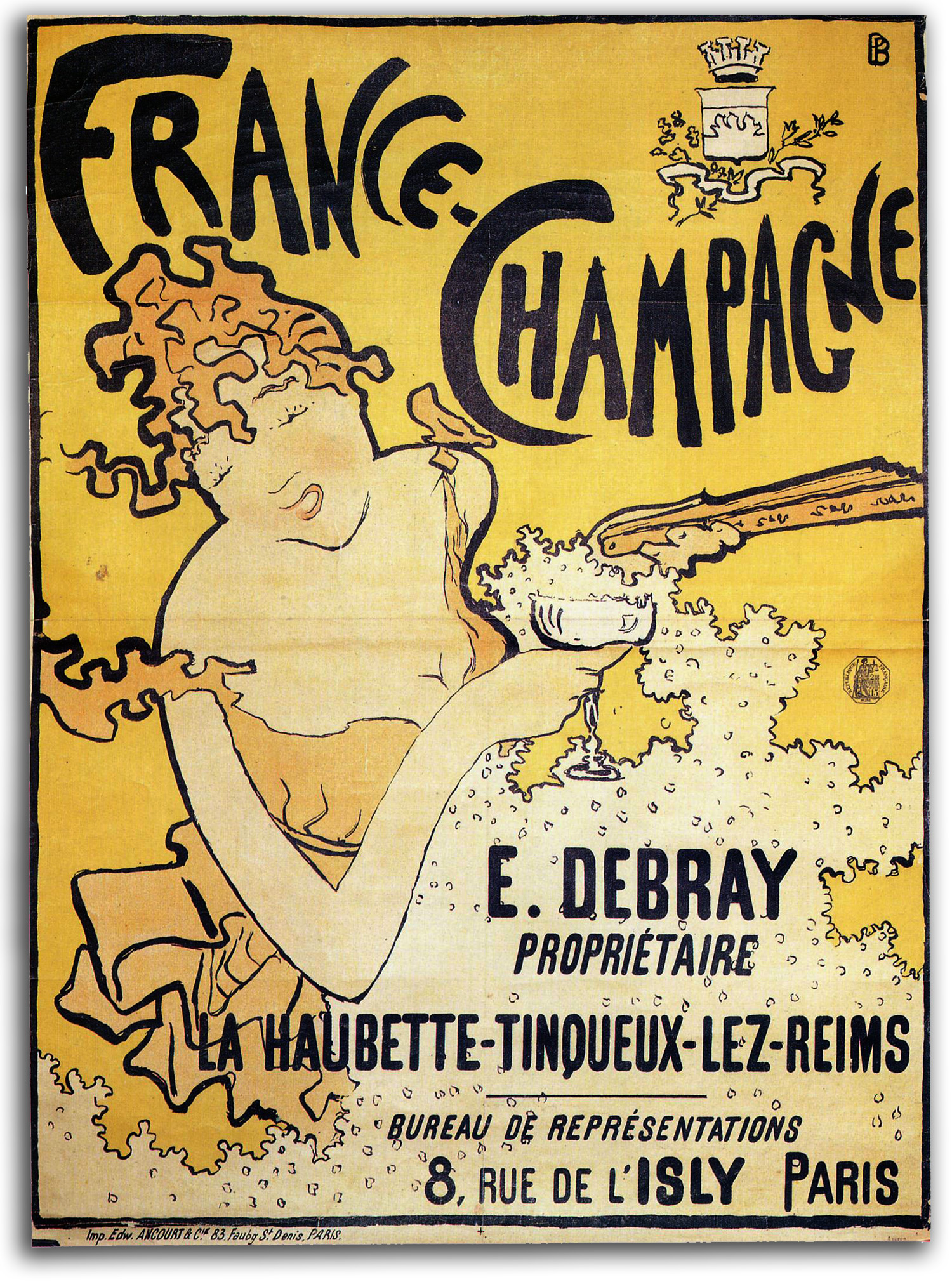
BONNARD (after)
France – Champagne (designed 1891)
Poster, early edition [Plate Signed]
Collection: IAD (2012)
NOTE: In 1889, a young Pierre Bonnard joined a Paris group of other young painters who called themselves the Nabis that in Hebrew means the Prophets. They were hopeful that a better way of being Modern was to be in a group, rather than individuals struggling alone. This group included Vuillard, Sérusier, Denis, Ranson, and others. They met regularly, wore robes, and conducted mystical rituals. Their devotion to the Transcendent was intense. Denis wrote: “Lord, we are only a few young fellows devotees of the Symbol…Mystics! … . May our reign come to pass.” Bonnard exhibited with them until they disbanded in 1900. The Nabis were focused on symbolism and spirituality under the influence of Gauguin’s intensely colorful Postimpressionism, Mallarmé’s philosophy of Symbolism, Redon’s mysticism, and traditions of occult organizations. Bonnard eventually lost interest in groups, but he never lost interest in the core goals of spirituality. As late as 1940, in a letter to Matisse, Bonnard wrote: “I dream of seeking the Absolute.”
The Nabis also liked the flatness and symbolic unmodulated colors of Japanese prints. They also continued the ideals of the Arts & Crafts Movement and Art Nouveau in their desire to bring art and life closer together by making the decorative arts more vital. That spirit went into a range of activities from poster design to furniture. For example, Bonnard made beautiful folding screens as room dividers.
In 1890 Bonnard began to make lithographs. That medium was encouraged by Toulouse-Lautrec whom he met the following year, and with whom he would collaborate on a theatre design in 1896. Bonnard went on to make a total of 10 posters and over 100 other prints. In 1891 his “France-Champagne” poster is a great success, and he exhibited in the first exhibition of “Impressionist and Symbolist Painters.” In 1894 he began designing graphics for LA REVUE BLANCHE. His work as a printmaker continued to flourish when Vollard in 1895 asked Bonnard to start preparing a series of lithographs and illustrated books. He became one of the most gifted colorists of the 20th century, and for many the “last of the Impressionists.” Bonnard actually was a Postimpressionist for most of his career. However, it is true that he was a lifelong friend of Renoir who encouraged Bonnard when he was very young and probably taught him something about melting colors together. And when Bonnard, in his later years, moved to the south of France he did indeed become a landscape painter of very impressionistic scenes.
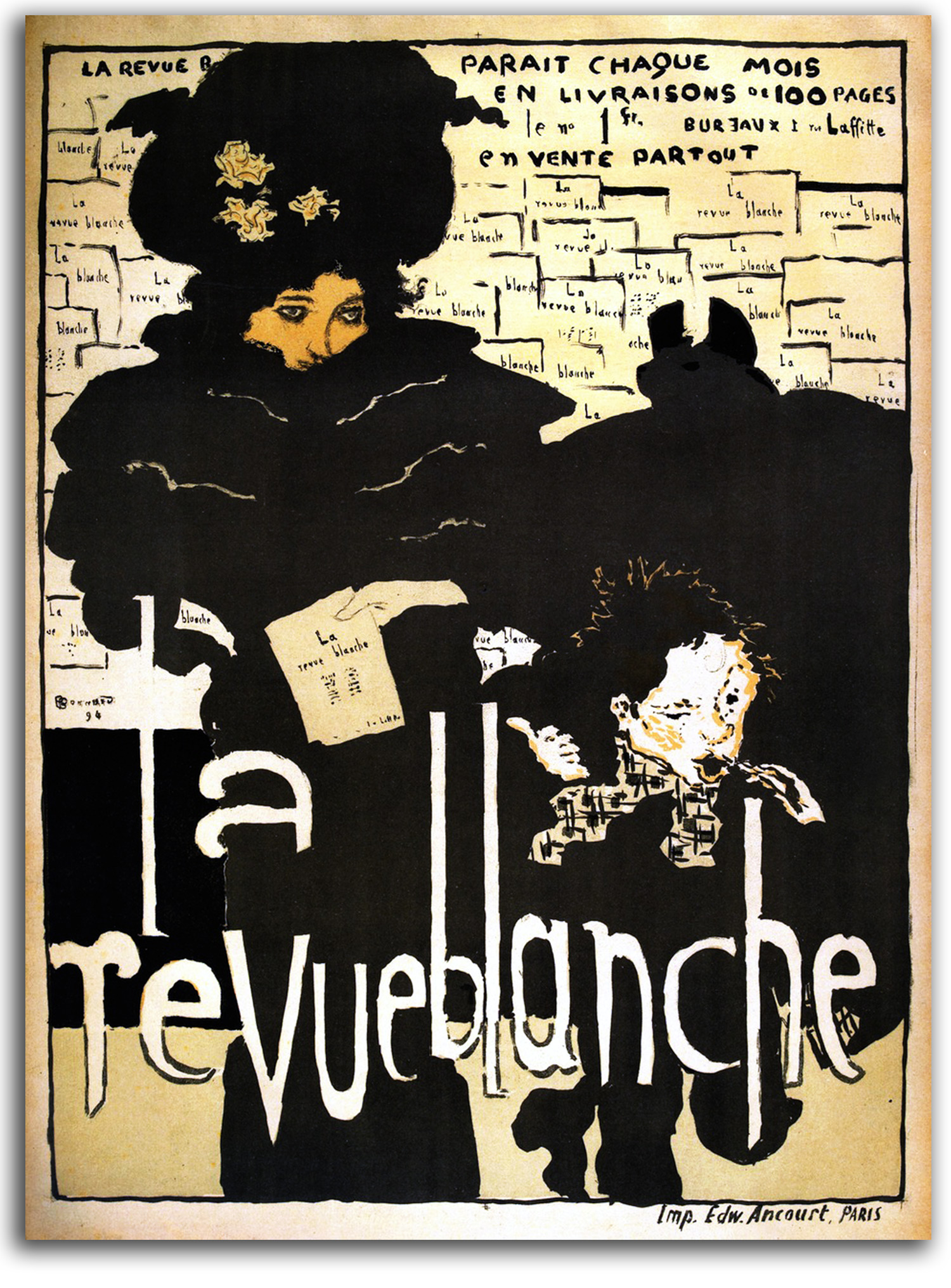
BONNARD (after)
La Revue Blanche (designed 1894)
Poster. Early edition [Plate Signed]
Collection: IAD (2012)
NOTE: LA REVUE BLANCHE (The White Review) was a Paris periodical that started in 1889 and published the work of contemporary writers and artists. It was the first revue to give equal attention to the visual and verbal arts of the avant-garde. Bonnard began doing graphic designs for the Revue in 1894. This poster, with its animated forms and playful spaces, is the best-known example of his work for the Revue. The woman in this poster probably is Misia Natanson who was married to one of the two brothers who owned the Revue. Intelligent and beautiful, she was painted by Renoir, Redon, and Lautrec. Her lively salons included Bonnard, Vuillard, Vallotton, Maillol, Mallarmé, Debussy, Ravel, and later Picasso, Gide, and Cocteau.
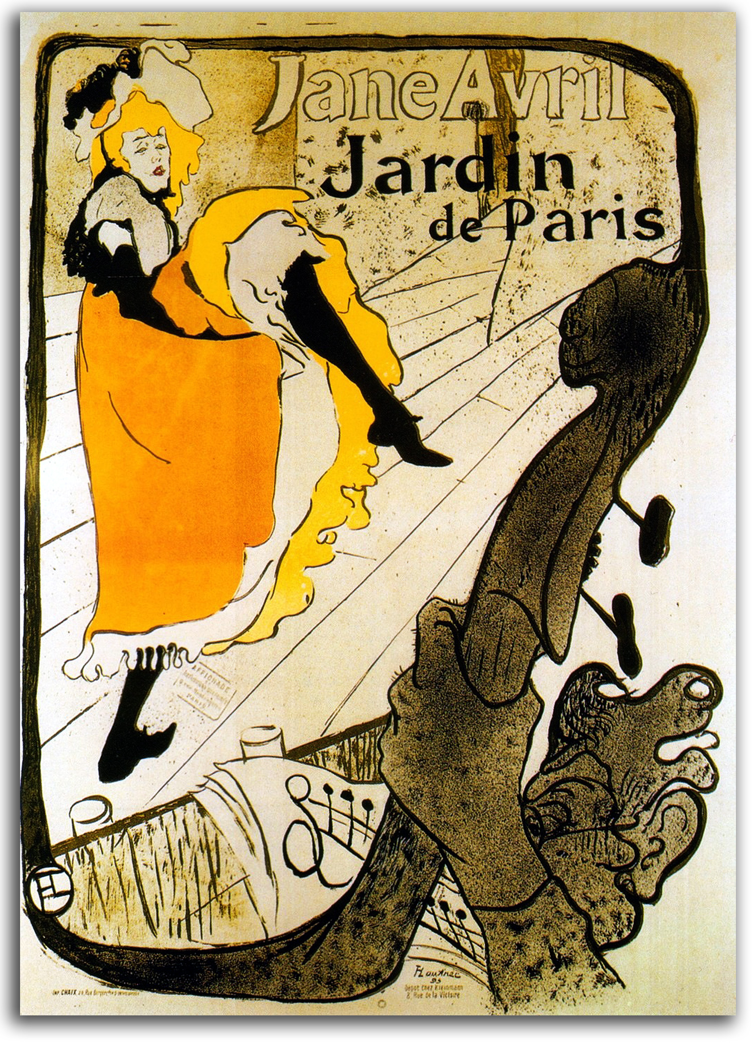
TOULOUSE-LAUTREC (after)
Jane Avril – Jardin de Paris (designed 1893)
Poster, ND [Plate Signed]
Edition by Jardin de Paris
———————————
Facsimile edition, c1960s
Collection: IAD (2012)
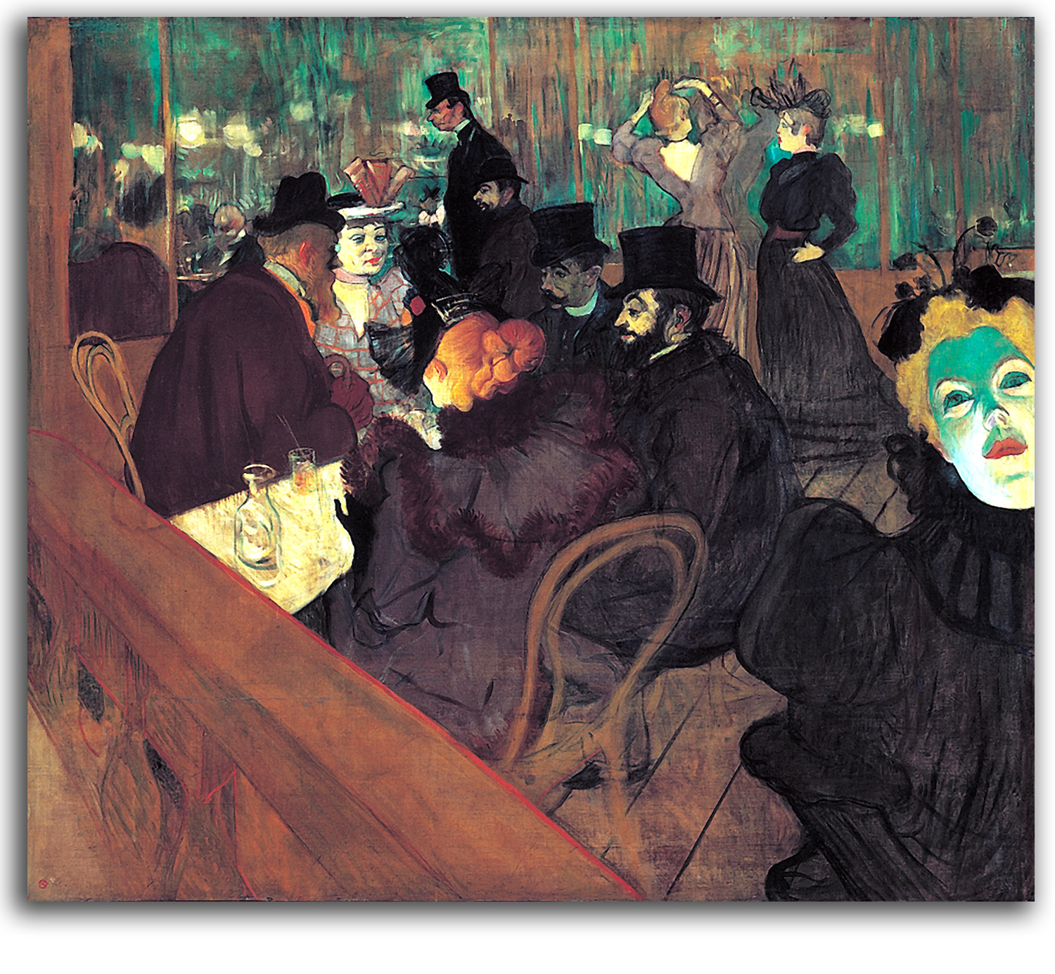
LAUTREC
At the Moulin Rouge
NOTE: The 1890s was the decade in which the Second Decade of Postimpressionists matured. The artists associated by most people with these dynamic years of the Belle Epoch are Henri de Toulouse-Lautrec and Pierre Bonnard. Most of those visual associations in the popular mind are with posters. The 1890s was the Golden Age of French posters. Of the many good poster designers working in Europe, none took to the task with a more robust vitality than Lautrec. As a painter of solid figures, the shapes he outlined in his early work during the late 1880s owed a good deal to the traditional forms of Manet and Degas. However, he rendered those shapes with increasingly energetic, highly abstract, intensely colored lines. It was a form of colored drawing. By the early ‘90s, in paintings such as “At the Moulin Rouge,” the coloring of his faces had left the world of nature for the world of emotional Symbolism.
As a very short man of stunted growth (his parents were first cousins), and as an alcoholic, he was most at ease in the world of other social misfits – mainly the world of dancehalls and prostitutes – rather than his family’s aristocratic circles. This was the only group he could join. When he was asked to do posters by the owner of a new cabaret called the Moulin Rouge in the bohemian quarter of Montmartre, Lautrec was delighted. Most accomplished painters looked down on such work. He did not. This was his world, and it was a joy for him to visualize its colorful energy. Moreover, he was encouraged by the success of Bonnard’s first poster, “Champagne-France” (1891). One of his best-known posters is “Jane Avril – Jardin de Paris.” This celebrated dancer also was Lautrec’s good friend.
As a graphic artist, Lautrec no longer felt bound by the conventions of figure painting. He let his imagination run free when composing this poster. The musical instrument in the foreground came alive in his mind and formed an undulating frame around the scene. The “living line” in this poster and others has much in common with the serpentine line that permeated many Art Nouveau designs, lines like those that Lautrec’s friend Oscar Wilde commissioned from Audrey Beardsley. In his posters and book illustrations, Lautrec immortalized many vivacious dancers including Jane Avril, Yvette Guilbert, and La Goulue (“The Glutton”) who is credited with the invention of the Can-Can. He also made extraordinary lithographs of Loie Fuller, the most famous dancer of the age. He lived hard and died young from alcoholism and syphilis.
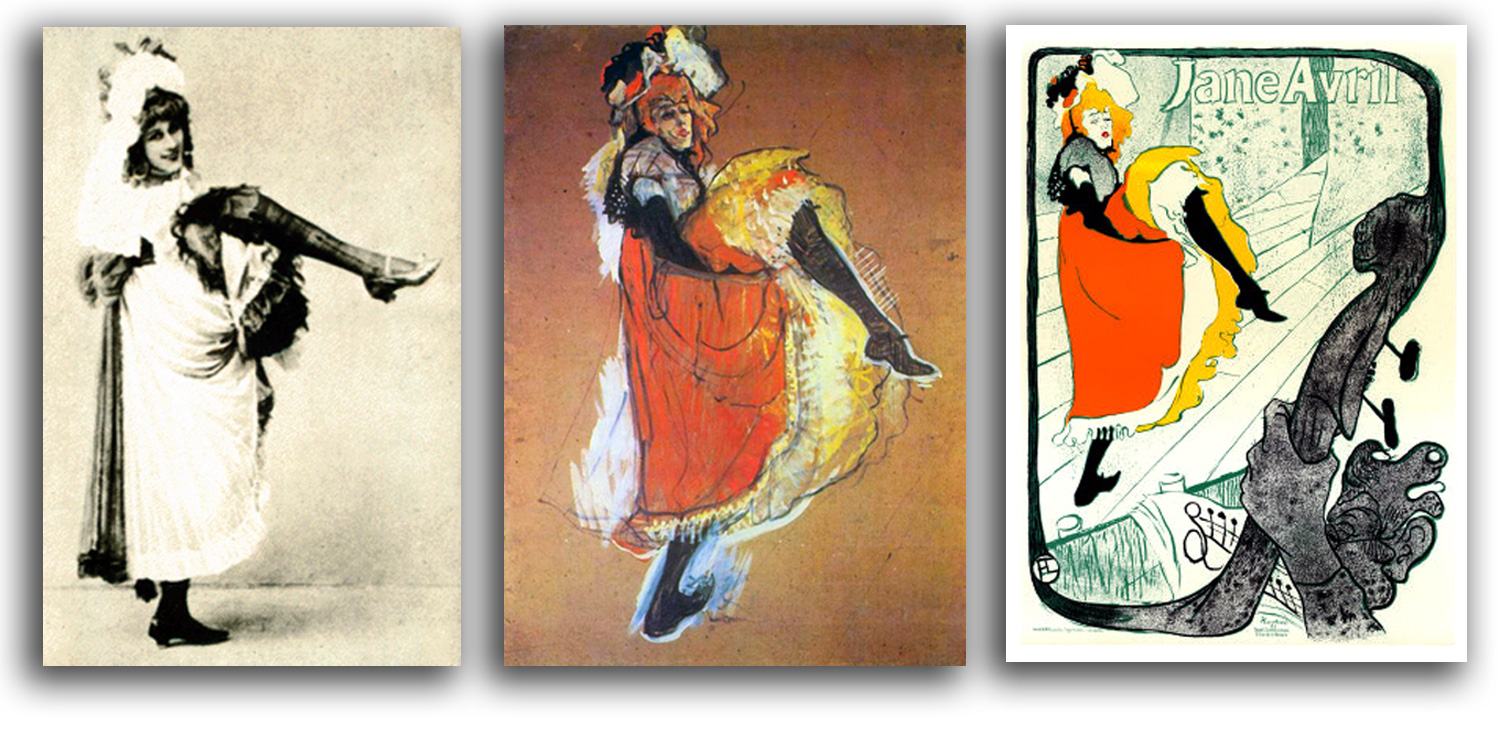
Jane Avril
Photograph, c1893
Collection: Unknown
NOTE: This celebrated dancer also was Lautrec’s good friend.
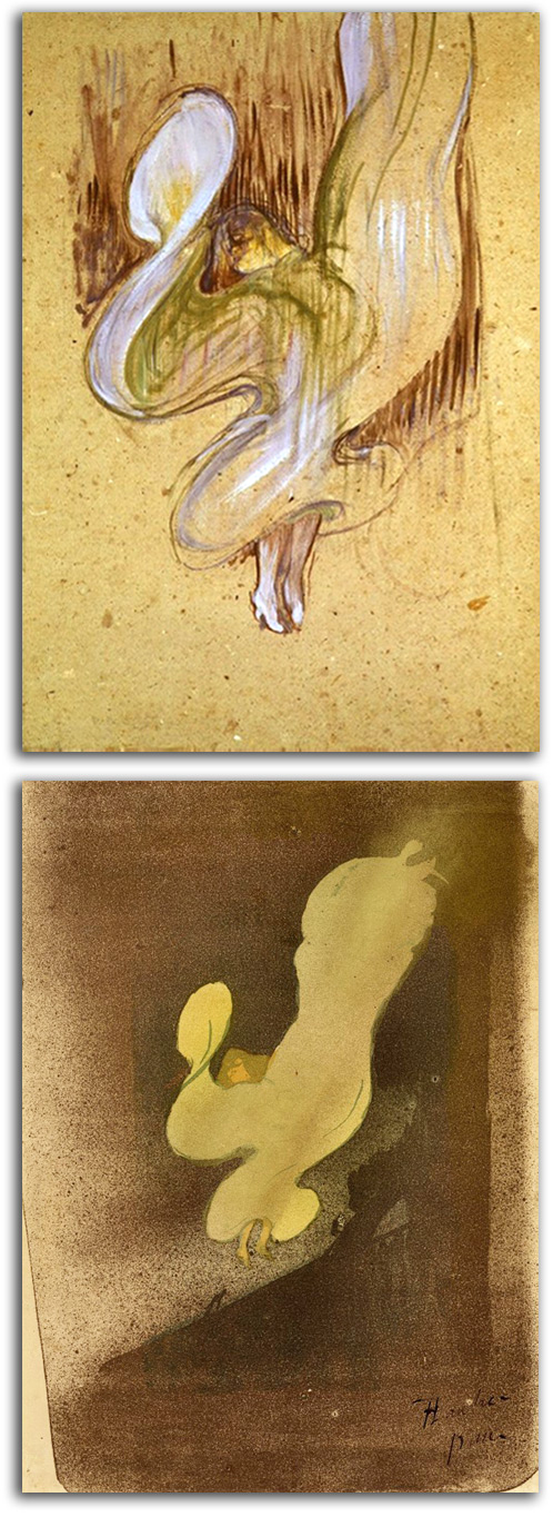
TOULOUSE-LAUTREC
Miss Loie Fuller, 1891
Drawing & Lithograph
Collection: Musée Toulouse-Lautrec, Alba
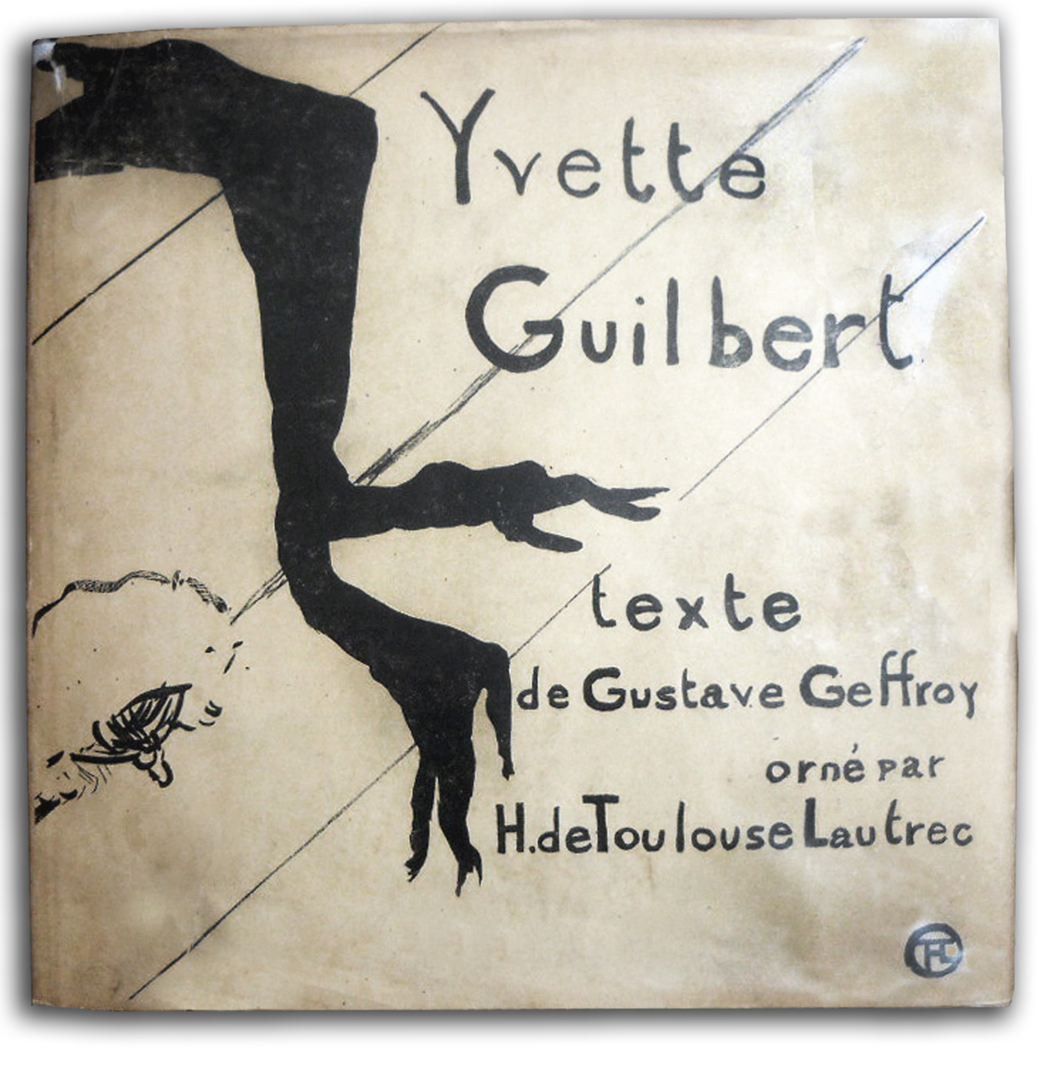
TOULOUSE-LAUTREC (after)
Cover of
YVETTE GUILBERT by Geffroy, 1894
Edition by Estampe Originale
———————————————-
Facsimile edition by Walker, 1968
{Published at the recommendation of FLG}
Collection: CSUEB, Gift of IAD
Exhibited in THE ART OF THE BOOK: THE MODERN LIVRE D’ARTISTE, University Art Gallery, CSUEB, 1999
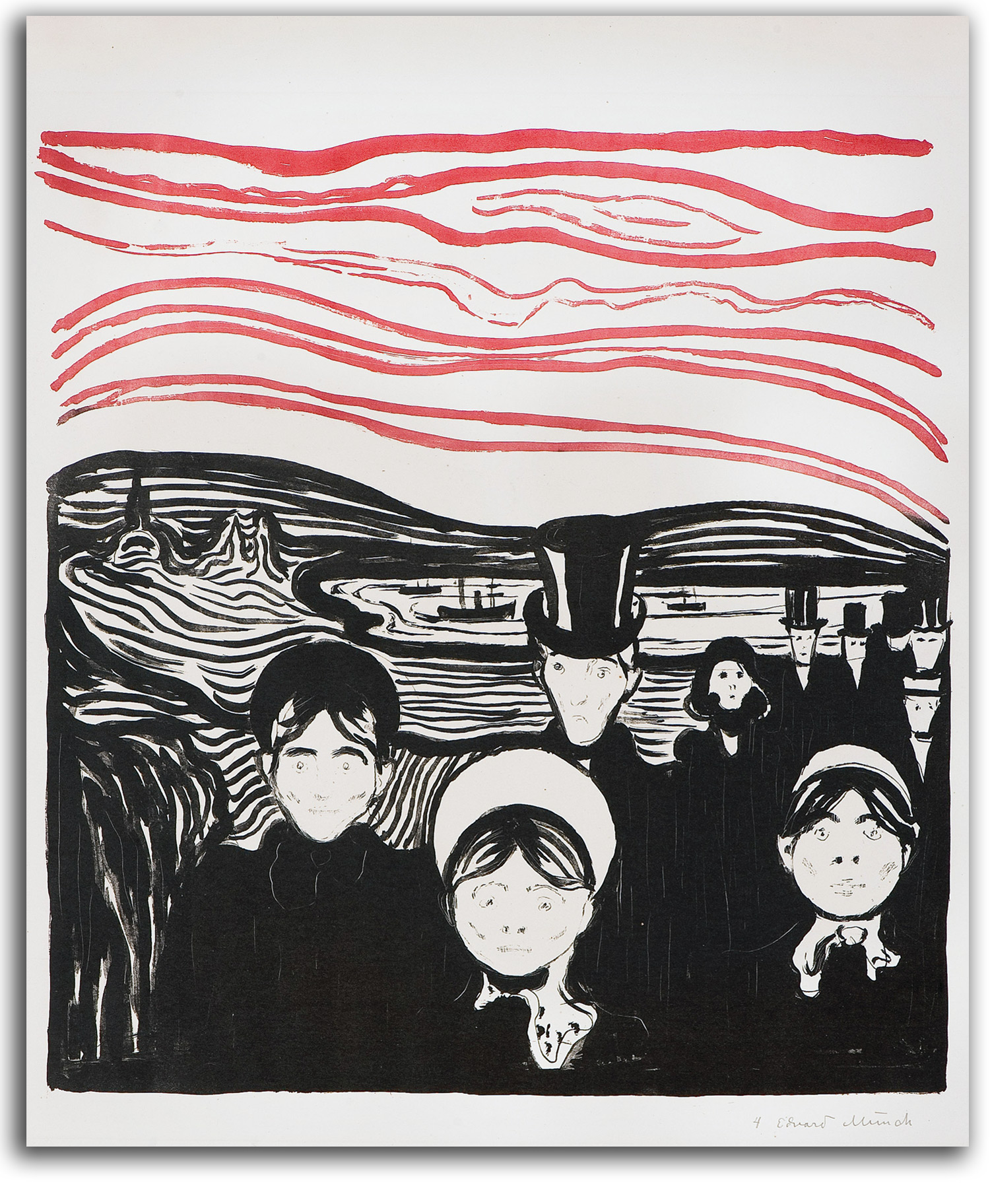
MUNCH
Anxiety (painted 1894)
Original Lithograph, 1896
Collection: Munch Museum, Oslo
NOTE: The majority of the most famous Postimpressionists lived in France. The most famous Postimpressionist who did not is Edvard Munch, a Norwegian. This very complex artist also has been called a Symbolist and/or an Expressionist. Various versions of “The Scream” have become instantly recognized icons of modern popular culture. Munch was respected in certain circles during his lifetime, but neither he nor van Gogh enjoyed anything like worldwide fame until the 20th century moved farther into the Age of Anxiety. That was after another major turning-point in social history, the point at which more people were living in cities than on farms – a point that turned in various parts of the Western World between the 1920s and the 1940s. Then, suddenly, van Gogh and Munch became famous. Suddenly, we saw ourselves reflected in the faces of these artists.
In this painting and print that Munch called “Anxiety,” we see a family who has begun to live inside The Existential Condition. Each in their own way appears to feel isolated, anxious, and incomplete. Being part of a nuclear family is not enough for a human being to feel the fullness of their humanity. Traditional extended families provided a greater feeling of fullness for each individual, and so (in a way) did working for a single company one’s whole career. The company was a kind of second family. But extended families are not the way modern families are now structured. The Industrial Age has required that families be nuclear families and move from city to city to satisfy corporate needs, and the average worker changes jobs several times in a career. Moreover, for a growing number of people, God actually is dead. What was called God has not been replaced by any other deeply satisfying mythology. Life without a meaningful mythology is a kind of hell.
P.S. Statistics naturally vary from area to area. Take London, for example. In 1851 the urban/rural ratio was 51% of 2,300,000 people. In 1891 it was 72% of 4,000,000. In the U.S., in 1800 it was 94% rural. In 1940 it was 44% rural. In Northern Europe and Western Europe the urban/rural ratio is now 83 percent. In Southern Europe and Eastern Europe the ratio is about 66%, as it is in West Asia and Africa. The change of the ratio in China is remarkable. In 1980 the urban ratio was 20%. In 2011 the urban ratio was 51% of 1.35 billion people. In 1900 the global urban ratio was 13% of 220 million. In 1950 it was 29% of 732 million. In 2005 it was 49% of 3.2 billion. By 2050 it is estimated that 66% of 6 billion people will be living in cities and towns. According to the United Nations, our planet as a whole passed the urban/rural tipping point in 2007.
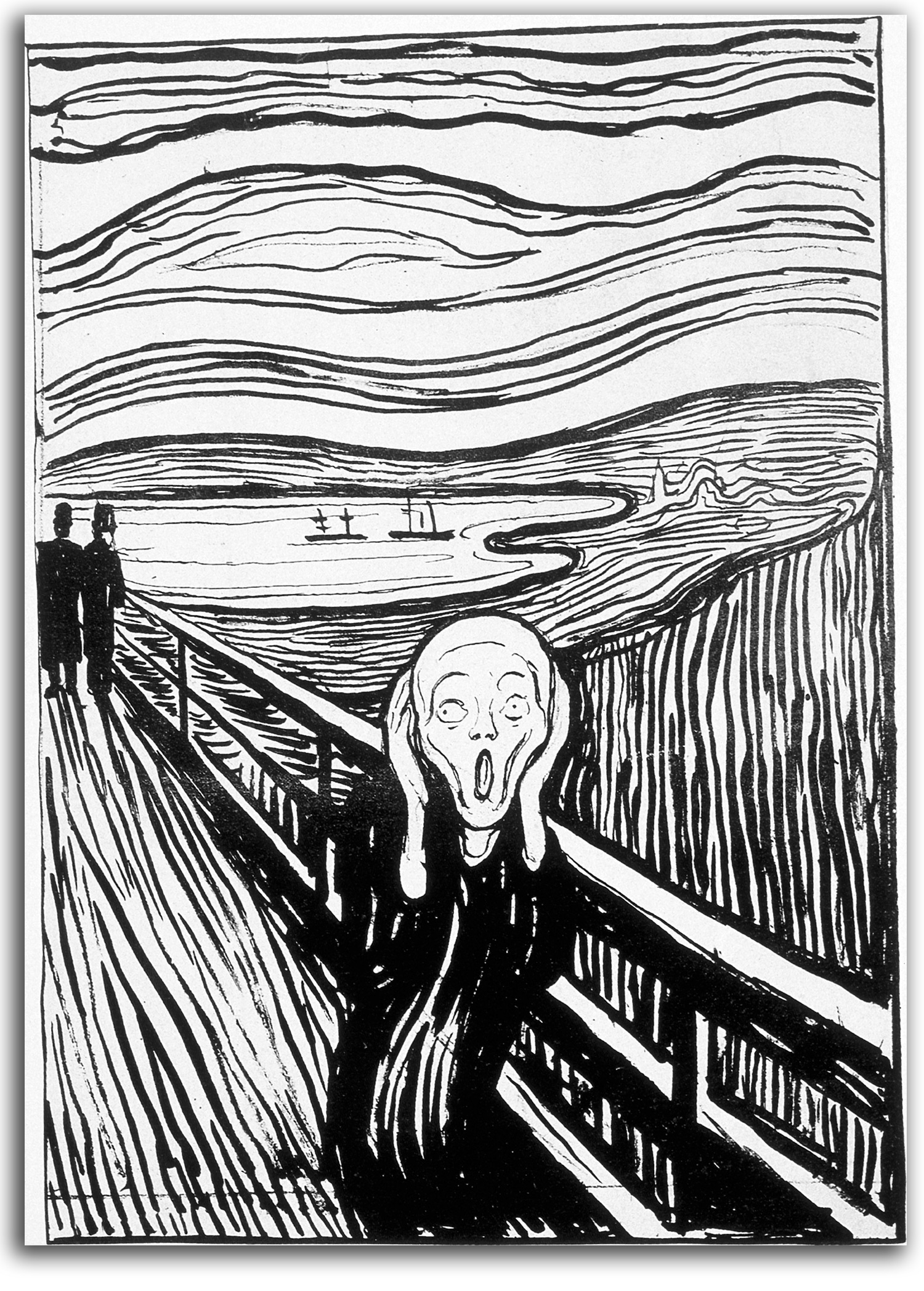
MUNCH
The Scream. First version painted 1893
Lithograph, 1895
Replica lithograph, 20th century
Collection: CSUEB. Gift of IAD
NOTE: This image is by far Edvard Munch’s most famous work. It takes us far deeper than van Gogh’s “Dr. Gachet” into the psychology of anxiety. It takes us to the Breaking Point at which the feeling of anxiety can no longer be contained. Munch knew it was a very special image. He rendered it in many media – oil, pastel, watercolor, lithography, and woodcut. One version (not an oil painting but a pastel) sold in 2012 for $120 million.
“The Scream” has become an instantly recognizable iconic image in modern popular culture. I can think of no other anxiety-based image that has so many different types of contemporary manifestations – for example: Hollywood movie masks for horrific characters, Halloween costumes, cartoon characters (Bart Simpson & others), life-size blow-up dolls, a screaming doll called the “Screaming Scream,” and a series of Andy Warhol versions. In short, it is us.
3) 3rd Generation 1900s: Fauves & Expressionists
EUROPEAN MASTERS – 19TH CENTURY – Symbolism
By the end of the 19th century, another movement known as Symbolism had captured the hearts and minds of many of the most gifted artists and poets in Europe. Many date the beginning of this movement to the poetry of Baudelaire whose life effort was to find “the infinite in the finite,” and thereby to find spiritual peace at the end of the seemingly endless pain of daily life.
Elements of the real world were merely points of departure for dream images and mythic metaphors. This aesthetic focused on not facts but symbols – temporary poetic capturings of emotional states. Symbolism continued many of the earlier features of Romanticism such as being grounded in feelings, and longing for the infinite. The pretty pictures of Impressionism seemed superficial to the Symbolists. They felt that the mainstream Postimpressionists did not go deep enough into the metaphysical dimensions of life. In other words, they had too little interest in mythology and mystic symbolism.
Earlier forms of visual Symbolism had been developing for some time, at least since the Pre-Raphaelites in the 1850s & ‘60s (if not since William Blake). However, by 1886 the Symbolist Movement had an actual manifesto from the hand of Moréas who advocated pure subjectivity as the way to escape the horrifying rationalism and materialism of the Industrial Age. Each Symbolist artist and poet followed his or her own type of subjectivity, but they were connected by their common quest for the Absolute. The Symbolists shared this quest with the Postimpressionists, but unlike the Postimpressionists the Symbolists were repelled by all forms of Realism and often visualized occult narratives.
Those with little self-discipline took this advice too literally and often drowned in the stupors of mindless sensuality. Those with enough discipline not to be overwhelmed by emotion found ways to link the finite and the infinite, found ways to generate images of the Transcendent that were meaningful to others.
All along the way, the thoughts and poems of Mallarmé inspired a great many poets and artists with the idea of suggesting/evoking/revealing rather than describing. His wide influence can be seen reflected in his circle of friends. Among the Impressionists (the first generation of artists to “suggest” reality), his good friends included Manet, Monet, Renoir, Morisot, and Degas. One of his best friends was Whistler whose art was the very essence of “suggestion.”
His visitors included Monet, Sérusier, Vuillard, Whistler, and Rodin, along with Verlaine, Rilke, Gide, Valéry, Wilde, Yeats, and Debussy, the magical musician who composed “The Afternoon of a Faun” as what he called an “illustration of Mallarmé’s beautiful poem.”
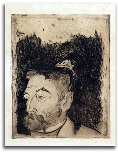
GAUGUIN
Portrait of Mallarme
Among the Postimpressionists, those who came to Mallarmé’s home regularly on Tuesday evenings to hear him speak of art as a spiritual meditation, of art as a new kind of secular religion, were Redon (who planned to do a book with him) as well as Gauguin and Munch – both of whom made striking portraits of their mentor. It is not an exaggeration to say that Mallarmé’s concept of symbolic art is at the very root of Modernism as a whole. In short, Modern art is symbolic art.
Moreover, Mallarmé suggested that what is best for writers and artists to do with symbols is to orchestrate them into “harmonies,” or “melodies.” This abstract musicality is a key lesson that Baudelaire and Mallarmé learned from the poetry of Poe and then propagated throughout the Symbolist Movement. The teaching, primarily from Mallarmé, is that Modern poems primarily are abstract compositions in which what matters most are the arrangements of sounds and the rhythms of their tonal relationships. The so-called “meaning” of the words is important but subordinate. What matters most is where your intuition takes you.
In his classic essay, THE SYMBOLIST MOVEMENT IN LITERATURE (1899), the Symbolist poet and critic Arthur Symons explained Mallarméan philosophy quite clearly: Words…are of value only as a notation of the free breath of the spirit; [they] chime upon one another.
Only in this way, says Symons, can the true poet express the invisible essence of the Transcendent, and thereby activate within the reader the kind of response that is an “affirmation of…eternal…life.”
This influence of this essay did not terminate with 19th-century Symbolism; it would have a strong influence of W. B. Yeats, T. S. Eliot, and many others. As I have pointed out again and again, much of 20th-century Modernism sprang from Symbolism.
Mallarmé’s direct influence also continued far into the 20th century. Gauguin’s devotion to Mallarmé was felt by many, including all the Nabis group (Bonnard, Vuillard, and the others who regarded art as a sacred ritual), as well as the young Picasso who came to Paris attracted by Mallarmé and Gauguin and drenched himself in Symbolism in the days before Cubism. Braque carried Mallarmé’s poems with him into the trenches of World War I. Cubism, Futurism, and Orphism (an abstract form of Symbolism) owe much to Mallarmé’s deconstruction techniques that were made famous in his concrete poem “A Throw of the Dice” (first published in 1897), a poem that arguably is the most influential poem of Modern times.
Apollinaire and Duchamp held Mallarmé in highest regard as Dada and Surrealism were getting underway, and so did Matisse (who illustrated a book full of his poems with a special feeling). America’s greatest Surrealist, Joseph Cornell, loved Mallarmé dearly. And at the beginning of Abstract Expressionism, the last of the Modern movements, Motherwell was painting “Mallarmé’s Swan.” All these Modern movements employed Mallarmé’s richly suggestive stream-of-consciousness technique that flows under and around the gates of rationality.
Narrative art (whether visual or verbal) constructed out of precise descriptions, is a rational or left-brain aesthetic. The art of symbols (composed of fluidly interacting symbols, moods, and tones (whether visual or verbal) is an intuitive or right-brain aesthetic.
As many young poets were following Mallarmé’s lead into prose poems and “free verse” (free from rhyme), a growing number of artists were inspired by him to move into the realm of “free form” – that is to say, away from attachment to descriptive content and toward the flowing interactions of intuitive connections.
And that was just the beginning. The power of Mallarmé’s continuing presence throughout the entire history of Modernism is remarkable. Impressionists, Postimpressionists, and Symbolists, together with Matisse, Picasso, Braque, Duchamp, Surrealists, and Abstract Expressionists, all were very grateful to Mallarmé the poet for the songs his spirit sang, and to Mallarmé the philosopher for pointing out with luminous lucidity that only by opening to the intuitive can one touch the Transcendent.
Looking back over the history of 19th century art, let’s consider what happened and what was about to happen. Some say early Modernism started with Fauvism and Expressionism during the first 10 years of the 20th century. I would say early Modernism stood up on the two feet of Postimpressionism and Symbolism during the last 20 years of the 19th century.
HUNT (after)
The Lady of Shalott (drawn c1856)
Engraving by J. Thompson in the Moxon edition of
IDYLLS OF THE KING (1856-57) by Tennyson
Collection: FLG
NOTE: William Holman Hunt with the co-founder of the Pre-Raphaelite Brotherhood with Dante Gabriel Rossetti in 1848. The Brotherhood was devoted to a highly detailed style of Realism that pointed toward Transcendent truths. Images such as this one, half naturalistic and half fantastic, anticipate Symbolist compositions later in the century. With John Ruskin and Thomas Carlyle, Hunt felt the world around us is a system of visual signs, signs that each of us much decipher.
ROSSETTI (after)
Beata Beatrix (painted 1864-70)
Original Gravure, c1880 (?)
Collection: FLG
NOTE: Dante Gabriel Rossetti, the son of Italians in England, was a founding member of the Pre-Raphaelite Brotherhood in 1848. They based their aesthetic on the art and literature of the Middle Ages and the Early Renaissance before the time of Raphael and Mannerism. The quest of the Brotherhood was to unite the human and divine in all forms of art – fine arts, decorative arts, and literature. One of his primary heroes was Dante (for whom he was named) whose work he translated into English. Rossetti was one of the rare poets who also was a painter and of note. He also generated a number of prints, including illustrations for the poems of his sister Christina. Naturally, another of his heroes was Blake whose work he also edited.
Rossetti had a strong influence not only on Whistler, but also on Morris and Burne-Jones and the whole of the Arts & Crafts Movement in England, as well as the Aesthetic Movement in England. His poems were a bit too erotic and too mystical for his British audience. However, he was an important influence on Symbolist artists and poets in the rest of Europe. That element of his sonnets which attempted to be a “moment’s monument” (in other words, the fleeting moment captured) also may have contributed to the formation of the Impressionistic aesthetic of Manet and Mallarmé.
“Beata Beatrix” is an idealized portrait of his beloved wife, Elizabeth Siddal (“Lizzie”) who died young in 1862. In this picture of a woman in ecstasy she is seen as the Beatrice who guided Dante to the Highest Heaven. Her death plunged Rossetti into such grief that he buried his unpublished poems with her body in her grave (but he later dug them up). Like many Symbolists, he used drugs to reached the states of ecstasy that he craved. An overdose of such drugs killed his wife. The regular use of drugs left Rossetti with only part of his once fine mind in his later years. He died at 53.
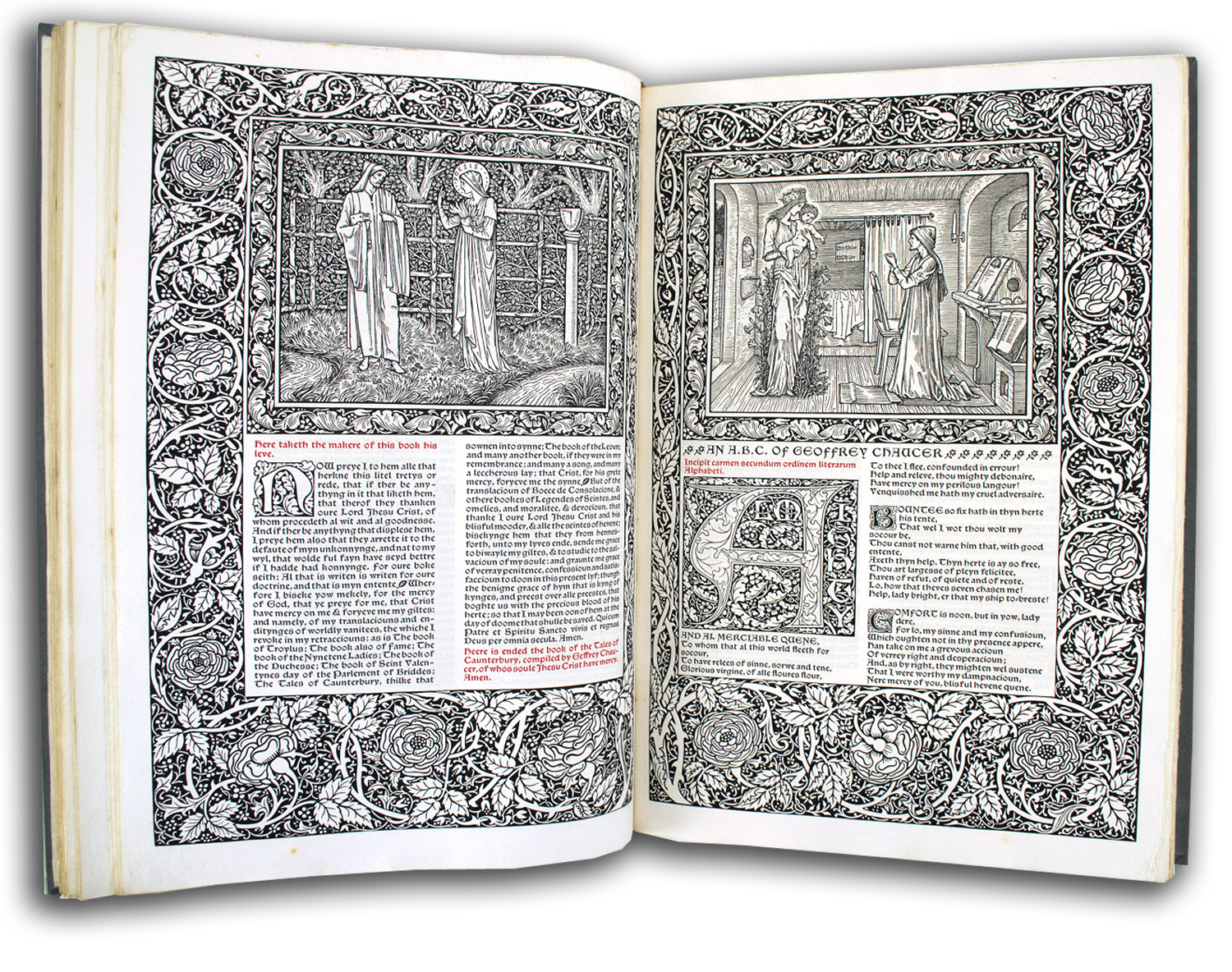
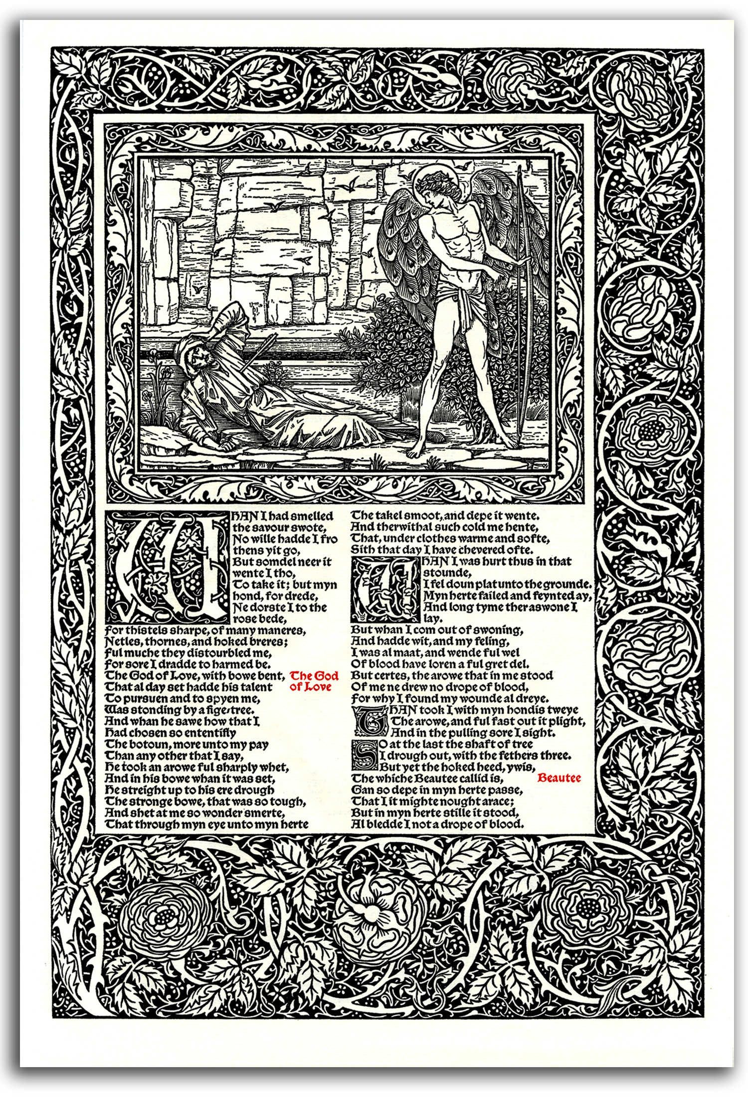
BURNE-JONES (after)
Illustrations from THE WORKS OF GEOFFREY CHAUCER
Designed (with borders & initials) by William Morris
Wood engravings by W. H Hooper
Editioned by The Kelmscott Press, 1896
—————–
Facsimile edition by World Publishing, 1958
Collection: CSUEB. Gift of IAD
Exhibited in THE ART OF THE BOOK: THE MODERN LIVRE D’ARTISTE, University Art
Gallery, CSUEB, 1999
NOTE: Edward Burne-Jones was one of the most widely admired of English Victorian painters. He had wanted to be a minister, but (under the influence of Rossetti) he and his good friend William Morris decided to become artists. He had little interest in earthly facts. All his subjects are dream-world fantasies, but dream-worlds delineated with an elegant, convincing precision and a musical linearity inspired by Botticelli. He captured the British imagination and became a household name. He was made a baron in 1894. In 1898 he was the first artist ever to be honored with a funeral in Westminster Abbey. He was an influence on the European Symbolist painters and poets of his time, and later on the Surrealists.
His greatest work as a printmaker was the CHAUCER that he illustrated with 87 woodcuts at the Kelmscott Press where Burne-Jones illustrated a number of editions between 1894 and 1898. The press also was the climactic achievement of Morris who generated over 50 editions as part of his gigantic legacy as the “grandfather” of the Arts & Crafts Movement. Morris’s favorite authors included Coleridge, Keats, Shelley, Tennyson, Rossetti, and Swinburne, along with a number of medieval authors. Each volume was a true work of art. Morris designed the typefaces, made the paper, and printed the books himself by hand. The whole enterprise was consciously a throwback to the spirit of the manuscripts of the Middle Ages, an enterprise that only a wealthy eccentric could maintain. However, it set a standard of visual quality that continued as an inspiration to book designers and printmakers in the 20th century.
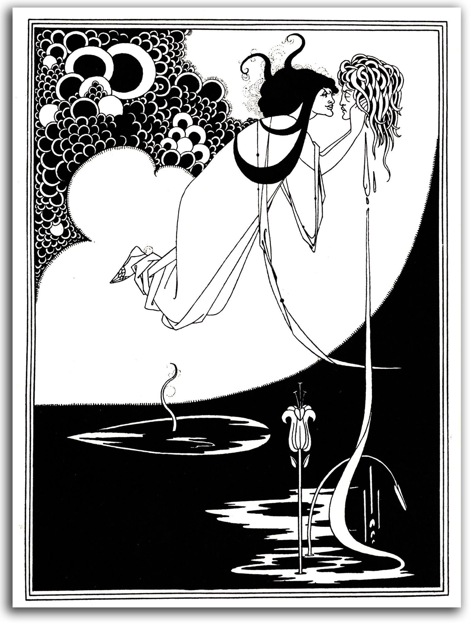
BEARDSLEY (after)
The Climax (aka I have kissed your mouth). Second State, 1894
Illustration in SALOME by Wilde
Photo-mechanical line-block print
Editioned by Lane, 1927
Collection: FLG
NOTE: During the 1890s two different forms of Symbolism had developed. Both were often interested in various forms of mythology and mysticism, but one group was taking the Right-Hand Path and one group was taking the Left-Hand Path. One group was moving in a positive direction, aiming beyond the ego toward the Transcendent. This Symbolism was inspired by poems and ideas of Mallarmé, and may be described as the “Bright end of Romanticism.” Many Symbolists were seriously interested in Buddhism and Hinduism (e.g., Redon, Kupka, and La Farge). The other group was moving in a negative direction, reveling in self-centered sensuality and other forms of ego-gratification, usually erotic. These highly sensual and often amoral artists, inspired by the poems and thoughts of Baudelaire and Verlaine, plunged into every possible pool of self-indulgence. They were called Decadent, and the “Dark end of Romanticism.”
Aubrey Beardsley was the most gifted (and most controversial) illustrator in turn-of-the-century England. He also was (and still is) probably the best-known of all the visual Decadents. Encouraged by Burne-Jones, the young Beardsley decided to be an artist. In 1892 he went to Paris and discovered Japanese prints, the posters of Lautrec, and the dynamic serpentine line of Art Nouveau. He quickly incorporated these strong influences and started his highly influential series of book and magazine illustrations. Two periodicals he co-founded were THE YELLOW BOOK and THE SAVOY. The website of New York’s Museum of Modern Art suggests he was the “most significant figure to emerge in English art in the last decade of the 19th century.”
The most famous of his many erotic and often perverse illustrations were for Oscar Wilde’s play SALOME, a play that Wilde regarded as his finest work. The best-known of the striking, unshaded prints in this set is “The Climax (aka I have kissed your mouth).” Salome is holding the severed head of St. John the Baptist whose blood is nourishing a lily. The image is grotesque, and that’s what he wanted. He once said: “I have one aim – the grotesque. If I am not grotesque I am nothing.”
Beardsley was closely associated with Wilde and his homosexual circle. He would die in 1898 of T.B. at the age of 25. In the end, he converted to Catholicism and begged his publisher to “destroy…all obscene drawings.” I don’t like many of his drawings, but I must admire his skill.
For all the SALOME illustrations CLICK HERE
For more of Beardsley’s illustrations CLICK HERE
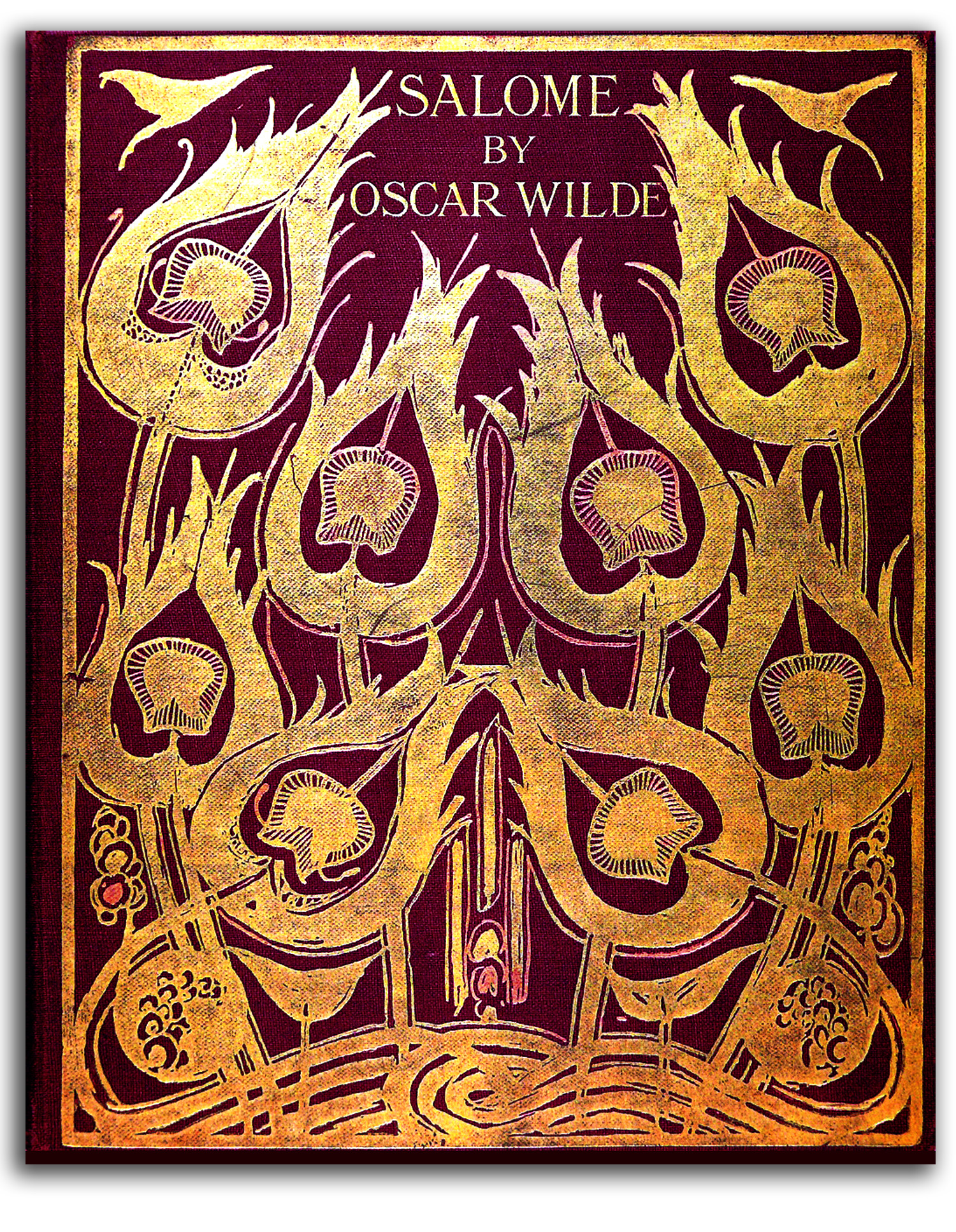
BEARDSLEY (after)
Cover of SALOME by Wilde (designed c1894)
Dent edition, 1927
Collection: FLG
Gift of Yvonne Brunhammer, 1969
NOTE: This is one of the most famous book covers of the Art Nouveau era. Aubrey Beardsley drew this design (and signed it) c1894, presumably for the cover of the first English edition of SALOME that was published that year. However, for some reason it was not used. Dent had published the original English edition of 1894 with a different cover. For this 1927 edition, Beardsley’s design was realized dramatically in red and gold, and the original drawing was illustrated inside. Pictured are peacock tails.
P.S. This book was given to me by Yvonne in Paris in 1969 as a token of the friendship we had formed while jointly planning my Hector Guimard exhibition. That exhibition started in New York at the Museum of Modern art in 1970 and ended in Paris in 1971 in the Musée des Arts Décoratifs where she was the Curator (and later the Director). She said with her charming smile: “Remember Beardsley also was loved by my Art Déco artists! He was a multicultural person, just as we are.”
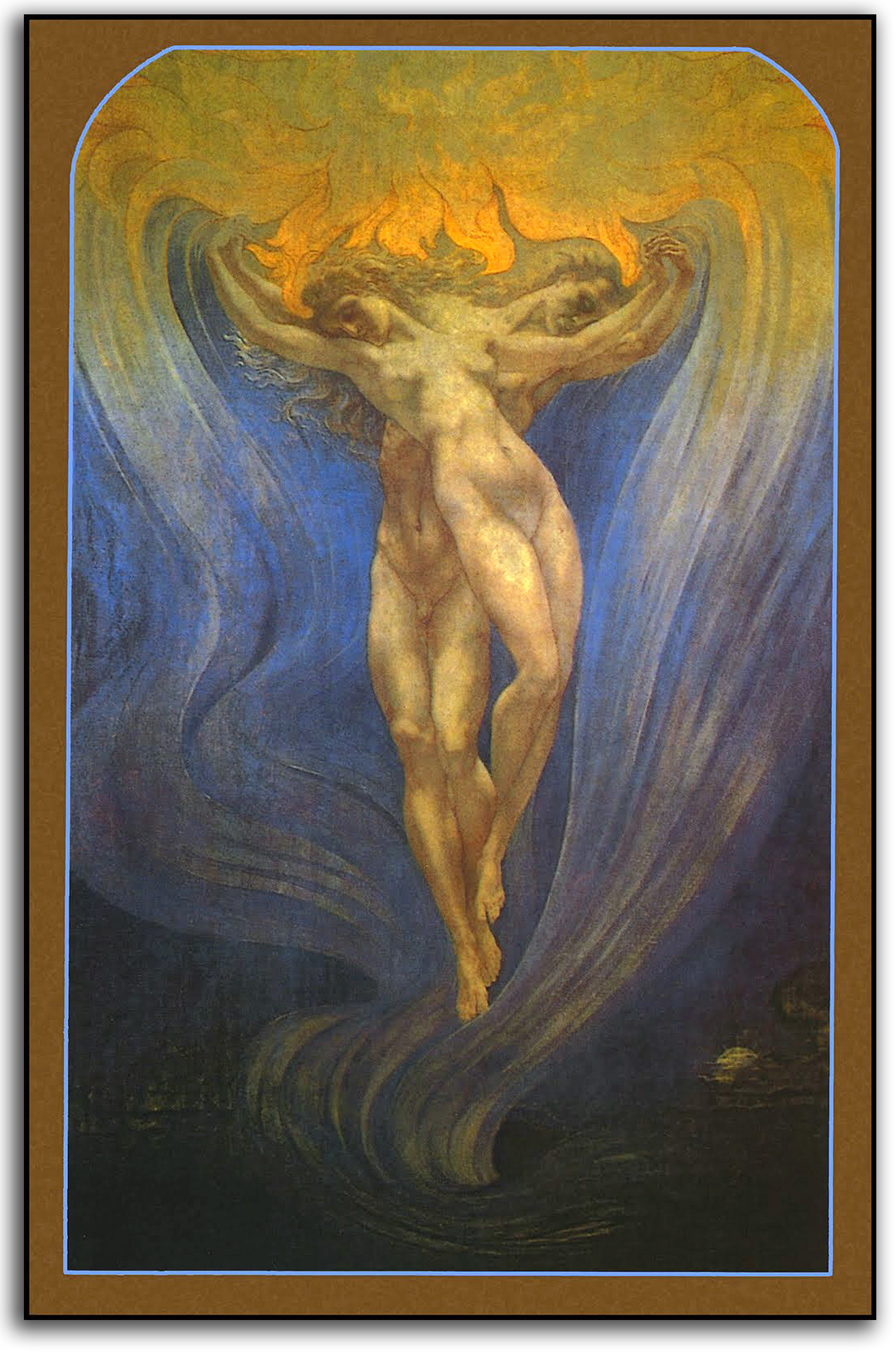
DELVILLE
Soul Love [L’Amour des ames] (painted 1900)
Tempra on canvas
Collection: Musée d’Ixelles, Brussels
Postcard, Musée d’Ixelles edition
Collection: FLG
NOTE: Jean Delville was a charter member of the Theosophical Society in Brussels, and one of the most mystical of the Belgian Symbolists. A friend of Schuré, Delville also was one of the positive Symbolists whose goal was not self-centered sensuality but rather the betterment of society. “Soul Love” is one of his best-known works. Here is an analysis by Michelle Facos in her thoughtful book SYMBOLIST ART IN CONTEXT (2009), an analysis based on Delville’s own book DIALOGUE:
A male and female soul…execute a mystical dance suspended in an ethereal blue cloud that swirls upward into the starry night sky. The cloud, with its golden canopy, is Delville’s visualization of astral light, an invisible ether that surrounds all matter.
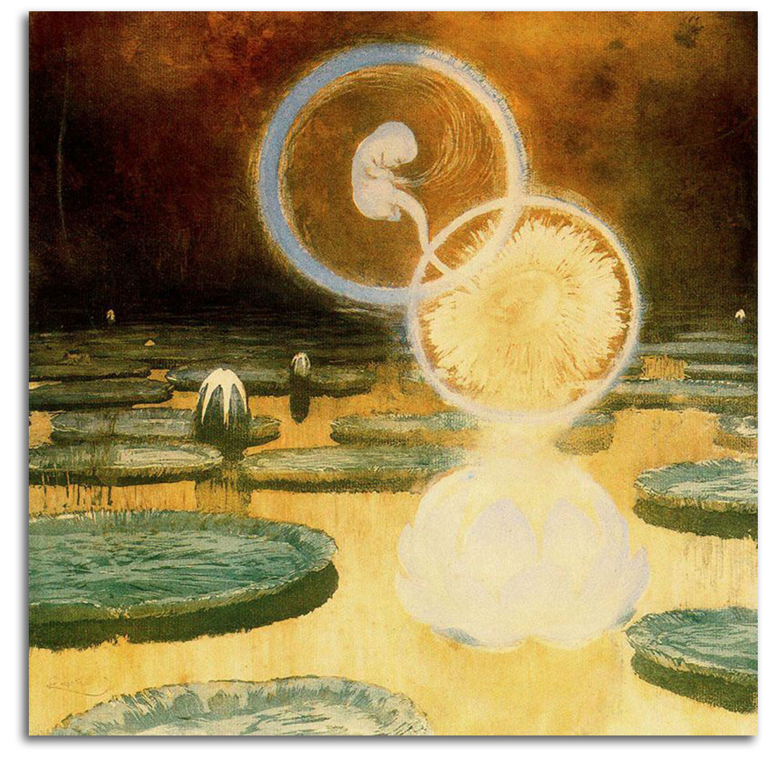
KUPKA
The Beginning of Life, c1900
Original Engraving
Collection: Musée Nationale d’Art Moderne, Paris
Collection: New York Public Library
NOTE: A large percentage of the painter-printmakers of the Symbolist era were interested in Asian religions. Again Mallarmé was an important source for many of these artists (such as Gauguin, Redon, and Munch) not merely because he had written a book on world mythology and knew the details of various spiritual traditions but because he was living out the traditional teachings in a Modern way. He had found ways to evoke the Nothingness that is the source of all, practical ways that involved turning words into symbols and symbols into sounds. It is these harmonious tonalities, he said, (not ordinary words) that evoke the Transcendent. Only disembodied sounds harmonizing inside our minds can resonate with the eternal Music of the Spheres.
Mallarmé had raised his consciousness to a point that his work was an actual meditation. From this elevated level of awareness he suggested that Modern art was becoming a new kind of secular spirituality (in which all genuine art-making is meditation), a contemporary mode of non-dogmatic religion. And that is exactly what Modernism became.
During the transitional period, from the era of a fading Christian God in the middle of the 19th century to the development of Modernism as a new kind of religion, there was Symbolism. The Symbolists tried on their own, without any spiritual guidance from a Western tradition, to link with the Transcendent. A number such as Redon, Gauguin, and van Gogh looked to Buddhism for inspiration. Others such as Kupka looked to Hinduism.
This etching by the Czech artist Frantisek Kupka is a beautiful Western perception of Hindu mythology. From out of the waters of formlessness, and the unshaped mud of omnipotentiality, the Lotus of Life is born. From the Lotus all else is born. Kupka went on to paint some of the world’s first totally abstract paintings.
Looking back over the history of 19th century art, let’s consider what happened and what was about to happen. Some say early Modernism started with Fauvism and Expressionism during the first 10 years of the 20th century. I would say early Modernism stood up on the two feet of Postimpressionism and Symbolism during the last 20 years of the 19th century.
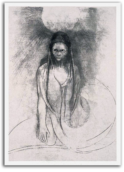
REDON
WISDOM BECAME MINE! I BECAME BUDDHA!
(L’Intelligence fut a moi! Je devins le Buddha!), 1896
Original Lithograph
Collection: FLG
NOTE: Odilon Redon (1840-1916) was one of the most important painter-printmakers of the Symbolist era. The appearance of the outside world was of interest to him only to a limited degree. More often he turned his eyes inward and visualized what he saw there. Redon wrote in his journal TO ONESELF (1922): “My whole originality…consists…in placing the logic of the visible…at the service of the invisible.”
Redon and his good friend Mallarmé played an important role in bringing Buddhism into late 19th century Europe. The subject of spiritual Enlightenment was of particular interest to Redon. He painted and drew a number of images of Buddha during his late years. For many, this lithograph is the most powerful of the series. It also marks a new level of luminosity in his previously dark black & white prints. The sun illuminates the scene. The figure seems to be coming from or dissolving into swirling arabesques, as if to say: “selfhood melts.” When I acquired this print I wrote a short interpretive poem for my daughter who is interested in Buddhism:
I came from out of Nothingness
to which I shall return
dissolving on the arabesques
which are the roads to ruin.
I once had a solid self
that I held very tight.
But that was melted by the rays
of Buddha’s Loving Light.
Redon and Mallarmé, along with van Gogh and Gauguin, were the first major artists of the Modern era to take a serious interest in Buddhism. It probably was Mallarmé who stimulated that interest in the others. Mallarmé was so highly respected by these particular artists (and others in his Paris circle), both as a poet and as a person, that he came to be considered a truly Enlightened human being, in the Buddhist sense of the term. Mallarmé appears to have been the first European to be so considered by a large number of influential people.
Redon and Mallarmé understood that the historical Buddha was not the last Buddha. Everyone has the potential of attaining the quality of consciousness known as Buddhahood, and a fair number of people have attained that special awareness, as it passed from master to student, generation to generation, century to century. This unbroken passing on of the Light-of-Wisdom (from the time of the historical Buddha to now) is called The Tradition and is made up of lineages. That is the meaning of this title (and this image) by Redon. It does not mean that “I” became the historical Buddha. It means that the subject of this visual story changed from being a self-centered personal “I” into being a transpersonal “I.” The usual English title of this print is “Intelligence became mine! I became the Buddha!” A better term would be “wisdom,” rather than “intelligence.” Moreover, the subject in this picture did not become THE Buddha, he became A Buddha. So a better translation would be: “I attained Buddhahood,” or “I became Buddha.”
Any use of “I” in a translation such as this is problematic. The teaching is that once Buddhahood has been attained there is no more “I” in the usual sense. The little “I” – the personalized “I” that ego calls its own – is replaced by a larger, transpersonal “I” that is linked with the universe as a whole. There no longer is any separation between “you” and all that is. What “you” do is a direct result of the universe moving through “you.” Redon’s dear friend Mallarmé wrote about this psychology from a transpersonal perspective.
When we were talking about Transpersonal psychology as an essential dimension of the whole of Modern art, Margit Rowell pointed me to this profound statement by Redon’s dear friend Mallarmé:
I am now impersonal, a potential in which the Spiritual Universe may see itself reflected and may develop through what was once my self.
A guide-for-living in many spiritual traditions is: “Never start a sentence with ‘I’.” Such ways of thinking get the mind moving in the right direction.
Redon and Mallarmé were planning to collaborate on an illustrated book, but Mallarmé died before it could happen. Those two had a great deal in common. It is a shame they did not co-create a volume of verbal and visual philosophy. Duchamp’s preference for the prints of Redon (and the poetry of Mallarmé) above all other Modern poets and printmakers is an interesting aspect of how strong the continuity of aesthetic philosophy was from late 19th century Symbolism to Dada, Surrealism, etc.
Part 3. EUROPEAN MASTERS – 20th CENTURY
INTRODUCTION
The first decade of the 20th century witnessed an astonishing explosion of creativity. Matisse and the Fauves gave new meaning to symbolic color, an exuberant joyful meaning. Matisse is considered by many to be the greatest colorist of the 20th century. He also was one of the last great masters of the human figure.
Many German-speaking Expressionists, in the uncertain years leading up to World War I (1914-18), were inspired to use this new French idea of intensely expressive color in a different way, a way that explored less joyful, and often anxious, internal reflections. Many think the most powerful image of this German generation is “The Prophet” by Nolde. Joyful Expressionist prints or paintings are extremely rare. Exceptions to this brooding inclination include Marc who found joy in the spirit of Nature (especially in images of animals), and Kandinsky who expanded his feeling of joy into the cosmic realm of total abstraction.
Cubism was such a powerful explosion that it blew away much of Fauvism and Expressionism, and most other lingering forms of Postimpressionism. Cubism was invented by Picasso and Braque (working closely together) between 1908 and 1910. They looked at people and objects from a multiple perspective, and fused overlapping elements from different spaces and times in a single image. Cubism proved to be the most influential style of the first half of the 20th century.
During and after World War I (1914-18) alternatives to the new Modern mainstream tradition of Cubism, Futurism, and Abstraction developed in the form of Dada and Surrealism. They reached for higher states of consciousness, often using dream-inspired images. The best-known practitioners include Duchamp, Ernst, Arp, Miró, Dali, and later Giacometti.
In the United States, Modernism got off to a slow start. The remarkable early abstractions of O’Keeffe and Dove did not inspire a following. Attention focused instead on various forms of urban and rural Realism (the “poetry of fact”) until the dramatic birth of Abstract Expressionism in the 1940s from the hands of Pollock and de Kooning and the rest of the New York School.
LITHOGRAPHY. Intaglio techniques (engraving and etching) continued to be used by artists during the Modern era, but only small editions could be made before the lines on the metal plates began to fade. The development of lithography in the early years of the 19th century solved that problem. Images drawn on a stone (and later on aluminum plates) could be printed many times. Color lithography (chromo lithography) was developed in 1837. Offset lithography, a photographic technique of the later 19th century, is the process by which most newspapers and books were (and still are) printed. Many of the most beautiful color lithographs ever made were created in Paris in the years around 1900 by artists such as Lautrec and Bonnard as ads and as fine prints (for publishers such as Vollard), and again after World War II in Paris at the workshop of Mourlot. In the late 20th century, with the advent of personal computers, many people bypassed commercial printing and publishing companies and became “desktop publishers.” Moreover, a remarkable new use for lithography developed for making the printed circuits at the heart of computers. If the printing is smaller than 10 micrometers, it is called microlithography. If the printing is smaller than 100 nanometers, it is called nanolithography.
P.S. Many integrated circuits have an accidental beauty. When I was a curator at New York’s Museum of Modern art, we acquired some for the collection.
EUROPEAN MASTERS – 20th CENTURY – Fauvism
The Fauvists were a group of painters who began to develop their new style about 1900, and then exhibited together in Paris three times between 1904 and 1908. They (along with the contemporary German Expressionists) were the third and final generation of Postimpressionists. The group included Matisse, Derain, Dufy, Rouault, Braque and several others. Their colorful heroes included Gauguin, van Gogh, and Cézanne. The word “fauve” in French means “wild beast.” The term was given to this group by an art critic who found their extreme brushwork and radical colors to be truly “wild.” The leading figure was Matisse who made over 800 prints and worked on 38 illustrated book projects.
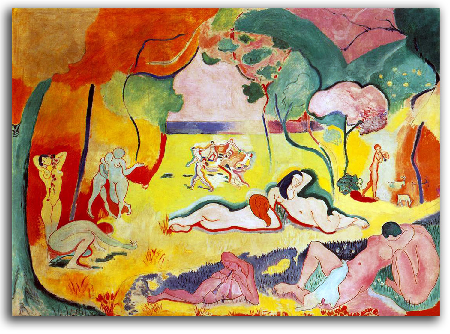
MATISSE (after)
The Joy of Life [Le Bonheur de Vivre]. painted 1905-06
Notecard, edition by the Barnes Foundation, Merion
Collection: FLG
NOTE: Henri Matisse was the greatest colorist of his age, and the last great Modern master of the human figure. His feeling for color was profound. To him color is a living reality permeated with Transcendent luminosity. It is largely because of Matisse that color became a primary dimension in Modern art. He also did more than any other early Modern artist to develop the Asian aesthetic of “emptiness” wherein that which is not there is as important as that which is. This appreciation for “unfilled space” seems to have come from the two Symbolist artists under whom he studied: Moreau and Guimard, as well as from the thoughts and poems of Mallarmé. They all also taught him to suggest rather than describe.
Like most Modern artists, Matisse had little interest in traditional religion. However, he had a great deal of interest in what he called “spiritual space” or “meditative space.” When asked if he was religious, his reply was: “only when I am working.” He also once said: “I am somewhat Buddhist. The essential thing is to work in a state of mind that approaches prayer.” Matisse had a special feeling for light as a metaphysical reality. He described this light as “not the physical phenomenon, but as the only light that really exists, that which is in the artist’s mind.” He spoke of it as a “very pure, non-material light.” Most of his life was devoted to evoking what he called the “spiritual space” of this timeless light.
In this very early painting from the beginning of his maturity, he already is picturing his consciousness. The colors are not natural. They are symbolic, Transcendent. They are the mysteriously luminous colors that permeate the universe of his mind. The figures are not natural figures. Each body has been animated into an unusual shape by the vibrant spirit of love. Around the central Dance (the Dance of Life) lovers merge into each other and experience unspeakable Oneness. The aroma of ecstasy is everywhere.
Matisse is my favorite painter-printmaker of the early 20th century, and has been since high school. My collection of Matisse prints began at that time with commercial magazine cut-outs. Illustrated here are most of the original prints and facsimiles that I have collected since then. This very personal collection includes the Matisse prints I love the most. There are more Matisse prints in my collection than there are prints by any other artist. There is no limit to the joy he brings me. But it also is a teaching collection. I use it in my classes on Modern Art. My selection covers most of his chronology from “The Joy of Life” of 1904-05 and “The Dance” of 1909-10 to the “Blue Nude” and the “Swimming Pool” of 1952. Some version of “Blue Nude” has been on my wall since 1956. It is a spine-splitting song of ecstasy.
Because I had compiled a comprehensive catalogue of the Illustrated Books of Matisse, John Elderfield asked me to advise him on which books to include in his monumental MoMA exhibition of 1992. We met in 1989 at the Simon Museum where he and his wife spoke highly of my 1970 Guimard exhibition at MoMA, and were enjoying my Matisse exhibition at the Simon – “Dreaming in Color: The Art of Matisse” (especially the wall labels, they said.)
The second time John invited me to MoMA was in 2009 to advise him on which de Kooning prints to include in his 2011 retrospective exhibition at MoMA, because I had written the catalogue raisonné of de Kooning prints. As John is an art historian of enormous skill and great discrimination (and probably the most powerful Modern curator in the U.S.), I looked forward to seeing how he would make his final selections.
When my wife and I arrived for the MoMA opening, we were delighted to see that John had decided to feature in a special way the print that I consider de Kooning’s greatest print – “Litho #1 (Waves #1)” of 1960. It was hanging on a wall with major de Kooning paintings. Very few prints of any period can withstand this kind of side-by-side comparison with paintings.
No other print by de Kooning was so featured in the exhibition, and with good reason. As the American Print Renaissance got going in the 1970s, many large lithos were made, but this monumental print of 1960 was historic not only for its quality but also for its radical size, almost 4 feet high. “Litho #1” probably is the first Modern print to be able to hold its own next to a painting of the same size. This monumental print entered the IAD Collection in 1990. CLICK HERE for that image.
John and I talked about a number of things that night, not only how he hung “Litho #1” but also how “Matisse would have enjoyed the fluidity of its motions.” We also spoke of the influence of Zen on not only Bill’s prints but also his paintings such as “Door to the River” which I has discussed with Bill as Zen-inspired. John concluded: “Matisse did not need Zen influence, of course; he was Zen!”
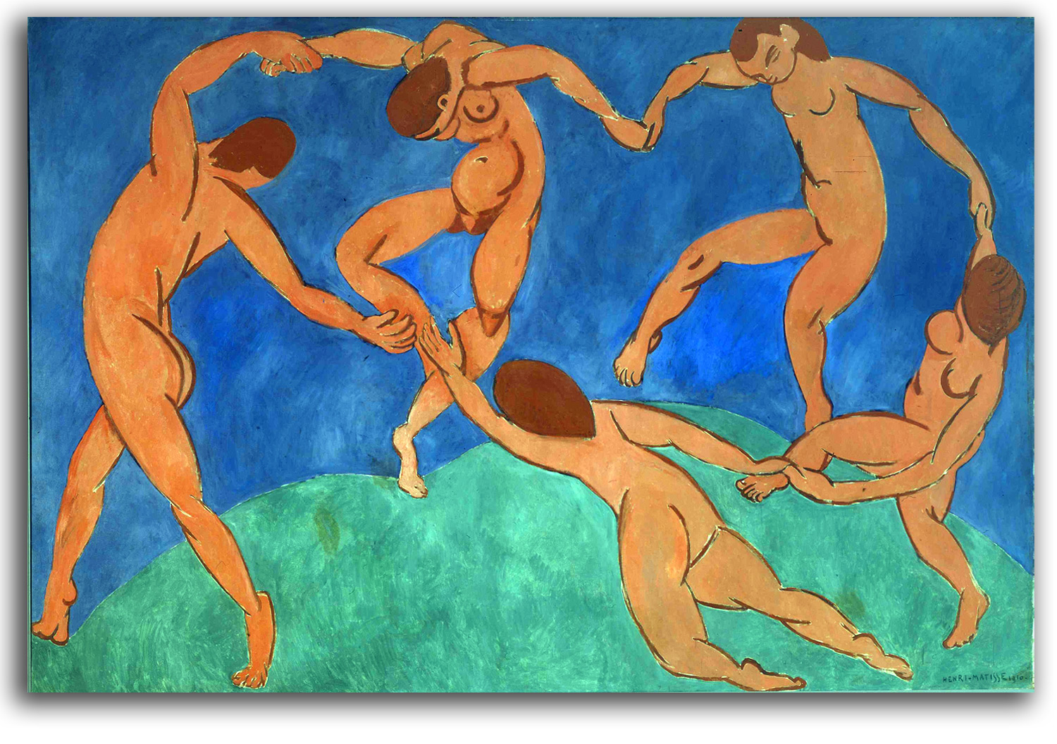
MATISSE
The Dance (painted 1909-10)
Original Lithograph from VERVE, 1938
Printed by Mourlot
Collection: FLG
Ex. Collection: John Windle
Exhibited in “Dreaming in Color: The Art of Matisse,”
Norton Simon Museum, Pasadena, 1989
NOTE: Matisse painted two versions of this very large picture, one in 1909 (now at MoMA) and the other in 1910 (now in Moscow). Matisse had a special fondness for the MoMA version. He described it as an “overwhelming climax of luminosity.” When I worked at MoMA, I looked at this painting every day on the way to my office. It was a wonderful way to begin the day!
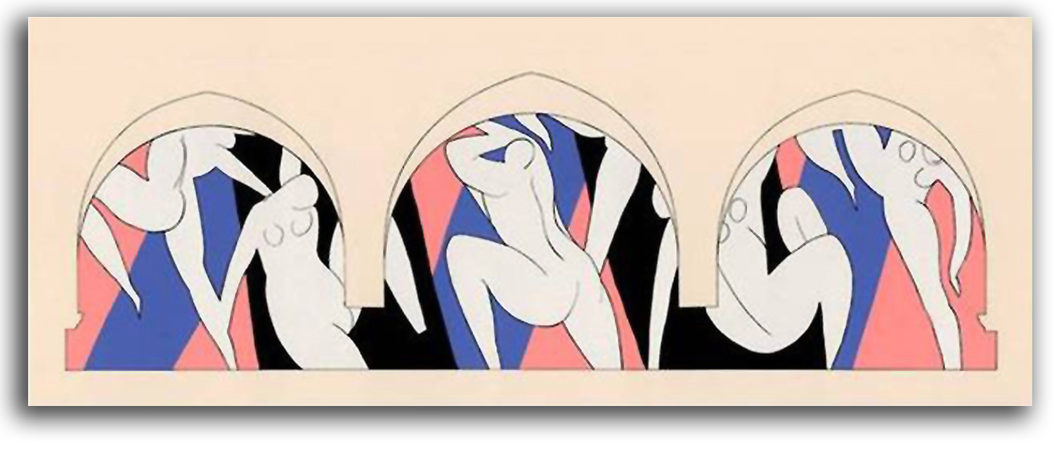
MATISSE
The Dance II (painted on three canvases 1931-33)
Original Triple-fold lithograph of the tryptich, with pochoir coloring
from HENRI MATISSE by Roger Fry
Edition by Editions des Chroniques du Jour, 1935
Collection: FLG
Ex. Collection: Roger Walton
NOTE: The extremely flat style of this painting for the Barnes Collection anticipates his later cut-out style.
MATISSE
Cover of VERVE, Volume 1, Number 1, 1937
Original Lithograph (in its original box).
Printed by Mourlot
Collection: FLG
Ex. Collection: John Windle
NOTE: This lithograph was composed for this cover. VERVE was an elegant French quarterly (1937-1975) designed to showcase original lithographs by contemporary artists. The publisher was Teriade. The printer was Mourlot. The quality was outstanding. Matisse contributed many original lithographs over the years.
MATISSE
Skater I & Skater II
Pair of Original Linocuts from VERVE #4, 1938? 1939?
[Plate Signed]
Printed by Mourlot
Collection: FLG
Ex. Collection: John Windle
NOTE: Like all Postimpressionists, Matisse stayed within the confines of gravity and the world of visible, physical realities as his points of departure. He never moved all the way into the realm of total abstraction. However, he sometimes came close. This pair of skaters, especially the second one, is as close to total abstraction as he ever came.
MATISSE
Illustrations in POESIES by Mallarmé
Etching & engraving
Edition by Skira, 1932
—————————————————————
Facsimile edition by Skira, Edition #4126 [No Date]
Collection: FLG (Purchased in Paris, 1985)
Exhibited in THE ART OF THE BOOK: THE MODERN LIVRE D’ARTISTE, University Art
Gallery, CSUEB, 1999
NOTE: Matisse had a deep love of Illustrated Books. He created some of the most beautiful books of the 20th century. His list of “his” editions included only those over which he had total artistic control, from the choice of the text and the type to the way his own illustrations were presented in relation to the text. POESIES was his first book. The poems of Mallarmé were special to him. He made a great many drawings for the project. In the end, 29 of those drawings were published in the book as extraordinary etchings and engravings. Matisse said he used very thin lines without any shadows so that the visual images would not overwhelm the words. Filled with a Mallarméan love of emptiness, Matisse wanted the illustrated pages to be what he described as “almost white.” Matisse’s hope was that he could echo some of what Mallarmé called the “universal musicality” of his poems, musicality that Mallarmé (following Leonardo) said corresponds with “a state of the soul.”
MATISSE
Untitled {“Fire Dance”}
Linocut from POESIE DE MOTS INCONNUS, 1949
Edition by Iliazd
Printed by Imprimerie Union
Facsimile Reprint as the greeting card of Fequet-Baudier
Collection: FLG
NOTE: This anthology features poems and prints by Arp, Braque, Chagall, Matisse, et al. Matisse’s linocut illustrates a poem by Rouke Akinsemoyin. This print, which I call “Fire Dance,” is one of the most abstract he ever did.
MATISSE
Borne Away to the Stars [Couple Embracing]
Original Linocut from PASIPHAE, 1944
Edition by Fabiani
Printed by Fequet & Baudier
Facsimile edition printed by Fequet & Baudier
Collection: Unknown
NOTE: PASIPHAE was one of several books that Matisse worked on during World War II. This tender picture of a loving couple among the stars is the best-known print in the book. This image faces these lines:
More closely than the clinging vine
About the wedded tree,
Clasp thou thine arms, ah, mistress mine!
About the heart of me.
MATISSE
Embrace (composed 1941)
Original Linocut in FLORITEGE DES AMOURS DE RONSARD
Edition by Skira, 1948
Collection: Unknown
NOTE: Matisse translated Ronsard’s 16th century French into modern French for this book.
MATISSE (after)
JAZZ
20 pochoir prints with a holographic text, all by Matisse
Printed from a set of metal stencils by Vairel
Editioned by Teriade, 1947
——————————————————-
Facsimile edition by Braziller, 1999
Collection: FLG
Exhibited in THE ART OF THE BOOK: THE MODERN LIVRE D’ARTISTE, University Art Gallery, CSUEB, 1999
NOTE: JAZZ by Matisse and A TOUTE EPREUVRE by Miró are widely considered the most beautiful Illustrated Books of the 20th century. The story of JAZZ begins in 1941 when Matisse underwent surgery for stomach cancer. Afterwards, confined to a wheelchair, it was difficult to paint or draw. He decided to start composing by cutting free-hand with a small pair of scissors various colored papers that he had painted to his specifications with gouache. He then arranged them on another sheet of painted paper. Assistants then prepared them for the printer between late 1943 and early 1944. Each page is 24 x 12 inches and folded in the center. All of the text was written (painted) in his own hand. The first edition of 250 portfolios in 1947 sold for $125.00.
This project, and the discovery that he could “paint with scissors,” gave him what Matisse called a “second life.” His work as a painter was over, but he did not miss the process. He used this other spontaneous technique for the rest of his life. It was a special joy for him to be able to draw, sculpt space, and color all at the same time. Many consider his “cut-outs” to be as beautiful as anything he ever did. I agree.
As a rule, the iconography of JAZZ is described as scenes from a circus. That certainly seems to be the front-story. However, I was never satisfied with this obvious explanation. I think there is a back-story. The more I thought about the fact that this work was done during the horrible days of World War II, days when members of his immediate family were imprisoned and tortured by the Gestapo, the more “M. Loyal” started looking like Charles de Gaulle (wartime leader of the Free French and later President of France), and the more “Icarus” started looking like a dying soldier, and the more the “Wolf” (not a normal circus animal) started to seem like a personification of the evil enemy. Even “The Clown” looks to me more like a bloody mutilated soldier than a clown, and the “Sword Swallower” seems to also be a cry for help. Jack Flam, a noted authority on Matisse and his cut-outs, has asked me to write an essay on this topic. One day I will do that. It is very expensive to buy an original edition of this world-famous book. It can cost hundreds of thousands of dollars. Even good facsimile editions such as this handsome Braziller production can cost $100. Happily however, small partial facsimiles of JAZZ can be purchased for $1.00
My first such miniature edition was given to me by Monroe Wheeler in honor of my promotion from Assistant Curator to Associate Curator at MoMA in 1968. That edition had been published by MoMA in 1948 for its members, at Monroe’s suggestion. Monroe was a great lover of illustrated books. He headed MoMA’s publications program for many years (starting in 1941), and therefore played a major role to spreading the gospel of Modernism beyond the walls of MoMA. He also assembled MoMA’s matchless collection of Illustrated Books. In that wonderland of books I have spent endless hours over a number of years. I could not have had a better education in the art of the livre d’artiste. Piper did a miniature edition of JAZZ in 1957. Braziller did a nice miniature edition in 1985.
MATISSE (after)
The Thousand & One Nights (composed 1950)
An original collage of paper cut-outs
Poster, Edition by Carnegie Museum of Art, Pittsburg
Collection: FLG
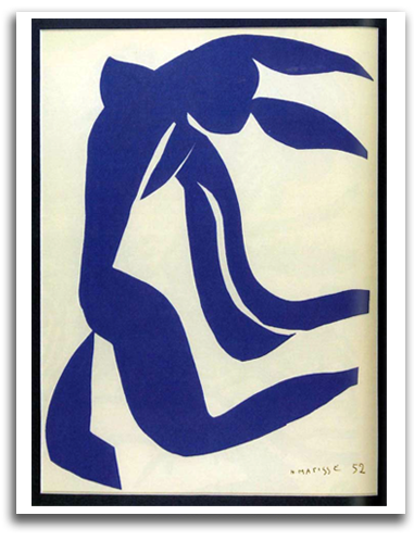
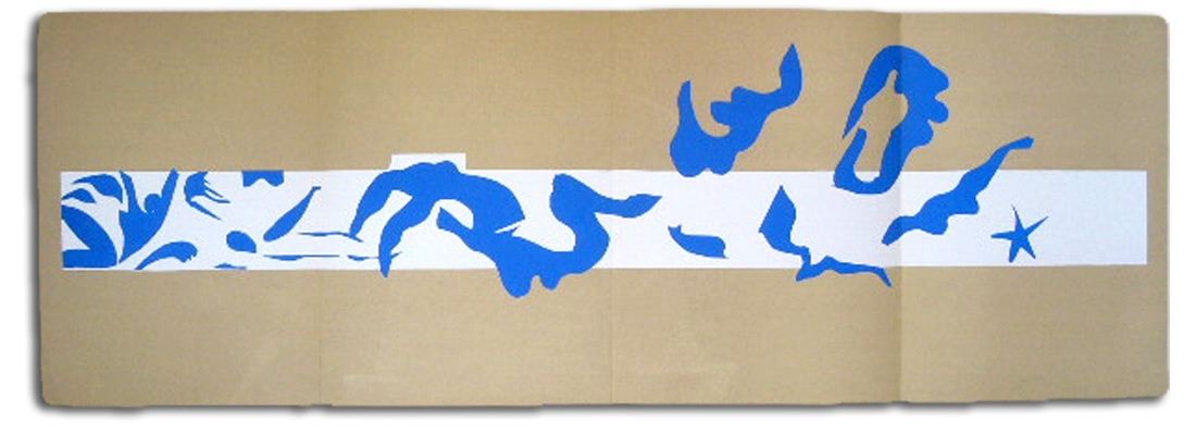
The Swimming Pool. (Composed 1952)
Original Lithograph from VERVE #35 & 36, 1958
Authorized edition
Printed by Mourlot as a triple fold
Collection: FLG
NOTE: The original cut-out from which this print was made was his largest cut-out composition, almost 54 feet long. The original is in the MoMA collection. It was originally conceived to decorate his private dining room in the Hotel Régina in Nice. Matisse said: “I have always adored the sea, and now that I can no longer go for a swim, I have surrounded myself with it.” The construction begins and ends with a starfish, as if that creature were telling the tale – a dream-like tale of joyous, unbroken fluidity. The whole is a composition of endless musicality. No figure is held back by being contained in an entirely human body, yet they all enjoy their smoothly rounded humanity swimming and diving into and out of the water, and into and out of the abstract rhythms of each other.
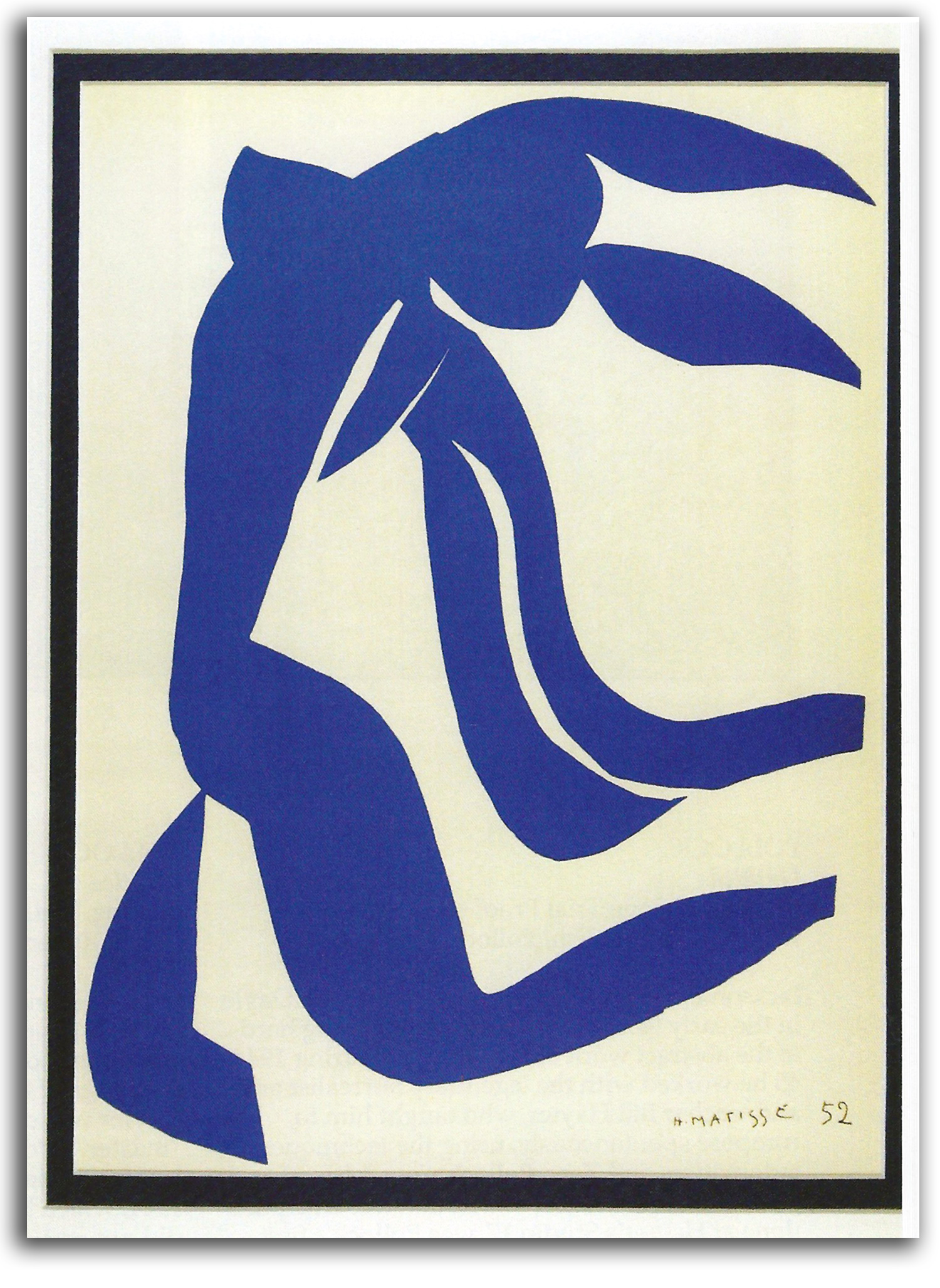
MATISSE (after)
Flowing Hair (Blue Nude). (Composed 1952)
Original Lithograph from VERVE #, 1958 [Plate Signed & Dated]
Printed by Mourlot
Collection: FLG & GKS on loan of IAD
Published in GLOBAL VISION, Part 1, 2006
NOTE: If I had to give away all the other Matisse prints in my collection and keep only one, it would be this one. Some version of “Blue Nude” has been on my wall since 1956. It is a spine-splitting song of ecstasy.
EUROPEAN MASTERS – 20th CENTURY – Expressionism
“Expressionism” is a tricky term. In every work of art there is some kind of “expression.” But “expressionism” usually means a particularly intense form of expression. It could be argued that there has always been a strong element of expressionism in German art, from the Middle Ages to the 20th century. However, for art historians, the term “Expressionism” defines a specific movement in the early 20th century among German-speaking artists, primarily in Germany but also in Austria. The cluster of individual Expressionist styles can be classified (together with its sister-style, Fauvism) as a 3rd and final phase of Postimpressionism.
The emphasis is on emotionally configured faces and figures the shapes of which are symbolic rather than naturalistic, and colors that are symbolic and selected by emotion rather than naturalistic. You will recall this also was the case in the first two generations of Postimpressionism. But there was a new spirit in the air.
There were strong influences being felt by the Germans from the powerful emotionality of van Gogh and Munch, as well as from the German Middle Ages. The tribal explorations of Gauguin pointed the first Expressionist group in Dresden to their local anthropology museum where they became fascinated with the tribal art. They were the first Modern group to feel this fascination that soon became one of the strongest single influences on the shaping of Modern art. {WRAP: 2 WOODCUTS: S-Rottluff: KNIEDE 1914 & GROSSE PROHETIN 1919}
The spark that ignited the general trajectory of this German development was the art of the Paris Fauves who opened doors to this radical exploration of symbolic color and symbolic form about between 1900 and 1905. Some key Germans, such as Kandinsky, had lived in Paris in 1905 at the start of the Fauve movement, or visited shortly thereafter. Within a short time, the Germans were seeing what they could do with these visual innovations that were moving dramatically from Impressionistic objectivity to endless subjectivity.
By 1911, both the Die Brucke group in the north of Germany (started in Dresden in 1905), and the Blaue Reiter group in the south of Germany (formed in Munich in 1911) were calling themselves “Expressionists.” Many in both groups were inspired by Nietzsche’s THUS SPAKE ZARATHUSTRA to think of themselves as assertive leaders of a higher consciousness who should lead society to a better way of life. But the direction taken by the two groups was quite different.
In the north, where the focus usually was on claustrophobic city life, we see sharply angular, vertical slashing lines and twisting contortions that spoke of a world filled with tensions, anxieties, alienation, and angst. {WRAP: Kirchner: Potsdamer Platz 1914} They also flaunted their young, uninhibited sexuality. {WRAP: Kirchner: Judgement of Paris 1913}
{WRAP their group portrait by Kirchner, from GOOGLE/Expressionism} This Die Brucke group was started by four students of Jugenstil architecture including Heckel, Kirchner, and Schmidt-Rottluff. Their ideal (at first) was a communal art in the medieval tradition of craft guilds. They revived the ancient art of woodcuts to spread their message to a wide public with bold, rough-cut imagery. [WRAP: woodcut} They were launching a deliberate political attack on the traditional naturalism of bourgeoisie art and the narrow, egocentric values of middle-class society that loved this kind of “comfortable” art. This was the self-centered, materialistic society the young radicals wanted to shock and then remodel. It is a bitter body of work. Their emotional satisfaction seems to have been found in the act of attacking. The kind of joy one finds among the Fauves is nowhere to be found.
In the south, where the focus was more rural and less political, the Blaue Reiter group had more peaceful visions of possible harmonies. Kandinsky and Marc and the others (including women artists who enjoyed equal respect) had visions of the Transcendent that looked on Modernism as a new kind of secular religion that could fill the world with purified values. Inspired by Symbolism and Theosophy, they saw themselves as secular priests of the new religion. Their key publications were the BLAUE REITER ALMANAC and Kandinsky’s book THE SPIRITUAL IN ART. {WRAP: Marc’s Atonement}
The gospel of Marc was a kind of pantheism. Kandinsky took his transcendentalism to the radical extreme of total abstraction. He was one of the first to do so. Kandinsky’s book became the best-selling book ever written by a Modern artist. {WRAP: K’s The Archer, woodcut, 1908-09; published 1912 as the colophon of the ALMANAC ).
Generally speaking, there were two phases to the Expressionist movement – before the First World War of 1914-18), and after the war – the first global war, and the first mechanized war.
There was a good deal of positivity before the war. After this horrific war, in which the German army was crushed by the armies of the English and the Americans, the picture was extremely bleak. Dix pictured the horror of war itself. Kollwitz pictured what it did to a war-torn society, particularly to the women. Thereafter, the postwar Expressionists focused their art on the greedy, mindless, imperialistic values of those who had started the war in the first place.
HECKEL
Portrait of a Man, 1919
Original Woodcut
Collection: Museum of Modern Art, New York
NOTE: This print is widely considered Erich Heckel’s masterpiece.
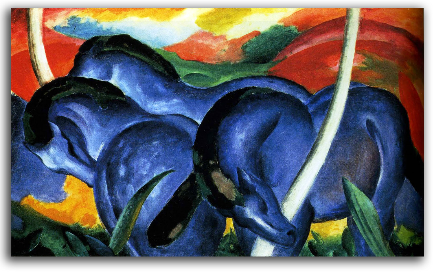
MARC
Large Blue Horses (painted 1911)
Postcard, edition by Walker Art Center, Minneapolis
Collection: FLG
NOTE: Franz Marc as a boy was called the “little philosopher.” He was considering the ministry before he decided to become an artist, or more specifically an artist-philosopher. Early on, he was attracted to the philosophy of Novalis who said: “All life is rhythm.”
He also was drawn to the Romantic painters from Delacroix to Runge who described his own work as “symbols of the eternal rhythm of the cosmos.” But how does a Modern artist sing the song of Eternal Nature? That is the problem Marc set for himself and struggled with for years. He said he was looking for the “back door to Paradise.”
He took a step in the right direction by visiting Paris in 1903 when he was overwhelmed by the bold colors of Impressionism and Postimpressionism, and the fascinating unmodulated colors of Japanese prints. During another visit to Paris in 1907 he helped hang a van Gogh exhibition and was stupefied by the experience. He called van Gogh: “the greatest, most poignant painter I know.” Van Gogh called himself a “musician with colors.” At one level Marc certainly seems to have been responding to this dimension of van Gogh’s work. At another level, he surely was struck by van Gogh’s ability to express emotion by means of rhythmic waving lines. One of van Gogh’s favorite words was “energy.” I suspect Marc was feeling van Gogh’s energy vibrating throughout every brushstroke on every canvas.
In 1910 he discovered Matisse and the Fauves. The door to Paradise was opening wider! He was discovering himself, and he did it in a semi-shamanic manner. He loved animals so much that he was able to look at the world from an animal’s point-of-view. He wrote: “I try to feel myself pantheistically into the…flow of the blood of nature, in trees, in animals… .” It was with this profound perspective that he came to feel what Goethe spoke of as the “vibrations…by which Nature links all this together.”
In 1911 he painted the great canvases for which he became famous. The best-known is “Large Blue Horses.” Every time I look at it I feel a special kind of wholeness. The curves of the horses and the curves of the landscape echo each other. There is no duality. Then, when I am walking away from the experience, I often think of words that Marc loved and often quoted from Schiller: “…the animal embodies everything man has lost – spontaneity, serenity, inner harmony.” In his missionary mode, Marc wrote in the ALMANAC:
We are standing on the threshold of one of the greatest epochs that mankind has ever experienced, an epoch of great spirituality. … [The tasks for artists is to] create contemporary symbols than can be placed on the altars of the great spiritual religion of the future.
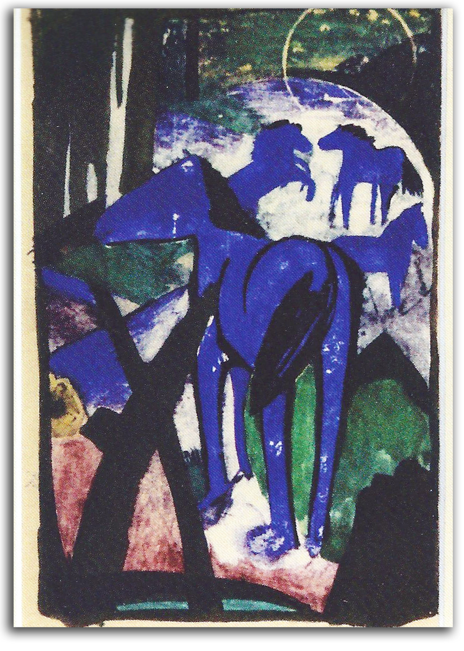
MARC (after)
Small Blue Horses, (painted c1911)
Lithograph from a watercolor. [Later edition]
Collection: FLG on loan to IAD
Published in GLOBAL VISION, Part 1, 2006
MARC
Atonement {At-One-Ment}, 1911
Original Woodcut
Collection: Museum of Fine Arts, Boston
NOTE: Marc made about 60 prints, woodcuts and lithographs. Marc’s feeling of being at-one with Nature and with the Universe as a whole, is rendered vividly in this woodcut. The original meaning of atonement was at-one-ment, meaning at-one with the Transcendent.
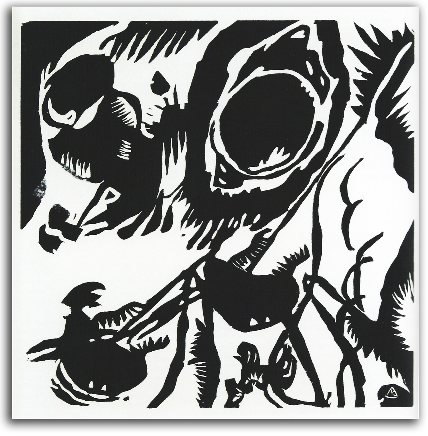
KANDINSKY (after)
Garden of Love (cut & plate signed 1912)
Woodcut from SOUNDS {KLANGE}, 1913
Collection: Los Angeles County Museum of Art
Gift of IAD
…………………………………………………………
Authorized Replica Lithograph from the woodcut, 1962
Collection: FLG
Exhibited in THE ART OF THE BOOK: THE MODERN LIVRE D’ARTISTE, University Art Gallery, CSUEB, 1999
Published in GLOBAL VISION, Part 1, 2006
NOTE: Wassily Kandinsky in most textbooks is credited with being the first painter to paint a totally abstract composition. The creation of abstract art is one of the most amazing events in the history of humanity. In a brief moment, the entire tradition of picturing visible reality, a tradition tens of thousands of years old, suddenly disappeared. The very definition of art was transformed. Nothing like that had ever happened before. There had been abstract patterns in the decorative arts, of course, but never in the fine arts.
Another remarkable aspect of this artistic revolution was how it happened. It took place within a very short period of time, between 1910 and 1920. It took place over a large area of the Western World, from Moscow to Munich to Paris and New York. And none of these artists knew each other!
The most important thing about this revolution is why it happened. The written testimony of the leading revolutionaries has been preserved, and their statements are quite consistent. They were all reaching for the Transcendent, but they knew that non-material reality cannot be described with ordinary words or ordinary pictures. It is transcendent of that mode of perception. Words and the material world in which they function is the sphere of space & time. The Transcendent is above and below this perceptual bubble.
Their intuition told them that there must be another way to evoke the experience of “the other side.”
They found clues among the Symbolist poets and painters who pointed to the teachings of many philosophers and to the great spiritual traditions of the world (Alchemy, Buddhism, Hinduism, etc.). All of these traditions have said that the only way to suggest the Transcendent is by means of verbal and visual metaphors. These metaphors can function as “ladders” that our intuition can climb to the sky.
[For my essay on “The Mystic Ladder: Parallel Stages of Consciousness in Alchemy and Tantra” CLICK HERE.]
All these revolutionary artists regarded materialism, in all its forms (economic and psychological), as the primary problem with people having little or no awareness of that which is non-material. Kandinsky articulates this position at the beginning of his book THE SPIRITUAL IN ART. Since the Industrial Revolution and the rise of science as a new kind of religion, many people had become stuck in the narrow assumption that matter is really all there is, and that logical information is the only information that really matters. Neglected or disregarded is intuitive information.
These pioneering artists concluded that pictures of material reality get in the way of the mind touching that higher level of consciousness that is the psychological space of non-material reality. So all these artists elected to stop picturing material reality and start picturing non-material reality. Their hope was that such paintings, prints, and poems would evoke the spirit of the Transcendent inside their audience by means of what Kandinsky called “spiritual resonance.”
Kandinky and his partner Gabriele Munter were drawn to this metaphysical position by reading the Theosophy books of Madame Blavatsky and Annie Besant, the Anthroposophy books of Rudolf Steiner, as well as THE GREAT INITIATES by Edouard Schuré. All these metaphysicians shared with Blake the conviction that “all religions are one,” and that matter and spirit are aspects of each other.
Who created abstract art? Several artists were doing it at the same time between 1910 and 1920. The best-known names are Kandinsky, Mondrian, and Malevich. When I was a young curator at the Museum of Modern Art in New York, I spent many hours looking at how these legendary painters suggested the psycho-cosmic relationships in which spirit and matter unite. Each rendered the spirit-matter relationship differently. Kandinsky was explosive. He dove into the Transcendent experience and then erupted with hot volcanoes of color. Mondrian and Malevich were more contemplative. They stood back from the Transcendent experience and reflected on it quietly, making cool geometric forms as metaphors of spirit-matter balance. Later, in the 1940s, the Abstract Expressionists got a taste of the strange and wonderous experience of the Infinite Luminosity we call the Transcendent, and left us powerful images of their anxious efforts to get beyond the ego-loving materialism in order to taste more Light.
The credit for being the very first to paint an abstract painting usually is given in textbooks to Kandinsky. The date usually given is 1910. A number of scholars have questioned this date; but he certainly was one of the first even though the actual date may have been 1913. Moreover, what he did with this new way of seeing has proven to be more memorable for more people than the work of other great innovators.
What he painted in those early years is quite remarkable. He set the standard by which biomorphic abstraction (non-geometric abstraction) would be judged for the rest of the century. For collectors and curators of prints, it is equally exciting to look at what he did as a printmaker during those pioneering years before the Great War of 1914.
The best-known group of those black & white prints is his book SOUNDS {KLANGE} published in 1913, with prose-poems by the artist. This book is a total work-of-art. Kandinsky called it a “musical album.” He was the author, the illustrator, and the designer. He wrote the 38 prose-poems between 1909 & 1911. The suite of 56 woodcuts he began in 1907. That suite proved to be a major arena of visual research as he moved during these critical years from the last vestiges of Symbolist naturalism toward the Abstract Symbolism for which he became famous. As a painter and as a printmaker, he actually worked using both Realistic Symbolism and Abstract Symbolism until 1912-13. Only after that did he begin to talk publically about Abstract Symbolism or what he called “concrete” art, and “absolute” art.
Too often overlooked is the important role played by Gabriele Munter, his partner and fellow painter, during Kandinsky’s struggle to shift from his rational side to his intuitive side, from the Realistic to the Abstract. At one point, while trying to start a large painting of a flood, he was blocked. What happened next has been reported this way:
Munter told him that he was trapped in his intellect… . She suggested he simply repeat the word uberflut (“delufe” or “flood”) and focus on its sound rather than its meaning. Repeating this word like a mantra, Kandinsky painted and completed the monumental work in a three-day span.”
This “Garden of Love” is the best-known print in SOUNDS. At their request, IAD donated an original impression of this print to the Los Angeles County Museum of Art for their matchless collection of German Expressionist prints (which did not have this very important print). Kandinsky regarded the woodcuts of SOUNDS as some of the most important work he ever did. He wanted that work to be better known. So, in his later years, he supervised the production of replica lithographs. His widow continued that work. I have kept a replica of “Garden of Love” (authorized by the estate) on my wall for many years. That is the impression that was exhibited in the 2006 exhibition at CSUEB of “Global Vision: A Survey of World Art, Part 1.” I am moved by its musicality, and by the fact that Pollock was looking at very similar compositions when he was in the process of finding himself.
[For a complete micro-gallery of the pages of SOUNDS on the MoMA site, CLICK HERE.]
Kandinsky’s more famous book is THE SPIRITUAL IN ART {UBER DIE GEISTIGE IN DER KUNST}. It was written over a period of about 10 years and seems to have been completed about 1910. A version was presented at a conference in Russia in December 1911, and the first published editions appeared in 1912. Many editions quickly followed. It became the best-selling book ever written by a Modern artist.
For many years, the standard English edition, authorized by his widow (and published by my friend George Wittenborn in 1947), carried an introduction by S. W. Hayter. Hayter was the painter-printmaker-teacher who played a key role in helping Pollock find himself between 1944 & 1945. Their legendary interaction was the start of Abstract Expressionism
[For the Hayter-Pollock story as told to me by Hayter and his assistant, “Pollock, Hayter, & the Seeds of Abstract Expressionism,” CLICK HERE.]
When I discussed Kandinsky’s book with Hayter in Paris in 1985, he made a number of very interesting points. Here are some of my notes from that conversation in which he summarized and then quoted Kandinsky from time to time:
After his opening salvos against materialism, Kandinsky’s point of departure was musical vibrations. When he looked at colors, he heard sounds, musical sounds. He’s not talking about metaphors there, but of actual experience. That of course is too “far out” for some readers, Bill said with a smile. The rest is a little more available.
What moves so many readers, Bill continued, is the power of Kandinsky’s metaphors. They go right down to our unconscious mind. For example, colors are not just pretty; they cause “vibrations in the soul.” That results in an “inner resonance.” Form is the exhalation of a “spiritual breath.” A form that touches the soul is good art. Otherwise, it’s not worth making.
Is it not curious, Bill asked out loud, that so many people say this book explains and defends abstract art? Those people have not read the book. The book does nothing of the kind. It was written before he had conceived of abstract art! However, it does lay out the mystical principles on which he did eventually build abstract art.
Bill continued with reflections on Kandinsky’s metaphysics: He did not define “spiritual” very clearly in the book. He relates the term to religion, but he may have been talking about religious feeling and not religion. Then Bill said the following with a clarity and forcefulness that stunned me:
In other words, as Carl Jung and Erich Fromm remind us, spiritual awareness can develop whenever and however the ego is transcended. A good working definition of Transcendence is feeling ‘at-one’ with the universe, not separate from the universe as a whole. No concept of God need be involved. As you know, there is no God in the Zen experience of Enlightenment. It’s a change in the quality of consciousness. You and I might have a brief moment of Transcendent experience from time to time. But the teaching is that once true Enlightenment takes place, the ‘at-one’ feeling is constant.
Bill ended that line of thought with two more striking sentences:
One must have a certain level of consciousness to appreciate abstract art, a level at which intuition is as important as rationality. Kandinsky got there about 1910.
Bill continued, in a reflective mood, recalling how impressed he always had been with how quickly and how widely Kandinsky’s book connected with artists around the world, not only among Europeans but also by Stieglitz and O’Keeffe and their circle in New York, all the way to an edition in Japan. Bill concluded:
He touched the core of our humanity.
Then Désirée, his delightful wife, came home and the three of us returned the conversation to Abstract Expressionism in the U.S. and the parallel development of L’informel in France. Happily, Bill and I stayed in touch for some time with a series of letters. He kindly checked the transcript of our conversation so that what I published would be accurate in my book THE SPONTANEOUS GESTURE: PRINTS & BOOKS OF THE ABSTRACT EXPESSIONIST ERA (1987). In one of my last letters to Bill I shared with him a statement by Diego Rivera about Kandinsky:
He opened a window to look inside the All.
NOLDE
The Prophet (cut 1912)
Lithograph from the woodcut, 20th century
Edition of the National Gallery of Art, Washington, D.C.
Collection: CSUEB. Gift of IAD
NOTE: This print by Emil Nolde is widely considered the most powerful print of the Expressionist era.
NOLDE
Lake Geneva (painted c1930s-40s)
lithograph from a watercolor, 1970
Collection: FLG
NOTE: Emil Nolde was one of the most gifted of the German Expressionists. As he did with all Modern art, Hitler removed Nolde’s work from German museums and forbid him to paint. Nolde quietly continued to paint in secret, with a special focus on watercolor landscapes. He was one of the last great landscape painters of the Modern era.
DIX
Wounded (etched 1916)
Original Lithograph from an etching, 1925
Collection: FLG on loan to IAD
Published in GLOBAL VISION, Part 1, 2006
Exhibited in “The Cost of War,” CSUEB, 2008
NOTE: Otto Dix was a German soldier in World War I. This is a picture of himself. He became an important member of the Second Generation of Expressionists after the Great War.
KOLLOWITZ
The Widow II, 1922-23
Lithograph from WAR, Leaf #5
Collection: FLG
NOTE: Kathe Kollowitz was the most important woman artist of the German Expressionist movement. Her best work was lithographic. This print, and the next one from her book called WAR are among the most powerful she ever made. She stands at the head of the Modern tradition of Social Realism.
KOLLOWITZ
The Mothers, 1922-23
Lithograph from WAR, Leaf #6
Collection: FLG
KLEE
Kleinwelt
Lithograph from the engraving
Collection: FLG
EUROPEAN MASTERS – 20th CENTURY – Cubism
Modern Art may be said to have begun with Postimpressionism, a series of related styles that developed over three generations. The First Generation of painters, led by Cézanne, Gauguin, and Van Gogh, matured during the 1880s. The Second Generation of painters matured during the 1890s. It included Lautrec, Bonnard, and Munch. The Third Generation of painters matured between 1900 and 1910. It included Matisse and the Fauves in Paris and German-speaking Expressionists. Cubism was invented by Picasso and Braque between 1908 and 1910.
This new style was so powerful that it blew away much of the force of the final generation of Postimpressionists – the Fauves and the Expressionists. Those artists were still holding on to the outward appearance of people, places, and things as seen inside a single moment of time from a single point of view. That was a Renaissance assumption that had defined European art for centuries. The Cubists exploded that Renaissance assumption. They decided instead to explore a new idea – the idea of a person, place or thing as seen from several points of view simultaneously.
Without any knowledge of what Einstein was thinking (which was curiously similar thinking), the Cubists folded space and time into each other. In the process, they broke forms into smaller elements and also forced the foreground and background into each other. The result is a stimulating formal achievement. It is neither very colorful nor very emotional, as a rule, but it is a striking kind of atonal musicality.
As with music for the ear, this visual music has no central tonal center around which other tones revolve. The traditional perceptual center of the Renaissance tradition has been exploded into equally important elements that exist all over the canvas. When looking at a Cubist composition, many feel they are looking at a windowpane that has been shattered and reassembled out of broken parts.
Daniel-Henri Kahnweiler (1884-1979) is of special significance in the history of Cubism. In his native Germany he was trained in finance but preferred art. He opened a tiny gallery in Paris in 1907 just as Picasso was painting his legendary “Demoiselles d’Avignon.” He quickly fell in love with this unknown thing called Cubism and became the exclusive representative of Pablo Picasso, Georges Braque, and Juan Gris. His gallery was the very core of the Cubist experiment from 1907 to 1914.
Traditional dealers felt they were doing their artists a favor by representing them; his attitude was the opposite. He not only was actually a friend of his artists, he had a novel way of supporting them. He gave them an annual stipend in return for ownership of whatever they produced. This gave each of them the rare feeling of financial security and psychological freedom. In short, he not only represented the core Cubists, he was a catalyst who helped Cubism to flower. Kahnweiler also published books by emerging writers such as Guillaume Apollinaire, Antoin Artaud, André Malraux, and Gertrude Stein, as well as beautiful livres d’artistes. In addition, he was one of those rare dealers who also was an important art historian – a respected historian of Cubism.
From Kahnweiler and others we hear again and again about the continuing importance of Mallarmé. One might think his influence, which was so strong on Impressionists, Postimpressionists, and Symbolists would have ended with the closing of the 19th century. But that was not the case. The importance of Mallarmé in the development of Cubism would be difficult to exaggerate. Mallarmé’s poem “Un Coup de Des” (first published in 1897) probably is the most influential poem of the Modern era. It gave to Modernism the concept of deconstructed space and time. The poet Pierre Reverdy said that what the Cubists did was “consolidate” the verbal innovations of Mallarmé.
Kahnweiler in his essay “Mallarmé and Painting” reports that Mallarmé was very influential on the Cubists. He goes so far as to state that Mallarmé as a source for Modernism was equalled only by Cézanne.
Robert Motherwell made a similar statement in his preface to FROM BAUDELAIRE TO SURREALISM: “Mallarmé was responsible for the atmosphere in which Cubism became possible.” When I asked Motherwell to say more about that in a conversation at MoMA in 1965 this was his reply: “Mallarmé blew the world apart. The Cubists put it back together.”
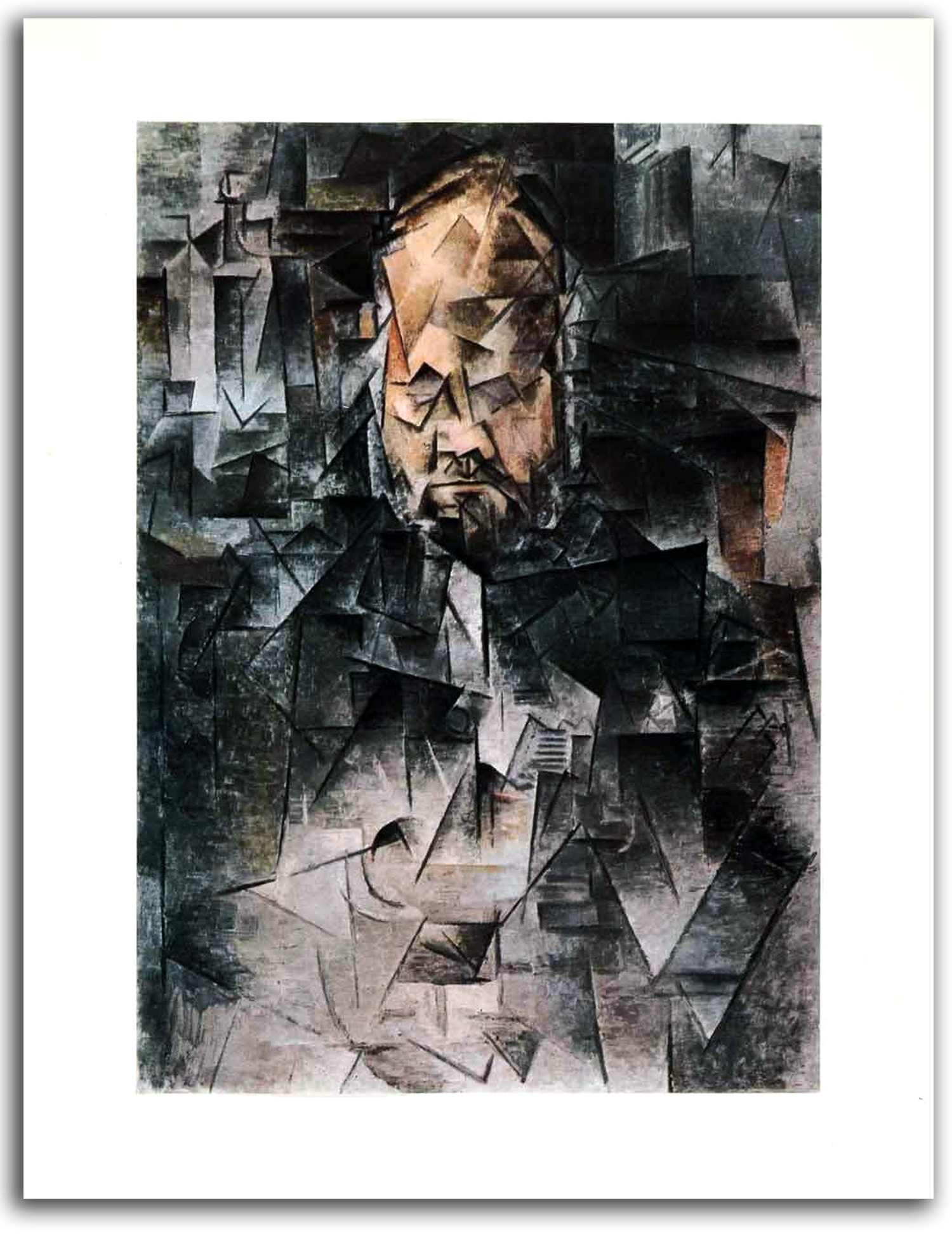
PICASSO
Portrait of Vollard (painted 1909-10)
photolithograph – tipped-in book plate, 1957
Collection: IAD (2012)
NOTE: Of all his Cubist painted portraits, Pablo Picasso thought this one was his best. It is a portrait of Vollard who was the most important print publisher of the age, and a major supporter of Picasso as a dealer-publisher. When I started reading art books in the 1950s the best color prints in books are not printed with the text. The technology was not yet good enough for that. The good prints were printed separately and then tipped-in which means glued on to the page. The print quality was so high that it was rarely matched until the digital technology of the late 20th century. These tipped-in prints were so attractive that many were stolen from libraries.
PICASSO
Portrait of Apollinaire (etched 1913)
Original Etching (frontispiece)
from ALCOOLS by Apollinaire, 1913
Edition by Vollard
Collection: Unknown
NOTE: None of Picasso’s etched portraits of the Cubist era were as powerful as his oil portrait of Vollard. But many are quite good, and some of the best were done for books. This “Portrait of Apollinaire” is one of the best of those. Apollinaire was an important poet and art critic, and a good friend of Picasso. Picasso loved being involved with illustrated books. Over his lifetime, he contributed a good number of his 200 prints to over 150 illustrated books.
PICASSO
THE METAMORPHOSES by Ovid
First Edition by Skira, 1931
————————————-
Facsimile edition, University of California, 1954
Collection: CSUEB
Gift of IAD
Exhibited in THE ART OF THE BOOK: THE MODERN LIVRE D’ARTISTE, University Art Gallery, CSUEB, 1999
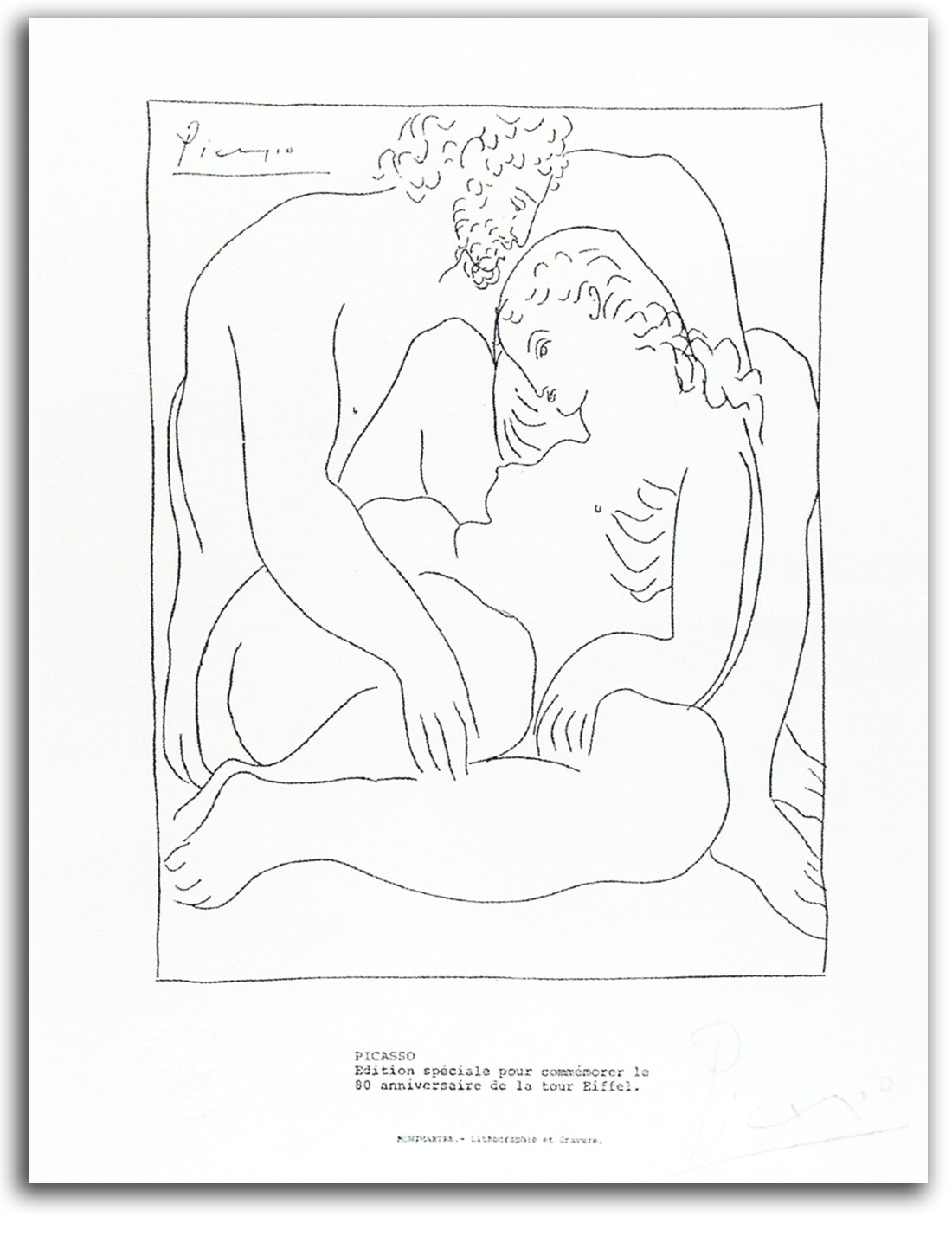
PICASSO (after)
Jupiter & Semele
Etching from METAMORPHOSES by Ovid
Edition by Skira, 1931
——————————————————
Facsimile edition, 1969, supposedly made to help fund the restoration of the Eiffel Tower. [Hand Signed?]
Collection: CSUEB. Gift of IAD
Published in GLOBAL VISION, Part 1, 2006
NOTE: After World War I Picasso left Cubism and turned to a gentle Neoclassical style. He used that style to illustrate this book by the ancient Roman poet Ovid, a book that was his only American publication. Skira gave Picasso the commission in 1928. The book appeared in 1931. There is reason to question the authenticity of this particular inscription and the signature. So it has been a good case study in connoisseurship in my Museum Studies seminar.
PICASSO
Bacchanal with a Minotaur, 1933
Original Etching from THE VOLLARD SUITE, Plate 85
Printed by Roger Lacouriere
Edition by Vollard, 1950
Collection: Museum of Modern Art, New York
NOTE: This suite of 100 etchings was Picasso’s last great work as a printmaker. They were etched between 1930 and 1937. The main theme is the Minotaur. The Minotaur image comes from the ancient pre-Greek mythology of Minoan Crete. He is a creature who is half man and half bull, and for Picasso a perfect metaphor for his own double personality. The wordless story told in this series of images is of the mindless passion of the Minotaur.
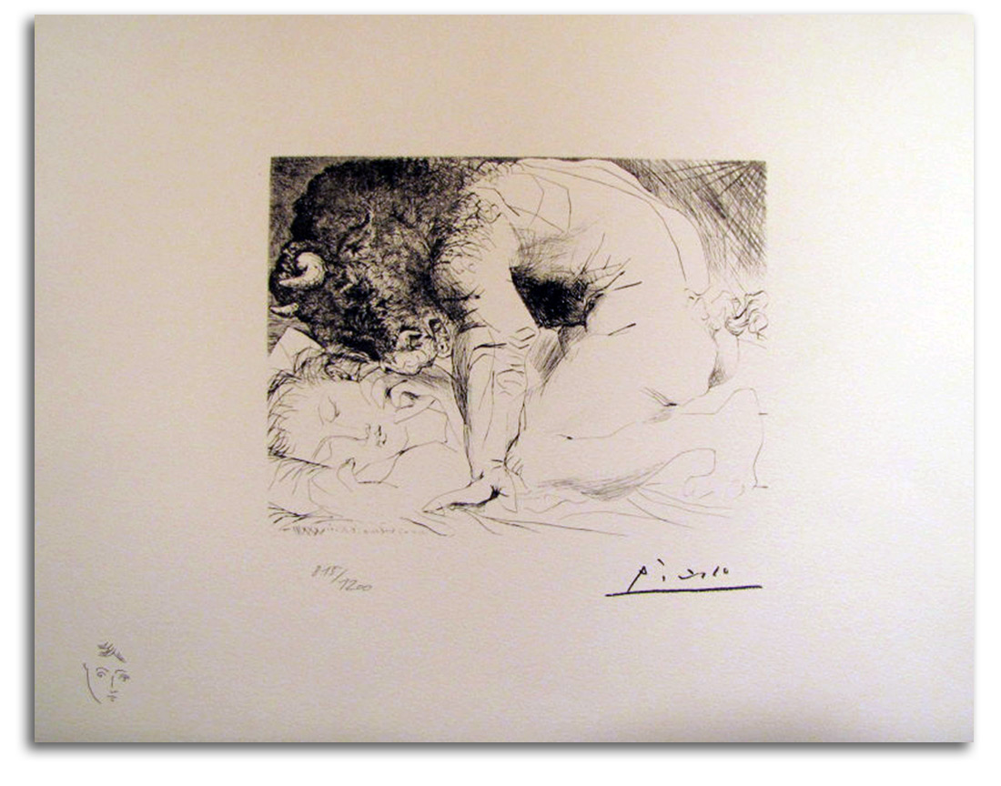
PICASSO (after)
Minotaur caressing a Sleeping Woman (etched 1933-34)
Original Etching from THE VOLLARD SUITE, Plate 93
Printed by Roger Lacouriere
Edition by Vollard, 1950
——————————–
Facsimile lithograph authorized by the estate, 1973
Collection: FLG
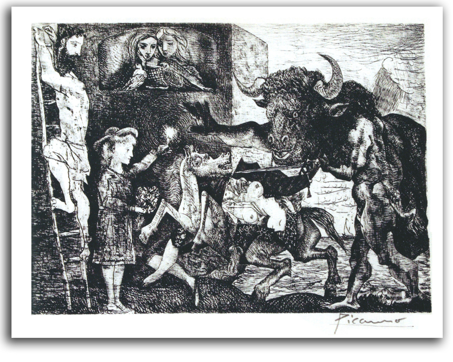
PICASSO
Minotauromachy (etched 1935)
Original lithograph from an etching [Hand Signed]
Editioned by Abrams in PICASSO:
50 YEARS OF HIS GRAPHIC ART, 1955
Collection: FLG on loan to IAD
Published in GLOBAL VISION, Part 1, 2006
NOTE: This is widely regarded as Picasso’s most important print. Not only is it a composition of great power, it also is the point of departure for his last great painting – “Guernica” of 1937.
PICASSO
Guernica, 1937
Oil
Collection: Museo Reina Sofia, Madrid
NOTE: This was Picasso’s last great painting. It was painted in response to the Nazi bombing of the Basque village of Guernica during the Spanish Civil War, a bombing that was “merely” a training exercise for the new German air force. It is one of the most important paintings of the 20th century. After this profound explosion of creative energy and moral purpose, Picasso’s artistic juices began to ebb. Most of his work thereafter is minor and often merely the repetitious renderings of an old man remembering his vibrant youth.
BRAQUE
Papiers Colles II, 1963
Original Lithograph in DLM, 1963
Collection: FLG
NOTE: Although this lithograph is a late edition, it was done in his early Cubist style. Picasso is usually given credit for the invention of Cubism. This is partly due to Picasso’s enormous ego and endless self-promotion. Actually, the evidence indicates that the basic concept of Cubism came from the mind of the more modest Georges Braque. Then the two worked together on the formal implications of this revolutionary concept for years.
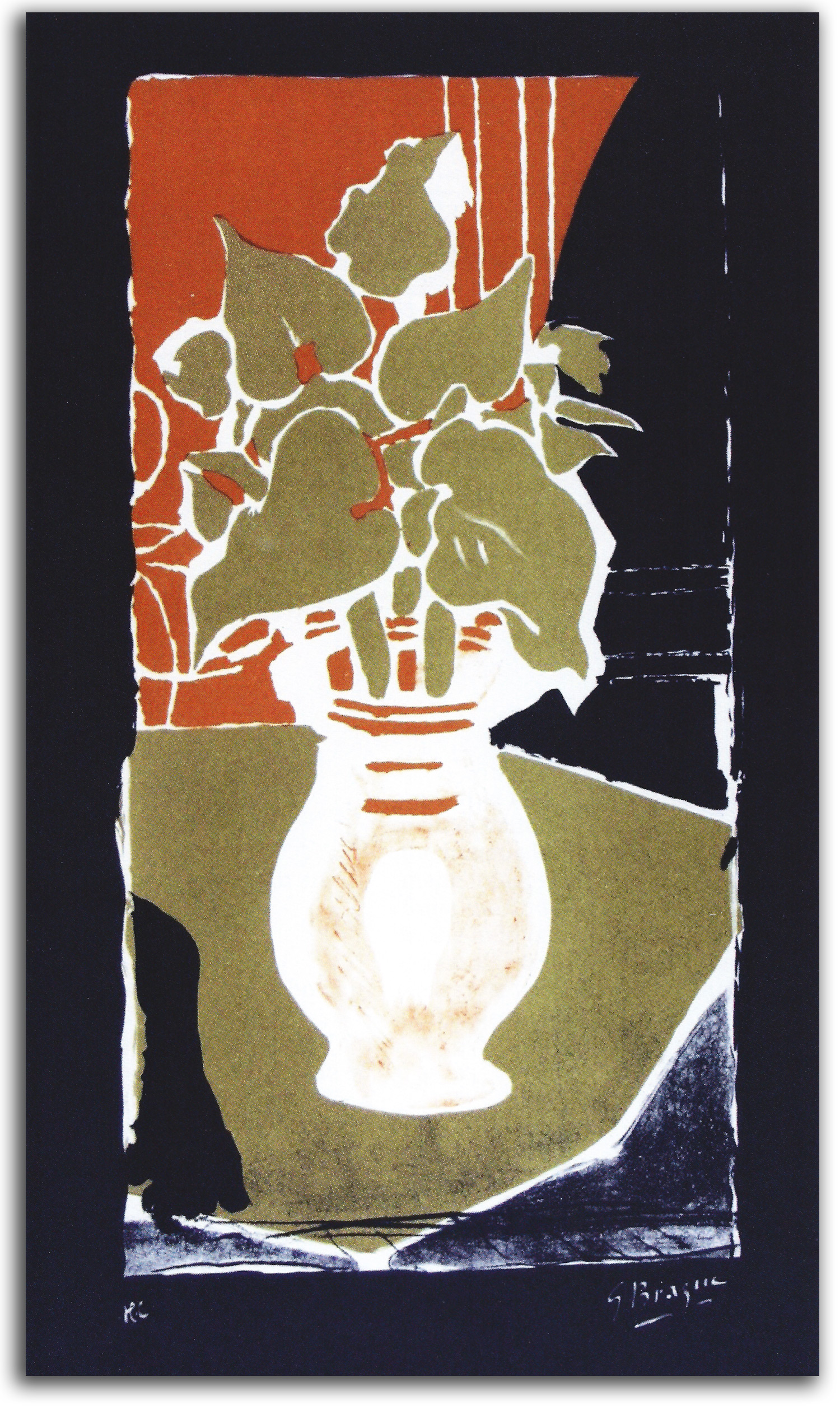
BRAQUE
Flowers and the Light, 1962
Original Lithograph [Hand Signed]
Collection: FLG on loan to IAD
Published in GLOBAL VISION, Part 1, 2006
NOTE: In his later years, Braque relaxed his Cubist style and made some of the most lyrical paintings and prints of the 20th century. This is one of the best examples.
EUROPEAN MASTERS – 20th CENTURY – Dada
Dada was a cultural movement that flourished in Europe and the United States between 1913 and the early 1920s when some of its leading figures transitioned into another movement, the Surrealist movement. Dada was sparked into being by the horrific events of World War I (1914-1918). Dada artists protested not only against the war but also the mindless logic of materialism, nationalism, and colonialism that generated the war, and the comfortable art of the bourgeois class whose greedy stupidity started the war.
Quite a few of these like-minded artists gathered in the safe-haven of Switzerland to live out the war. Their primary gathering place was the Cabaret Voltaire in Zurich. A lively cast of characters (including Arp, Ball, Hennings, Janco, Tauber, Tzara, and Richer) provided entertainment unlike any seen before. Absurdity was everywhere. Nonsense was everywhere – in poems, in songs, in plays, in costumes, and on the walls. Their manifestos and widely publicized various public antics were shocking to many (and that was just fine). They were trying to blow up the past and clear the way for a more humane future.
To the consternation of all who thought of art as something idealized and remote, the Dadaists rummaged around in the neglected pockets of the everyday, discovering the richness of common realities. To their newly opened eyes, the hitherto unrealized aesthetic potential of their daily environment continuously burst like an endless string of colored firecrackers. They reached right out into the middle of life, and brought the actual world right back into the middle of art.
Taking hold of reality with a brand-new grip, they conducted a revolution in the history of seeing. Because their revolution was successful, we look at things differently today. They made us aware that the difference between what we usually accept as art and what we usually regard as reality can be very small. The sensuous line of an oil slick, the massive gnarls of a tree stump, or the sharp outline of a spark plug now can now be legitimately enjoyed as much as a painting.
After the war in Berlin another highly creative group of artists (including Hausmann, Heartfield, Hoch, and Huelsenbeck) blew the horns of Dada. In the process, they (along with Schwittersin Hanover and Ernst in Cologne ) made the finest collage and photomontage compositions of the age. There also were activities in Eastern Europe and Japan.
In New York City, the mischief was being caused mainly by Duchamp, Picabia, Man Ray, and Beatrice Wood. The mischief-making that caused the greatest uproar was the “readymades” of Duchamp, especially “Fountain.”
Historians usually place emphasis on the destructive element within Dada, and that certainly was very important. It was an explosive movement. However, its constructive elements are too often overlooked. Dada brought in Asian philosophy with a new seriousness, and produced the stream-of-consciousness technique that was extremely important to the rest of the 20th century, from the novels of James Joyce and Virginia Wolf, to the free forms of Surrealism and Abstract Expressionism, as well as the Postmodernism of the Neo-Dada artists and Beat poets during the 1950s.
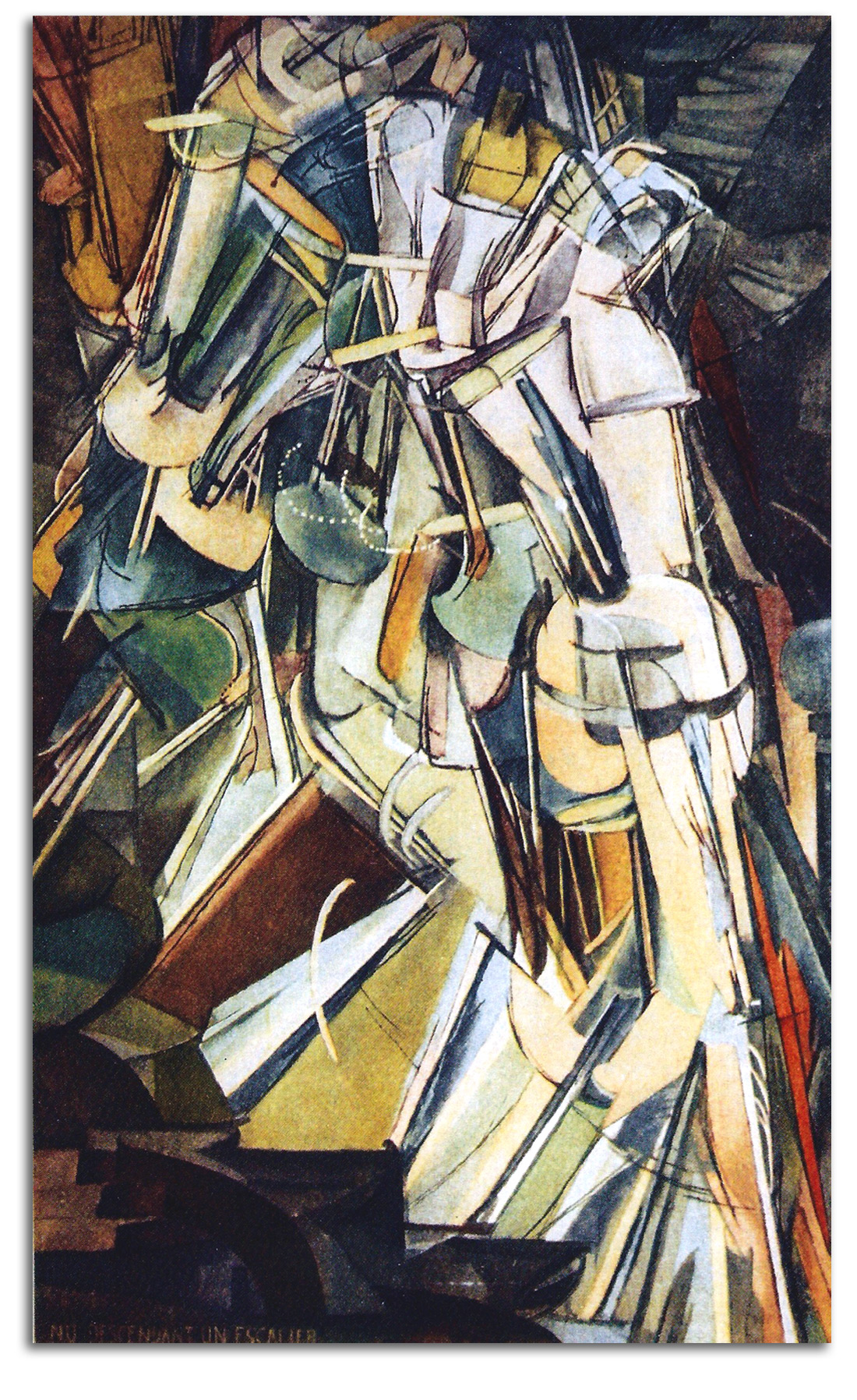
DUCHAMP
Nude Descending a Staircase #2 (painted 1912)
Original Lithograph
from MARCEL DUCHAMP by Lebel, 1959
Collection: FLG on loan to IAD
Gift of the Artist, 1968
Published in GLOBAL VISION, PART 1, 2006
NOTE: Marcel Duchamp was the most important figure of the Dada movement, and one of the most influential figures of the 20th century – probably second only to Picasso and Matisse in terms of influence over the 20th century as a whole. I used to play chess with Duchamp and have written a good deal about him. For my book DUCHAMP & ANDROGYNY: ART, GENDER, AND METAPHYSICS click here.
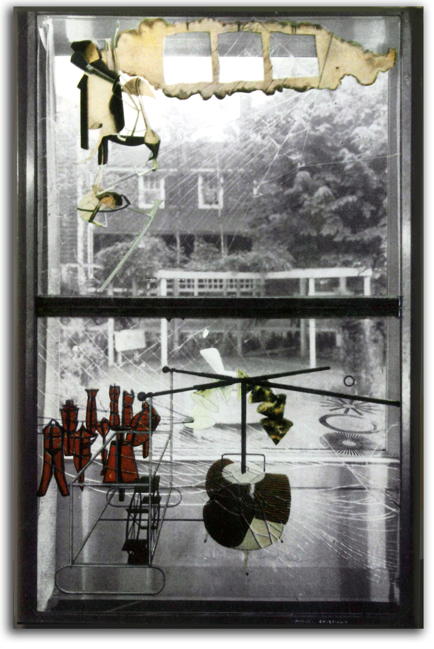
DUCHAMP
The Large Glass. Original made 1915-23
Photo-offset lithograph from a 1959 book he designed
Collection: FLG on loan to IAD. Gift of Marcel Duchamp, 1968
Published in GLOBAL VISION: A SURVEY OF WORLD ART, Part 1, 2006
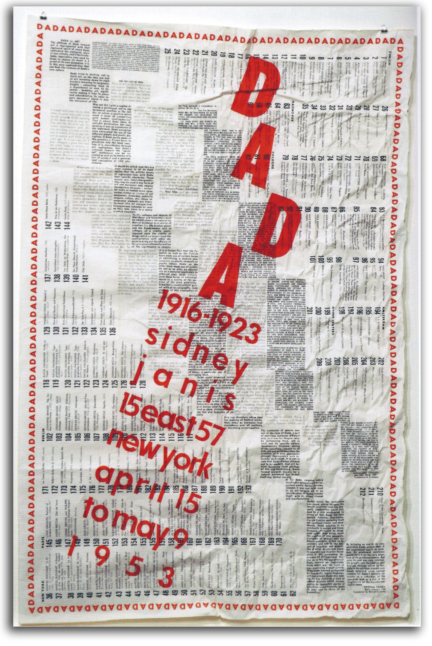
Dada 1916-1923 by Marcel Duchamp, 1953
Color poster
Collection: FLG on loan to IAD
Published in GLOBAL VISION: A SURVEY OF WORLD ART, Part 1, 2006
EUROPEAN MASTERS – 20TH CENTURY – Surrealism
What is Surrealism? The term “surreal” first appeared in 1917 from the pen of Apollinaire, shortly after the Dada movement served notice that logic is not a good basis for art. However, Surrealism did not become an official movement until several years later. The publication of André Breton’s “Manifesto of Surrealism” in 1924 marks the beginning of the Movement. That manifesto contained this definition:
SURREALISM. Noun, masculine. Pure psychic automatism, by which one intends to express verbally, in writing or by any other method, the real functioning of the mind. Dictation by thought, in the absence of any control exercised by reason, and beyond any aesthetic or moral preoccupation.
ENCYCL. Philos. Surrealism is based on the belief in the superior reality of certain forms of association heretofore neglected, in the omnipotence of dreams, in the undirected play of thought… .
Breton went on to declare:
I believe in the future resolution of the states of dream and reality, in appearance so contradictory, in a sort of absolute reality, or surreality… .
In their desire to “go beyond” realism, and to use the power of the marvelous, the Surrealist poets drew inspiration from a number of artistic ancestors. As far back as the middle of the 19th century, Baudelaire, the father of modern poetry, had written about what he called “surnaturalism,” and of the need for what he described as “pure art” in order to “create a suggestive magic…enchantment…astonishment.” The Surrealists also were moved by the word-magic of the Symbolist poets working in the later 19th century, especially Mallarmé, Rimbaud, and the Comte de Lautréamont.
It would be difficult to overemphasize the importance of the concept of “reasonable unreality” (as Apollinaire called it), or “surreality” (as Breton called it). This concept is at the core of Surrealist philosophy. Professor Anna Balakian of Columbia University has written a comprehensive description of that philosophy in her highly respected book, SURREALISM: THE ROAD TO THE ABSOLUTE:
The objective of surrealism was the infinite expansion of reality as a substitute for the previously accepted dichotomy between the real and the imaginary. Acknowledging the human need for metaphysical release, the surrealists believed that through the exploration of the psyche, through the cultivation of the miracles of objective chance, through the mystique of eroticism, through the diverting of objects from their familiar…surroundings, through a more cosmic perspective of life on this earth, and finally through the alchemy of language…man might be able to satisfy his thirst for the absolute… .
The point is not that imaginative realities are superior to physical realities, or that intuition is more important than reason, or that the world of the infinite is more fundamental than the world of the finite. The point is that both are part of the universal whole. The goal of Surrealist artists is to explore for themselves and provoke in others the realization of this profound truth. The perspective of materialism in the modern world, with its adoration of logic, has made us forget that both sides of our consciousness perceive different aspects of the truth. Unless we are able to be aware of both the finite and the infinite, both the conscious and the unconscious, and how they interpenetrate, we will remain imprisoned within a one-sided consciousness – a consciousness that is unable to feel at one with the universe as a whole.
Most of the major works of the Surrealist era were paintings and prints. However, there also were some important sculptures. The most famous single object of the era is a fur-lined “Object” of 1936 by the Swiss artist Méret Oppenheim (1913-1985). A great deal has been written about this legendary object. Many theories have been developed, but no one is quite certain what it means. And that was fine with Ms. Oppenheim. It is good for some things to be mysterious. Many feminists thought of her as a heroine, but she quietly reminded her fans that she was in favor of not radical feminism but gender-balance in both daily life and in society as a whole.
ARP
Untitled (“The Long Blue Road”), 1949
Original Lithograph from DLM, May 1949
Collection: FLG
NOTE: Jean (Hans) Arp started in the Dada circle and then was a key figure in the Surrealist circle as a sculptor-printmaker. For examples of his sculpture CLICK HERE. <Modern Sculpture>
ARP
DEMETER
Conceptualization & first carving: 1960
Realization of this replica: late 20th century
white marble
Collection: FLG on loan to IAD [Keep this or Drop?]
ARP
“Myrtl” {Demeter”} 1960
engraving
<duplicate from Modern Sculpture page>
xxxxxxxxxxx
EXHIBITED: ART OF THE BOOK
The portfolio is Hand Signed
NOTE: Arp was very fond of themes from ancient Greece. Demeter in Greek mythology was the Goddess of Fertility. She also presided over Marriage and Law, as well as the Eternal Cycle of Life & Death. She and her daughter Persephone (Personification of Spring) were at the heart of the Elysian Mysteries where the ancient Athenians found spiritual renewal every year. These Greeks may well have imported the Demeter & Persephone rituals from Minoan Crete. For Arp, Demeter was life itself. Max Ernst said this of Arp: “His nude forms tell of the time of lost paradises, and speak of cosmic secrets. They teach us to understand the language spoken by the universe itself.”
Arp also was a poet, one of the best among the visual artists of the Dada-Surrealist tradition. His first wife, Sophie Taeuber-Arp (1889-1943) was one of the most gifted women artists in the Dada-Surrealist tradition. They collaborated frequently on projects, a practice rare in the world of Modern art. She also was a dancer who performed at the legendary Cabaret Voltaire in Switzerland during World War I at the birth of the international Dada movement.
“Demeter,” with her budding breasts of eternal fertility, is my favorite of Arp’s more figurative pieces. I have published it a number of times, and look at it every day. IAD’s Arp collection includes three small bronzes (”Thales of Miletus” of 1951, “Cobra” of 1952,” and “Floral Nude“ of 1957), and a limited edition brass multiple of 1960 called “Golden Goddess.” They have been exhibited together with a marble “Demeter” and several Arp prints from a private collection including an etching of “Demeter” from Arp’s portfolio of etchings VER LE BLANC INFINI (1960).
My students sometimes ask what other Arp piece I would add if I could have one more. My answer is (if I were to have only a little money) a white version of “Star” of 1956 or (if I were to have a lot of money) the unique white marble of 1949 called “Silent.” Every time I see a picture of “Silent” I am stupefied by this Transcendent marriage of Being & Nothingness taking place beyond the Clouds of Reason in the Realm of Dreams. In the visual language of traditional figuration, nonduality often is pictured as the Androgyne, or the Double-Serpent, or Shiva-Shakti. In an abstract form such as “Silent” IS+IS NOT are united in perfect balance without any additional narrative picturing.
P.S. In the interest of “full disclosure,” I hereby confess that the modern sculptors of the early 20th century I love most are Arp and Brancusi. [For a poem I wrote about them both CLICK HERE.]
DALI
The Last Supper (painted 1955)
Original Lithograph, 1969 [Hand Signed]
Collection: CSUEB. Gift of IAD
Published in GLOBAL VISION, PART 1, 2006
NOTE: Salvador Dali is the best-known painter-printmaker of the Surrealist circle. In a museum filled with Old Masters, many are surprised to learn that Dali’s “The Last Supper” is the most visited painting in the National Gallery of Art in Washington, D.C. For two of my conversations with Dali CLICK HERE.]
DALI
And they Crucified Him, 1964
Original Lithograph, 1964 [Hand Signed]
Collection: CSUEB. Gift of IAD
Published in GLOBAL VISION, PART 1, 2006
ERNST
Loplop Introduces members of the Surrealist Circle …
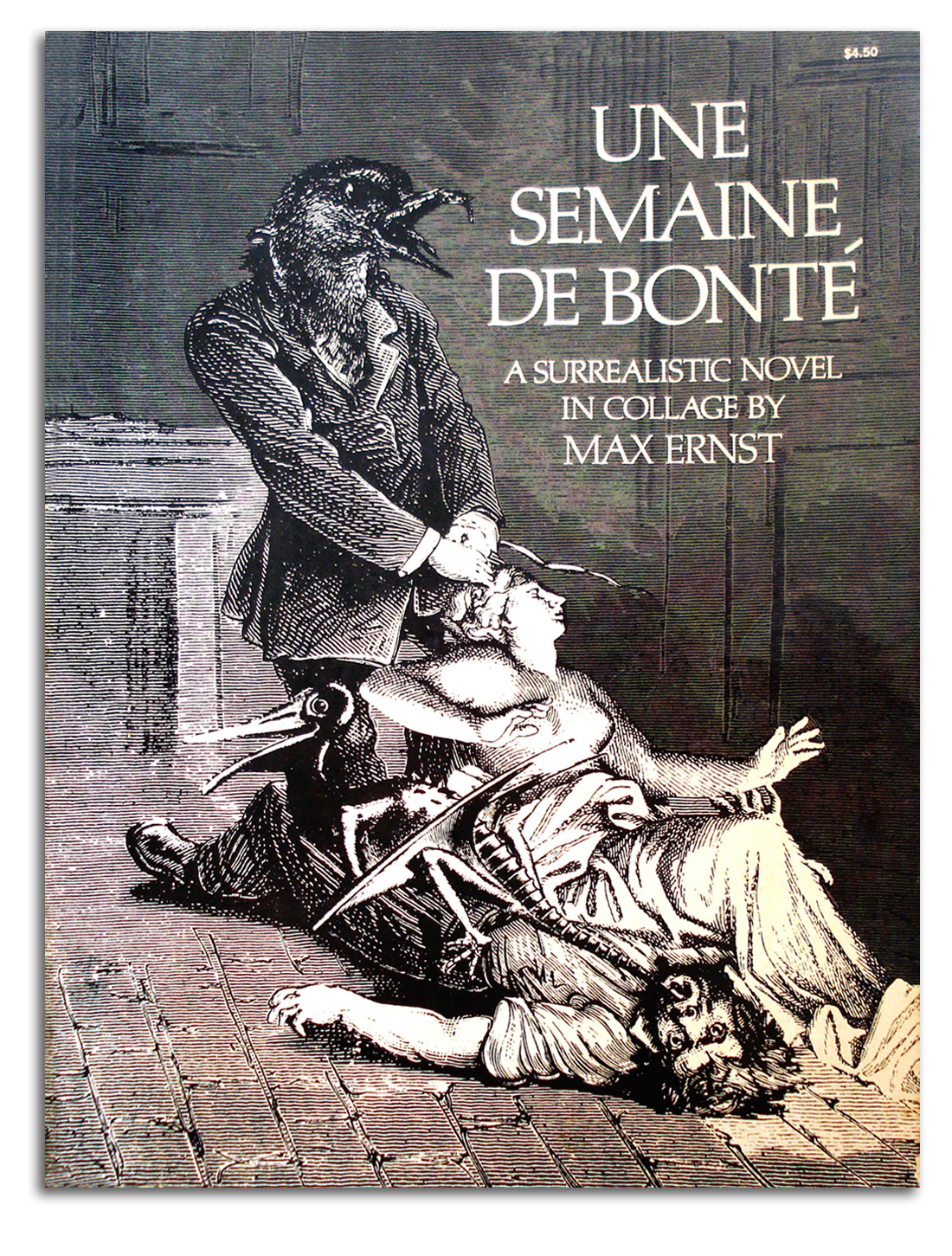
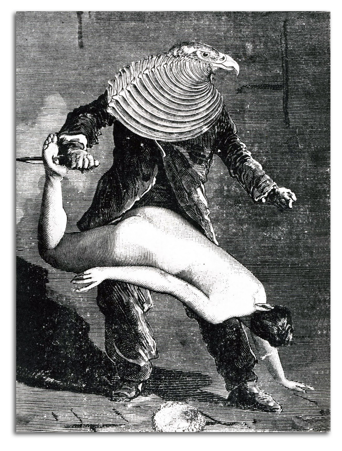
ERNST
Original pages from UNE SEMAINE DE BONTE
{A WEEK OF KINDNESS}, 1934
Two pages of collage lithographs
[The four-volume set is Hand Signed]
Exhibited in THE ART OF THE BOOK: THE MODERN LIVRE D’ARTISTE, University Art Gallery, CSUEB, 1999
Published in GLOBAL VISION, Part 1, 2006
NOTE: These pages are from one of his best-known graphic novels. These illustrated books have a wide influence on many artists in the Surrealist circle. In fact, the early Surrealists in Paris were not sure their verbal art could ever be a visual art. Ernst arrived from German taught them that it could be with his brilliant collages. {For my work with Ernst and his wife Dorothea Tanning CLICK HERE.]
ERNST
Feathered Androgyne, 1934
Book plate from UNE SEMAINE DE BONTE, 1934
Collection: IAD. Gift of Max Ernst, 1967
Exhibited: “Impossible Realities: Marcel Duchamp & the Surrealist Tradition,” Norton Simon Museum, 1991; and “The Art of the Book: The Modern Livre d’Artiste,” University Art Gallery, CSUEB, 1999
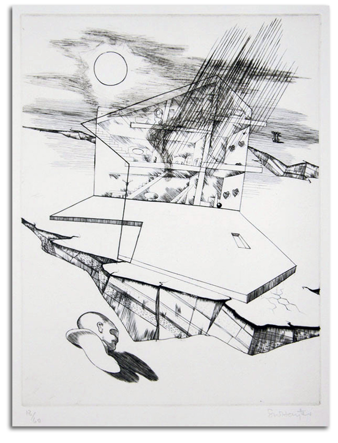
HAYTER
Apocalypse (Spanish Civil War), 1937
Original engraving in L’APOCALYPSE by Hugnet, 1937
[Plate Signed]
Collection: FLG
Gift of the Artist, 1985
Exhibited in THE ART OF THE BOOK: THE MODERN LIVRE D’ARTISTE, University Art Gallery, CSUEB, 1999
NOTE: William Stanley Hayter was the most important British painter-printmaker in the Paris Surrealist circle and later an Abstract Expressionist. He also was an articulate author and a beloved teacher. In Paris during the ‘30s, he taught many Surrealists how to make prints. In New York during the ‘40s, he taught a number of young painters how to make prints, e.g., Pollock, de Kooning, and Rothko. [For my conversations with Hayter CLICK HERE]
MAGRITTE
The Indiscrete Jewels, 1963
Original lithograph. [Plate Signed]
Collection: FLG on loan to IAD
Published in GLOBAL VISION, PART 1, 2006
NOTE: Réné Magritte was the most important Belgian artist in the Surrealist circle. A signed & numbered impression of this print is on the cover of the catalogue raisonné (1982). This is the only lithograph he made that was not based on one of his paintings.
MAGRITTE
The Rape, 1963
Original Lithograph [Plate Signed]
Collection: CSUEB. Gift of IAD
Published in GLOBAL VISION, PART 1, 2006
MIRO (after)
Dawn Perfumed by a Shower of Gold (painted 1954)
Postcard edition by SFMoMA
Collection: FLG
NOTE: Joan Miró remains the most widely respected painter of the Surrealist circle. Dali is better-known by the gereral public, but is less respected in professional circles. Dali did some amazing paintings. He also did a lot of junk. The figure in this painting is an Androgyne, which was a common mythic symbol in the paintings and prints of Symbolism and later of Dada and Surrealism. For my book of the subject, see DUCHAMP & ANDROGYNY: ART, GENDER, AND METAPHYSICS, 2003 {CLICK HERE}
The deep commitment of Miró to spirituality is well known to those who have read his poems and statements, for example he said it is good to “…find the religious essence, the mahic meaning of things.” I had learned something about the particular structure of his metaphysics from his good friend Soulages; but I wanted to know more about his psychodynamics. So I spoke with Magit Rowell who had recently edited JOAN MIRO: SELECTED WRITINGS AND INTERVIEWS (1986):
LG: What were Miró’s thoughts on the ego?
MR: Much like those of Mallarmé, stepping out of the little self into the big universe.
Here is how she quoted Mallarmé in her Miró book:
I am now impersonal, a potential in which the Spiritual Universe may see itself reflected and may develop through what was once my self.
Miró would speak of a comparable anonymity… .
Anonymity allows me to renounce myself but in renouncing myself, I come to affirm myself more strongly… . The same practice makes me seek…the infinite in the finite.
MIRO
Untitled (engraved [printed?] 1958)
Facsimile woodcut (#15), one of the 79 woodcuts
in A TOUTE EPREUVE {READY FOR ANYTHING} by Eluard
Facsimile edition by Cramer, 1987
Collection: FLG
Exhibited in THE ART OF THE BOOK: THE MODERN LIVRE D’ARTISTE, University Art Gallery, CSUEB, 1999
NOTE: This is widely considered one of the greatest books of the 20th century. During a period of 11 years, Miró made over 200 woodcuts for this project. Paperback edition: 1997
MIRO
Yellow
original lithograph in DLM, 1961
Edition by Maeght
Collection: Unknown
MIRO
Trace Sur l’Eau {Traced on Water}, 1963
Original Lithograph on the cover of a portfolio of facsimile prints
of watercolors on onion skin paper
Collection: FLG
TANNING
Untitled, 1964
Original Lithograph
Collection: CSUEB. Gift of IAD
Published in GLOBAL VISION, PART 1, 2006
NOTE: Dorothea Tanning, an American, was one of the most gifted women painters in the Surrealist circle. She also was the wife of Max Ernst. [For some of my correspondance with Dorothea CLICK HERE.]
CORNELL
SURREALISM by Julian Levy, 1936
Original Book Cover
Collection: FLG on load to IAD
Gift of Julian Levy, 1967
Published in GLOBAL VISION, PART 1, 2006
NOTE: Joseph Cornell was the most famous American Surrealist. His primary medium was the shadow-box, but he also produced many graphic works. Levy was the primary New York dealer promoting Surrealist artists during the ‘30s & ‘40s. For my research on Levy and Modern chess sets, and some of our correspondence CLICK HERE.]
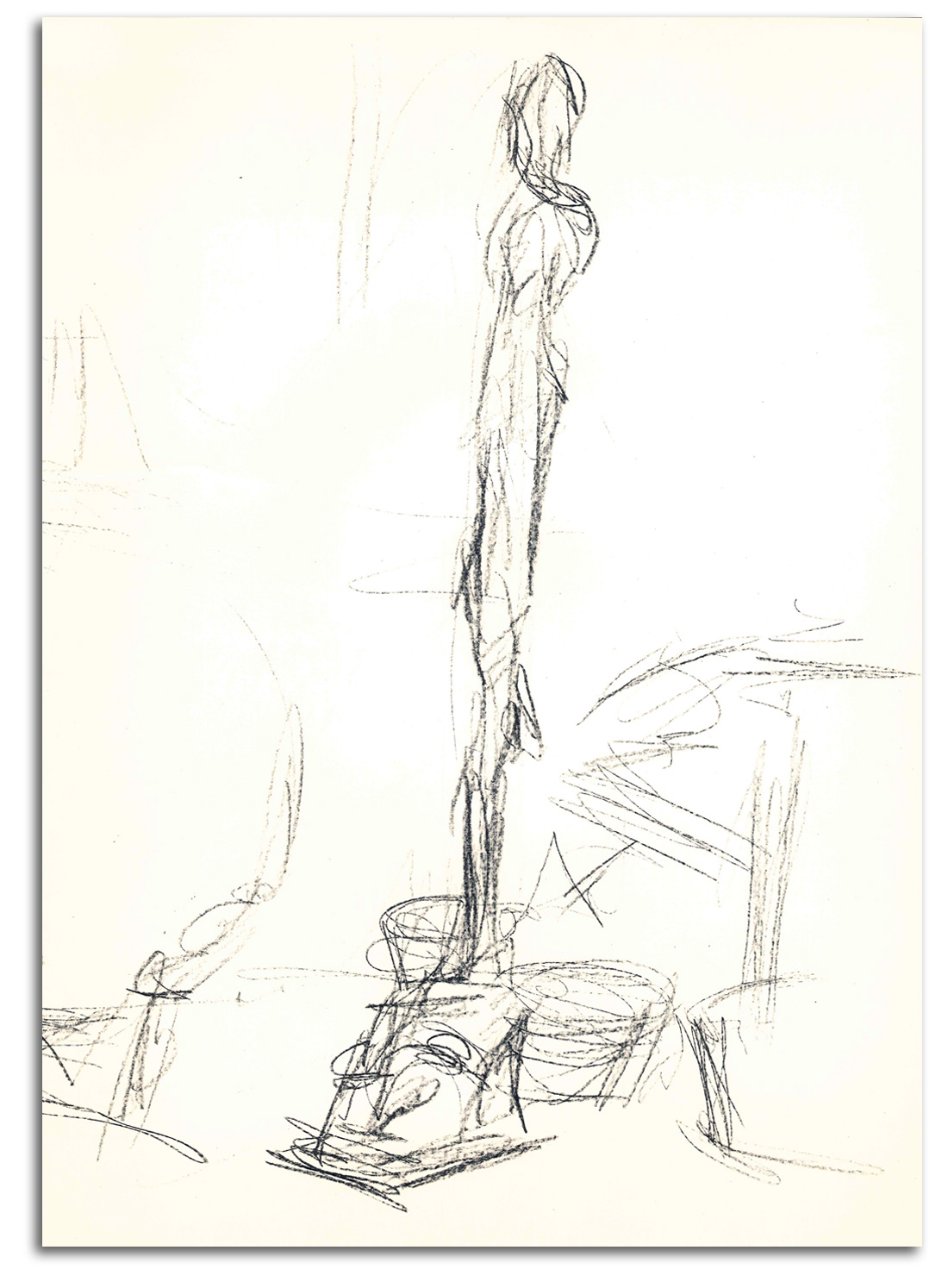
GIACOMETTI
Untitled [sketch for a Tall Man], 1961
Original Lithograph in DLM #127, 1971
Collection: FLG
NOTE: Alberti Giacometti began as a Surrealist sculptor. For examples, CLICK HERE <link to Modern Sculpture page>. After World War II (1939-45) he became famous for his tall, very thin figures that for many symbolize the Existential Condition. When my daughter asked me to explain Existentialism, I showed her this print and photographs of his sculpture, and wrote this interpretive poem for her:
Existential Man
(Homage to Giacometti)
I wander through
the streets of life
wondering who I am
and why I’m here at all.
There is no mythology
to give meaning
to my moments.
As there is no God
and I have no special feeling
for anyone else,
is it any wonder
that what I usually feel
is anxiety, uncertainty, and alone-ness?
I hover between
Being and Nothingness
not sure which side I’m on.
So, you see,
my height is a mask
that hides my emptiness.
I am not really
standing tall.
I think I really am
No-thing at all.
end of Surrealism xxxxxx
EUROPEAN MASTERS – 20TH CENTURY – Late Modern
SOULAGES
Lithograph 20A, 1969
Original lithograph
Collection: National Gallery of Australia, Canberra
{Acquired at the recommendation of FLG}
NOTE: Pierre Soulages was (and still is) the best-known French painter-printmaker of the Abstract Expressionist era. Indeed, he probably still is the most famous artist in France. The Americans of the Ab. Ex. era favored rapidly brushed, highly energetic compositions. The strokes of Soulages are slow and smooth. It was a special pleasure to converse with him about his influences (such as Zen and his friend Miró), and his metaphysics, when he invited me to dinner in Paris in the summer of 1985. The heart of what we discussed I published in THE SPONTANEOUS GESTURE: PRINTS & BOOKS OF THE ABSTRACT EXPRESSIONST ERA (1987).
We spent a good deal of time working together to polish translations of his statements into English, extremely subtle statements involving luminous Nothingness. His English is not perfect, and my French is a long way from what it once was; but we finally ended up with lines for publication that felt good to both of us. Here is one of his statements:
We Modern painters are not painting the forms that you see on the canvas, or the marks you see on the paper of a print. We are painting the light that radiates up through all that, from the other side.”
In short, as with so many major artists of this era, the csubject matter of Soulages is luminosity, Transcendent luminosity, or what he described in a shorter phrases as:
The radiance – the luminosity of the infinite.
And:
The light that shines up from underneath matter.
When the subject-matter of an Abstract Expressionist painting or print is not Transcendent, the composition can be as empty as wallpaper. [For one of the letters Pierre and I exchanged, CLICK HERE]
TAPIES
Untitled [Cover of DERRIERE LE MIROIR #210], 1974
Original lithograph
Collection: FLG
NOTE: Antoni Tapies was widely regarded as the most important Spanish painter of the postwar era. He is Catalonian, from Barceloan. It is curious that most of the greatest Spanish artists of the 20th century are not simply Spanish but Catalán: Dali, Miró, and Tapies. Even Picasso spent his formative years in Barcelona. What is it about Catalonia?
Tapies started under the influence of Surrealism, inspired by Miró. He moved on in the mid ‘50s to a lifetime of mysterious “scratchings” that often look like grafetti on a wall, and/or strange signs from an unknown language. Some works have the flavor of Abstract Expressionism, but many are encrusted with objects and other bits of matter – sometimes in a Neo-Dada manner. Some see this mixed image as spiritual fluidity wounded by the ugliness of the hard Spanish street life he knew well and brutal memories of the Spanish Civil War. The critic John Russel described his scrapped and carved canvases as: “not so much painted as excavated from an idiosyncratic compound of mud, sand, earth, dried blood and powdered minerals.”
Tapies never wished to “explain” his work. However, Tapies did say that he was working in the tradition of the sacred, and noted that “we are losing our sense of the eternal.” He also said he was trying to return painting to what he called “origins.”
Part 4. AMERICAN MASTERS – 19TH CENTURY
During the Colonial period, there was little interest in fine printmaking. One exception to this rule was portrait heads by the late Colonial master Gilbert Stuart. Portraits of Colonial heros were engraved and distributed throughout the young republic. A modern engraving of Stuart’s “George Washington” is on the $1 bill, as you all know. There was only a modest interest in fine prints during the first half of the 19th century, except for John Trumbull’s highly patriotic “Declaration of Independence.” It was painted in 1817/19, engraved by Durand in 1823, and it has been immortalized on the back of the modern $2 bill. {WRAP both Trurmbulls}
The later prints of the Hudson River School mark the beginning of mature printmaking in the United States. The first black & white “best-seller” of this group was the “Voyage of Life” series painted by Thomas Cole (1840) and engraved by Smilie (1854-56). Elaborate engravings and richly colored chromolithographs of work by Frederick Church also became very popular with an increasingly sophisticated American audience at mid century.
Then came Winslow Homer. This self-taught artist began by making modest magazine illustrations for HARPER’S WEEKLY, but during the 1870s he became a masterful painter and printmaker. His primary interest was outdoor life. The natural world had considerable appeal to a sophisticated urban audience that was moving away from the actual experience of nature but liked to think about that world as a kind of paradise. The same is true for the less sophisticated audience for whom the Currier & Ives company (1857-1907) produced a huge number of cheap color prints throughout the later 19th century. Many cost only pennies apiece.
During the second half of the 19th century, most American painters practiced various forms of Realism. A few practiced Symbolism. Except for Homer, neither the Realists or the Symbolists did a great deal of inspired printmaking. The prints they did generate usually were commercial reproductions in periodicals.
With the exception of Homer, the most gifted American painter-printmakers of the time lived in Europe – James Whistler in London and Mary Cassatt in Paris. She was the only American to exhibit with the French Impressionists, and made some spirited prints. In the United States, the one painter-printmaker who came close to the style of French Impressionism was Childe Hassam.
Whistler was an inspired printmaker, one of the greatest etchers between Rembrant and Picasso. His semi-abstract paintings and prints established a tonal approach to composition as an entirely new way of making art – one many considered to be like music. One result was a generation of Tonalism in the United States by painters and “pictorial” photographers.
<<Most of these are on the Net, so pick the best; but I’ll send a few scans just in case. FAMSF stuff off the FAMSF site: “search the collections”>>
AMERICAN MASTERS – 19TH CENTURY – Romantics
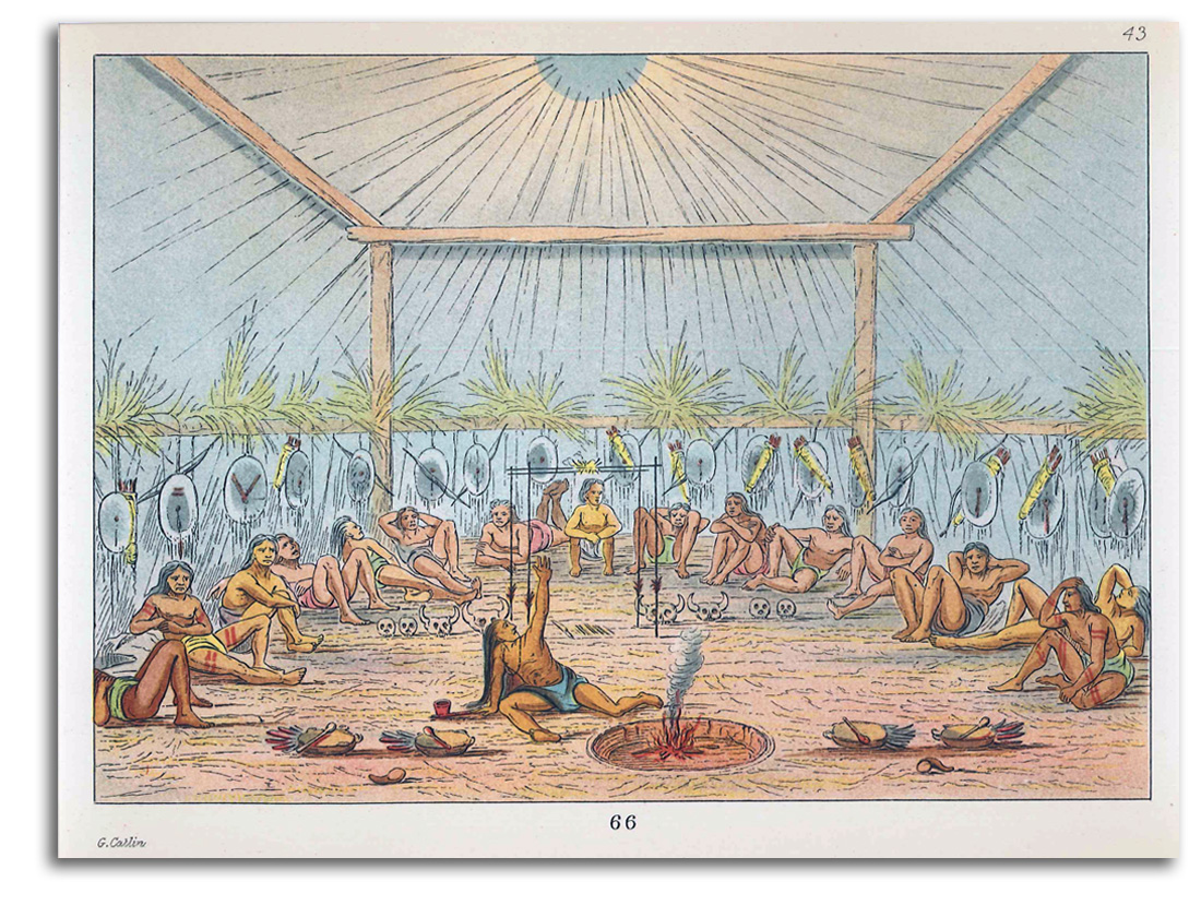
CATLIN
Mandan Great Spirit Ritual (painted c1832-39)
From the 2nd edition of NORTH AMERICAN INDIANS
Original Chromolithograph, 1913
Collection: FLG
NOTE: George Catlin was one of the first artists in the United States to live among the Native Americas and to picture them with reverence.
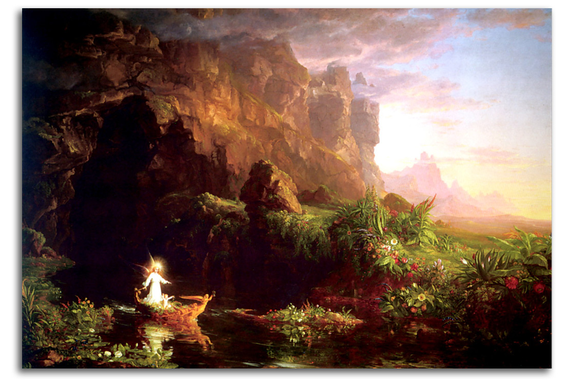
COLE (after)
The Voyage of Life: Childhood (painted 1840)
Original Engraving by James Smilie, 1854-56
Collection: CSUEB. Gift of IAD
NOTE: Thomas Cole began the Hudson River School of landscape painting and was one of the most admired artists in mid 19th-century America. This engraving is from his famous series of prints engraved by Smilie, a leading etching master.
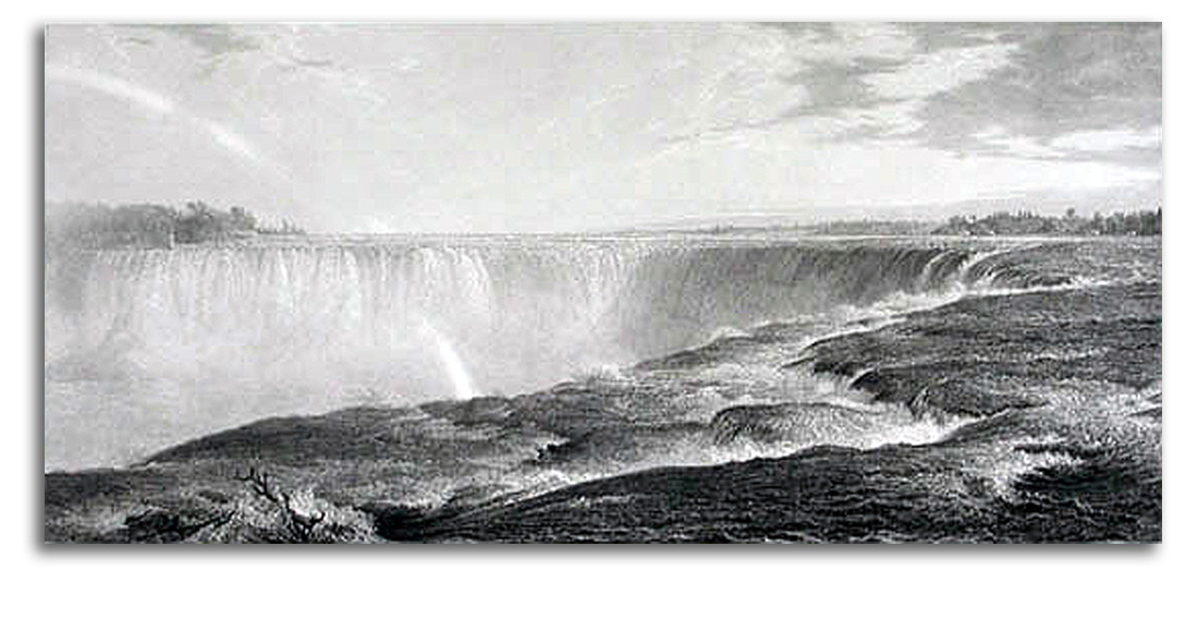
CHURCH (after)
The Great Fall, Niagara (painted 1857)
Proof, before Letters, 1875
Engraved by William Forrest in Edinborough
Printed in London
Published by Knoedler, New York, 1875
Collection: FLG
Ex. Collection: Gregg & Connie Peters, Ontario
& Britnell’s Bookstore, Toronto
NOTE: Church’s painting of Niagara Falls might well be the most famous American landscape painting of the 19th century. Church was brilliant at both painting and marketing. He was happy to have engravings and chromolithographs made from his paintings. He watched over the quality, and they sold very well. When Knoedler’s (America’s oldest art gallery) secured the rights to reproduce Church’s paintings, they hired Forrest who was one of the best steel engravers of the age. This is a typical very large Victorian engraving, 28 x 17.75 inches. The time Forrest put into this monumental Niagara engraving probably was similar to what he reported that he put into making another Church engraving, “Heart of the Andes” (painted 1858), that Forrest executed in 1863 for Church and Knoedler’s: 10 hours a day for 3 years. Church was pleased and signed the Andes print with Forrest. Engraved editions Editions were not colored (except by misguided later dealers or collectors). By the end of the 1870s, Church’s enormous popularity was fading. American taste was shifting from the Hudson River School to the Barbizon School. The quality of this impression is exceptional because it was never framed in the old acidic manner.
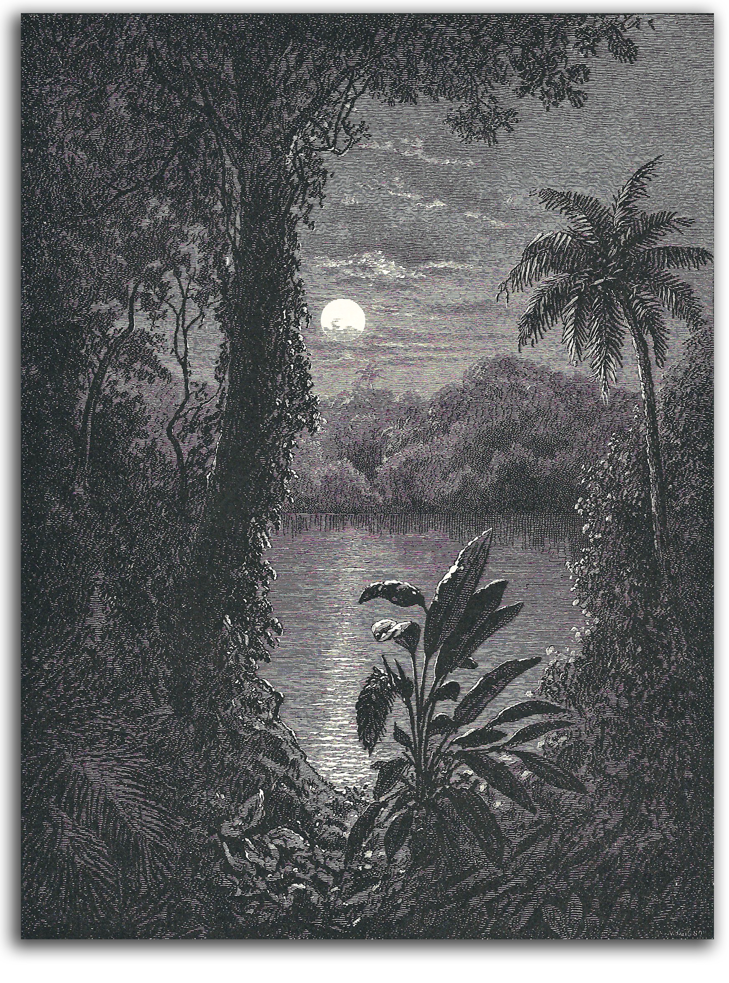
CHURCH (after)
A Twilight Moonlight, (painted 1860s)
Wood engraving from
AMERICAN PAINTERS WITH EXAMPLES OF THEIR WORK
ENGRAVED ON WOOD by Appleton & Co., 1879
Collection: FLG
NOTE: Many of Church’s most lavish paintings and prints were made from his memories of travels in the tropics of South America where he followed in the footsteps of his hero, Alexander von Humboldt. The painted version of this work sold in 2009 for over a million dollars. His more famous masterpieces are commonly valued at over 100 million dollars. In short, his work has returned to the highest possible level of international appreciation.
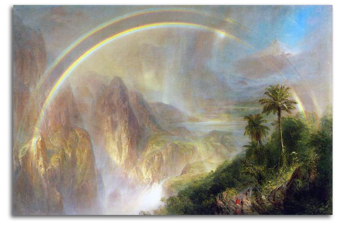
CHURCH (after)
Rainy Season in the Tropics (painted 1866)
Oil
{acquired at the recommendation of FLG}
Poster, edition by FAMSF, 1971 (Editor/Publisher: FLG)
Collection: CSUEB. Gift of IAD
NOTE: Frederic Edwin Church was a student of Cole during the 1840s and become the most widely respected landscape painter of his time. He now is considered by many to be the most important American landscape painter of the 19th century. Americans were just beginning to appreciate their own artists, as opposed to European artists who had a much higher status in the U.S. Most Europeans considered American art to be “colonial,” merely derivitive of European art.
{WRAP IMAGE: Andes} Church was painting the kind of show-stoppers that were changing minds. To see one of his paintings, “Heart of the Andes” (1859), huge, turn-away crowds paid 25 cents to get in the exhibition. Some women fainted at the sight of so much sublime beauty. Mark Twain came back three times to “take all the wonder in.” Henry James was “speechless.” Here is part of the essay I wrote about this picture in THREE CENTURIES OF AMERICAN PAINTING (1971):
In Europe, France’s leading Academician, Gérome, acknowledged that Church’s work marked the beginning of a distinctly American school. England went even further. London’s official aesthetic voice, ART JOURNAL, gave Church the nation’s highest possible honor by singling him out as the heir-apparent of Turner.
During the two decades that Church dominanted America’s principal art form, there were two kinds of approach to the power of nature. His works of the 1850s are relatively restrained. The energies of the earth rumble underneath the tranquil membrane of their brilliantly delineated surface – felt but not seen. In his masterpieces of the 1860s, Church’s interest in the surging aspects of nature led him to explore the most dramatic extremes of nature’s complete cycles – the fluid processes of compression and release, from greatest intensity to greatest calm. He had the audacity to attempt, and the unique capacity to capture the melting of gigantic icebergs; the explosions of the aurora borealis; the eruption of volcanos; and – with his comic pantheism as its lyric height – the moment just after the earth has been rejuvenated by a shower.
For the story of how this famous painting came to San Francisco, and inspired John D. Rockefeller 3rd to consider donating his entire American collection to San Francisco, CLICK HERE.
CHURCH
Original Signature
Collection: FLG
AMERICAN MASTERS – 19TH CENTURY – Realists
AMERICAN REALISTS & The New Mass Market for Picture-Prints
THE DEVELOPMENT OF THE ILLUSTRATED PERIODICAL & THE PICTURE-POSTCARD
Until the middle of the 19th century, if a person wanted a reproduction of a painting for their home, or as a gift, that image had to be painted by a skilled copy artist. From the middle of the 19th century, the new way most people looked at a wide variety of paintings in their homes, and shared such images with family and friends, was in the form of the illustrated periodical or the picture-postcard.
The development of lithography made possible the modern customs of illustrated newspapers and magazines, as well as exchanging and collecting picture-cards. The most famous periodical illustrator of the 19th century was Winslow Homer. All the early pictures in periodicals were wood engravings. Lithography also made possible the very inexpensive color prints by Currier & Ives that decorated a great many of the homes of people with modest means. Only later in the century was it possible to print in periodicals photographic reproductions of paintings, drawings, and fine prints. In this section on Realism you will find examples of all these types of printed experiences (illustrations, cards, stamps, and fine prints), experiences that were the richest possible visual experiences of the focused type (the type that artists make) in the days before movies and television.
In Modern society, mass consumption became the economic bedrock of the Industrial Revolution. Magazines played a major role in simulating consumers to buy huge quantities of industrial production. By the year 1900, there were about 1800 periodicals being published in the U.S, along with about 15 million newspapers appearing daily. The U.S. was starting to become the leading economic power of the 20th century, a position it attained by the start of World War II (1939-1945).
Postcards without pictures started to be used early in the 19th century. Illustrated Christmas Cards were made popular by Queen Victoria in the 1840s. By the 1860s, there were mass-produced greeting cards with many different themes. Sometimes noted artists such as Kate Greenway and Walter Crane were the illustrators.
Improvements in color lithography during the 1930s & ‘40s made possible not only more richly illustrated books and magazines, but also full-color greeting cards. Art book publishers and art museums became particularly interested by publishing reproductive prints of superior quality. Commercial publishers are often less careful about the quality control of color relationships, whereas museum curators usually put a great deal of energy into making their cards and page-prints as close to the feeling of the original works as possible.
Publishing such art-cards has become a major activity in art museums. In the late 20th century, laser printing made art-cards even closer to the originals, and increased the number of card collectors who cared about authentic reproductions. Digital card collecting is becoming an even more popular form of art-image collecting in the Computer Age.
I encourage my students to collect art-cards and (sometimes) even to look at them during and after my lectures. What we experience while holding a print or a book inside our personal space is quite different from the most abstract experience we have while looking at something that is outside our immediate tactile universe. Slides projected on wall, movies, TV, and computer screens are certainly very visual but the psychology of perception is not as complete or as deeply felt as it is when we hold a print inside our personal space where all our senses engage – sight and touch at the center of the experience, with sound and smell hovering around the edges of the experience and contributing to completeness.
THE DEVELOPMENT OF POSTAGE STAMPS
The postage stamp was first introduced in England in 1840. Until then, mail was stamped with a hand stamp, hence the name. Postage stamps rapidly became a major part of the modern world. Those first pictured on stamps during the early years were limited to royalty and national heroes. But soon a much greater variety of pictures were being printed. The quantity and variety of stamps has become enormous. By the year 2000, hundreds of different countries were producing over 100,000 different stamp types every year. Stamp collecting is by far the most popular form of print collecting. On eBay alone, one can find over 500,000 examples of U.S. stamps for sale. It is considered a national honor for an artist or a writer or a musician or an athlete to be portrayed on a stamp or a dollar bill. Only a limited number of individuals have been so honored with what I call “stamp-hood.” These people are all luminaries in the cultural history of the United States. As part of the social history of printmaking in the United States, I will be illustrating some of the “artist” stamps in our chronology of Realism.
POPULAR PRINTS by CURRIER & IVES
Paintings have always been expensive. Only a certain percentage of the population has ever been able to own them. A larger percentage of the general population has been able to own fine prints by major artists in the last few centuries, but even those have been too expensive for most people. 19th-century printing technology made it possible for almost anyone to own a printed picture or two if they had a few pennies to spare. They could cut a Homer engraving from HARPER’S WEEKLY and frame it, or decorate an entire wall with colored landscapes from Currier & Ives. This company began its history in 1837 and continued until 1907. It described itself as the: “Grand Central Depot for Cheap and Popular Prints” and dished up any subject that would sell: landscapes, domestic scenes, or sporting events. Its motto was: “Colored Engravings for the People.” The prints were black & white and then hand-colored. Their artists were not the most sophisticated but they touched the hearts of generations. They produced over a million prints over 72 years, decorating many barrooms and hotel rooms as well as an endless number of modest homes.
HOMER
Art-Students in the Louvre, 1868
wood engraving
Collection: Brooklyn Museum
NOTE: Winslow Homer, largely self-taught, was the most gifted American printmaker of the mid 19th century. In the days before photographic illustrations were possible, illustrators like Homer drew on a smooth block of wood that was then cut by an engraver. Homer did not cut his own blocks. Homer’s “reports” (engraved sketches) in HARPER’S WEEKLY were very popular at the time and are still widely collected. His deeply humanistic Realism is such that he probably still is the most widely respected 19th-century American painter. His first prints were modest and often awkward productions. He started creating his great prints in 1873.
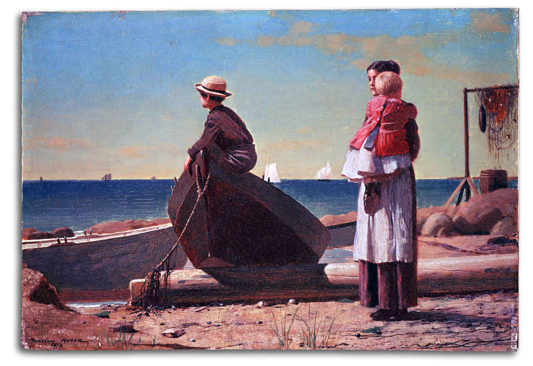
HOMER
Dad’s Coming, 1873
Original wood engraving from HARPER’S WEEKLY, 1873
Collection: FLG
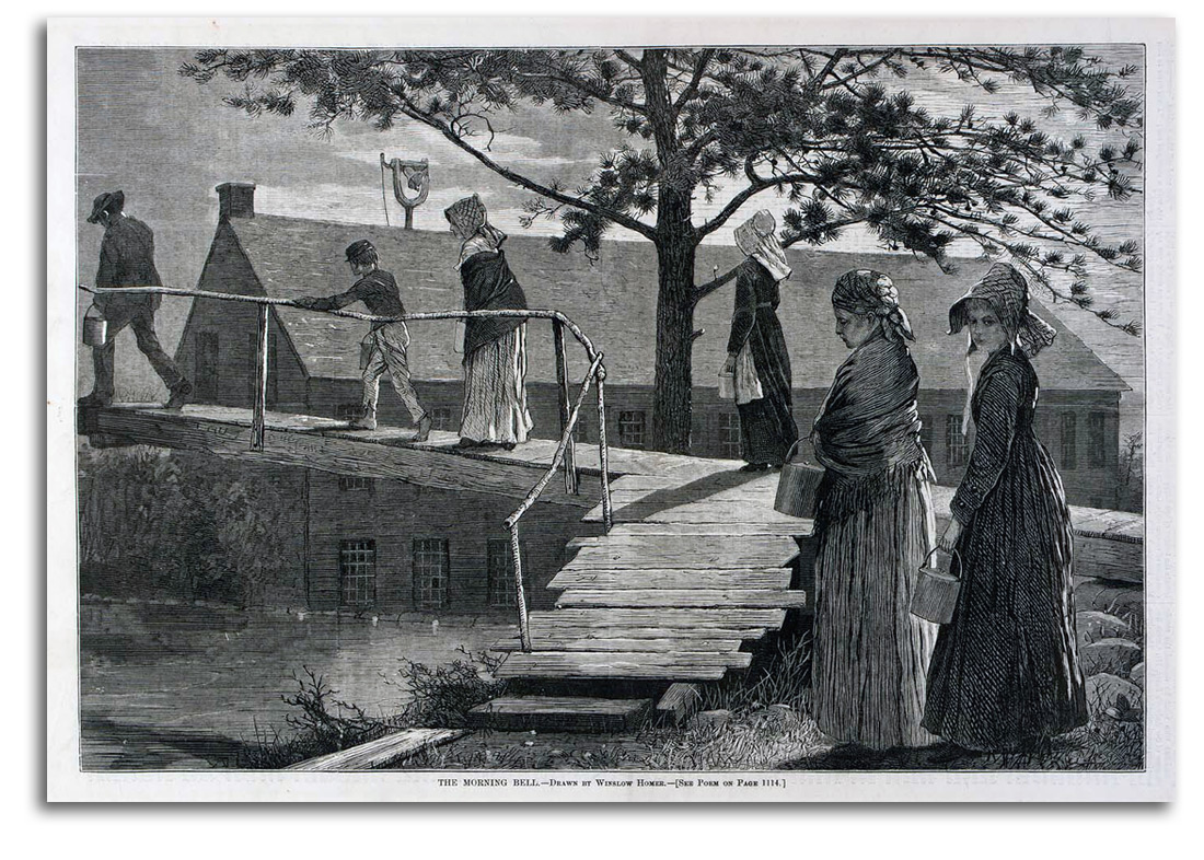
HOMER
The Morning Bell, 1873
Original wood engraving from HARPER’S WEEKLY, 1873
Collection: FLG
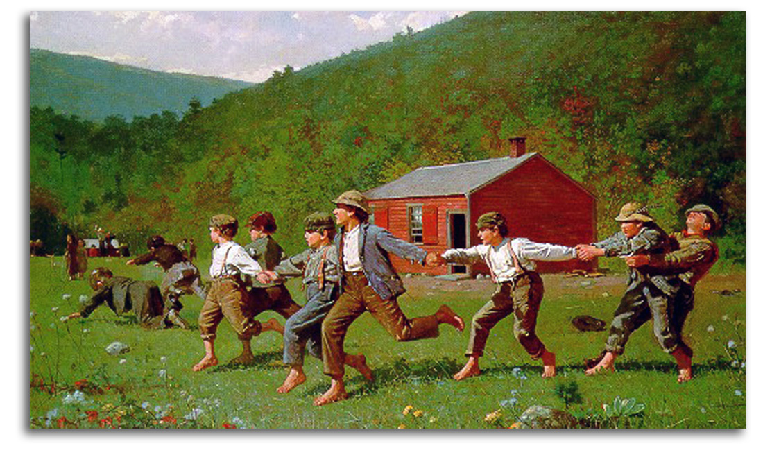
HOMER (after)
Snap-of-the-Whip, (engraved 1873)
Wood engraving from HARPER’S WEEKLY, 1873
Facsimile after the wood engraving of 1873
Bowdoin College edition, 1960
Collection: FLG
HOMER (after)
Sail-Boat [aka Breezing Up] (painted 1876)
Original wood engraving in
HARPER’S NEW MONTHLY MAGAZINE, Mar. 1879
p. 488
Collection: FLG
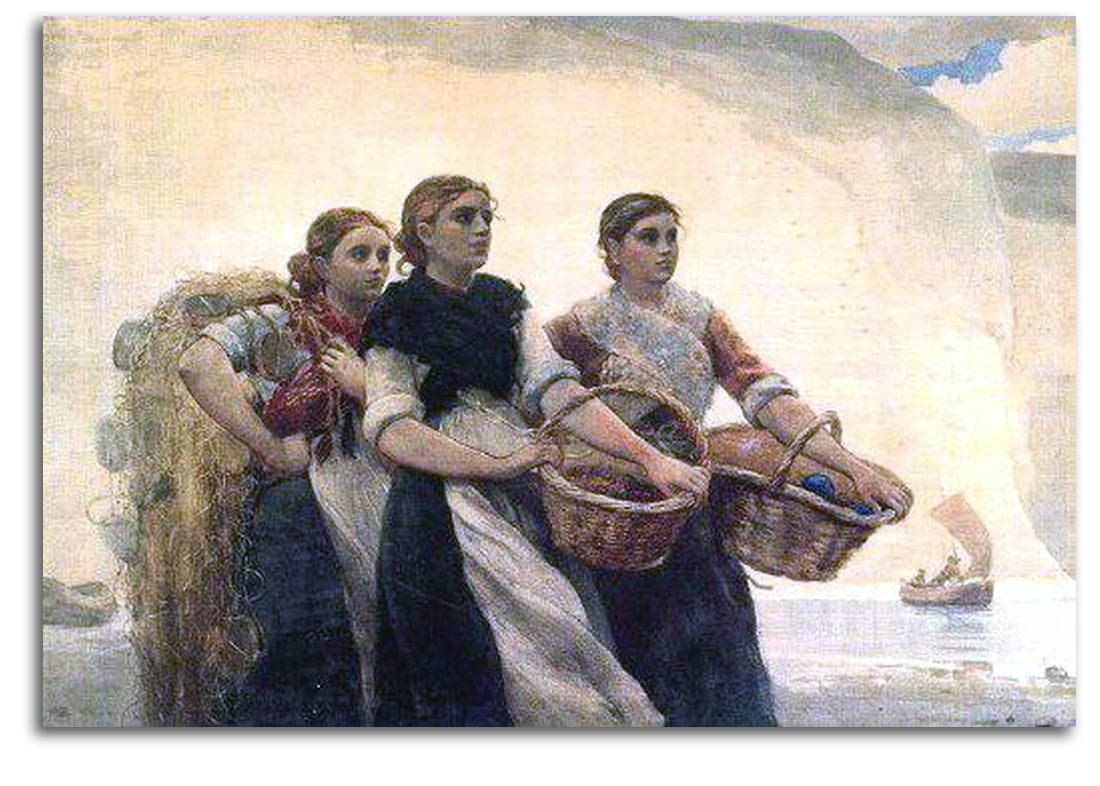
HOMER
A Voice from the Cliffs (painted 1883; etched 1888)
Original etching by James Smilie, 1888
Plate signed by both Homer and Smilie
Collection: FLG
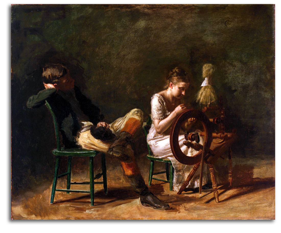
EAKINS (after)
The Courtship (painted c1878-81)
{acquired at the recommendation of FLG}
Postcard, edition by FAMSF
Collection: FLG
NOTE: The greatest 19th-century American painter of outdoor life was Homer. The greatest 19th-century American painter of indoor life was Thomas Eakins. As a portrait painter, Eakins stands with Copley and Stuart at the first rank in American history. He was working at the end of the great tradition of highly detailed realism that started during the Colonial period and would evaporate by the end of the 19th century. His uncanny combination of acute visual precision and profound psychological depth would never be exceeded.
I know of two watercolors that seem to be studies for this spinner. Both have been dated 1881. One is signed and dated on the wheel. A large oil sketch also survives in the Worcester Art Museum. At first glance, this charming painting of a young couple may seem unfinished. However, while considering it for purchase and examining the canvas carefully I located a signature on the spinning wheel. Therefore, in the mind of this highly experimental artist (who also pioneered early photography), this painting, with its different degrees of focus, was actually finished. The young woman in this painting (Nannie Williams) also was his nude model for “William Rush carving his Allegorical Figure of the Schuykill River” (1877). That painting also has a range of fields with very different degrees of focus. It appears that Eakins was beginning to explore in his paintings some of the perceptual implications of his photographic research.
EAKINS (after)
The Professor (painted 1875)
(Detail of Professor Gross from “The Gross Clinic”)
Original wood engraving in
HARPER’S NEW MONTHLY MAGAZINE, March 1879
p.494
Collection: FLG
[WRAP image OF WHOLE GROSS CLINIC}
NOTE: This print reproduces the central detail of one of his greatest paintings, “The Gross Clinic.” “The Gross Clinic” by Eakins is widely considered his masterpiece, and certainly one of the “Top 10” American paintings of the 19th century. It was in the news a few years ago. Prices paid for paintings are not always a sign of their historical importance, especially when the new money of status-seeking billionaires is used to buy “anything at any price.” However, sale prices often do reflect how much a work of art is widely respected by the Art World as a whole. And a tracing of the history of prices does say a good deal about how that respect increases within a society over time. Elsewhere I have noted how the first time over $1 million was spent at auction was for a painting it was for a Renoir in the 1960s. (That was Norton Simon in action). In recent years, paintings have been purchased for over $100 million. American paintings got off to a slower start. When I began acquiring American paintings for the Fine Arts Museums in 1970, the record American price was about $100,000. Later that year, we set a new American record by paying $165,000 for Church’s “Rainy Season in the Tropics.” Such spectacular paintings are now being insured for between $50 million and $100 million. “The Gross Clinic” (1875) by Eakins had been in the Jefferson Medical College of Philadelphia since 1976 when it was acquired from Eakins for $200. In 2006, the Board of that college agreed to sell it to the National Gallery of Art & the new Crystal Bridges Museum for $68 million. The people of Philadelphia did not want this masterpiece to leave town. In a short period of time, they raised the funds to keep it in Philadelphia.
EAKINS (after)
The Chess Players (painted 1876)
Original wood engraving by Alice Barber in
SCRIBNER’S MONTHLY: AN ILLUSTRATED MAGAZINE FOR THE PEOPLE, May 1880
Collection: FLG
EAKINS (after)
On the Harlem [two oarsmen].
Original wood engraving by Alice Barber in
SCRIBNER’S MONTHLY: AN ILLUSTRATED MAGAZINE FOR THE PEOPLE, June 1880
Collection: FLG
EAKINS (after)
Rail-Shooting (painted 1876)
Original wood engraving by Alice Barber in
SCRIBNER’S MONTHLY: AN ILLUSTRATED MAGAZINE FOR THE PEOPLE, July 1880
Collection: FLG
EAKINS (after)
A Pusher
Original wood engraving by Alice Barber in
SCRIBNER’S MONTHLY: AN ILLUSTRATED MAGAZINE FOR THE PEOPLE, July 1880
Collection: FLG
JOHNSON (after)
The Mother, 1879
Original wood engraving in
HARPER’S NEW MONTHLY MAGAZINE, Mar. 1879
p. 487 Collection: FLG
NOTE: After Homer and Eakins, Eastman Johnson probably was (and still is) the most widely admired American Realist of the 19th century. He began as a lithographer and became prominent as both a painter and a printmaker. His many painted and printed portraits of distinguished citizens are excellent. He was known as “The American Rembrandt.” His more informal genre scenes are much more fluidly composed. He turned a deeply humanistic eye turned to people of all classes, ages, and colors. His best-known painting is “Old Kentucky Home (Negro Life in the Old South),” 1859. He was a co-founder of the Metropolitan Museum of Art in New York.
JOHNSON
Three Portraits???
Lithographs
Collection:
HOVENDEN (after)
I’s so Happy! (painted c1882)
Original wood engraving by William (Willy) Miller, 1882
Collection: FLG
NOTE: Thomas Hovenden and his wife were staunch abolitionists. Their home was a stop on the Underground Railroad. His best-known painting is “The Last Moments of John Brown.” He taught alongside Eakins and Anschutz at the Pennsylvania Academy of Fine Arts. He was widely appreciated as an artist and as a teacher. His sympathetic rendering of Negroes was admired by Henry Tanner.
TANNER (after)
The Banjo Lesson (painted 1893)
Poster, edition by Hampton University Museum, Hampton Virginia
Collection: FLG
NOTE: Henry O. Tanner was a student of Eakins. He lived much of his life in Paris in order to escape American racism. He became the most famous Black painter of the 19th century, and the first African-American artist to win an international reputation. “The Banjo Lesson” is his best-known painting. He took an old Negro stereotype and turned it into a sensitive moment between generations. His later works are intensely religious paintings, partly under the influence of his parents –his deeply spiritual mother (a former slave) and his father – a Bishop in the African Methodist Episcopal Church.
ANSHUTZ (after)
Ironworkers – Noontime (painted 1880-81)
Original wood engraving by Juengling in HARPER’S WEEKLY,
August 30, 1884
Collection: FLG
(Based on a painting in the Collection of FAMSF
Gift of Mr & Mrs John D. Rockefeller 3rd)
NOTE: Thomas Anshutz was a student of Eakins. Rendered with the wide compositional layout of a classical sculptural frieze, this is one of the earliest known paintings to honor industrial workers. But there was no market for such a subject, so Anshutz did not paint any more.
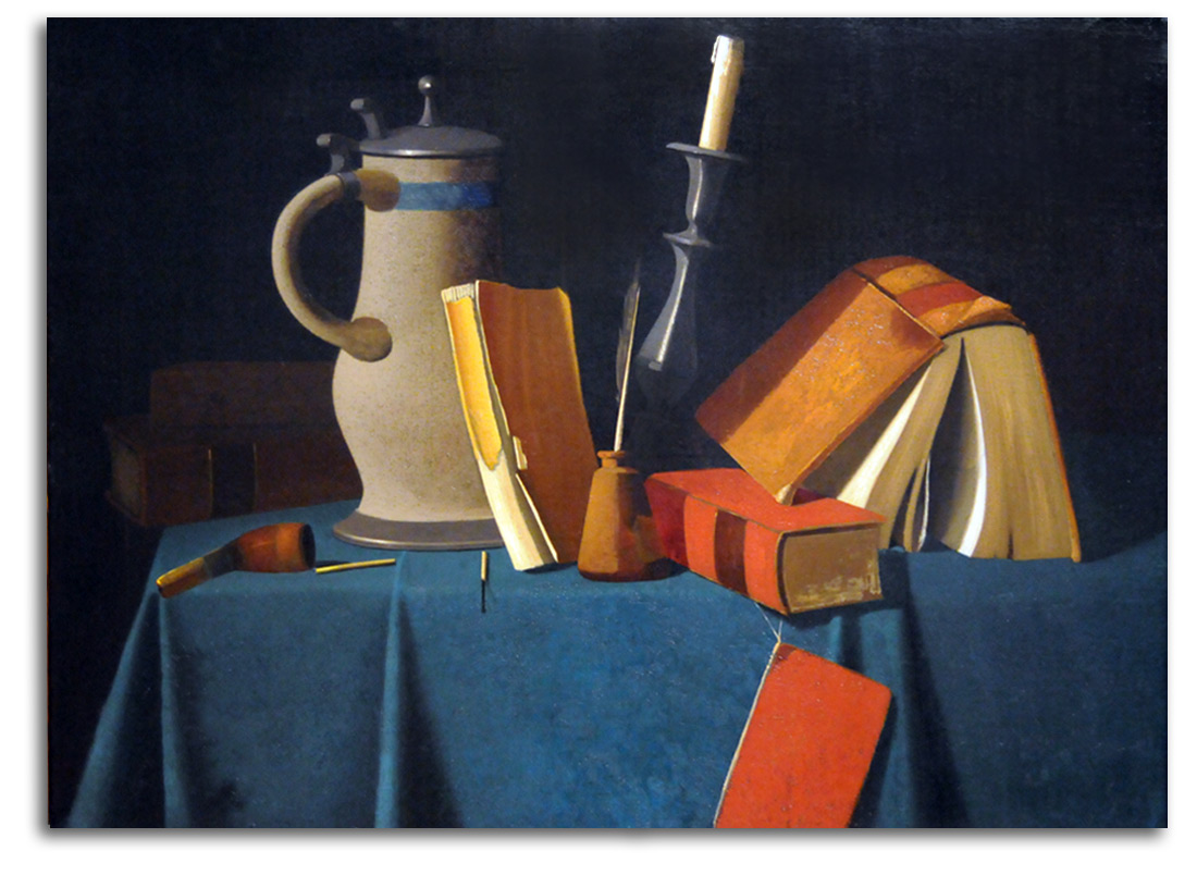
PETO (after)
Still-Life with Pitcher, Candle, & Books (painted c1900)
{acquired at the recommendation of FLG}
Postcard, edition by FAMSF
Collection: FLG
NOTE: Trompe l’Oeil painting, which in French means “fool the eye” painting, is designed to make viewers think (at least for a moment) that what they are looking at is real. This kind of painting has a long history. It goes back to Greece and Rome. During the Renaissance and Baroque eras, ceilings and the interior of domes often were filled with illusionistic scenes made to seem quite real. In the late 19th century, Trompe l”Oeil painting became quite popular in the United States, especially in barrooms. Not everyone respected this genre. Some critics called it “mere trickery.” The most gifted practitioners are widely considered William Harnett, John Peto, and John Haberle. They all liked looking at everyday objects and celebrating the poetry of fact. And what they accomplished was a good deal more than “trickery.”
Harnett painted very carefully balanced forms with sharply demarcated edges and highly literal, extremely tactile materials such as a brass horn and a rabbit’s fur. His best-known painting is “After the Hunt.” Peto was more spontaneous, more abstract with his forms, and more likely to be suggesting an emotional narrative. His edges are less severe. His surfaces have a powdery texture that has been compared to Chardin – the greatest still-life painter of the 18th century. Of particular interest is how much he bends objects out of their natural shapes, and brings colors into an unnatural realm, in order to integrate the composition as a whole using all these abstract elements. In this way of creating compositions, he comes closer to Cézanne than any other American of the time.
Among the visual tricks they all used were: objects seen in their actual size; objects strongly shadowed; and objects almost never cut off at the edge of the canvas so they are always in full view. Of particular importance is that objects are rendered in a very shallow pictorial space – otherwise the illusion does not work.
P.S. The Trompe l’Oeil gallery at the de Young Museum in San Francisco is considered one of the best in the United States. Building on the fact that Harnett’s famous masterpiece “After the Hunt” was already in the collection (but had little to go with it), I decided it would be worthwhile to create a Trompe l’Oeil gallery by acquiring important paintings by Peto, Harbele, and Pope. This strong grouping particularly impressed John D. Rockefeller 3rd with whom I discussed at length all these paintings and the wonderful Petos in his collection during the years we were secretly negotiating for his entire American collection.
Happily, the combined collections of trompe l’oeil paintings are now hanging together at the de Young. The visiting public in this special gallery can have a very rich experience of that quality which is at the heart of the best of most 19th century American painting, that quality which is at the core of American values – a reverence for reality. When Kenneth Baker, Art Critic of the SAN FRANCISCO CHRONICLE, reviewed the new de Young Museum in 2005, he concluded that this gallery was the strongest in the entire museum.
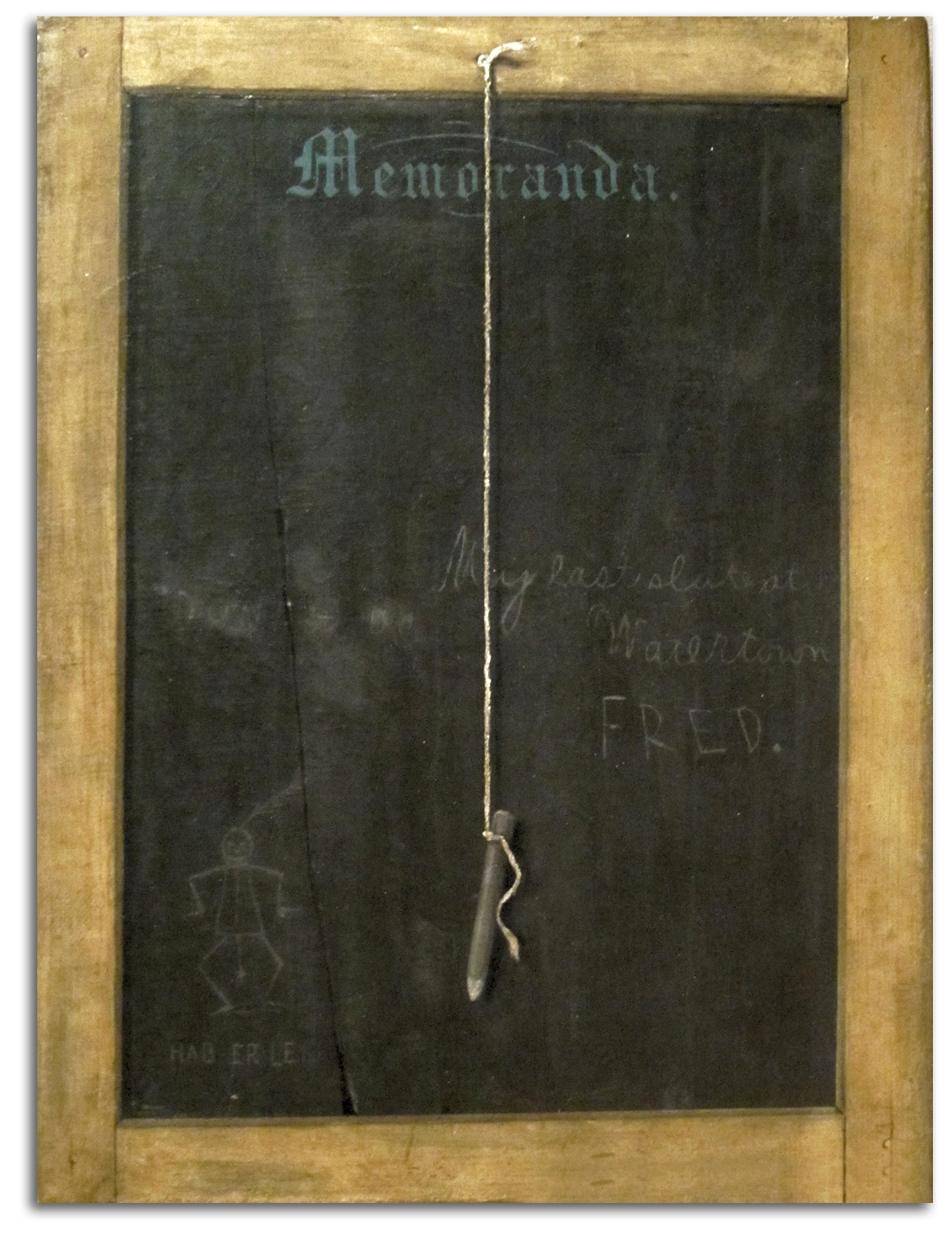
HABERLE (after)
The Slate: Memoranda (painted c1895)
{acquired at the recommendation of FLG}
Postcard, edition by FAMSF
Collection: FLG
NOTE: John Haberle was very witty, and this is one of his most amusing works. What we see on the leading edge of the canvas is striking enough, but a second look reveals that he also has painted all the edges to increase the illusion of being an actual school slate. The best-known authority on Harnett, Peto, and Haberle was Alfred Frankenstein, art critic of the SAN FRANCISCO CHRONICLE. I enjoyed a number of conversations with Alfred on the work of these three artists. Here is a taste of his opinions from his book AFTER THE HUNT:???
Peto is moved by the pathos of used-up things. Haberle is wry and wacky, full of bravado, …virtuosity, and sly flamboyance.
[His work] is poles away from Harnett’s sumptuosity, careful balances, and well-modeled volumes, and equally far from Peto’s sensitivity in matters of tone and hue.”
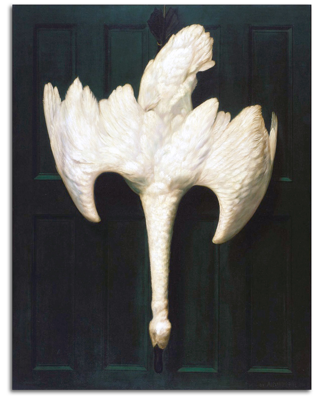
POPE (after)
The Trumpeter Swan (painted1900)
{acquired at the recommendation of FLG}
Postcard, edition by FAMSF
Collection: FLG
NOTE: This painting is widely considered Alexander Pope’s masterpiece.
xxxxxxx
AMERICAN MASTERS – 19TH CENTURY – Tonalists
TONALISTS
“Tonalism” is one of the newest terms to be defined by art historians. It was defined in 1972 by Wanda Corn in an exhibition at the Fine Arts Museums of San Francisco called “The Color of Mood: American Tonalism 1880-1910.” Since then, many publications have expanded the study of Tonalism in the United States. However, Tonalism was an international phenomenon with early manifestations in both the tonal landscapes of the Barbizon School and the tonal nocturnes of Whistler.
It was among members of the Barbizon School, led by Corot, that the aesthetic of Tonalism first developed during the 1820s & ‘30s. As Corot expressed it: “I love more than anything else…the harmony of the tones.” The Barbizon artists were fascinated with the forest and the subtle twilight moods of Nature. This Barbizon style of what I call Tonalistic Realism is what would be taken by Inness to the U.S. where it became quite popular during the 1880s & ‘90s.
Whistler was more radical. His was a modified form of Realism that could be called “diluted” Realism. Whistler started under the influence of Courbet during the 1850s. Then he flattened the thickly painted, roughly stroked, naturalistic Realism of Courbet into very thin, extremely smooth strokes of paint, and put the focus almost entirely on tonal composition. He took away almost all corporeality and sunlight leaving us with prints of barely physical figures and painted seascapes of shimmering twilight and washes of the moon.
In other words, Tonalism did not begin in the United States during the 1880s; that actually was what I call Late Tonalism. Most of the Barbizon School, and most of Whistler’s production starting in the 1860s were forms of what I call Early Tonalism.
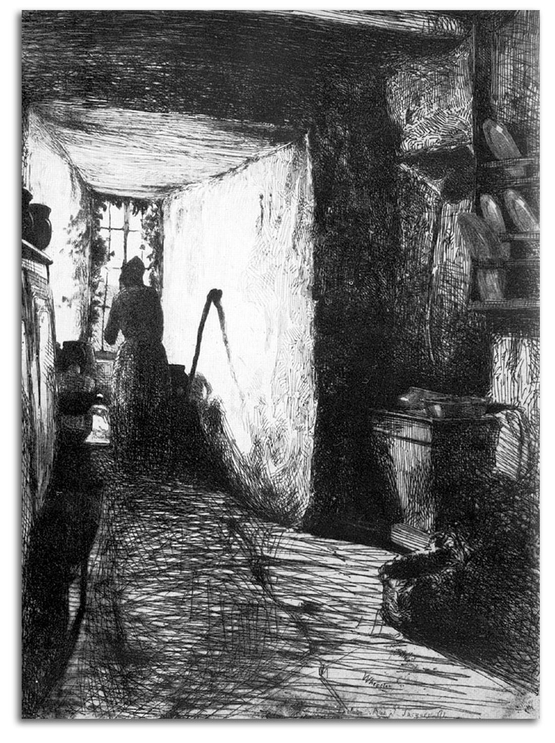
WHISTLER (after)
The Kitchen
Etching from THE FRENCH SET (etched 1858)
Replica lithograph in THE STUDIO, 1932
Collection: FLG
NOTE: James M. Whistler, who spent most of his life in England, is widely considered the most gifted American printmaker of the late 19th century. Many think he was the most gifted etcher in Western art between Rembrant and Picasso. Whistler’s early style was a Realist style, inspired by Courbet. This etching is one of the best examples of that early style. He soon left Realism behind and invented a highly innovative style that has come to be known as Tonalism.
WHISTLER
Nocturne, Blue and Silver – Cremorne Lights 1872
Oil
Collection: Tate Gallery, London
NOTE: After some years in France, working under the influence of Courbet and Manet (and the Symbolist poetry of Baudelaire), Whistler in 1859 decided to settle in London. There he became friends with leading members of the Pre-Raphaelite circle, particularly Rossetti and Millais. They all shared a feeling for art as primarily symbolic and a love for the newly discovered Japanese prints. The flatness of these prints and their symbolic colors was an exciting new vision of pictorial possibilities. It seems to have been a combination Symbolist thinking and Japanese forms that inspired Whistler to start creating his extraordinary “nocturnes” during the mid 1860s. The term “nocturne” seems to have been suggested to him by the music of Chopin.
Whistler’s nocturnes are astonishing creations – flatter than anything seen before and so abstract they almost have no subject. They are primarily fields of color tones. His goal was to make art that is like music, providing a direct feeling that is beyond rational analysis. It was an ideal that a number of artists held in the late 19th century but one that would not be fully realized until the development of abstract painting in the 20th century. Whistler came closer to realizing this revolutionary ideal than anyone else of the time.
His nocturnes pre-date Impressionism by a number of years, and may even have contributed to the development of Impressionism by Whistler’s good friend Monet.
Whistler’s radically simple art of suggestion was stronly encouraged by Mallarmé after the two became good friends. Many letters between them survive. Just when that warm friendship began is not clear. If not earlier, it would have begun in 1888 at a lunch organized by Monet. Mallarmé particularly loved Whistler’s etchings. Both Monet and Whistler regarded Mallarmé as a mentor. It was Mallarmé who led the effort to have the French government buy “Whistler’s Mother” of 1871. This was the only American painting in the French national collection for many years, and remains to this day Whistler’s best-known painting.
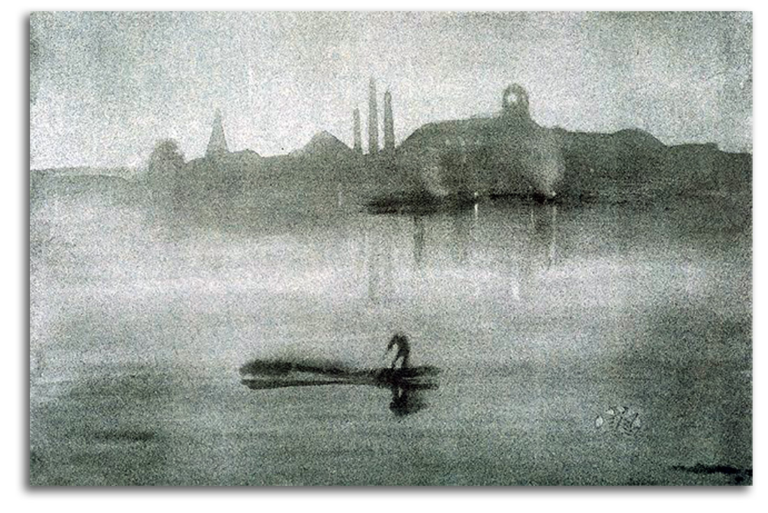
WHISTLER (after)
Nocturne: The Thames at Battersea (printed 1878)
Replica lithograph, Cornell University edition, 1962
Collection: FLG
NOTE: Inspired by both Impressionism and Japanese prints, Whistler’s later style was highly abstract. This lithograph is one of the best examples of that later style. He wanted visual art to affect one emotionally as music does, with little or no reference to subject-matter. He came very close to this ideal, as close as anyone in the 19th century.
NOTE: This lithograph is one of the best examples of his later style as a printmaker. It probably has been reproduced more often than any other Whistler print. He wanted visual art to affect one emotionally as music does, with little or no reference to subject-matter. He came very close to this ideal, as close as anyone in the 19th century.
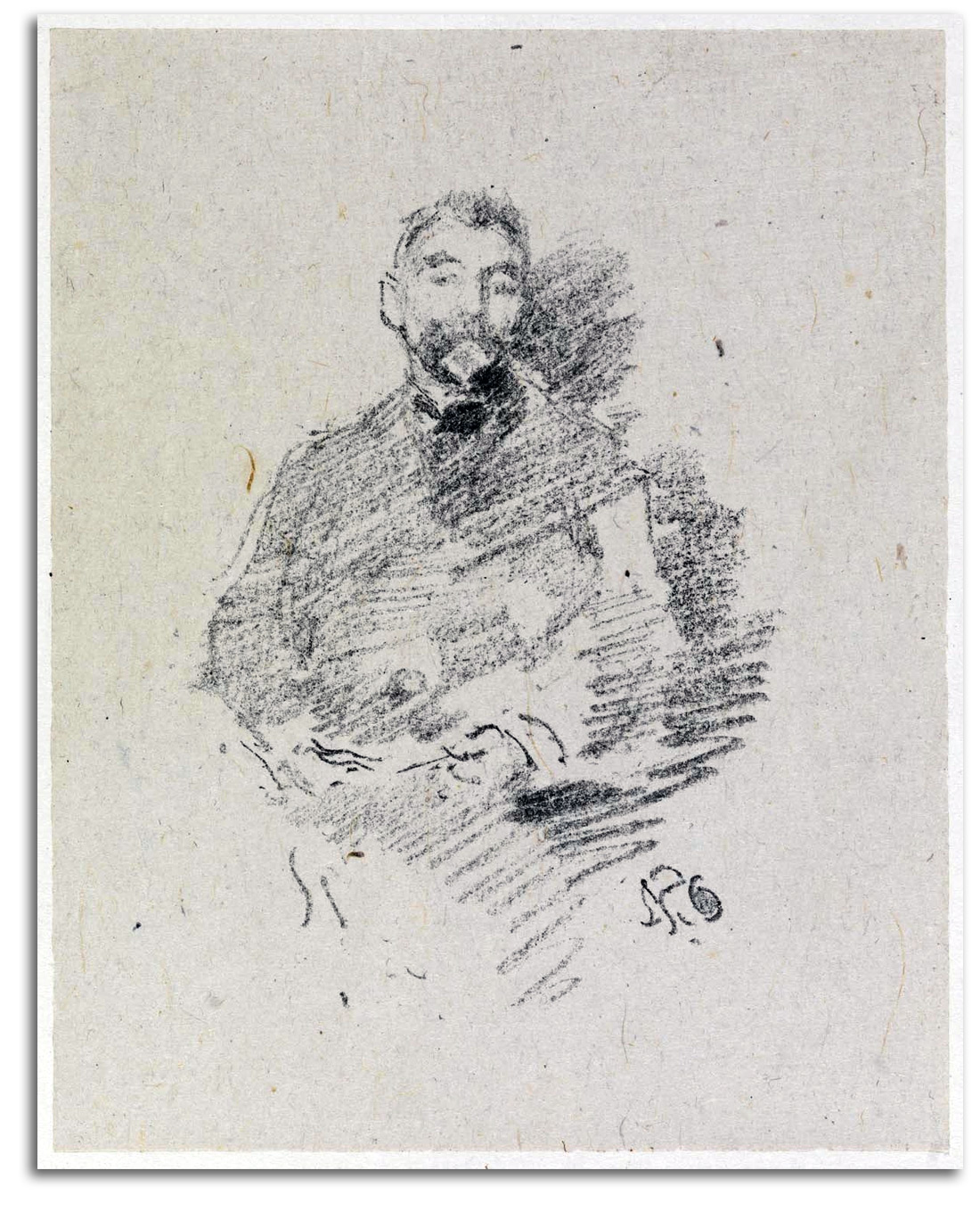
WHISTLER
Portrait of Mallarmé (drawn 1892)
(First printed 1893 in 1st edition of VERS ET PROSE)
Original lithograph in 2nd edition of VERS ET PROSE, 1926
Collection: FLG
NOTE: Mallarmé considered this print by his good friend to be the best portrait ever made of him. Théodore Duret, wrote biographies of Manet and Whistler. He also was a mutual friend of Whistler and Mallarmé. Duret said about this portrait that it is an:
…astonishing resemblance… the image is like a breath of air, emerging from the most rapid stroke of the chalk. It is an improvisation, but one cannot improvise such a striking likeness of a human being without knowing the subject intimately… .
And Mallarmé loved Whistler’s etchings. He spoke of them this way:
I feel like I am touching paper money from a fairyland…that could serve as currency for supernatural beings.
Whistlers etchings, like his noctures, are congruent with what Mallarmé loved so much – that glimpse of the passing moment, the moment that Mallarmé called “the aspect.” This is the brief beauty that Mallarmé describes as that which:
…perpetually lives yet dies every moment, that which exists only by the will of the idea.
What is this that “lives yet dies every moment”? It is the heart of what Mallarmé cared most about as an artist. It is at the heart of what the Impressionists and Whistler cared most about as artists. This is the cresting of the wave of the eternal pulsations of élan vital – the coming into being of something from nothing – the evanescent eruption of being.
Pre-Modern art was generated by a consciousness that was aware only is what IS – that which usually is called physical reality. To the Symbolist mind, and to the Tonalist Mind, it is consciousness of a higher truth – the metaphysical unity of IS and IS NOT – that generates new art, Modern art.
In the metaphysical dimensions of Mallarmé’s aesthetics, no-thing-ness is as important as some-thing-ness. It does not seem to be accidental that this image of the poet is half there and half not. [For my essay “The Philosophical Aesthetics of Mallarmé,” CLICK HERE]
xxxxxxxx
AMERICAN MASTERS – 19TH CENTURY – Impressionists
A number of American collectors fell in love with French Impressionism and purchased a considerable number of paintings by Renoir and Monet and the rest. However, not many American painters shared this enthusiasm. The central aesthetic of American psychology remained tied to the naturalistic representation of physical reality – the poetry of fact, not “unnatural” colors and sketchy “half-finished” paintings.
High-keyed art did become quite popular in the late 19th century under the direct influence of Impressionism, but American artists usually preferred figures with normal, solid corporeality that is fully responsive to gravity. They did not want to see their figures evaporating into vibrating brushstrokes or melting into sunlight. A large percentage of the American paintings of this era that journalists called Impressionist, actually are Tonalist.
There were exceptions to this general rule, of course. One American, Mary Cassatt, actually exhibited in Paris with the French Impressionists. That was a remarkable achievement for an American and for a woman artist. But even Cassatt, the most famous of the American Impressionists, elected to maintain solid figure-forms. Other Americans incorporated some Impressionist elements. Only a few, such as Childe Hassam, actually made works that looked French.
CASSATT
Mother & Child (etched c1894)
Etching
Replica lithograph from an etching, 1920s
Collection: CSUEB. Gift of IAD
Published in GLOBAL VISION, Part 1, 2006
NOTE: Mary Cassatt exhibited with the Impressionists in Paris (and was the only American woman to do so), but much of her style was grounded in the Impressionist Realism that was practiced by her good friend Degas. This etching is typical of her semi-Realist style.
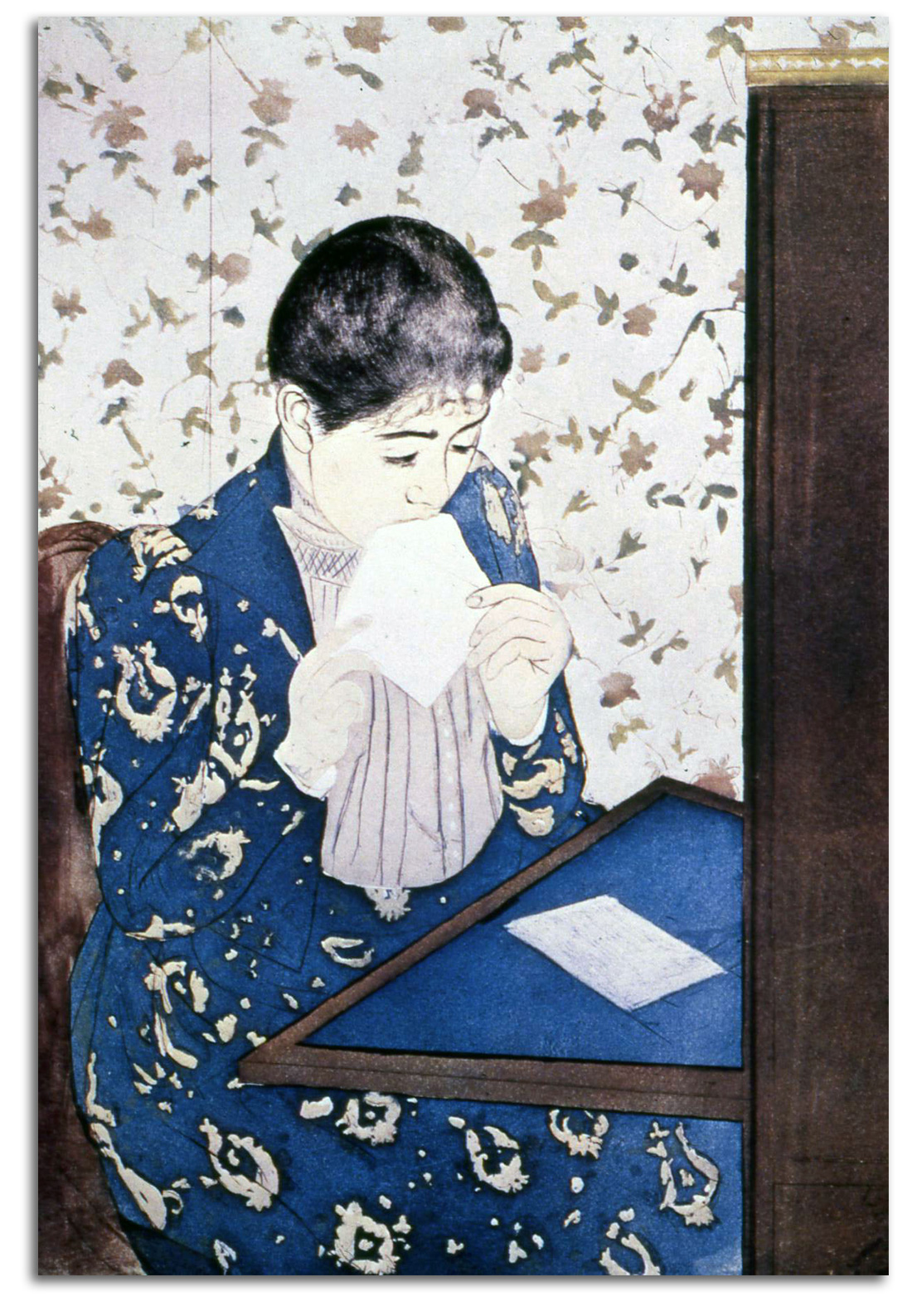
CASSATT
The Letter, 1890-91
Original Drypoint & aquatint
Collection: National Gallery of Art, Washington, D.C.
NOTE: When her compositions became less solid (as in “The Letter,” it was under the influence of Japanese prints. Aquatint is a form of color printing that developed in the 18th century. A series of plates are used to apply different colors. It is an expensive process that was little used after the 19th century.
HASSAM
The Regatta, Venice (painted c1889)
Original Aquatint from VENETIAN LIFE by W. D. Howells, 1892
Printed Donald Ramsey at the Riverside Press, 1889
Collection: FLG on loan to IAD
??Published in GLOBAL VISION, Part 1, 2006
NOTE: The influence of French Impressionism on American painting and printmaking was limited. The American who came closest to the spontaneous fluidity of Monet was Childe Hassam. Indeed he has often been called the “American Monet.” None of his works come closer to the spirit of Monet’s fluid style than this series of Venetian watercolors. This set of aquatints was among the finest produced during this period.
HASSAM
Twilight, Venice (painted c1889)
Original Aquatint from VENETIAN LIFE by W. D. Howells, 1892
Printed Donald Ramsey at the Riverside Press, 1889
Collection: FLG
NOTE [keep or discard this older NOTE?]: The influence of French Impressionism on American painting and printmaking was limited. High-keyed art did become quite popular in the late 19th century under the direct influence of Impressionism, but American artists usually preferred figures with normal, solid, corporeality that is fully responsive to gravity. They did not want to see their figures evaporating into vibrating brushstrokes or melting into sunlight. Even the most famous of the American Impressionists, Mary Cassatt, felt this way about solid figure-forms. The American who came closest to the spontaneous fluidity of Monet was Hassam. Indeed he has often been called the “American Monet.” None of his works come closer to the spirit of Monet’s fluid style than this series of Venetian watercolors.
NOTE: This aquatint was executed by Donald Ramsay from a watercolor by Hassam who worked closely with the printer. Under such conditions, I usually consider the artist and printer to be co-creators of the work. If the artist has not worked closely with the printer, I describe the work as “after” what the artist did.
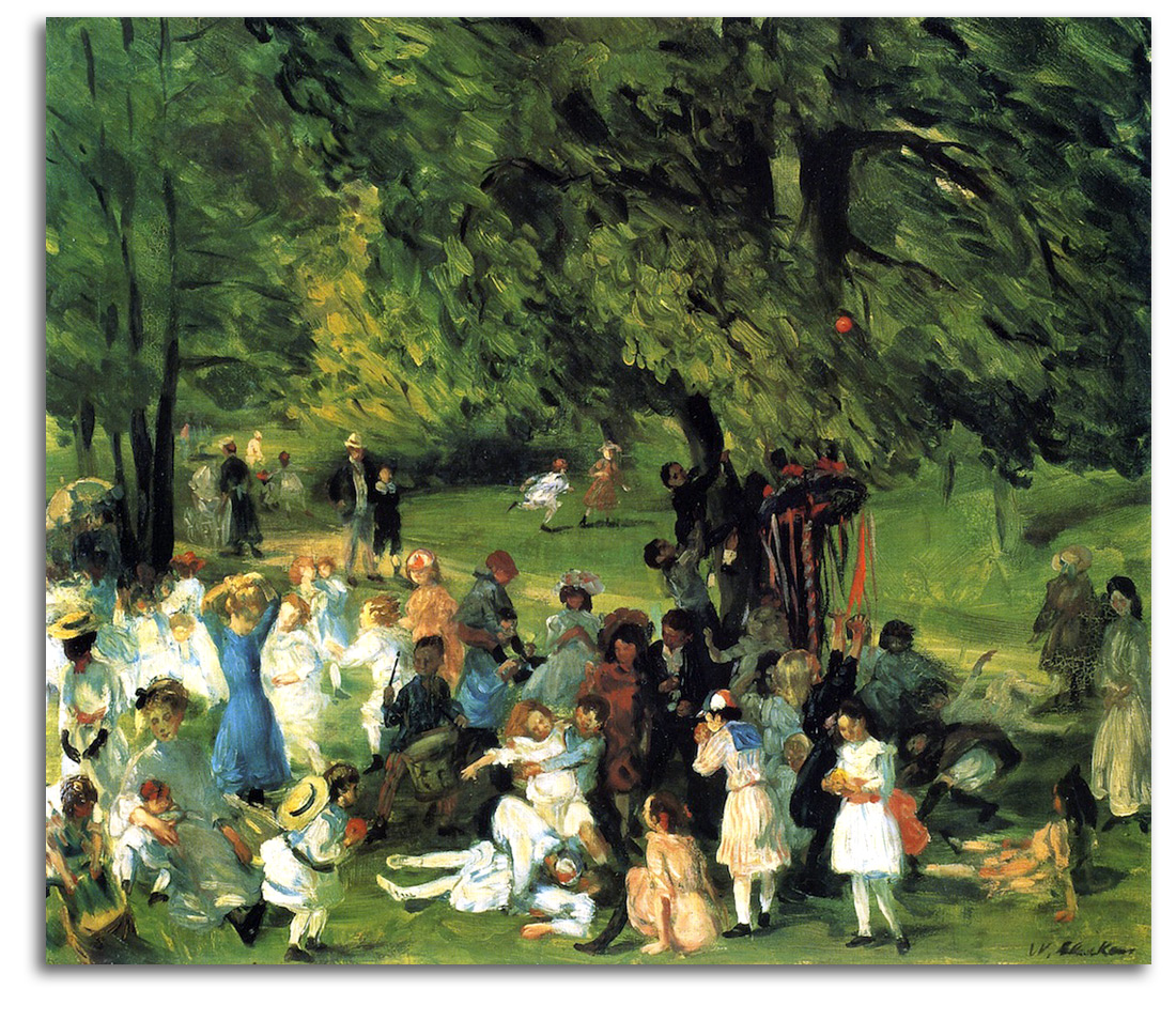
GLACKENS (after)
Mayday, Central Park (painted c1905)
{Acquired at the recommendation of FLG}
Postcard, edition by Fine Arts Museums of San Francisco
Collection: FLG
NOTE: This painting by William Glackens is as close to French Impressionism as any member of the Ashcan School of New York Realists ever came. Some critics say Glackens had “misunderstood” Renoir. But they are missing the point. Actually, Glackens was not trying to copy Renoir. He only took from Renoir what he wanted to use. The joyful spirit of the picture does not emerge so much from lively brushwork imposed on a static scene (in the French manner) but rather from the robust vitality of the actual children at play.
xxxxxxxx
AMERICAN MASTERS – 19TH CENTURY – Symbolists
Symbolism in the visual and verbal arts of Europe is well studied. This is because Symbolism was central to the European cultural experience. However, Symbolism is one of the least studied aspects of 19th century American cultural history. This is because Symbolism was not central to the American cultural experience. Only two books have attempted to survey the whole American subject as art history – Eldridge in 1979 and Chalmers in 2004. On both sides of the ocean, we find that the primary motivation of the Symbolists was their search for the Absolute.
One finds roots of American Symbolism 200 years ago in the paintings of Benjamin West and especially Washington Allston. But those artists did not generate a following. The Symbolist Movement in the United States began to solidify at mid-century with the work of La Farge, Rimmer, Inness, Vedder, and Ryder. This was the same period in which Poe was writing the extraordinary “proto-symbolist” poetry that would have such an enormous influence in Europe. Ryder was the most “modern” of this group of artists. It is not by chance that at New York’s Armory Show of 1913, the first major exhibition to introduce Americans to Modernism, Ryder was the most celebrated American painter of them all. In short, Symbolism was the fountainhead of Modernism.
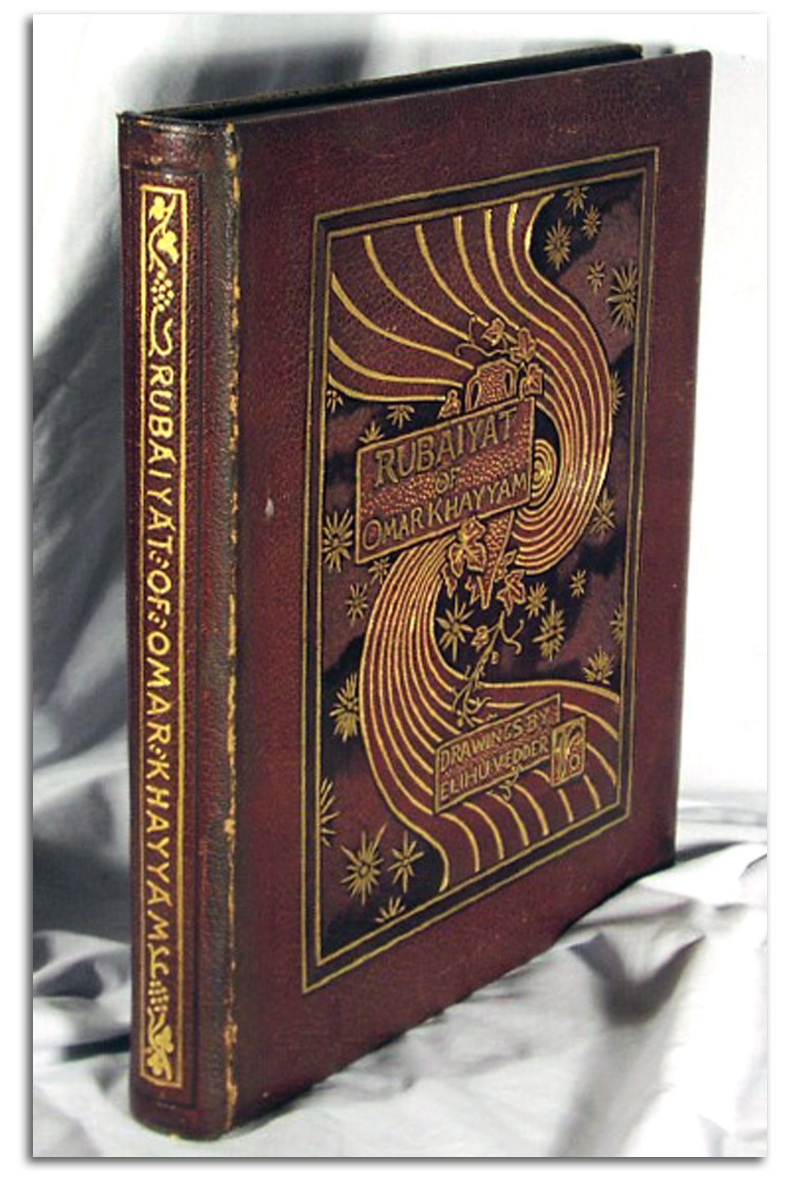
VEDDER
THE RUBAIYAT OF OMAR KHAYYAM, 1884
Original Book Cover
Collection: FLG
Exhibited in THE ART OF THE BOOK: THE MODERN LIVRE D’ARTISTE, University Art Gallery, CSUEB, 1999
NOTE: Not many American Symbolist painters made prints. One who made many prints was Elihu Vedder. He was (and still is) best known for a remarkable book of poetry that he illustrated with dozens of page-prints (as well as the cover and all the graphics: THE RUBAIYAT OF OMAR KHAYYAM (1884). This publication of rich visual-verbal harmonies set a new standard for artist-designed books in the United States and Europe.
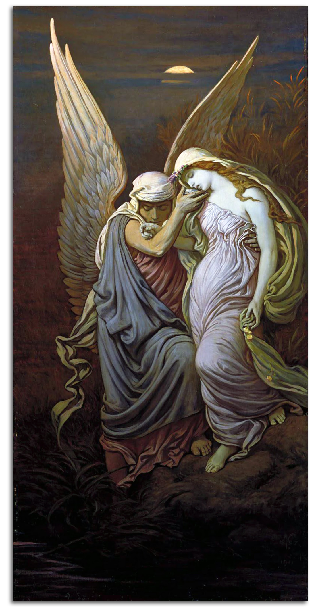
VEDDER
The Cup of Death (painted c1885)
Original wood engraving by F. French, 1885
Collection: FLG
NOTE: [PLACEMENT – KEEP?] Symbolism is the visual and verbal arts of Europe is well studied. However, Symbolism is one of the least studied aspects of 19th century American cultural history. I know of only two books that have attempted to survey the whole subject as art history – Eldridge in 1979 and Chalmers in 2004. One finds roots of Symbolism 200 years ago in the paintings of Benjamin West and especially Washington Allston. But those artists who did not generate a following. The Symbolist Movement began to solidify at mid-century with the work of La Farge, Rimmer, Inness, Vedder, and Ryder. Ryder was the most “modern” of this group. It is not by chance that at New York’s Armory Show of 1913, the first major exhibition to introduce Americans to Modernism, Ryder was the most celebrated American painter of them all. Not many of these American Symbolists made prints. The one who made many prints was Vedder. He was (and still is) best known for a remarkable book of poetry that he illustrated with dozens of page-prints (as well as the cover and all the graphics: THE RUBAIYAT OF OMAR KHAYYAM (1884). This publication of rich visual-verbal harmonies set a new standard for artist-designed books in the United States and Europe. “The Cup of Death” derives from one of the illustrations for that book. Vedder’s narrative style of drawing drew inspiration from the “proto-symbolists” of Europe, especially Watts and Burne-Jones. It is significant that many American Symbolist artists also were poets, e.g., Allston, Ryder, and Vedder. Symbolists usually do not use ordinary symbols or standard metaphors. They use intensely personal symbols to evoke their private feelings for all the emotional edges of the human condition, especially the universal longing for the Transcendent.
NOTE: “The Cup of Death” derives from one of the illustrations for THE RUBAIYAT. Vedder’s narrative style of drawing drew inspiration from the “proto-symbolists” of Europe, especially Watts and Burne-Jones. It is significant that many American Symbolist artists also were poets, e.g., Allston, Ryder, and Vedder. Symbolists usually do not use ordinary symbols or standard metaphors. They use intensely personal symbols to evoke their private feelings for all the emotional edges of the human condition, especially the universal longing for the Transcendent.
P.S. In terms of the psychology of communication, rational symbols are elements used in ordinary language, spoken, written, or visualized. They speak to the left side of the brain. Intuitive symbols, such as those used in religion and mysticism, bypass rational mental filters and speak directly to the right side of the brain.
VEDDER
Original Book Plate of Anita Herriman Vedder, c1890
Lithograph
Collection: FLG
NOTE: She was Vedder’s daughter. This proto-Art Nouveau form anticipates the kind of semi-abstract figuration we see in Matisse. [See next image.]
<Wrap-image>:
MATISSE
The Large Woodcut, 1906
Woodcut
Collection: MoMA
NOTE: This is one of Matisse’s early prints. It comes out of his training under two masters of the Symbolist-Art Nouveau era: Gustave Moreau and Hector Guimard.
RYDER
The Race Track (Death of a Pale Horse). Painted c1896-1908 (?)
Postcard, edition by the Cleveland Museum of Art
Collection: FLG
NOTE: The Symbolist Movement in the United States began to solidify at mid-century with the work of La Farge, Rimmer, Inness, Vedder, and Ryder. This was the same period in which Poe was creating the Symbolist poetry that would be a major influence on European Symbolism. Most of these American painters were struggling to express their feeling for the mystical, for Transcendent, with traditional figure-forms in traditional pictorial settings. It did not always work well. All too often the visual results did not match their noble ambitions. All of them were good artists, but none of them became great artists.
Ryder was the most “modern” of this American group. He alone among the American Symbolist painters was able to move beyond the constricting shell of Renaissance conventions and start composing with natural elements that were dramatically reshaped into abstract forms. He amplified outlines into highly abstract rhythms that echo each other, and compressed naturalistic shapes into almost abstract forms that also echo each other. This visual vitality made him a hero to generations of Americas up to and including Pollock.
It was his fusion of the natural with the abstract, and the emotional energy which heated this Alchemical fusion, that anticipated 20th century Modernism.
It is not by chance that at New York’s Armory Show of 1913, the first major exhibition to introduce most Americans to Modernism, Ryder was the most celebrated American painter of them all, while Redon was the most celebrated of the Europeans. In short, Symbolism was the heart of this historic exhibition. Said another way, Symbolism was a fountainhead of Modernism.
“Death on a Pale Horse” is Albert P. Ryder’s best-known painting. Death himself rides around the track, while a giant serpent slithers beside him. Death and his horse are sculpted with paint of various thicknesses that make them seem half there and half not there. The huge scythe in the hand of Death and the circularity of the track extend into each other in a kind of psychological overlap. That which is inside the circle of life, and that which will always be cut away, are one. Ryder probably had in mind this line from REVELATION: 6:8 “…before me was a pale horse! Its rider was named Death, and Hades was following close… .” As usual, Ryder worked on this canvas for many years. Historians have a very hard time trying to date his works. Ryder did not care. His interests lay elsewhere.
BRADLEY
Bradley: His Book, 1896
Original Poster
Lithograph
Collection: Unknown
NOTE: William H. Bradley was the most gifted graphic artist in the U.S. during the Art Nouveau era. Art Nouveau is the name given to Symbolism in the decorative arts of the 1890s. He popularized the poster that was a new art form at that time. He was strongly influenced by Beardsley and the Arts & Crafts Movement in general, but had a distinctive style of his own. BRADLEY: HIS BOOK was a popular literary periodical for which he was the editor, illustrator, designer, typographer, and production manager.
BRADLEY
Serpentine Dance – Loie Fuller, 1894
Original Poster
Lithograph
Collection: Unknown
NOTE: This is the most abstract image of Loie ever made. It is almost all skirt, with only her tiny feet visible. The radical form of the design anticipates the total abstractions of the 20th century.
xxxxxx end insert xxxx
Part 5 – AMERICAN MASTERS – 20th CENTURY
AMERICAN MASTERS – 20TH CENTURY – Urban Realists
{wrap: Bellows: Cliff Dwellers, 1913, LACMA} The first progressive group of 20th century American painter-printmakers is known as the Ashcan School. This is because their subjects were often the underside of New York City – life in and around the back alleys and gritty tenement buildings of the working class, urban subjects never seen before in American art. They flourished during the years before World War I. They rejected the popular Impressionist influence with its light colors, and took their cues from darker ranges of Daumier and the splashy Dutch Realists. The group included Sloan, Bellows, Glackens, Luks, Shinn, and Henri who led this group of newspaper illustrators turned painters. Many of them had studied under Anshutz in Philadelphia. While their style was not innovative, their subject matter certainly was. They brought the drama of urban life alive for the first time in American art. The Urban Realism they began was continued throughout the 20th century by painters, printmakers, and photographers.
In another part of New York City, European Modernism in the form of Cubism, Futurism, etc. was being introduced to the U.S. But few prints were coming from these Modern Europeans or the Modern Americans they inspired in these early years. There was no market for such strangeness in America. The abstract art of Dove and O’Keeffe would not sell for a long time. Realism, however, is always in vogue one way or another in America. Many of the Ashcan group did a great deal of graphic work, especially Sloan who made powerful illustrations for a Socialist periodical called THE MASSES.
{WRAP: Sloan: Cover of The Masses, 1914} This cover illustrates the Ludlow Massacre of 1914, one of the most bloody conflicts in the history of American corporate/labor relations. Workers had very few rights until the labor unions of the 1930s. If workers decided to strike, the employers could (and often did) hire strike-breakers with freedom to shoot. In this case, the Colorado National Guard and the Colorado Fuel & Iron Co. attacked a tent colony of 1,200 striking workers and their families. Somewhere between 100 and 200 were killed on both sides during the armed conflict. Federal troops eventually disarmed both sides. John D. Rockefeller, Jr. negotiated a settlement that finally gave the workers a union, and a number of reforms.}
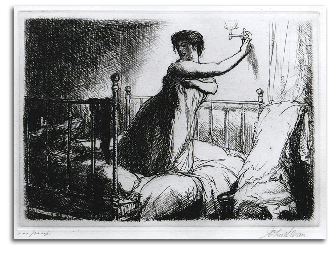
SLOAN
Turning out the Light (etched 1905)
Etching
Lithograph from an etching. Later edition [Hand Signed]
Collection: FLG
NOTE: John Sloan was one of the most gifted members of the Ashcan School because they were the first to paint the seedy side of cities. To the surprise of many, thse painter-printmakers found beauty in the underside of urban life.
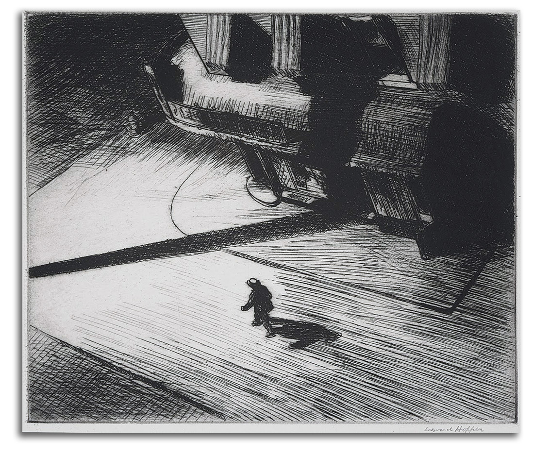
HOPPER
Night Shadows (etched 1921)
Original etching
Collection: Unknown
NOTE: Edward Hopper is the best-known Urban Realist in the whole of 20th-century American painting. In paintings such as the “Night Hawks” and in prints such as “Night Shadows” Hopper pictures the isolation and silent anxiety of the Existential Condition that pervades modern urban life. [WRAP IMAGE Hopper: Night Hawks – the painting}
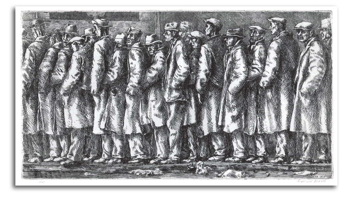
MARSH (after)
Bread Line (engraved 1932)
Engraving
Lithograph from an engraving. Later edition [signed]
Collection: CSUEB. Gift of IAD
NOTE: Reginald Marsh was one of the first painters to picture hope-drained life during the Great Depression of the ‘30s. The Federal government put many artists to work on public projects during the Great Depression – something never done before. It was the photographers so commissioned (rather than the painters) who best captured the deeply sad spirit of the times.
AMERICAN MASTERS – 20TH CENTURY – Cubists & Abstract Artists
MARIN
Woolworth Building (The Dance), 1913
From SIX NEW YORK ETCHINGS, 1913
Published by 291 (Alfred Stieglitz)
Etching & drypoint
Collection: Museum of Modern Art, New York
NOTE: Trained as both an artist and an architect, John Marin was one of the few Americans who was deeply inspired by Cubism. In his early etchings such as this one, he said he was after the “energy” of the big city. He wanted to suggest what he called the “great forces” moving through the dramatic skyscrapers of New York City, as well as the Brooklyn Bridge (1883). He began etching in Paris in 1905, then developed his Cubist style in New York City in 1911. He later adapted his semi-Cubist style to the natural world.
DAVIS
Barber Shop Chord, 1931
Lithograph
Probably printed by George C. Miller
Collection: Museum of Modern Art, New York
NOTE: Stuart Davis grew up under the powerful Urban Realism of Robert Henri and John Sloan. Like so many Modern Americans in the 1920s, he went to Paris to drink in Modernism which he discovered at the Armory Show of 1913. In Paris he fell in love with Cubism and started to integrate different kinds of reality. When he came home and applied his new feeling for fractured space-time to the “American Scene” during the 1930s, his jazz-inspired paintings and prints were among the most dynamic of the period. Among other things, Davis anticipated Pop Art.
DOVE
Nature Symbolized #2 (painted c1911)
Postcard
Edition of Art Institute of Chicago
Collection: FLG
NOTE: Arthur Dove and his friend O’Keeffe were the first Americans to paint abstract paintings. Both were moved by various aspects of what they called “cosmism,” including both Kandinsky’s spirituality and Bergson’s élan vitale (vital force).” They were not very interested in making fine prints of their work, but their fame became such that millions of printed postcards, posters, and bookpages were made from their work during the 20th century. “Nature Symbolized” is one of the first abstract paintings ever created anywhere.
Dove lived a quiet life, as far as he could get from the materialism of the Modern world, working mostly as a farmer. His paintings did not become as popular as did the work of O’Keeffe who managed to touch a wider mythology. Happily, he found a patron in Duncan Phillips who helped Dove through hard times. When I was working for Mr. Phillips in 1963, I asked him to describe Dove. This is what he said: “A quiet rustic Alchemist, or a Zen Buddhist.” Dove’s spirit was fed by nature, his family, and a Transcendental philosophy that had taken him beyond his ego to a level of awareness from which he could see that everything in the material world is “a condition of light.” And he he could say:
…the world is a dream and everything in it is yourself.
He also said:
We cannot express the light in nature… we can only express the light we have in ourselves.
When his son asked him for a definition of God, he answered:
… the perfection we have in ourselves.
DOVE
Fog Horns (painted 1929)
Postcard
Edition by Colorado Springs Fine Arts Center
Collection: FLG
NOTE: When my daughter asked me about this painting, I answered by writing her a little interpretive poem:
THE SOUND OF A DOVE
(Reflections on “Fog Horns”)
Painting a pigeon
(one critic said)
just would never do.
So Mr. Dove decided
To only paint the “coo.”
And so it was with “Fog Horns”
The shapes of which are round.
He painted not the look of things
But the feeling of the sound.
O’KEEFFE (after)
Abstraction #11 (painted 1916)
Frontispiece in THE MEETING OF EAST & WEST: AN INQUIRY CONCERNING WORLD UNDERSTANDING by Northrup
Lithograph from a painting, 1947
Collection: FLG
Exhibited in “Zen & Modern Art,” University Art Gallery, CSUEB, 2003
NOTE: Abstract prints of any kind were uncommon in the U.S. until late in the Abstract Expressionist era when artists such as de Kooning, Motherwell, Frankenthaler, Francis, and Jenkins started to make editions. This 1947 book illustration by O’Keeffe is an exception. It is the frontispiece of an important book on East/West philosophy by a very thoughtful Yale professor, F. S. C. Northrup. This book was required reading for those of us who specialized in East Asian Studies at American University’s School of International Service in the ‘60s. Northrup’s selection of a work by Georgia O’Keeffe to symbolize his book was a good choice.
One could say her 1916 composition is neither Eastern nor Western, but rather both at once. She was one of the very first Americans to paint abstractly during that pioneering decade (1910-20) when abstract art was created. This pair of blue lines (or as a Buddhist might say: the “one that is not two”) is one of her earliest abstractions. The two verticals rise from a single source.
O’Keeffe was very interested in Zen, both contemporary Zen and traditional Zen. When we met in 1971, O’Keeffe told me that her favorite painters were the Chinese landscape masters of the Sung Dynasty. Many of those Sung artists were Chan Buddhists, a branch of Buddhism that became known as Zen when Buddhism came to Japan.
When she was studying Art History in college, my daughter was interested in O’Keeffe, partly because she is the most famous female artist in American history. I think more books have been written about her than any other woman artist in all of history. So I gave my daughter some O’Keeffe postcards and a book, and wrote for her a little poem using words that O’Keeffe and I actually exchanged in our 1971 conversation at SFMOMA:
LIFE IS NEVER NOT – A CONVERSATION WITH O’KEEFFE
We were talking about poetry.
She liked Sidney Lanier
Because he was so musical
And death he did not fear.
Then we spoke of Zen and Sung
Whose scrolls sound like a gong.
She’s also fond of Haiku because
“They keep us close to nature’s song.”
“Ever write short poems yourself?”
To which O’Keeffe replied:
“Nothing much – a thing or two.
Here is one I’ll share with you:
NOTHING IS INANIMATE!”
O’KEEFFE (after)
Music – Pink and Blue #2 (painted 1918)
Poster, 1990s
Edition of the Whitney Museum of American Art
Collection: FLG
NOTE: A poster or a postcard of this painting has been on my wall since college when I wrote my first O’Keeffe essay. She did not stay in the remote world of total abstraction after these early years. However, much of the power of her later work with objects in the material world derives from her remarkable capacity to fuse the two worlds.
xxxxx
AMERICAN MASTERS – 20TH CENTURY – Visionaries
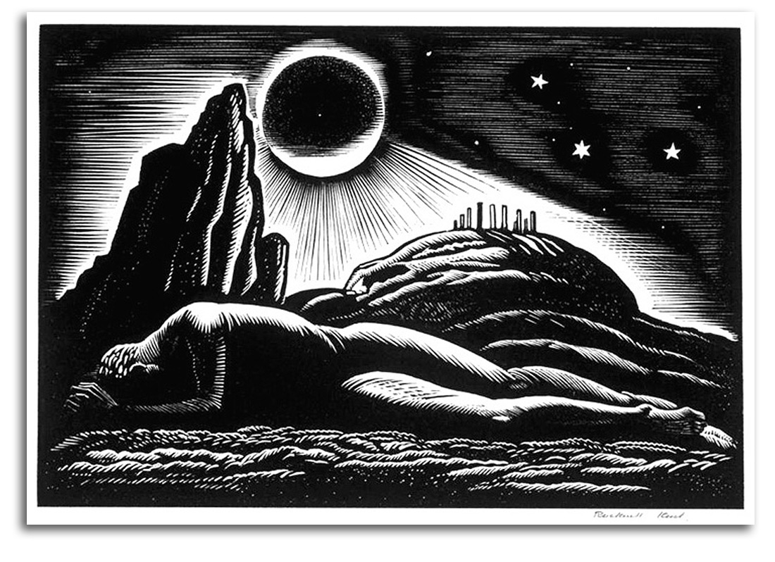
KENT
Twilight of Man (painted 1922)
Wood engraving, 1926
Collection: Unknown
NOTE: Rockwell Kent was an artist, adventurer, and social activist. The powerful Modernist style of his extremely popular book illustrations pictured both mythological worlds and the struggle of the working class. This print is based on a watercolor of an eclipse and the ancient idea that an eclipse will bring doom to humankind. Kent’s sincerity and his intensely concise style touched the mythic imagination of the American people during the ‘20s and ‘30s, especially with his MOBY DICK. His illustrated edition brought Melville’s half -forgotten novel back to life. His illustrated SHAKESPEARE stimulated the imagination of generations. However, his favoring of Communism, and his working for peace between the U.S. and Russia got him in trouble with the McCarthyism of the Cold War. In 1950, he lost his passport and his popular appeal, but not his purpose in life. The money that came to him with the Lenin Peace Prize in 1967 he gave to the brutalized children of North Vietnam and South Vietnam.
KENT (after)
Two Whale illustrations, 1930
Lithographs from wood engravings in MOBY DICK by Melville
Collection: Unknown
NOTE: His best-known illustrated book is MOBY DICK. His renderings of the great white whale in various states are especially dramatic and visually touch the edge of total abstraction.
LANDACRE
Tuonela, 1934
Wood engraving
Collection: Smithsonian American Art Museum, D.C.
NOTE: Paul Landacre played a major role in elevating Modern wood engraving to a fine art. He also taught at USC. His meticulous Realism is so intense that it borders on Surrealism. His work celebrated many parts of California, especially the coast, and is now in over 150 museum collections.
xxxxx
AMERICAN MASTERS – 20TH CENTURY – Regionalists
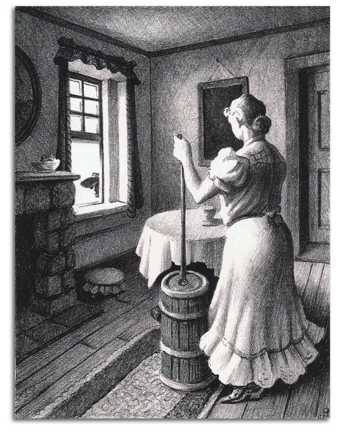
BENTON
Churning Butter, 1954
Original Lithograph
Limited Editions Club edition [Hand Signed]
Collection: FLG
NOTE: Thomas H. Benton was the best known painter of the Regionalist Movement during the 30s, a movement that was farm-based and dismissive of urban Modernism.
BENTON
The Race (printed 1942)
Original Lithograph
Collection: Unknown
NOTE: Benton’s undulating rhythms were admired by his young student, Jackson Pollock who became famous for painting abstract rhythms.
BENTON
Aaron, c1950
Original Lithograph.
Collection: Unknown
WOOD
March, 1938
Lithograph
Edition of Associated American Artists, 1941
Collection: FLG
NOTE: Grant Wood was one of the most gifted artists of the Regionalist Movement which celebrated the sights and values of farm life in the heartland of America. This is one of his strongest prints.
AMERICAN MASTERS – 20TH CENTURY – Abstract Expressionists
Abstract Expressionism is the best-known part of the New York School and last dominant style within Modernism. At first all these painters were called Abstract Expressionists. Later it was realized that there were two polarities in the New York School. Pollock and de Kooning came to be called called Action Painters. Rothko and Newman, whose work was less gestural, came to be called Color Field Painters. These styles were generated in the late 1940s and became widespread around the world during the 1950s. In the process, the capital of Modernism moved from Paris to New York City.
A majority of the best-known paintings and prints are abstract, but some continued figuration. Both Pollock and de Kooning returned to figuration in the ‘50s. In the early days of Abstract Expressionism, printmaking was looked down on by the leading painters, but de Kooning and Motherwell turned that around during the 1960s by surprising the Art World with masterpieces of printmaking. They inspired younger painter-printmakers to generate the American Print Renaissnce of the 1960s & ‘70s. The other side of the First Generation of the New York School – the Color Field painters – made only a few prints. Rothko made only one print. Newman made several very “minimal” prints.
Pollock and de Kooning were brilliant artists but not brilliant speakers. Other members of the New York School, such as Rothko, Newman, and Motherwell, were very articulate spokesmen for the subtle metaphysics of their group. Motherwell said to me in our first conversation of 1962 : “Abstract art is a form of mysticism.” That is a remarkable statement. What does it mean?
Said simply, mysticism is a process by which one attempts to link with the Transcendent. Some mystics go off to mediate in caves, but that is only one way to follow a mystic path. Modern artists, from the very beginning of Modernism, have regarded to process of making art as a path toward the Transendent, the Absolute.
I have pointed out this important fact in every section of this course. It is a new way of understanding, one that is not in traditional textbooks, most of which were written by Formalists.
Formalists, who dominated art criticism and art history for much of the 20th century, did not have much interest in what the artists said they were doing. They were interested in form but not content. Indeed they often said the form was the content. My generation of art historians, the first Post-formalist generation, felt something was wrong with this idea of art history. We felt art history should involve the examination of both form and content. So we studied the statements, and listened to what the artists had to say. We found an important consistency from the beginning of Modernism to the end of Modernism. We found that (more often than not) the greatest Modernists were deeply involved with metaphysics, convinced that art as a way of life can take the self beyond itself. And here we find once again the metaphysics of Modernism at the heart of the New York School.
Here’s how MoMA’s distinguished curator and authority on Abstract Expressionists, William Seitz, wrote about his painter-friends concisely:
The oscillating equilibrium they seek involves… a way of life…, art is not a profession but a path towards truth. … Most important of all, it implies a need for the softening of that monad of…mass: the ego.
Motherwell used more words to characterizes the situation in his well-known 1951 essay “What Abstract Art Means to Me”, saying that the Modern artist’s response to life:
…arose from a feeling of being ill at ease in the universe, so to speak — the collapse of religion, of the old close-knit community and family may have had something to do with the origins of the feeling. … But whatever the source of this sense of being unwedded to the universe…Abstract art is a true mysticism…that grew up in the historical circumstances that all mysticisms do, from a primary sense of gulf, an abyss, a void between one’s lonely self and the world. Abstract art is an effort to close the void.
Rothko explained his view of the New York group’s Transcendent thinking this way:
The Romantics were prompted to seek exotic subjects…[but]…not everything strange is transcendental. … [In archaic art] the urgency for transcendent experience was understood and given official status. … The familier identity of things has to be pulverized in order to destroy finite associations.
The psychological structure of this way of thinking is very much like that of Kandinsky. In other words, only if the painted or printed image is beyond physical associations, can the mind’s eye “see” beyond the inherent materialism of the ego’s concrete world up into the world that is Transcendent of the ego and all the material world that it usually loves. At other times, Rothko clarified the central dynamics of his transpersonal psychology in statements that are simple and profound:
The dictum ‘Know thyself’is only valuable if the ego is removed.
I don’t express myself in painting. I express my not-self.
Traditional religion was not important to most of these artists, but spiritual experience was. It was what they wanted most, and their art was their way of getting there. Rothko told an interviewer:
The people who weep before my pictures are having the same religious experience I had when I painted them.
Newman thought in similar ways. He was not only a painter and a printmaker. He also was an exhibition curator who wrote beautiful exhibition catalogues. In one on Pre-Columbian art, he wrote:
While we tanscend time and place to participate in the spiritual life of a forgotten people, their art by the same magic illuminates the work of our own time.” In a related letter he wrote: “These sculptors were interested in the elemental mystery of life… . We today are concerned with the same problem.
Newman also said in one of his short, luminous phrases that what motivates artists is “our struggle for perfection.” Elsewhere he wrote about transpersonal psychology: “…painting becomes sublime when the artist transcends his personal anguish.”
During one of the conversations I had with Newman in 1968, we talked about his first masterpiece: “Onement I” (1948), now in New York’s Museum of Modern Art. He noted that the title goes back to the original meaning of atonement which is at-one-ment, at-one with the Transcendent. Then we spoke of how that famous painting and its vertical symbolism evolved and was later used in his prints. {WRAP IMAGE: BN minimal print}
LG: May I ask about your magical ‘zip’ (as you call it)?
This quivering line, this light-beam, this crack of luminosity – has it been a kind of tool that has helped you to climb Jacob’s Ladder?
BN: Yes, it has, in a way; and I like the way you express it. … Once I made it absolutely vertical, then it was no longer limited. It and I were no longer separated.
[For more of this conversation, CLICK HERE]
The most perceptive critics of the era realized that the art of the New York School was linked to the Transcendent. Clement Greenberg said it this way:
…the European is concerned with the transcendence of objects while the American is concerned with the reality of the transcendental experience.
Harold Rosenberg, who was a very good friend of Newman, and a critic who understood the New York School more deeply than Greenberg, said this:
Newman’s…emptiness is the indespensible ground against which all other qualities are brought into play…the invisible sublime.
[For my conversation with Newman on the Sublime, CLICK HERE for the last paragraphs of “The American Sublime: Transcendental Landscape Painting from the Hudson River School to the New York School” (2003).
Similar quotations from this dynamic era from the end of Modenism could fill a book. Let me close with just one, a summation of the spirit of the age by Harold Rosenberg:
In sum, what the new American artist sought was not richer…fiction (like the Surrealists), but the formal sign language of the inner kingdom – equivalents of a flash, no matter how transitory, of what had been known throughout the centuries as spiritual enlightenment.
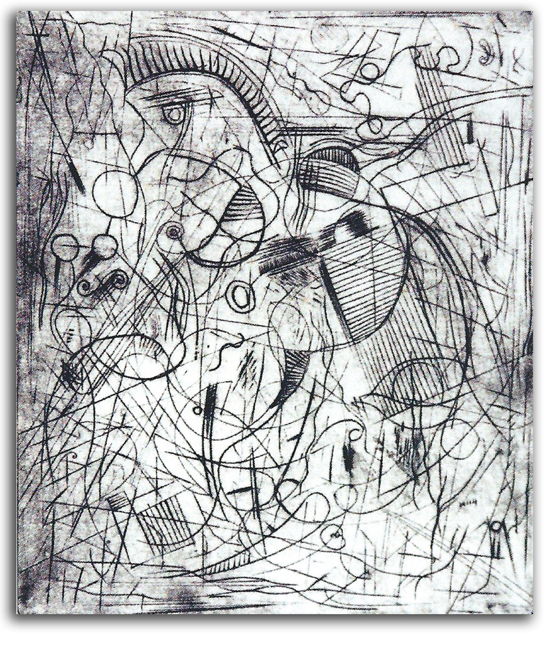

POLLOCK
Untitled (a pair of trial prints), engraved 1944
Engraving
Printed by Reuben Kadish, 1989
Collection: FLG on loan to IAD
Gift of Reuben Kadish, 1989
Published in O’Connor, ed., JACKSON POLLOCK: A CATALOGUE RAISONNE, SUPPLEMENT NUMBER ONE, 1995, and in GLOBAL VISION, Part 1, 2006
NOTE: These impressions are from a two-sided practice plate that Pollock worked on in 1944 in Hayter’s workshop. The second of these two experiments is of particular importance because it turned out to be Pollock’s first totally abstract composition. A few proofs were made in 1944 but they have disappeared. Pollock’s printer, Rube Kadish, kept the plate. At my request, he printed a very small edition so it could be part of the catalogue raisonné of Pollock prints that I was preparing. My notes indicate that there were only three sets pulled. One set was donated by Kadish to the Pollock-Krasner House & Study Center where it was exhibited by Helen Henderson in 1993.
CLICK HERE for my essay “Pollock, Hayter, & the Seeds of Abstract Expressionism” (1987; revised 1991). This essay documents how these prints were created and thereby started Pollock on the road to his Abstract Expressionist style.
POLLOCK
Number 14 (Grey), 1948
(Enamel on gesso on paper)
Poster, edition by Yale University Art Gallery, New Haven
Collection: FLG
NOTE: Jackson Pollock’s most famous works were done between 1948 and 1951. This was a period in which his alcoholism was in check. “Number 14 (Grey)” is a good example of the lyrical quality he achieved at this time. What is the subject-matter of his famous abstract paintings and prints? Many critics have said the form itself is the subject of abstract art. Such critics are known as Formalists. Formalists usually have little interest in what most people call subject-matter. Pollock said a great deal when he stated that his paintings and prints were not entirely abstract. He indicated his primary subject was “Energy Made Visible.”
POLLOCK
Untitled (Mural), 1950
(Enamel on paper)
Poster from a five-foot mural. AllPosters Edition, ND
Collection: FLG
Exhibited: ZEN & MODERN ART, University Art Gallery, CSUEB, 2003
POLLOCK
Untitled, 1951
Screenprint from JACKSON POLLOCK: SIX PRINTS, 1951
Collection: National Gallery of Australia, Canberra
{Acquired at the recommendation of FLG}
NOTE: This suite of screnprints is the only set of abstract prints Pollock ever editioned. Printed by his brother, they are based directly on paintings of the same period.
DE KOONING
Revenge (etched 1957)
Original etching & aquatint from
21 ETCHINGS AND POEMS, 1960 [Hand Signed]
Printed by Anderson-Lamb
Collection: FLG
NOTE: Willem de Kooning’s first famous paintings of the late ‘40s were abstract, but during the ‘50s he returned to figuration (as did Pollock). When he did, some of what he was thinking about seems to have been Chaim Soutine and Jan Toorop. He called Soutine his favorite painter. Soutine in Paris during the ’20s painted highly contorted faces and figures in an Expressionistic manner with a thick materiality that de Kooning called both “lush” and “luminous.” Toroop, whom de Kooning had admired in Holland as a young man, was the leading Dutch painter-printmaker of the Symbolist/Art Nouveau era. In his compositions, as a rule, figures occupy half the field while abstract swirling linearity occupies the other half of the field (and that also is what de Kooning often did). De Kooning became the most influential painter in the world during the 1950s, and in 1960 gave a new respect to printmaking.
The French concept of a livre d’artiste, a deluxe book in which the illustrations are original works of art, was invented by Vollard in the years around 1900, and developed by many French artists for decades. The concept got off to a slow start in America. 21 ETCHINGS AND POEMS was the first important livre d’artiste created in the U.S. For its history, see my article “The Rise of the Livre d’Artiste in America: Reflections of 21 ETCHINGS AND POEMS and the early 1960s” in THE TAMARIND PAPERS: A JOURNAL OF THE FINE PRINT. 13:35-40 (1990)
DE KOONING
Litho #1 (Waves #1), 1960
Original Lithograph. [Hand Signed]
Printed by Oliveira and Miyaski
Collection: IAD
Ex. Collection: Karl Kasten
NOTE: This lithograph is widely regarded as de Kooning’s greatest print. In the last great de Kooning retrospective at MoMA, it and it alone from all his prints was selected to hang with the paintings. “Litho #1 (Waves #1), along with a second similar print (Litho #2, Waves #2), was made at the University of California, Berkeley, in 1960 in the print shop of Karl Kasten at Karl’s suggestion. It is a monumental size, and of such power that it inspired a generation of younger artists to take printmaking seriously and to start the American Print Renaissance of the 1960s & ‘70s. It also was the first American print ever made that can hold its own next a painting of a similar size. CLICK HERE for the story of how these two legendary prints were created, a story that I published in WILLEM DE KOONING: THE PRINTER’S PROOFS (1991). CLICK HERE for my book THE PRINTS OF WILLEM DE KOONING: A CATALOGUE RAISONNE, Vol. 1 (1991).
DE KOONING
The Preacher, 1971
Original Lithograph [Hand Signed]
Printed by Fred Genis at Hollander’s Workshop
Collection: Fine Arts Museums of San Francisco
Ex. Collection: Fred Genis
Gift of FLG & GKS, 1994
NOTE: Although most of his greatest paintings and prints are abstract, there sometimes is a disembodied eye or two in the composition that continues from his days under the spell of Symbolism and Surealism. I interviewed Fred in Australia and bought from him this print and “Landscape at Stanton Street.” I considered these two prints to be the strongest of the famous series of lithographs that Bill did in 1971 at Hollander’s Workshop in New York City.
DE KOONING
Landscape at Stanton Street, 1971
Original Lithograph. [Hand Signed]
Printed by Fred Genis at Hollander’s Workshop
Collection: Fine Arts Museums of San Francisco
Ex. Collection: Fred Genis
Gift of FLG & GKS, 1994
NOTE: I once asked Bill why his so-called “landscapes” are abstract. He said: “I am not painting what the landscape looks like but how I feel about what I see when I’m looking at a landscape.”
DEKOONING
Untitled, 1986
Original Lithograph. [Hand Signed]
From the portfolio QUATRES LITHOGRAPHIE
Editions de la Difference
Collection: Fine Arts Museums of San Francisco
Gift of Harry W. & Mary Margartet Anderson
NOTE: As artists get older, more often than not, their work tends to be less creative. There are notable exceptions in the case of Titian, Rembrandt, and de Kooning. The ‘70s was a bad decade for Bill. Alchoholism was ruining him. His paintings were poor. His wife, Elaine, helped him kick that habit. His heath returned. His late paintings and prints from the early 1980s are brilliant dances of colored light. Many critics of the time did not like these late works, saying they were not riddled with enough anxiety. That said more about the critics than about Bill. For much of his life, Bill was anxious and that anxiety permeated his work. It was a quality that appealed to many living in an Existential world.
In his late years, however, Bill was no longer anxious. His work was an outpouring of fluidity. The last conversation we had was in his studio in 1985. A good deal of demenia had set in, but he was still painting and would be for a little while longer. His eyes were bright and the points he made were quite coherent as we talked about the printers he had worked with – Bill Hayter, Irwin Hollander, and Ken Tyler. I asked why he did not make more colored lithographs. His stunning reply: “Sometimes there is more light in black and white.”
MOTHERWELL
Automatism, 1965-66 (signed)
Lithograph. Collection: FLG on loan to IAD
Ex. Collection: Irwin Hollander
Published in GLOBAL VISION: A SURVEY OF WORLD ART, Part 1, 2006
MOTHERWELL
Lament for Lorca, 1982
lithograph
authorized advance edition
Printed by Ken Tyler
Collection: FLG
KRASNER
Untitled (Light…Clarity), 1967
Original Lithograph from
IN MEMORY OF MY FEELINGS by O’Hara, 1967
Collection: FLG
Gift of the Museum of Modern Art, New York, 1967
Exhibited: “The Art of the Book, The Modern Livre d’ Artiste, University Art Gallery, CSUEB, 1999
NOTE: Lee Krasner was a good painter before she married Pollock. But only after he died did she come into her own as an important artist. A detail of this print I used on the cover of my book THE SPONTANEOUS GESTURE: PRINTS & BOOKS OF THE ABSTRACT EXPRESSIONIST ERA (1987). The French concept of a livre d’Artiste, a deluxe book in which the illustrations are original works of art, was invented by Vollard in the years around 1900, and developed by many French artists for decades. The concept got off to a slow start in the U.S. IN MEMORY OF MY FEELINGS was one of the first important livre d’artiste made in the U.S. after 21 ETCHINGS AND POEMS (1960). [For that history CLICK HERE]
Many major contemporary artists contributed to this memorial volume of poems by Frank O’Hara who was both a noted poet and a curator at MoMA. The printing technique was revolutionary. These lithos were drawn not on stones or metal plates but on transparent plastic. Those of us involved had to convince some of the MoMA trustees that these prints were original works of art. This book is now widely accepted as a masterpiece of book art and has been featured in many publications and museum exhibitions.
FRANKENTHALER
Bronze Smoke, 1978
Lithograph
Collection: Museum of Modern Art, New York
NOTE: Helen Frankenthaler, as a very young artist, was struck by how Pollock stained part of his canvases. She expanded on that concept and led the Second Generation of the New York School into the fluid potential of acrylic-based Color Field Painting during the early 1950s. She continued to produce brilliant work throughout the 20th century. As with Motherwell (with whom she was once married), her prints are as fine as her paintings.
FRANKENTHALER
Tales of Genji VI, 1998
Original Woodcut
Printed by Ken Tyler
Collection: CSUEB. Gift of IAD
Published in GLOBAL VISION, Part 1, 2006
NOTE: This series of woodcuts was based on the Japanese novel, TALES OF THE GENJI, which was written in the 11th century by Murasaki Shikibu. She was one of the earliest known female writers of note in Asia. Helen and I met at a 1978 philosophy conference in San Francisco (“Philosophy, where are You?”). In that conversation about color she said to me: “Light? Color? What’s the difference?” In other words, she put light into her colors effortlessly. For her, coloring light was as natural as breathing. I went home and composed another little poem for my daughter to introduce her to the most fluid woman of the New York School:
WHAT IS LIGHT MADE OF?
(after a conversation with Helen Frankenthaler)
Frankenthaler flows as naturally
as a river or a stream.
To look inside her pictures
is to see a dream.
Color may be what matters.
It does make forms that swirl.
Color that solidifies
is the material world.
But what puts the song into the dove?
What makes a motion feel like love?
The heartbeat of color comes from above.
Light is what hearts are made of.
JENKINS
Phenomenon: Tide Finder. 1970
Original Lithograph from ART IN AMERICA, 1970
Collection: FLG
Exhibited in “Zen & Modern Art,” University Art Gallery, CSUEB, 2003
NOTE: Paul Jenkins, a member of the Second Generation of the New York School, was among the first to explore the potential of pouring acrylic paint on canvas. He divided his time between New York and Paris, drawing on both sides of the Modern tradition. Zen became an important part of his life in the 1950s. As with Helen Frankenthaler and and other Color-Field painters, the results can be both powerful and lyrical. In his case, and hers, they were using rivers of fluid color to reach for the Transcendent. In a richly democratic act, original lithographs such as this one were published in regular issues of ART IN AMERICA for a number of months. For many, one of these lithographs was the first original prints they ever owned. For one of the letters Paul and I exchanged over the years CLICK HERE.
JENKINS
The Mind is its Own Place, 1992
Original Lithograph [Hand Signed]
Collection: FLG
Gift of the Artist, 2003
FRANCIS
Cover of THE LITHO SHOP, 1979
Brooke Alexander edition, 1979
Collection: FLG
Gift of the Artist, 1985
Exhibited: “Zen & Modern Art,” University Art Gallery, CSUEB, 2003
NOTE: Sam Francis was California’s most important member of the Abstract Expressionst era. Few artists have been so steeped in Asian philosophy, and few rendered the metaphysical concept of Being-and-Nothingnes with such lyrical clarity. In traditional art, Being would be at the center of the composition. In the art of Sam Francis, Nothingness is at the center.
FRANCIS
Of Vega, 1972
Original Lithograph
Collection: FLG
Gift of the Artist, 1985
NOTE: In some of his earlier lithos, the Nothingness at the center of the composition is only a square space – a window into the Beyond (see above). However, in his later classic style (as in this work) the Nothingness at the center is the primary space of the composition. All else is secondary.
———————————————-
MID-CENTURY REALISTS
CATLETT
Sharecropper, 1958
Original Linocut
Collection: Unknown
NOTE: Elizabeth Catlett was one of the most gifted African-American printmakers of the 20th century.
SHAHN (after)
Gandhi, (drawn 1964)
Original Drawing
Collection: Fine Arts Museums of San Francisco
Gift of Mr & Mrs John D. Rockefeller 3rd
———————————————————-
Printed in LOOK magazine, Aug. 26, 1969)
Print from LOOK, Collection: FLG
NOTE: Ben Shahn was an Urban Realist who had a gift for summing up a situation or a person with a few lines. His paintings are full of social consciousness. This drawing is a portrait of India’s great leader of guided his nation’s independence from the colonial empire of the British. Ghandi’s non-violent protest methods, inspired by both Hindu tradition and Henry Thoreau, were an inspiration for the Civil Rights leadership of Martin Luther King, Jr.
BASKIN
Hydrogen Man, 1954
Wood engraving
Collection: Unknown
NOTE: Leonard Baskin, son of a Rabbi, was a Renaissance Man – author, printmaker, booksmith, sculptor, teacher, social commentator, and collector. The range of his narrative imagry was great, and so was the depth of his humanity. His style could be called Expressionist. He could work on a scale almost as small as the picture stamps he loved to collect. On the other hand, he developed the monumental wood engraving as a Modern art form. “Hydrogen Man” is an image of what humans might look like at the end of World War III in which the key weapon was the hydrogen bomb.
BASKIN
William Blake, 1968
Lithograph from a wood engraving
Collection: FLG
Exhibited in “Flaming Pages: The Illuminated Books of William Blake,” University Art Gallery, CSUEB, 2003
NOTE: William Blake, the greatest booksmith of the Pre-Modern era, was a major inspiration for Baskin. This composition is as abstract as Baskin ever wanted to go.
ROCKWELL (after)
The Connoisseur [Looking at a Pollock], 1962
Cover of SATURDAY EVENING POST
Replica lithograph. ND
Collection: FLG
NOTE: Norman Rockwell was the most popular American magazine illustrator of the 20th century. He did over 300 covers between 1913 and 1980. Magazine illustrators have usually been closer to the pulse of society as a whole than painters have. Cultural historians find more to write about in magazine pages than they do in art museums. In this particular magazine image, America seems to be wondering: “Just what is there to see in a Pollock painting?” The year of this picture, 1962, was a time of change in the Art World. Abstract Expressionsim has dominated avant-garde American paintinf gor years, but Pop Art was about to explode on the scene and blow Ab. Ex. into the sidelines.
For a long time, the Modernist elitism of most curators would not acknowledge that Rockwell’s work was anything but “illustration.” I was severely criticized for presenting a Rockwell exhibition at the de Young Museum in the early ‘70s. “This is not art!” I was told. Three decades later, I told this story to Robert Rosenblum, the noted art historian who had become a curator at the Guggenheim. He was engaged in the radical act of planning a major Rockwell exhibiton at the Guggenheim in collaboration with the High Museum in Atlanta. Bob said: “Lanier, I can understand why some people wanted to fire you in 1972 for doing a Rockwell show. What I’m doing – a full retrospective – had to wait until the Postmodern era.” Bob’s show “Norman Rockwell: Pictures for the American People,” opened in New York in 2001.
ROCKWELL
The Problem We All Live With
Story Illustration in LOOK, January 1964
Collection: FLG
NOTE: Abstract Expressionism dominated contemporary art during the 1950s, but it began to fade from view during the early ‘60s as Pop Art burst on the scene. Pop Art was a strange new form of Realism. Rockwell’s old fashioned Realism also took a new turn in the early ‘60s. He made a deliberate shift from picturing American Dreams – America as it wanted to see itself – to American Problems. THE SATURDAY EVENING POST would not allow controversial subjects. Advertizers did not want “negro subjects.” Rockwell, a liberal at heart, had more freedom when he moved to LOOK. This powerful picture of a young girl entering school with the help of federal marshalls was a revolution in American magazine history. Nothing like it had ever been seen before.
Like Martin Luther King, Jr’s famous “March on Washington” that had just taken place in August of 1963, Rockwell’s image made millions of white people think about Racism – many for the first time. Within several months of that historic march (on July 2, 1964 to be precise), President Johnson was able to pass his most noble piece of legislation – the Civil Rights Act of 1964. This Act eliminated many forms of discrimination in voter registration, schools and workplaces. Civil Rights in the U.S. still has a long way to go, but this piece of legislation was a watershed moment. And Rockwell helped that moment to be.
—————————————————–
POSTMODERNISTS
Scan All but a few from last section of GV.1 (as indicated in the captions)
Postmodernism developed in reaction to the last dominant style within Modernism -Abstract Expressionism. Postmodernism started in the 1950s with the work of Rauschenberg, Johns, Hockney, et al., and became widespread during the 1960s & ‘70s with Warhol, et al. We are still living in a postmodern world. In the process, contemporary art is no longer dominated by a single style or a single city. Historicism has returned as an OK option. Woman artists and minority artists finally have gained proper recognition, something usually denied them during the era of Modenism. Less attention is given to personal self-realization. More attention is given to collective well-being. Pluralism and diversity have become the hallmarks of our age, an age in which relatively little social consciousness has been replaced by great deal of social consciousness.
JOHNS
Figure 4
During the ‘50s & ‘60s, comic books, color magazines, films, and especially T.V. increased focused visuality among the general public to historic levels. The traditional mode of public education based on reading, writing, and ‘rithmatic (which results in people with a rationalistic left-brain view of reality) started to have more for the intuitive visually-oriented right-brain to do.
It is in the right-brain that we process both seeing and feeling. The two are related. Seeing can be a way of feeling. The more we look strongly the more we feel deeply. Looking with our intuition wide open is very different from looking with only the left-brain turned on. Looking intuitively, and learning to trust what we see that way, is a mental “muscle” that everyone trained in a left-brain society needs to learn how to develop.
The arrival of personal computers in the ‘80s started to make the act of looking closely an even larger part of contemporary life. The creation of the World Wide Web in the ‘90s turned the internet into a universe of endless visualizations. Prints and scans of many different kinds have become more popular every day. Everyone has become a printmaker!
The rational, logical, science-oriented values of the industrial world were based largely on materialism and left-brain values. The post-industrial world has been moving in a different direction. For the first time in modern history, society as a whole has started moving toward a mode of perception that includes an equal respect for left-brain analysis and right-brain intuition. The Wisdom Paths of all the great spiritual traditions teach that only when we have come to balance inside ourselves the capacity to think and the capacity to feel can we reach the fullness of out humanity.
RAUSCHENBERG
Booster
Lithograph, 1967
Authorized advance issue of the 1967 edition.
Printed by Ken Tyler at G.E.L.
Collection: FLG on loan to IAD
NOTE: When we were preparing a Ken Tyler retrospective at the National Gallery of Australia, Ken told me this famous print is a self-portrait, as it was based on a life-sized x-ray of the artist. It was the largest fine art lithograph at the time. Bob had a new level of confidence for undertaking unpresidented projects such as this one after winning the Grand Prize at the Venice Biennale in 1964. He was the first American to win this prestigious prize. Two other Euro-Americans had won the Painting Prize in Venice: Whistler (1895) and Tobey (1958). But this was the first Grand Prize for an American. For many, that singular event marks the point at which Postmodernism began to replace Modernism as the central focus of the Art Establishment.
RAUSCHENBERG
Signs (composed 1970)
Screenprint
Castelli Graphics edition
———————————
Poster, ND
Collection: FLG
NOTE: Robert Rauschenberg and Jasper Johns were at the forefront of the Neo-Dada Movement in the ‘50s, the movement that anticipated Pop Art. Rauschenberg and Warhol became household names during the 1960s & ‘70s. Rauschenberg was one of the best collage artists of the 20th century. “Signs” is widely considered one of his greatest prints. It pictures key figures and events that made up much of the collective experience of the ‘60s. Here we see JFK, his brother Robert, and Martin Luther King, Jr. (all three murdered), Janis Joplin, the Vietnam War, Race Riots, and a Man on the Moon.
This image has been on my wall for 40 years. Bob (whom I knew in New York before I moved West) had a great deal of social consciousness. I followed my exhibition on Warhol & Social Consciousness with an exhibition on Rauschenberg & Social Consciousness. Bob was particularly pleased with my exhibition proposal because it had never been proposed before. He was very supportive and lent everything I asked for from his own collection. [CLICK HERE for the brochure of my exhibition ROBERT RAUSCHENBERG, ARTIST-CITIZEN: POSTERS FOR A BETTER WORLD, an exhibiton that opened at CSUEB in Hayward and then travelled from coast to coast under the management of S.I.T.E.S (Smithsonian Institution Traveling Exhibition Service).]
RAUSCHENBERG
Cardbirds, 1971
Limited edition Book
Collection: FLG on loan to IAD
Published in GLOBAL VISION, Part 1, 2006
JOHNS
Savarin (1st version, a monotype 1977)
Lithograph from the monotype, 1982
Authorized advanced issue of the 1983 lithographic edition
Printed by ULAE
Collection: CSUEB. Gift of IAD
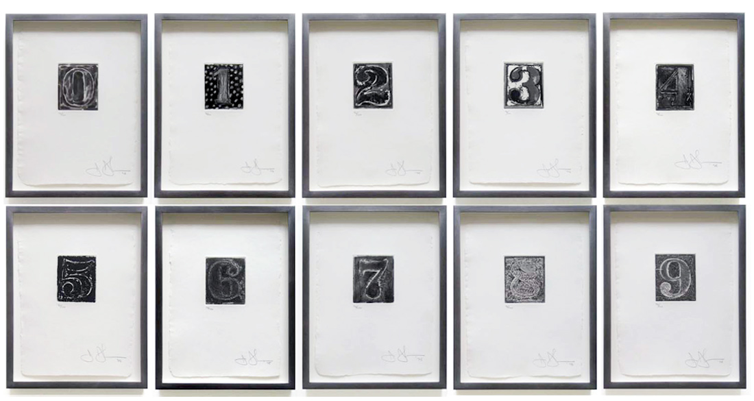
FERLINGHETTI
Nothingness, 2003
Xerox of a handwritten poem
Collection: FLG
Printed by Ferlinghetti
Gift of the Artist
Exhibited: “ZEN & MODERN ART,” University Art Gallery, CSUEB, 2003
NOTE: Lawrence Ferlinghetti is best known as a leading poet of the Beat Generation. He became the Poet Laureate of San Francisco. But he also was a visual artist most of his life. We had some interesting conversations over the years. When he heard I was planning a Zen exhibition, he invited me to his home and his studio to see how Zen themes had been part of his work since the ‘50s. His latest paintings were too large to be considered. What I ended up selecting was this prose-poem written in his own hand.
CONNER
Mandala, 1965
Original Lithograph. [Hand Signed]
Tamarind Edition
Collection: FLG
Ex. Collection: Rachel Homer
NOTE: Bruce Conner is one of the most under-appreciated artists of the Neo-Dada ‘50s. His remarkable works include drawings, prints, sculpture, and film. Bruce and Rachel were lovers during the 1960s. I also purchased from Rachel Homer, Bruce’s collage “Mt. Ararat.” [below]
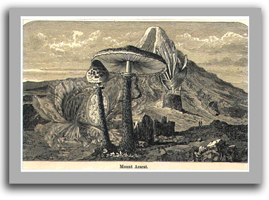
CONNER
Mount Ararat, 1960s
Collage of etchings (in the tradition of Max Ernst)
Collection: FLG
Ex. Collection: Rachel Homer
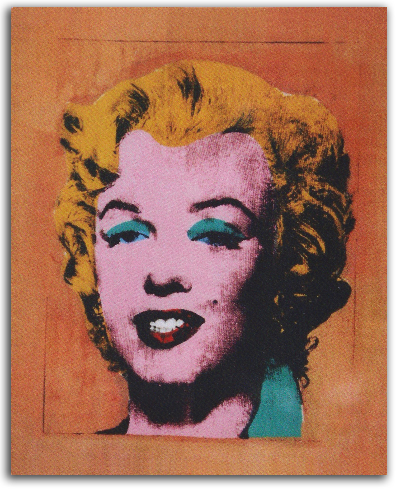
WARHOL
Gold Marilyn (printed 1962)
Authorized replica lithograph, c2000
Collection: CSUEB. Gift of IAD
Published in GLOBAL VISION, Part 1, 2006
NOTE: Andy Warhol became the leading figure in the Pop Art movement during the ‘60s, and is still a household word. His most famous subjects were Marilyn Monoe and soup cans. Many thought everything about him was superficial, but he had another side. I got to know Andy and his “other side” and made that side of him the basis of an exhibition. [For my exhibition brochure ANDY WARHOL & SOCIAL CONSCIOUSNESS: ANOTHER SIDE OF POP ART click here.]
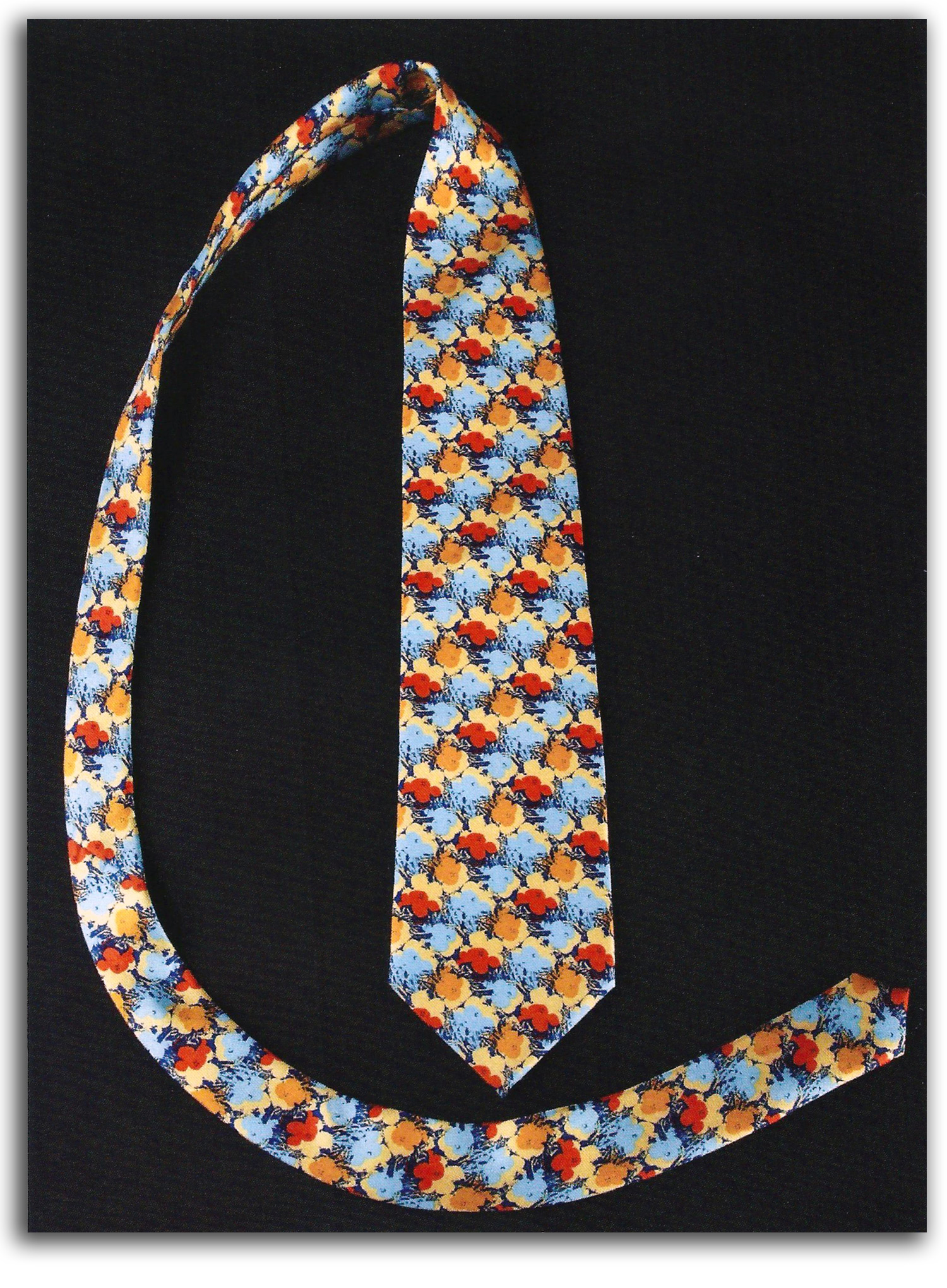
WARHOL
Neck Tie (with prints of “Flowers,”
[his very popular print of 1970], c2000
Authorized open edition. Purchased at Macy’s, c2000
Collection: FLG on loan to IAD
Published in GLOBAL VISION, Part 1, 2006
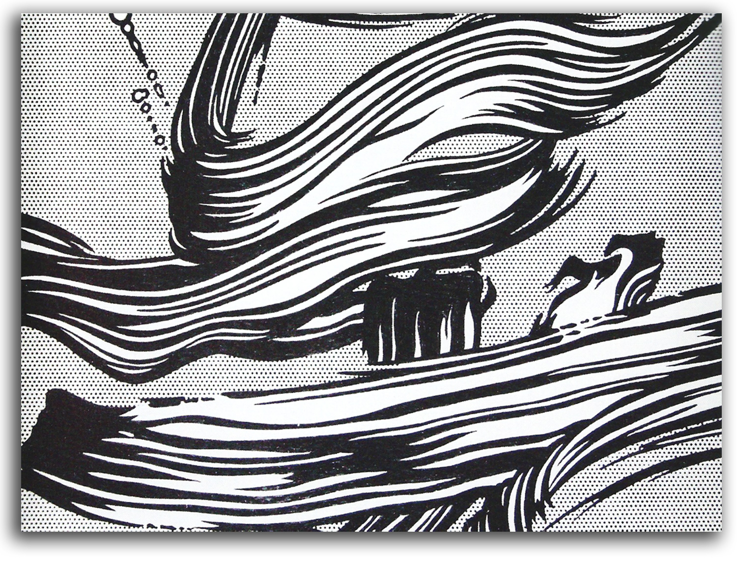
LICHTENSTEIN
Brushstrokes
Original Lithograph, 1966
Collection: FLG on loan to IAD
Published in GLOBAL VISION, Part 1, 2006
NOTE: Roy Lichtenstein was a major figure in the Pop Art movement. This picture of vigerous brushstokes is a perfect parody of the Abstract Expressionism against which Pop Art was a reaction. Ab. Ex. brushstrokes were continued during the Neo-Dada era of the ‘50s in the work of Rauschenberg and Johns, but were completely eliminated in the Pop Art of the ‘60s. The personal touch, the artist’s hand, was replaced by an industrial look by most of the Pop Artists.
RAMOS
Lola Cola #5, 2005
Original Lithograph. [Hand Signed]
Collection: Art Department, CSUEB
{Acquired at the recommendation of FLG}
Gift of the Artist
NOTE: Mel Ramos is California’s most enduring contribution to the Pop Art movement. Underneath the humor and his unqualified celebration of life, is an artist whose extraordinary linear skills descend from the Neoclassical tradition of Ingres. He also was a beloved professor at CSUEB for many years.
BEARDEN
Conjur Woman, 1964
Postcard, ND
Collection: FLG
NOTE: NOTE: Romare Bearden as a young African-American artist and writer grew up during the Harlem Renaissance of the ‘20s & ‘30s. His collages are some of the best made by anyone during the ‘60s & ‘70s. In the culture of the American South, the conjur woman has continued many of the traditional functions that the shamans and shamanesses had in Africa, such as magical potions and healings. Bearden pictured her frequently. Bearden also was an art historian and a professor. One of the places he taught was CSUEB.
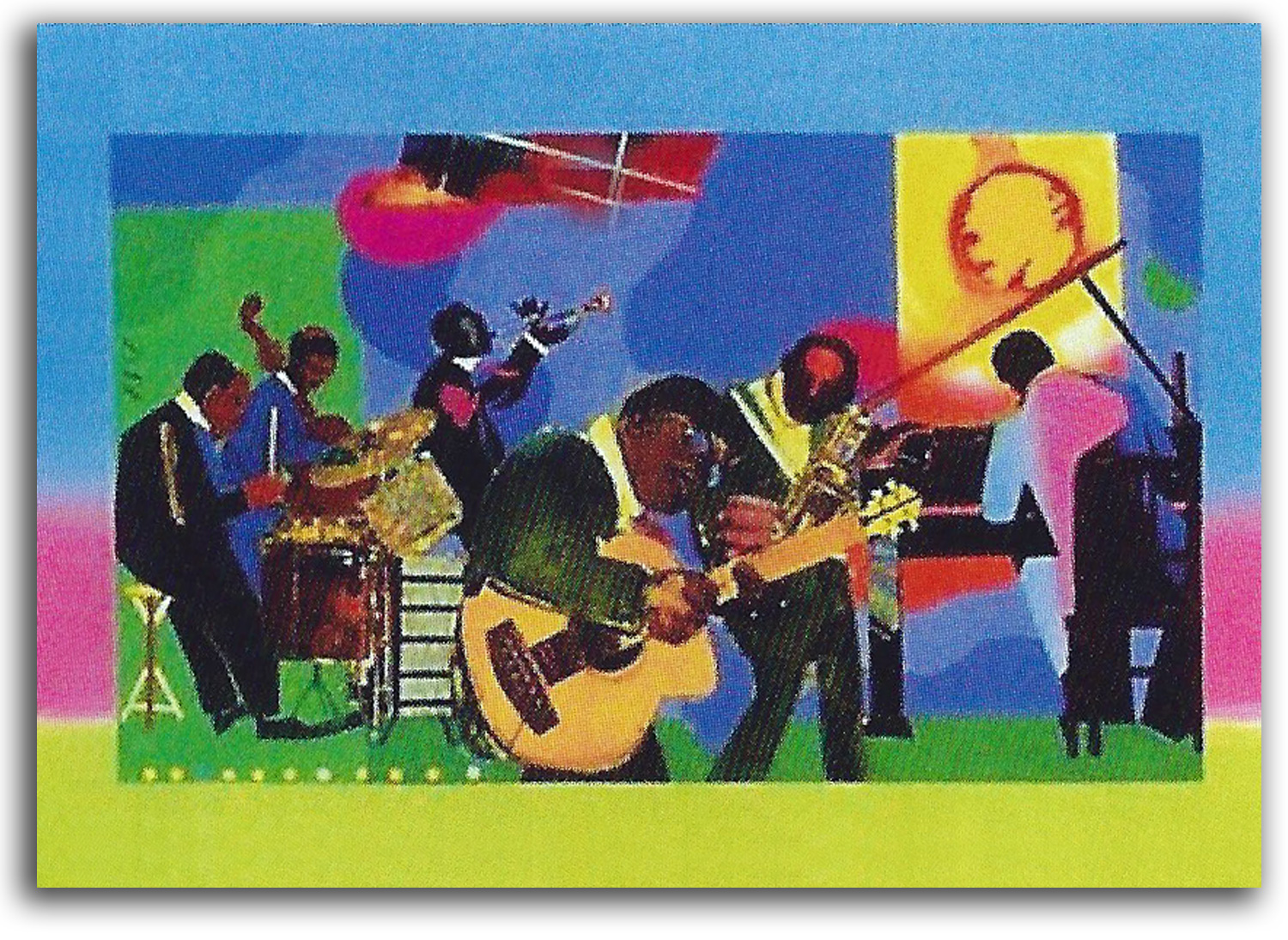
BEARDEN
The Blues (printed 1975)
Authorized replica lithograph, 2003
Collection: CSUEB. Gift of IAD
Published in GLOBAL VISION, Part 1, 2006
LAWRENCE
Olympics
Poster, 1971
Collection: CSUEB. Gift of IAD
NOTE: Jacob Lawrence grew up in Harlem. During the 1940s he was one of the first African-American artists to gain a national reputation. He also was a highly respected professor at a number of universities including CSCEB. This poster is one of his better-known works. The USA withdrew from these Olympics following Russia’s invasion of Afghanistan.
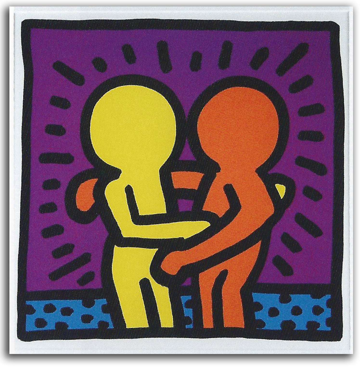
HARING
Untitled (Loving Couple with Aura). Printed 1987
Authorized replica silkscreen, c1990
Collection: CSUEB. Gift of IAD
Published in GLOBAL VISION, Part 1, 2006
NOTE: Kieth Haring became extremely popular during his short career that was cut short by AIDS. His simple spirited forms charmed many, and he was a hero in the Gay community.
CRUMB (after)
Kosmic Kapers (drawn 1967)
Comic strip, 1968
Apex Novelties edition
Collection: FLG
NOTE: This may seem like a comic strip of little interest, but look more carefully. An entire metaphysical cycle has been illustrated. It has been reproduced in a number of publications the theme of which is spirituality.
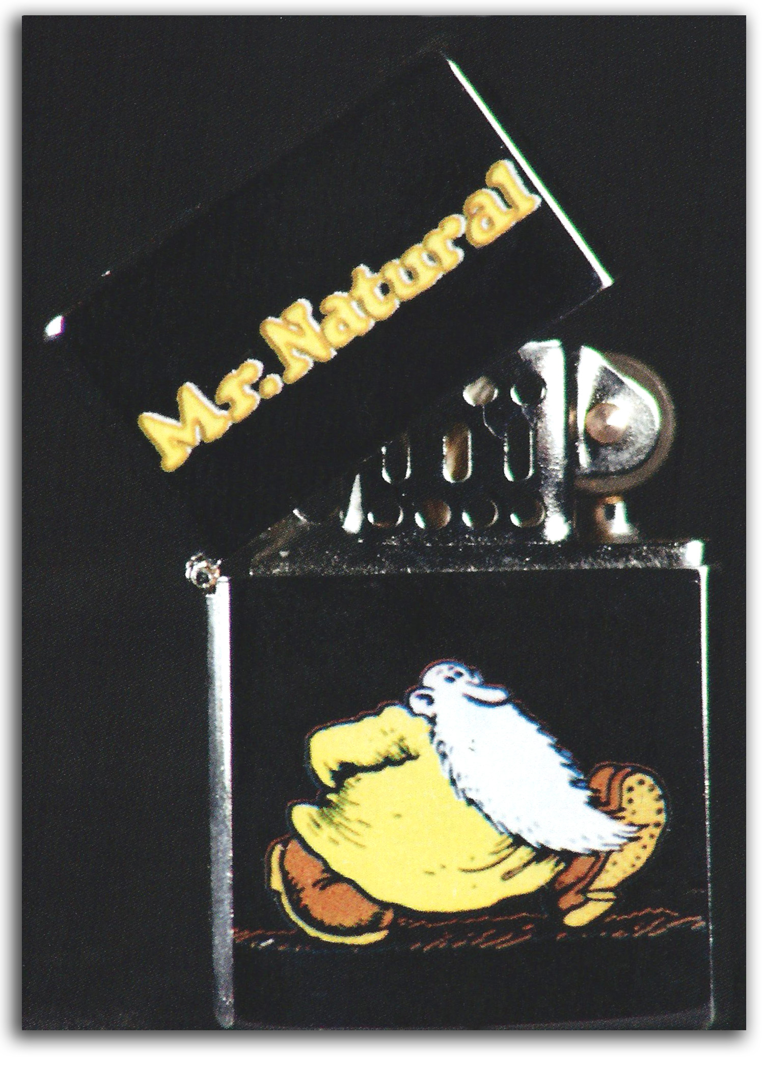
CRUMB (after)
Mr. Natural [sticker on a Zippo lighter], c2000
Authorized open edition Multiple
Collection: FLG on loan to IAD
Published in GLOBAL VISION, Part 1, 2006
NOTE: R. Crumb developed an international reputation as a counterculture cartoonist who began that work in San Francisco in the ‘60s. Much to his surprise, major art museums have recently presented major retrospectives of his work in the U.S. and Europe.
CRUMB
THE BOOK OF GENESIS, 2009
Illustrated Book
Collection: FLG
NOTE: With his amazingly narrative pen, Crumb has illustrated all 50 chapters of GENESIS with a reverence for every word of the OLD TESTIMENT, even the words many Jews and Christians do not like to read.
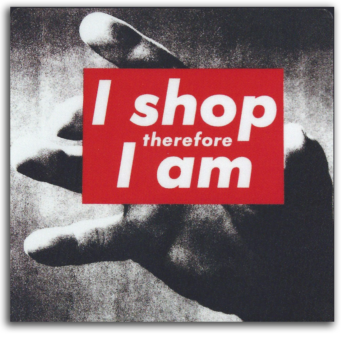
KRUGER
I Shop therefore I Am, c1987
Authorized mousepad edition, c2000
Collection: IAD
Published in GLOBAL VISION, Part 1, 2006
NOTE: Barbara Kruger is part of one of the best-known “conceptual artists” who focus on Information Art. Many Information artists are preoccupied with little more than form. Kruger’s words usually contain social commentary.
BELLOLI
Amerika is Devouring its Children, 1970
Poster
Collection: Center for the Study of Political Graphics
NOTE: This poster, a protest against the Vietnam War by Jay Belloli, is based on a painting by Goya. It was made at UC Berkeley during the student strike when Nixon invaded Cambodia. No event in American history has generated so many angry posters as did the Vietnam War.
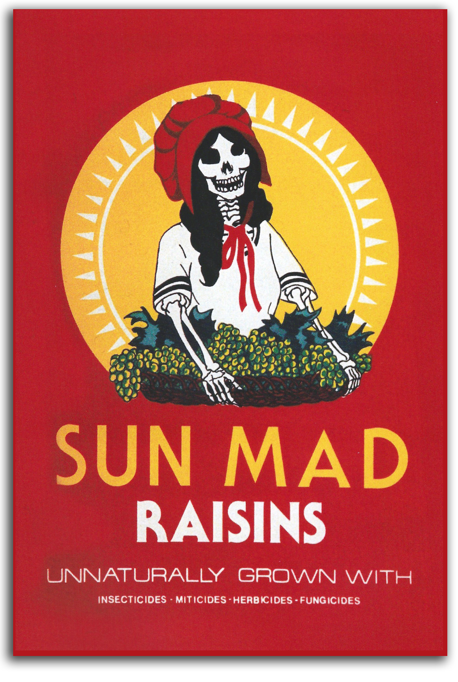
HERNANDEZ
Sun Mad Raisins, 1982
Original Poster [Hand Signed & Inscribed to FLG]
Collection: CSUEB. Gift of IAD
NOTE: This poster by Ester Hernandez is one of the best-known socially conscious posters of the Postmodern era. Inspired by Cesar Chavez and his leadership of the Farm Workers movement, Ester was making a powerful visual protest against how this raison company was treating its workers. The small business card version of this famous poster, a gift from the artist, was published in GLOBAL VISION, Part 1, 2006
CHAGOYA
Friendly Cannibals, 1996
Cover of an Illustrated Book
Collection: IAD
Published in GLOBAL VISION, Part 1, 2006
NOTE: Enrique Chagoya is a gentle soul. We taught together at CSUEB where he helped me design California State University’s first course on “Multicultural Art in the United States.” But his socially conscious art can be quite strong.
LOPEZ
Portrait of the Artist as The Virgin of Guadalupe, 1978
Oil
Collection of the Artist
NOTE: This self-portrait by Jolanda Lopez has been very controversial. In my classes on multicultural art, there always has been a great deal of discussion on whether or not this picture is sacrilegious. Some say yes. Some say no, and hail the image as a powerful image of the Women’s Liberation Movement.
MARTIN
Agnes Martin: Paintings & Drawings, 1992
A portfolio of 10 Original Lithographs
Collection: FLG on loan to IAD
Exhibited: “ZEN & MODERN ART,” University Art Gallery, CSUEB, 2003
NOTE: Agnes Martin started as an Abstract Expressionist under the friendly influence of Barnet Newman and Ad Reinhardt, and then became one of the widely respected of Minimalist artists. Many Minimalists have no content other than form; she does. Her metaphysics is conscious. It is remarkable how subtle her markings were as she attempted to evoke the Transcendent. When I look at the prints in this portfolio, it is as if light is breathing gently into matter.
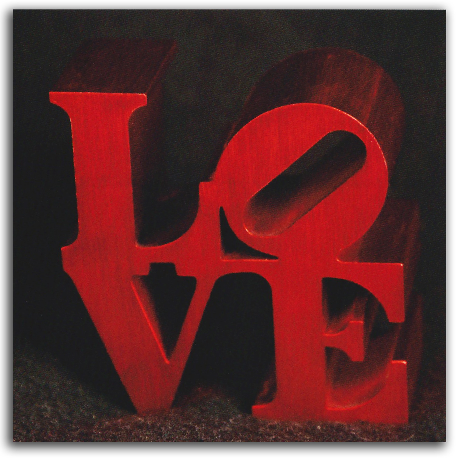
INDIANA
Love,1966 (2000)
Authorized Multiple; aluminum
Collection: FLG on loan to IAD
Published in GLOBAL VISION: A SURVEY OF WORLD ART, Part 1, 2006
NOTE: Robert Indiana was one of the Pop Artists of the 1960s. This image of LOVE became his most famous work, in paintings, prints, large-scale sculpture, and as a desktop multiple. It became an icon of the age. Like a print or a sculptural cast in a limited edition, a 3-D Multiple is a type of “multiple original.” Each one is more or less identical to all the others, and they all are “original.” Inspired by Duchamp, Multiples were made by many famous Postmodern artists during the ’60s and ’70s and afterwards. Many Multiples fall under the category of Desk Art because they usually are small and sit on desks. Duchamp’s legendary objects usually were limited editions. Inspired by the democratic impulse that has been common in Postmodernism, most Postmodern Multiples are not “limited editions” but rather “open editions” which means any number can be made. Indiana’s “LOVE” is probably the best-known Multiple of all time. Its iconic design began as a Christmas Card in the MoMA store in 1965. I played a tiny role in helping the design into production. I happened to be in the store when the manager was considering producing Indiana’s design. (I was looking for a job there.) She asked me what I thought of the design, and I said: “I think it’s great. Publish it!”
VOL 7 PHOTOGRAPHS
MILLER
Joseph Cornell with a Yacht Model by Lee Miller, 1933
Photograph. Collection: Norton Simon Museum.
Gift of IAD Published in IMPOSSIBLE REALITIES:
MARCEL DUCHAMP & THE SURREALIST TRADITION, 1991
SOMMER
Max Ernst in Sedona (1946)
Photo-offset lithograph, 1960s. Collection: FLG on loan to IAD.
Gift of Frederick Sommer, 1989
Published in GLOBAL VISION: A SURVEY OF WORLD ART, Part 1, 2006
NOTE: Frederick Sommer was one of the most important Surrealist artists in the U.S. He was the only artist from the United States to be included in the last great Surrealist exhibition in Paris in 1947. Sommer was a friend and neighbor of Ernst and Tanning in Arizona where he made this haunting portrait of Ernst using a rare double-exposure.
MICHALS
Illuminated Man, 1968
Photo-offset lithograph. Collection: FLG on loan to IAD
Published in GLOBAL VISION: A SURVEY OF WORLD ART, Part 1, 2006
NOTE: Duane Michals was an American photographer who worked under the influence of Surrealism and Buddhism. He deeply admired Magritte whom he photographed in a series of remarkable portraits. ‘Illuminated Man’ one of his most famous works was inspired by a Magritte painting showing a man with a similarly luminous head. Michals a longtime student of spiritual traditions intended this powerful image to be a visual metaphor for enlightened consciousness and reminds us that everyone has this potential.
VOL 8 ASIAN PAINTINGS & MANDALAS
INDIA
Yoni-Linga and Snakes. c. 1900-1999
Paper: (Color: Cow Dung?) Painting India India. IAD
NOTE: At the center of this composition is the image of a Yoni-Linga one of the most revered icons in Hinduism. Early forms appear in the Indus Valley during the Bronze Age. Tiny shrines with such objects at their center can be found by the thousands all over the Indian countryside today. The larger temples also are usually centered on this simple but profound form. The image combines a semi-abstract form representing Shiva the “male energy” of origination and a semi-abstract form representing Shakti the ‘female energy’ of generation. The two energies are perceived as aspects of each other interacting continuously. Linga means phallus. Yoni means vagina. Here the physical act of sexual union is used as a symbol for the metaphysics of Hindu theology. To the faithful this image is more than a symbol. It is a living reality a transcendent reality worthy of worship. Male scholars name this icon a Shiva Linga but that is only partly accurate because the Goddess is equally present. A better name would be Linga-Yoni or Yoni-Linga. This painting is a traditional tribal vision of the invisible forces at work around a Yoni-Linga. It was recently painted by women of the Mithila region near Madhubani in Northern India next to Nepal. In popular mythology the Shiva serpents bring fertility. Esoterically the dynamic ‘serpent energy’ pictured here in a symbolic way corresponds to the esoteric teachings of Kundalini yoga which state the subtle energy that rises up a pathway parallel to the spine is like serpents that pass through each chakra on the way to the Liberation of consciousness.
C.Lingam-Yoni: Reflections on Nonduality
Kali, Mother of the Four Great Gods. Brahma, Vishnu, Shiva, and Indra. c. 1900-1999
Paper: Watercolor: Gold Painting Hindu India. IAD
NOTE: Shown here is the Holy Trinity of classic Hinduism: Brahma Vishnu and Shiva. Brahma the Creator of the universe looks in all 4 directions. He is also god of wisdom while his partner Sarasvati is the goddess of wisdom learning and music. He is not to be confused with Brahman the world soul with which every individual soul (atman) seeks to reunite. Blue Vishnu on a lotus is the Preserver of the universe. His partner Lakshmi is beauty. Shiva with a snake is the Destroyer of the universe. Shiva’s partner Uma is perishable matter. The activities of the Holy Trinity are all happening all the time. The main point of this image is that Kali (in the birth giving position with her necklace of skulls) is the mother of them all. Such a theology is a continuation of the Stone Age and Bronze Age traditions of the Great Goddess ‘Giver & Taker of All’ before the male principle became dominant in India with the arrival of the Indo-Europeans. The fourth god pictured is Indra ‘King of the Gods’ in ancient Vedic mythology with eyes on his body. He appears to have come to India with the Indo Europeans. This modern replica was commissioned from the esteemed artist Shri Kailash Raj who continues the rich tradition of his ancestors. This painting is done in an 18th century style.
D. Ardhanarishvara, the Divine Androgyne of India: A Bibliography of Books
E.D.G. Sharma & the Living Tradition of Indian Painting
ISLAM
Shah Jahan, Emperor of India and builder of the Taj Mahal.
Early 17th century. watercolor
Collection: CSUEB. Gift of IAD
VOL 9 ASIAN SCROLLS & CALLIGRAPHY
Daruma on the Water. c. 19th century
Paint: Paper Painting Zen Japan. IAD
NOTE: Daruma is the Japanese name of the Buddhist teacher known in China as Bodhidharma. He is considered the 28th Patriarch in a direct line from the historical Buddha. He is thought to have brought a special form of Buddhism to China in the 6th century a form known as Chan in China and later as Zen in Japan. It is said that he arrived by sea rather than by land.
Dragon in the Clouds. c. 19th century
Paint: Paper Painting Edo Japan. IAD
NOTE: No image in Japan or China activates the mythic mind more than the Dragon. Its magical spirit has been articulated in many media but some of the most enduring images have been painted on scrolls such as this one.
Zen Priest with a Flaming Enso (Zen Circle). c. 19th century
Paint: Paper Painting Zen Japan. IAD
NOTE: The enso is a well-known Zen symbol. It is an almost complete circle rendered with a single brushstroke. The white circle worn by Zen monks on their robes is a related symbol. The form of this image has many levels of symbolism including the primal relationship between spirit and matter thingness and nothingness etc. The mode of rendering is itself symbolic of the goal of the Zen path: the fearless- spontaneous fluidity of an Enlightened mind. Young monks might spend many years learning (or un-learning) enough to be spontaneous enough to make an enso which reveals that one’s mind has become totally spontaneous. Then the monk may be qualified to leave the monastery and go out to be of selfless service to the world. This artist shows us the enso in flames. This burning metaphor probably refers to the flaming truth (Dharma) that burns away ego and to the teaching that attachment to all symbols must be burned away even symbols of Buddha. Hence the dramatic Zen saying: ‘If you see Buddha kill him.’
Mountain Colors ~ Buddha Mind brushed by Nantenbo roshi, 1920s (signed)
Calligraphy scroll. Collection: FLG & GKS
Ex. Collection: Professor John Stevens & Shambhala Zen Gallery
VOL 10 ASIAN PRINTS
JAPAN
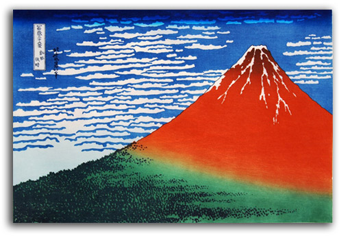
“Red Fuji” by Hokusai, from VIEWS OF MT. FUJI, 1827. Old edition
Click here for closer view of above image in PDF format
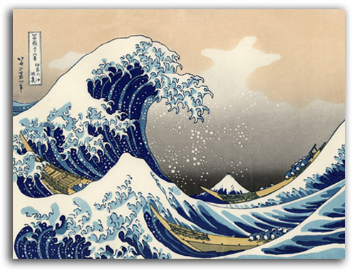
“The Wave” by Hokusai from VIEWS OF MT. FUJI, 1827. Modern edition
Click here for closer view of above image in PDF format
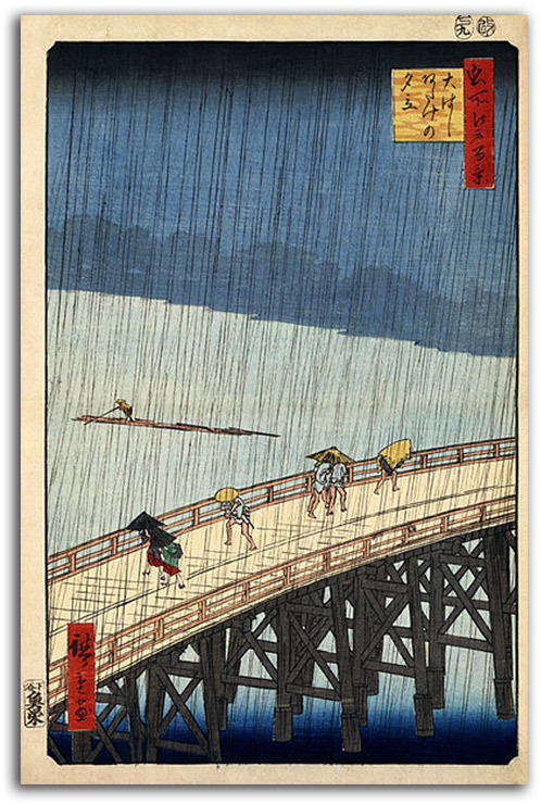
“Sudden Shower at Atake” by Hiroshige, from 100 FAMOUS VIEWS OF EDO, 1857. Old edition
Click here for closer view of above image in PDF format
ADDENDA
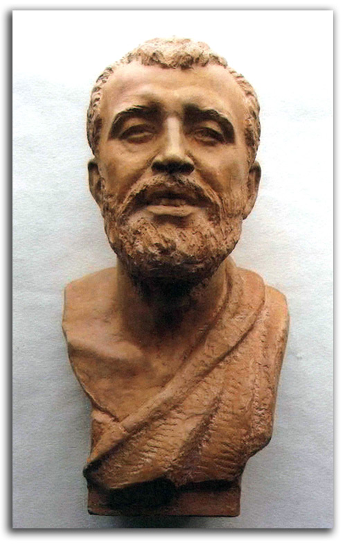
Portrait of Sri Ramakrishna by Malvina Hoffman. 1952 (signed)
Terracotta. Collection: Vedanta Society of Southern California
Gift of IAD, 2011
NOTE: Ramakrishna is one of the most revered teachers in the modern history of Hinduism. His spiritual son, Vivekananda, played a major role in bringing the ancient tradition of Vedanta to the United States. Hoffman was one of the most widely celebrated sculptors of the early 20th century. Her marble bust of Sri Ramakrishna, commissioned in 1952, stands at the heart of the main altar in the Ramakrishna-Vivekananda temple in New York City. This dynamic terracotta bust, signed by Hoffman, is Hoffman’s study for that marble. At their request, it was donated by IAD to the Vedanta Society of Southern California in Santa Barbara.
What follows is HOLDING TEXT for future disposition on this page (07/24/2012):
VOL 2 SCULPTURE
VOL 2A.1 ANCIENT SCULPTURE / Tribal & Ancient
(Click here for Tribal sculpture)
(Click here for West Asian sculpture)
(Click here for Pre-Columbian sculpture)
VOL 2A.2 ANCIENT SCULPTURE / Minoan & Mycenaean
(Click here to view these topics in Greek & Minoan Studies)
VOL 2A.3 ANCIENT SCULPTURE / Greek
(Click here to view these topics in Greek & Minoan Studies)
VOL 2A.4 ANCIENT SCULPTURE / Roman & Celtic
(Click here to view these topics in Roman Studies)
(Click here to view these topics in Celtic Studies)
VOL 2B.1 EUROPEAN SCULPTURE / Medieval
(Click here to view these topics in Medieval Studies)
VOL 2B.2 EUROPEAN SCULPTURE /Renaissance & Baroque
(Click here to view these topics in Renaissance & Baroque Studies)
VOL 2B.3 EUROPEAN & AMERICAN SCULPTURE / 19th Century
(Click here to view these topics in Modern Studies)
VOL 2B.4 EUROPEAN & AMERICAN SCULPTURE / 20th Century
(Click here to view these topics in Modern Studies)
VOL 3 EUROPEAN & AMERICAN SCULPTURE/Decorative Arts
VOL 3a EUROPEAN Decorative Arts
(Click here)
VOL 3b AMERICAN Decorative Arts
(Click here)
VOL 4 JEWELRY
VOL 4a JEWELRY #1 Ancient to Baroque
(Click here)
VOL 4b JEWELRY #2 19th century
(Click here)
VOL 4c JEWELRY #3 Art Nouveau
(Click here)
VOL 4d JEWELRY #4 Modern
(Click here)
VOL 4e JEWELRY #5 Medals & Decorations
(Click here)
VOL 5 ASIAN SCULPTURE
(Click here to view these topics in Asian Studies)
VOL 5a ASIAN SCULPTURE – India, Gandhara, Tibet, Nepal, S.E. Asia, & Japan
(Click here to view these topics in Asian Studies)
VOL 5b ASIAN SCULPTURE – Stone Age China
(Click here to view these topics in Chinese Studies)
VOL 5c ASIAN SCULPTURE – Buddhist China
(Click here to view these topics in Chinese Studies)
Pasted here for possible reference only:
VOL 6C EUROPEAN Prints / Later 19th century [Should this be “Impressionism”?]
INTRODUCTION
Impressionism was the dominant “contemporary” style of painter-printmakers during the second half of the 19th century. The primary bridge-builder whose moved aesthetics away from Renaissance assumptions of space and time and sculptural volume was Manet. He began as a Realist under the influence of Courbet. However, by the 1860s, Manet was flattening his figures to such an extent that they seem to be merely “impressions” of figures. The most famous example is “Olympia.” An important influence on Manet’s thinking may well have been Manet’s good friend Mallarmé. The two saw each other almost every day for years. Mallarmé suggested: “Paint not the thing but the effect it produces.” In other words, do not describe a scene (with many details) but rather render a suggestion or evocation of a scene, or to use Manet’s word: a mere “impression” of a scene. Impressionist pictures (often painted outdoors) are filled with light. The brushstrokes are short, rapid, and energetic, not unlike light waves themselves. The sketch-like character of the compositions often requires that the viewer complete the painting or the print with his or her own mind. Never before was the viewer “required” to participate in the aesthetic moment in quite this way. Even though Manet himself was not an Impressionist, this seems to be where the term and the concept of Impressionism began. Younger painters in “Manet’s gang” such as Renoir and Monet actually invented the pictorial style of Impression together in 1869. The Golden Decade of Impressionism was the 1870s, but some masters such as Monet carried the style with a robust vitality into the 20th century where Impressionism has remained the most popular of all art styles. Why? Because Impressionism is filled with a positive, spontaneous, joyous spirit unmatched in the history of art, and because Impressionism evokes a closeness with the natural world that (alas) has largely disappeared.
Impressionism was the main bridge between traditional art and modern art. After Impressionism came Postimpressionism which is commonly divided into three decades of development. During the 1880s, the First Generation matured. That included Cézanne, Gauguin, and van Gogh. During the 1890s, the Second Generation matured. That included Lautrec, Bonnard, and Munch. During the first decade of the 20th century, the Third Generation matured. That included Matisse and the Fauves in France, and the German-speaking Expressionists. All three generations stayed within Renaissance assumptions of perspective and gravity but they bent the edges of these rules. They consistently made figures that are more symbolic than realistic, and colors that are more symbolic than realistic. Moreover, they moved the background and the foreground towards each other so that there often is a flat “picture plane” rather than the usual deep visual recession of pictorial space. The common goal of all three generations of Postimpressionists was to picture not external visual realities but rather internal emotional realities.
At the end of the 19th century, there was another movement in the visual arts that has come to be called Symbolism. It is closely related to Art Nouveau in the decorative arts. Art Nouveau was a way of working that is also given to explosions of fantasy. One of the most famous practitioners of Symbolism was the painter-printmaker Redon. In a way that anticipates Surrealism, the Symbolists looked away from the ordinary world of visible reality and pictured their dreams.